Recently, the Interactive Advertising Bureau (IAB) polled 360 marketers across a variety of industries about their digital video ad budgets. 62% of respondents answered that they expect to increase their mobile video ad spending within a year. These findings are significant but not at all surprising. In fact, according to recent estimates from eMarketer, mobile’s share of total digital video ad dollars is expected to reach 47.7% by 2019.
Statistics like those above are indicative of a larger trend: a transition away viewing videos on television (and even on desktop) and towards viewing videos on mobile devices. Yet even this true seems to be staring us in the face—both statistically, as well as anecdotally—rarely do we talk about how, if at all, content ought to be altered to remain effective in a mobile format. More specifically: what does the proliferation of mobile mean for your explainer video?
In (August 19, 2016)’s post, we talked about some of the ways you can make sure that your explainer video works in a mobile format. Today we’re going to dig deeper and specifically look at how character animation can help with this cause…

Consistency via Character Animation
In the quest to retain viewer attention throughout the duration of your explainer video, the use of character animation—when skillfully executed—can provide several benefits. Like personalizing the message, enhancing accessibility and—most relevant in this situation—a sense of consistency for your video.
The reason why consistency is particularly valuable in the mobile space because of how videos tend to be watched on smartphones. With (literally) so many other options at the viewer’s fingertips (games, messaging, social media apps) the competition for engagement is unlike in any other space. While we hope that our explainer video can rise to that challenge and achieve full engagement, we must also accept that this will not always be the case and come up with ways to re-capture the viewer’s attention. There’s where consistency is key.
By creating characters that the viewer can invest in, two things are accomplished:
- They provide incentive for the viewer to continue watching through the duration of your explainer. To find out, ultimately, what happens to the protagonist/s.
- If a viewer momentarily drops off, the familiarity of character provides an accessible re-entry point to your video.
Less is More
There are no hard and fast rules about what types of character animation work (or don’t work) in the mobile video format, but one danger area is crowded storytelling.
As such, it tends to work best when the number of featured characters in your video are limited. By “featured characters” we mean those the audience should note and follow. This being in contrast to “throwaway characters,” by which we mean only exist for a single frame (or scene) to exemplify a singular point.
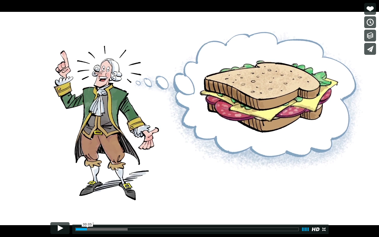
For reference, let’s look at a recent spot we did for Know Better Bread. The story revolves around a featured character named The Earl of Sandwich:


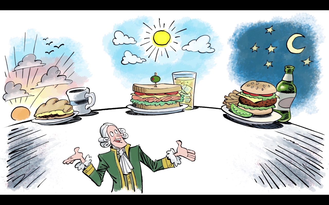
By scripting this character as the hero of this video and also by not including any other recurring characters, The Earl of Sandwich becomes an unofficial tour guide for the viewer. We also made an effort—touching on the point about consistency above—to include the Earl in every scene. Even those where he doesn’t play a narrative role:


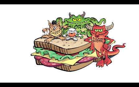
Now, as valuable as The Earl of Sandwich proved to be, he was not the only character in this video. The explainer also features a handful of throwaway characters. Like these guys:


In both instances, the ensemble of characters played a key role to delivering the message in that scene. But, because these characters don’t recur, the viewer’s connection with the featured character/s and remain focused on the larger narrative.
Whiteboard Animation
The Know Better Bread examples above come from an explainer we made with a whiteboard technique. And that’s no accident. Because of whiteboard animation’s unique properties, the characters in this explainer video lend themselves to the mobile video format. This is largely a result of two things:
- The iconic look of whiteboard animation characters.
- The stark contrast against white background makes the characters pop (especially with an appropriate pinch of color).
In addition to those byproducts of character, the limited movements of the technique instill a sense of consistency throughout your video. A sense of consistency that, from start to finish, can help make your video easier to follow on any size screen.
Digital & Social Articles on Business 2 Community(59)
Report Post


