Recently, the Interactive Advertising Bureau (IAB) polled 360 marketers across a variety of industries about their digital video ad budgets. 62% of respondents answered that they expect to increase their mobile video ad spending within a year. These findings are significant but not at all surprising. In fact, according to recent estimates from eMarketer, mobile’s share of total digital video ad dollars is expected to reach 47.7% by 2019.
Statistics like those above are indicative of a larger trend: a transition away viewing videos on television (and even on desktop) and towards viewing videos on mobile devices. Yet even this true seems to be staring us in the face—both statistically, as well as anecdotally—rarely do we talk about how, if at all, content ought to be altered to remain effective in a mobile format. More specifically: what does the proliferation of mobile mean for your explainer video?
A lot. So that’s exactly what we plan to answer today and tomorrow…
![]()
Preparing for a mobile audience may, at first, seem daunting. Going from a desktop screen to a mobile device? That’s an enormous difference. In truth, however, it’s not as bad as it seems. There are two reasons why:
Defining Mobile Video
Mobile doesn’t just mean mobile phones. The category refers to both phones and tablets. And while the screen on a tablet is still smaller than that of a desktop, it’s not significantly so. Especially—as anyone who uses their tablet to stream movies can attest—if the tablet is laid width-wise so that the video is playable in its widescreen format.
Size Matters (Sometimes)
Still, a large portion of the mobile viewing audience will be watching on smart phones. But, once again, that’s not as dire as it sounds. Because, when watching on a desktop or laptop, not everyone expands to full-screen anyway. So the default dimensions really aren’t even that much bigger than the typical smartphone screen. For example, the mid-size iPhone display is 4.7 inches. Compare that to the default size of a YouTube or Vimeo video on your computer. It’s actually not that much of a difference.
In fact, the difference is so minimal that it might cause you to think: so, what’s the problem? The problem is that most smart phones viewers aren’t necessarily going to view your video at full size. They may opt to do so if they’re invested, but more likely they’re going to be holding their phone length-wise and encounter your video as a fraction of their screen size. And it’s for that possibility—the worst case, smallest-size scenario—that we need to be prepared.

Center of Attention
Many of the best explainer videos are beautifully nuanced. This needn’t change as those intricate, not-necessarily-visible-at-first details will continue to retain compositional value and provide incentive for additional viewings. But regardless of how detailed your video might be, successful mobile videos tend to have a strong central focus.
Think of this almost like a spotlight. A way for you to highlight a singular focal point to try and lure the viewers attention. This focal point does not need to be the same throughout the entirety of your video (although it can help, especially if it’s a hero character), but you at least need to continually provide a center of attention. Something that can grab and holder the viewers attention and provide an accessible means into the world of your explainer. Because, ultimately, what you want to avoid is this: someone looks at your video, is confused and then clicks onto something else. Your central focus, then, is the antidote to confusion.
Prepare for Sound, but Don’t Count on It
According to an article on Digiday, as much as 85% of the video views on Facebook are played without sound. This would appear to be a scenario that impacts desktop/laptop viewing as well (which it does), but not to the same extent. Because stats like this one—56.5% of Facebook users only login from a mobile device—indicate that the overwhelming majority of Facebook views come from mobile devices.
It would be a mistake to take this information to mean that the sound in your video doesn’t matter. It does, and still represents the optimal viewing experience for your video. But it just means that you shouldn’t count on it. In other words, your video needs to be accessible enough to garner interest without sound (and, ideally, compelling enough to persuade the viewer to watch with audio).
As such, one good way to think about this challenge might be to liken aspects of your explainer video to a comic book. In the sense that although a comic book does have text to help tell the story, one can still (generally) follow the narrative by following the illustrations. Because comic books tend to do a great job of setting the stage, introducing action and then using the focal point of character to tell a story.
Text is Fine, But Make Sure it’s Mobile Video Ready
Speaking of text…
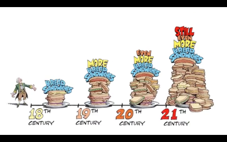
The text in an explainer video is quite different than that of a comic. In that it’s not narration and, very often, is used to underscore key facts. Here are a couple examples from recent videos that we produced:


In both of the examples above, we hope that the viewer will be able to see and read all of the text. But, in the event that a viewer’s screen is too small (or the viewer just does’t care enough to read) we’ve tried to be prepared by making sure that the most important aspect of the text is still readily accessible. In the frame above-left, the most important text is the word “Wanted” as that is used here for the story purpose of branding bread an outlaw. In the frame above-right, the most important text is those numbers on the bottom that indicate this is a timeline.
In both cases, the vital text aspects are expressed with the biggest fonts on screen. But that’s not the only reason (we hope) that they immediately stand out. In the above-left example, our character’s reaction to the text/sign helps shine the spotlight on that word “Wanted.” And int he above-right example, we used different coloring and also paced out the numbers with a spacing less crowded than anything else on the screen (as well as tried to leverage the average viewer’s familiarity with a chronological timeline).
So to reiterate, text can still play a key role in a mobile-sized explainer video, but you should make sure you are being deliberate about how to make that text most accessible.
Characters are Key (But…)
Tomorrow, we’ll focus specifically on character animation in the mobile space. In the meantime, we’ll end by stating that the use of a hero character (or characters) can be a great way to compensate for mobile viewing. But…not all types of characters are equally effective.
Digital & Social Articles on Business 2 Community(98)
Report Post


