There’s a ton of speculation online about ads being removed from the right side of Google’s SERPs. This speculation is quickly turning into confirmation as a Google spokesperson has reached out to an SEM Post with the following:
“We’ve been testing this layout for a long time, so some people might see it on a very small number of commercial queries. We’ll continue to make tweaks, but this is designed for highly commercial queries where the layout is able to provide more relevant results for people searching and better performance for advertisers.”
Google has been transitioning away from the right hand ad placement for the past two to three years, but it has only become a hot topic over the past few days.
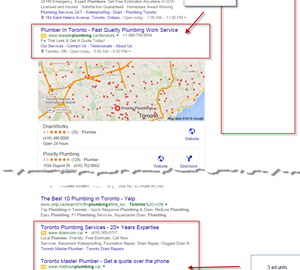
Here’s the old vs the new layout:
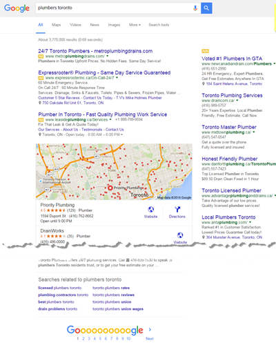
Old Layout
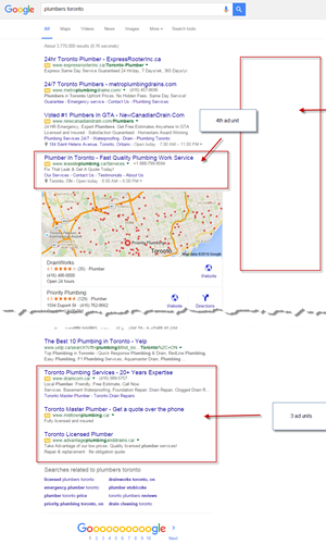
New Layout
As you can see, the change is significant. Personally, I
like
this change…There are only 3 top spots, and sometimes a 4th spot for more competitive searches. Another notable change is the addition of up to 3 more ad units at the bottom of the page. It may seem like an odd spot to put ads, but it does make sense. CTRs are considerably lower on the side than they are on the top or on the bottom of the page. When a user cannot find an answer on the first page, they either revise their search or move on to the next page. Ads at the bottom sit right on top of related searches and SERP page numbers, giving them prominent visibility.
What Does This Mean For Advertisers?
Advertisers who don’t already bid for top ad positions will have to pay a bit more to start playing. If you’re moving to the top, make sure you’re taking advantage of relevant Ad Extensions!
For advertisers who already bid for the top positions, you may start to notice a rise in your CPCs as well. You’ll need to actively monitor your budgets to ensure you’re still able to secure one of those top 3-4 spots.
Personally, I like this change… It will push everyone to ensure their landing pages and offers are the best they can be.
Is this new layout showing up on your screen? What do you think? How will this impact your online advertising strategies? Share your thoughts in the comments below.
Hand-Picked Related Articles:
* Social sharing image adapted from brighter than sunshine
Google Testing 4 Top Ads Layout
The post Google Testing 4 Top Ads Layout appeared first on Search Engine People Blog.
Search Engine People Blog(95)
Report Post