By Jared Newman
Slack’s big 2023 redesign has been rolling out for the past couple of months now, so there’s a solid chance it’s running on most or all of your workspaces.
As with most redesigns, the new look has been divisive, with users bemoaning its extra navigation layers and (for a time, at least) missing functionality. Fast Company polled readers on LinkedIn this week and found that only 17% of respondents said they loved it. The plurality had mixed feelings, at 41%.
It’s not all bad, though. With time, some of Slack’s changes might feel normal, and the redesign does introduce some useful new ideas for those who take the time to try them. Slack isn’t letting users revert to the old design, so you might as well get used to it. Here are best ways to do that:
Bring back the workspace switcher
Slack’s redesign was initially a big step backward for multi-workspace users, as it eliminated the sidebar for quickly switching between them.
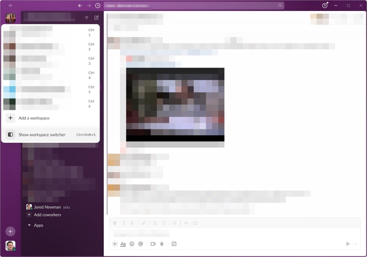
Fortunately, Slack absorbed the feedback and restored the workspace switcher sidebar as an optional feature. Just hover over the stack of workspace icons, then click “Show workspace switcher.” (You can also toggle the sidebar by pressing Ctrl+Shift+S in Windows or ?+Shift+S on a Mac.)
Find features that moved
The new Slack has shuffled some existing features around, so you might have trouble finding them at first. Here are the notable changes:
Glance at DMs and reactions
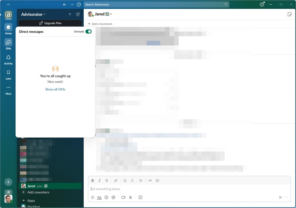
The biggest change in Slack’s redesign is the new sidebar, which has dedicated tabs for DMs and Activity. The former brings up a list of direct messages, while the latter shows all your mentions, reactions, and thread responses.
Both of these tabs also have one extra useful feature: Hover your cursor over the DMs or Activity buttons, and you’ll see a pop-up with your most recent interactions. That way you can quickly decide which ones need a response and which ones can wait.
Show unreads only
One welcome improvement in the new Slack is a filter that shows only unread messages and mentions. In either the DMs or Activity tabs, just click the “Unreads” toggle at the top. Combined with the pop-up previews mentioned above, this a great way to see only the interactions you missed.
Use Slack in multiple windows
Now you can open DMs, threads, channels, or Canvases in their own separate windows. There are a few ways to do so:
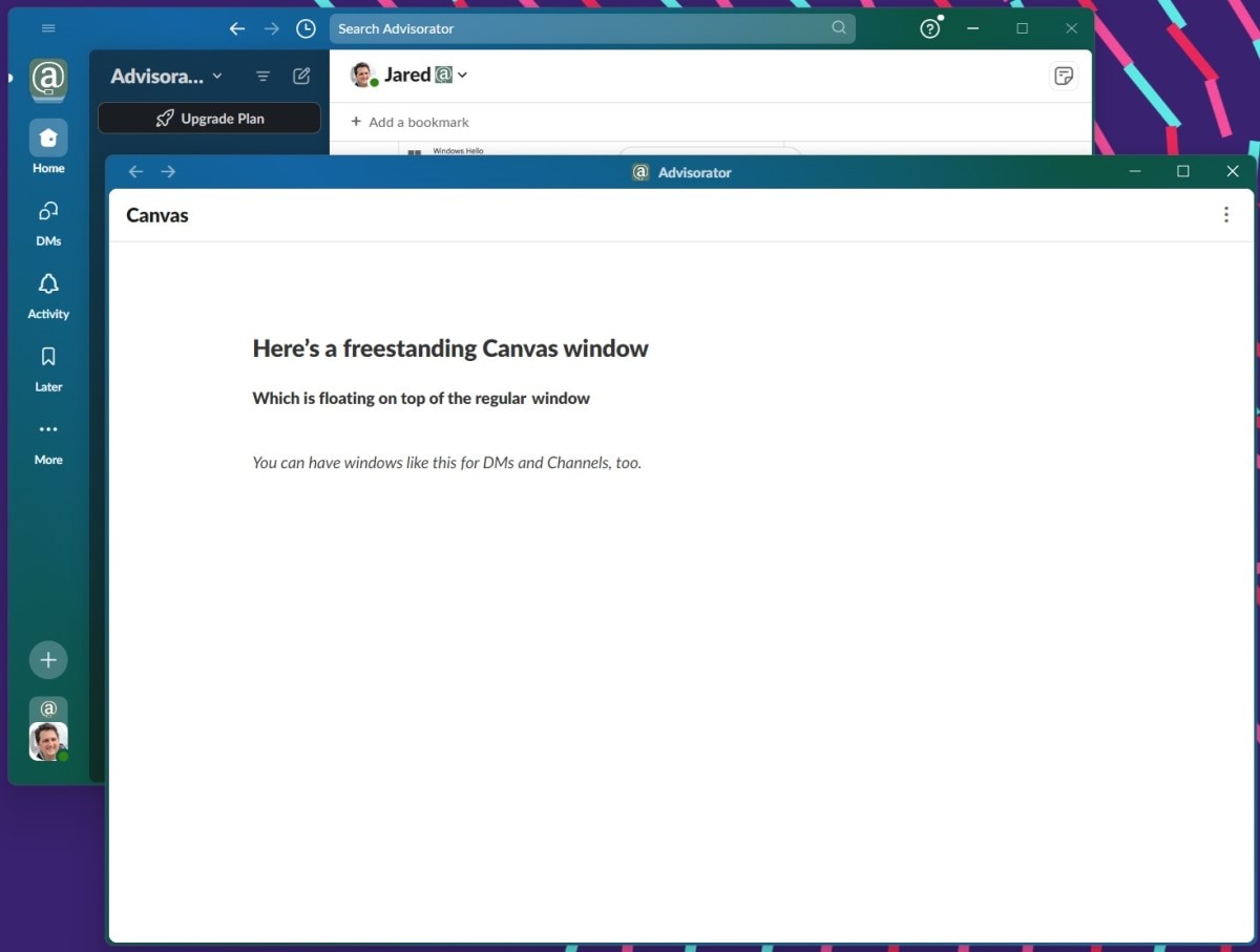
If you still have some workspaces running the old design, they should support Slack’s new windowing features as well.
Tweak your themes
Color themes aren’t a new feature for Slack, but the redesign has some new options, including adjustable brightness levels and a “darker sidebars” toggle. There’s also a “Surprise Me” button if you want to shake things up with minimal effort. (The only downside: There’s no color picker anymore, you can choose only from the colors Slack provides.)
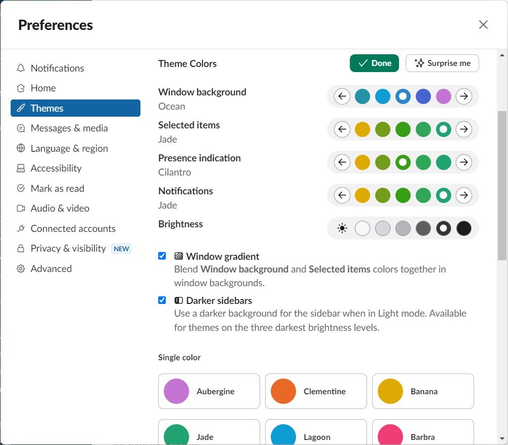
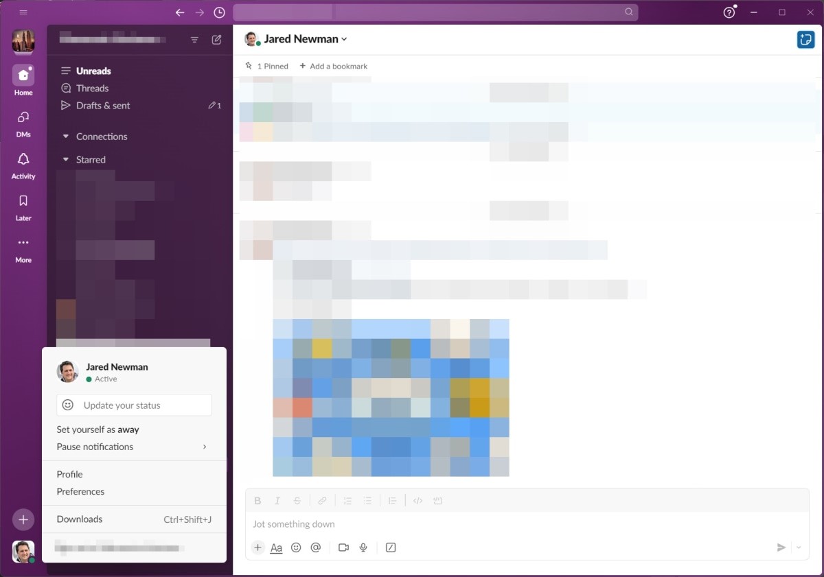
To switch themes, click your profile image, head to Preferences, and select Themes from the sidebar menu.
Try the “Later” tab
As before, you can save any Slack message by highlighting it and clicking the bookmark icon. You can also save files by clicking the ? icon and selecting “Save for later.”
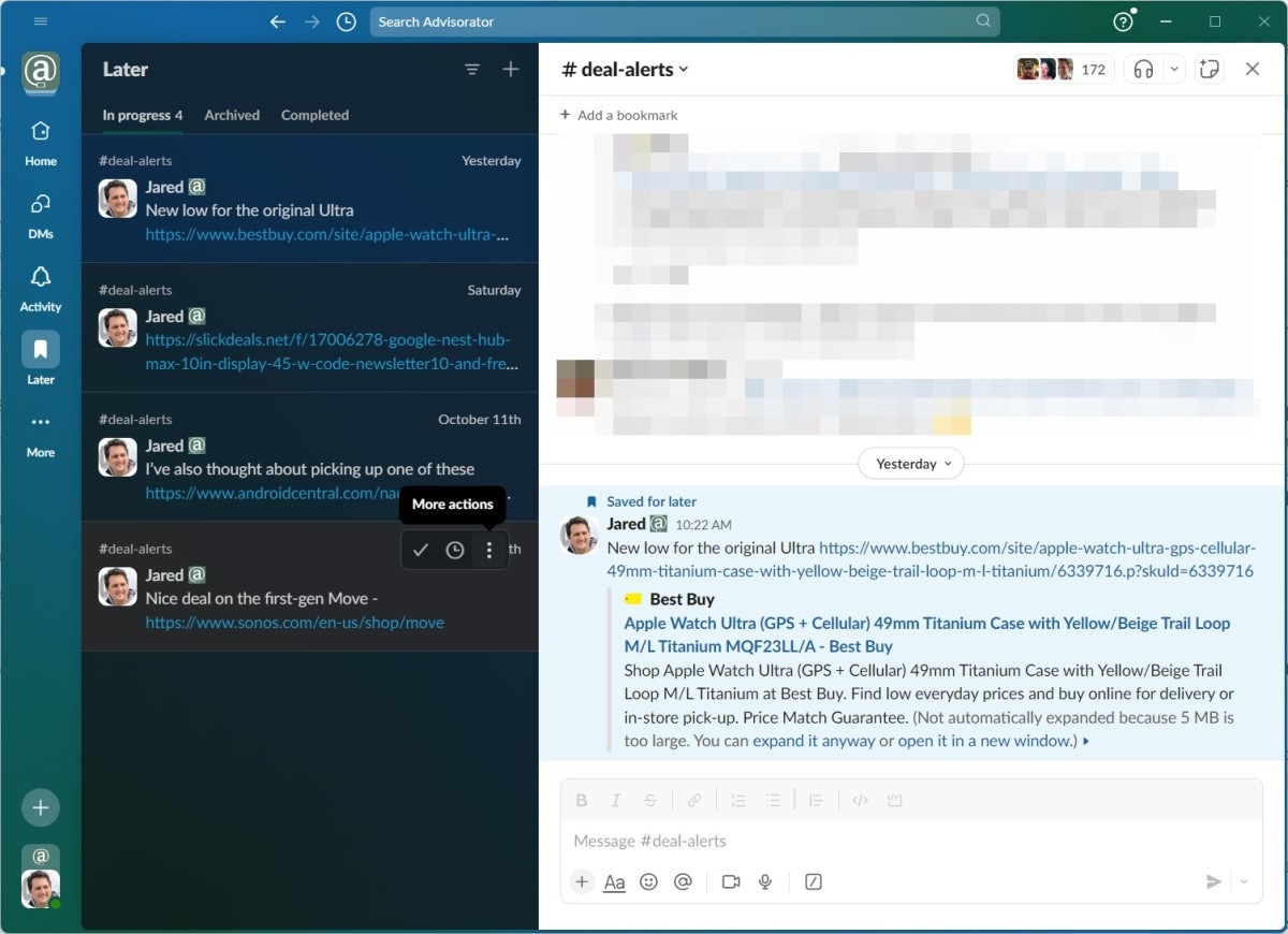
But now, those bookmarks are easier to deal with through the “Later” tab on the sidebar. Whereas the old design would take you out of the Later menu when you clicked on an item, the new version provides a split-screen view of saved items on the left and content previews on the right. That makes the Later menu more useful for tracking important messages and quickly addressing them when time permits.
Set up sidebar filters
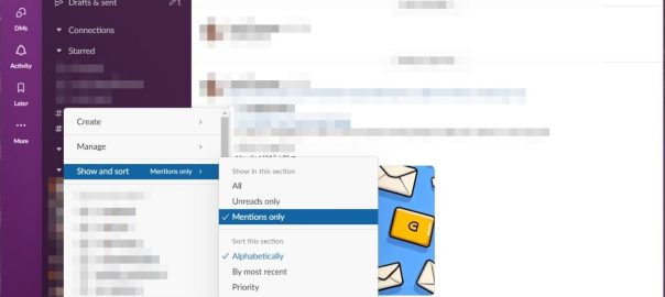
While customization is not a new feature in Slack’s channel view, it’s much easier to set up now. Just click the filter button at the top, then choose between seeing all channels, just the ones with unreads, or just the ones that mention you.
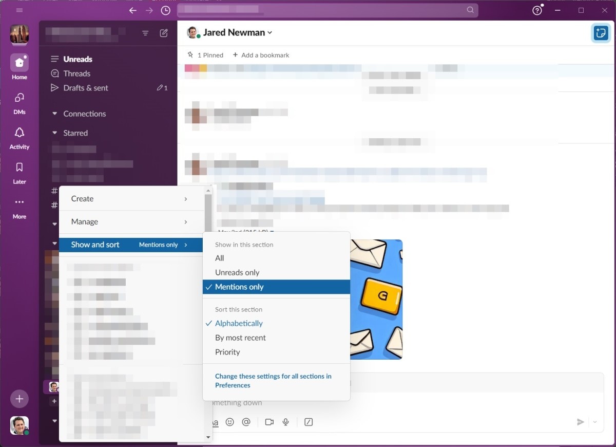
Even better, choose “Custom by section,” and you can set up different filtering options for Starred conversations, Channels, and DMs. Click the little drop-down next to each section, then select “Show and sort” to change its filtering options.
This is especially useful cleaning up your sidebar in noisy Slack workspaces. For instance, you have the sidebar always show the channels in your Starred list, while hiding all the others unless they mention you. Having all these options within easy reach might be the redesign’s best and most underappreciated feature.
Sign up for Jared’s Advisorator newsletter for more tech tips every week.
(9)
Report Post