More and more business owners recognize that a high-quality website is no longer a great addition to your marketing but is now a necessity. In the early 2000s, the internet was merely a luxury and something that most people just sort of dabbled with. As the years went on, the internet became a little more popular with consumers and turned into something consumers used as a regular part of their day-to-day lives. The global pandemic moved more and more aspects of business virtually, from ordering merchandise normally purchased in your physical store to setting up curbside pickup for groceries and food.
Despite the increased role of the internet in daily commerce, small businesses shy away from building a high-quality website because they fear it involves complex coding and huge costs. The truth is very different and anyone with a little patience and desire can build a high-quality website in an afternoon for around $ 100. I even wrote an ebook that steps you through the process of building a high-quality website from beginning to end with tons of images that make the process idiot-proof.
In this day and age, websites are so prevalent in our society. Anyone who wants to get their name out there must create a website and use it as a hub for branding, marketing, and even commerce. Whether you’re looking to create a business, a blog, or you want to boost your own personal profile, a high-quality website is what you need.
Building a high-quality website
At this stage, you probably viewed thousands of different websites and saw the wide variety of pages created by other businesses. Without even realizing it, you probably hopped on some very high-quality sites and some seriously low-quality ones, too. Over time, you probably developed an understanding of the kinds of websites you like and those you immediately leave because they lack appeal. The quality of a website isn’t an accident, though – a lot of different parts work together in order to make it all work.
All of the best websites in the world are seen as such because each facet was considered pretty meticulously. Sure, some aspects of building a high-quality website aren’t too difficult to work out, but they certainly considered every aspect and tested them carefully before launching the finished website. Every single high-quality site contains plenty of positive points – here are just a few of those for you right now:
1. Superior customer experience
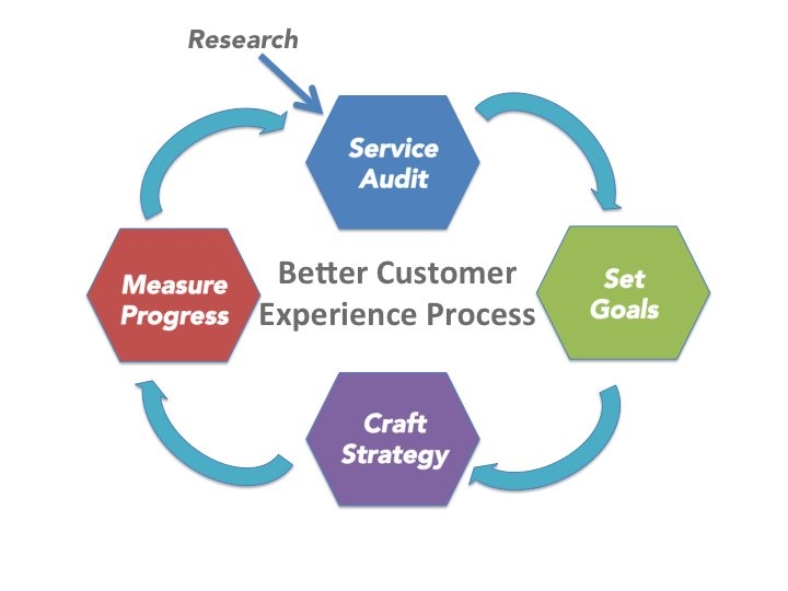
When you enter a website and feel comfortable with what you see, it is because the administrator or web designer crafted a superior customer experience. If you want to create a site that people enjoy right off the bat, you must ensure you provide value with a website designed to meet or exceed customer needs. The image above shows how to build a better customer experience but here are a few elements to consider.
- Don’t bombard the visitor as soon as they enter with popups and advertising.
- Offer attractive, appropriate images and lots of white space to invite them in.
- Match your homepage to the customer’s search intent and show them they’re at the right place.
- And, pay careful attention to provide elements listed below, as well.
First impressions are key, so you need to ensure you don’t mess things up straight away.
2. An easily navigable space
One of the most important parts of a website is navigation. While it doesn’t really take precedence in most people’s minds most of the time – especially at the start – it’s something that pieces together each page of your website properly. Make it easy for visitors to quickly find what they came for and ensure proper filtering and sorting so they can work through your product database to find exactly what they’re looking for without spending hours sifting through products that don’t meet their needs.
3. Market your website to bring in the right visitors
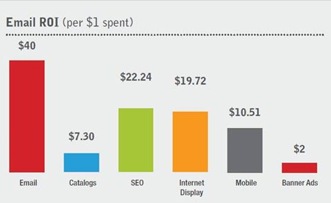
While a website for a large and popular company might not need a ton of marketing, since prospective customers enter their brand name in a search, smaller businesses must work to attract visitors to their site. Whether you own a heating and ventilation company looking to work with the likes of HVAC marketing agencies or a small boutique hoping to attract visitors to your physical store, you need a variety of marketing channels, including social media, to create success. Things like email marketing driven by subscriptions from your website keep people informed and tempt them to continue visiting the site. Email marketing also demonstrates the highest ROI of any other marketing tactic.
4. A website optimized for mobile
A lot of people surf the web using their phones and tablets in this day and age. Hence, building a high-quality website means you start with a mobile-first strategy to ensure your website looks awesome on mobile devices. Fortunately, WordPress and Shopify offer templates already optimized for mobile to make your life easier. Ensure you test your website on a variety of platforms, especially iOS and Android, the major mobile platforms, as they play a big part in the overall quality and experience you deliver to customers.
5. Excellent SEO
Search Engine Optimization (or SEO) means a lot when it comes to the quality, popularity, and rating of a website. It’s quite literally the practice of ensuring the site ends up near the top of the search results (SERPs) when somebody types in a particular set of words and looks for something you offer.
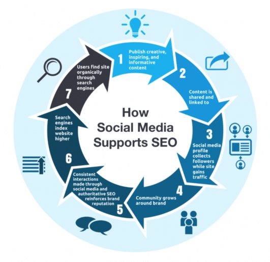
Image courtesy of SEM Rush
SEO is a huge topic all by itself and I’ve written a lot about how to ensure excellent organic search results. So, feel free to search this site for more information. Here are just a few things to consider:
- Create fresh, valuable content on a consistent basis
- Keywords and how you use them on your pages, especially landing pages
- Internal linking
- Word count — most top ten websites feature 2000+ words
- Produce content that attracts backlinks
- Titles with approximately 45 characters
- Fast load speed — see below
6. Simplicity
You might think that, in order to produce the best possible site, you need to have all of the best little widgets and the coolest, newest attachments. Well, there’s a time and a place for those kinds of things in many different websites, but you want to keep things pretty simple for the most part. In terms of productivity and getting the right results, you want to ensure you don’t overdo it and just stick to your fundamental goal, which is converting your target market. Check out that process below.
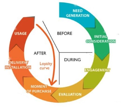
Image courtesy of Smart Insights
7. Get insights from professionals
You may be pretty competent with what you’re doing and you may have your own ideas but it’s wise to solicit help and advice from people who’ve been around this game for a while. People who work in web design know exactly how to create a high-quality website that delivers the kinds of messages that you wish to convey.
Graphic designers can help you out in terms of the kinds of logos and images you insert. Marketing and SEO agencies can help you out in terms of expanding your reach. If you can’t afford to hire these folks, read as much as you can from experts and work to implement their advice.
8. Get to the point
Many website creators overthink what they have to do. They may look to put as much info onto the page as they can in order to look like a business that knows what they’re talking about. People aren’t really interested in that side, however, as they just want to satisfy their curiosity and understand what they’re looking for.
9. The right amount of advertising and promotion
Whether you’re advertising the service you perform, the products you sell, or your personal profile, you need to do advertising and promotion – but don’t bombard visitors with your promos (as we’ve mentioned before). You need to know where to place the advertising banners and widgets so they don’t interfere with the user experience. Typically, websites have new products on show on a large banner that covers the top or the center of the page, for example. You should use popups sparingly and never block your content when a visitor first gets to a page.
10. Fast load speed
The page speed is something that can really affect the way somebody feels about the website. It’s annoying when you click on a link or a button and you have to wait about thirty seconds for the entire page to load, right? The chances are that your load time is longer because you have lots of different pieces all going on at once. Do what you can to keep things pretty basic overall in order to keep the speed up.
11. Cybersecurity
A lot of nefarious activities happen online, as you probably know already. If you aren’t protected, then you are easy prey for hackers and other computer whizzes who look to take advantage of your data – and even your money further on down the line. The likes of ransomware are rife in this day and age, unfortunately. This is why you need to ensure that you have good-quality protection software and a good IT firm on your side. As you grow, you might even want to look into something like managed support so that you can be guarded at all times.
12. The right branding and colors
When you enter what you think is the right place but see that the colors, branding, and overall feel are not what you expected, you can feel a little concerned and lost. You might think that you’ve traveled all this way just to walk into the wrong building. The same can be said for a website. It’s unsettling when you don’t stick with the brand and the colors. For marketing and continuity purposes, too, make sure that you always stick to what you know.
Digital & Social Articles on Business 2 Community
(104)
Report Post