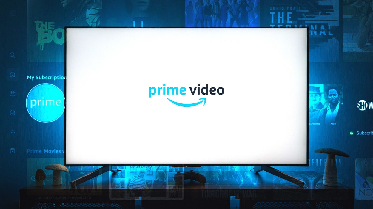
Amazon’s Prime Video app is about to look a lot different.
An update this week will overhaul the entire interface on TVs, with a new sidebar for navigation, a grid-based live channel guide, and a bigger emphasis on Amazon’s burgeoning sports catalog. It also more clearly distinguishes core content included with an Amazon Prime subscription from Amazon’s ad-supported offerings, a la carte purchases, and add-ons.
The new Prime Video app may help address some complaints with the previous design, which critics have described as “genuinely impossible to browse,” “nearly unusable at times,” and “the worst user interface in streaming.”
But it also speaks to a broader shift in streaming TV. Whereas services like Prime Video once focused on streaming on-demand movies and shows, they’re now branching out into linear channels, live sports, and news as they slowly replace the cable bundle. That in turn requires a fundamental rethink of how their apps work.
Live TV emphasis
Browsing Prime Video’s on-demand catalog should be easier with the new design. The revamped home screen includes filtering options for movies and TV shows, along with quick links into “Categories,” such as Comedy and Action & Adventure. Those genre menus will also appear in the search section, which is being renamed “Find.” Taking a page from Netflix, the home screen will feature a “Top 10” list, making trending shows easier to track down.
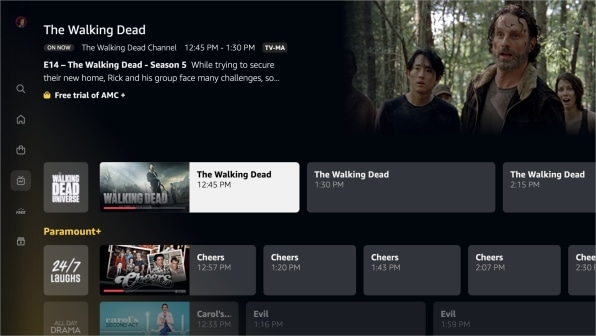
But Amazon’s also making some big changes to emphasize live TV. The app’s left sidebar now includes a dedicated “Live” menu, with a cable-style grid guide for Amazon’s free streaming channels, along with live feeds from premium add-on channels, such as Paramount+ and AMC+. (Here, though, a new gripe emerges: You won’t be able to hide channels you’re not paying for or otherwise customize the guide.)
Meanwhile, the Live TV tab will include a row for live and upcoming sporting events, both from Prime Video and add-on services. It’s a meaningful change as Amazon buys up more live-sports streaming rights. Prime Video will be the exclusive carrier of Thursday Night Football this fall, for instance, and it has started offering some regional sports coverage, including select New York Yankees and Seattle Storm games in those markets.
More than just Prime
“Prime Video” has long been a misnomer for Amazon’s app. In addition to movie and shows for Prime subscribers, it also includes free, ad-supported video from Amazon’s Freevee service (formerly known as IMDb TV), movie rentals, a la carte TV shows to buy, and an array of subscription add-ons.
The redesign tries to make more sense of those options. A new “Free with ads” menu showcases movies and shows from Freevee, replacing the old design’s “Free to Me” section that included both ad-free and ad-supported content. And while Amazon’s “Store” menu isn’t going anywhere, it now covers all the forms of steaming video Amazon sells, including a la carte purchases and Prime Video Channels subscriptions.
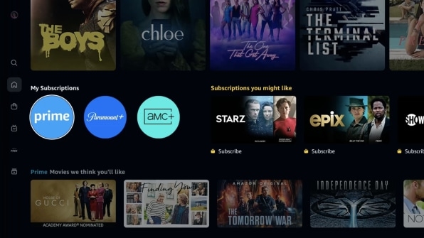
Accessing content from those subscriptions will be a bit simpler as well. A “My Subscriptions” row on the home screen will include quick-launch icons for add-ons you’re already paying for, along with suggestions for ones you’re not.
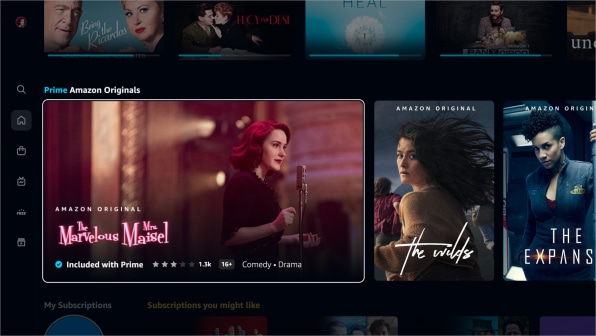
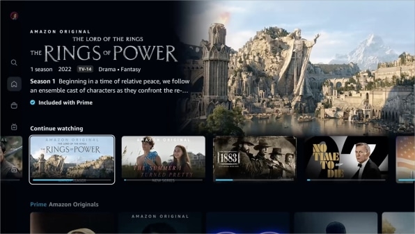
At the same time, Amazon is trying to be clearer about where its recommendations come from, with color-coded descriptions for everything on the home screen. Rentals and add-ons will have a gold shopping bag icon next to them, while a blue “Included with Prime” tag will appear beneath core Prime Video content.
Making sense of more stuff
The underlying theme here is that Amazon’s app isn’t as simple as it used to be.
Whereas the Prime Video catalog was once somewhat analogous to premium cable channels, such as HBO or Showtime, over the years it’s become more like a miniature cable bundle, with a mix of movies, shows, linear channels, and sports. The redesign feels like an attempt to step back and better reflect this new reality.

Other streaming TV apps have been moving in a similar direction as their catalogs expand. Paramount+ and NBC’s Peacock both have live-channel guides and sports sections, and the latter has to juggle both free and premium subscription tiers inside a single app. (It accomplishes this by showing a purple “Premium” tag over subscription-only content for users on the free tier.) Hulu, meanwhile, now has an embedded version of ESPN+ so subscribers to both services don’t have to juggle two separate apps.
Change is likely coming to other streaming services as well. Live news and sports have always been in the cards for HBO Max, and those plans could accelerate now that Warner Bros. Discovery is acquiring more sports streaming rights. Netflix is reportedly considering live streaming for unscripted shows and stand-up specials, and it has kicked the tires on live sports. Apple TV’s sports lineup is quickly growing with Friday Night Baseball and Major League Soccer, and it has dabbled in free streaming for past seasons of its original shows.
Amazon’s new app offers a glimpse at this multi-headed future for streaming services, in which the biggest ones attempt to be all things to all people. It may not make streaming TV any simpler as a whole, but at least it’ll make Prime Video itself a bit easier to navigate.
Check out Jared’s Cord Cutter Weekly newsletter for more advice and insight on the post-cable world.
(69)
Report Post


