You want to see your conversion rates leap up. You ambitious and want to double them, if not triple or quadruple them.
You’ve probably looked at dozens of blog posts that promise to increase your conversion rates in *insert dramatically short timespan here*. The thing is, a lot of the tips you’ve found would take you several days or even weeks to implement, let alone start seeing results.
You don’t want to spend hours on research, plus a fortune on a website redesign and a new marketing team. You want them now!
So, what are your options?
Okay, let’s get real. And maybe parental.
I’d be remiss not to tell you that the best results are worth the wait. Traffic spikes that stick and long-term high conversion rates require diligent and continuous approaches like:
- Customer surveys and interviews.
- Multiple A/B testing sessions.
- Search Engine Optimisation (SEO).
- In extreme cases, complete website rewriting and redesign.
But…I also realise that you may want some quicker wins too.
So here are a few well-known tricks you can use to double your conversion rates. You can apply the following strategies in a few days, maximum. While they’ll require group thinking and help from your team, they’re not nearly as time-consuming as developing a whole new marketing strategy.
Read on to learn more.
Rewrite Your Hero Section to Match Your Prospects’ Expectations
The hero section is the most important part of your website. It’s where visitors decide if your website speaks directly to their needs or if they should leave and look elsewhere.
This alone makes optimising your hero section one of the most important steps towards conversions.
A hero section entails your headline, your subheadline, your hero image, and everything that conveys brand value upfront.
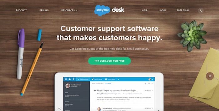
Here’s an example from Salesforce:

See how the words exactly match the expectations of people looking for a customer support software? Not any software, but one that cares about customers’ desires?
While it’s not always possible to know exactly who’s coming to your website, you can work with what you know. If you own a business, there’s a high chance you know what customers expect from you. Previous praises and complaints, emails, survey results, or social media interactions can help you with that.
Okay. Based on what you know, what’s the first sentence they need to see on the page to think “I’m in the right place”?
Yes, your software might be a “cutting edge solution”, but does that really speak to the problem they came to your website to solve? You can go deeper than that.
Whoever wrote Salesforce’s headline above could’ve said something like “the best customer support software”. But that’s not a customer-centered headline. They had a reason to believe their visitors were coming to their site to make their own customers happy. So they addressed that.
Your hero section should match your visitors’ expectations. If it can’t do that, don’t expect more conversions!
If Possible, Do User Tests. If Not…
There’s nothing like a fresh set of eyes to pinpoint where something’s off.
Ideally, you’d use platforms like UserTesting.com to have real users go to your website and tell you what keeps them from converting. While these users aren’t exactly your customers, you can adjust filters to have them correspond to your target audience.
It can be awkward to ask customers to do that work for you, even if you offer incentives. In this case, an alternative is to have someone on your team run a basic heuristic analysis through your “problematic” web pages — the ones you need to perform better.
That means they’ll voice unbiased opinions as they go through the page, telling you where the hiccups are. It’ll require them to step into your desired customers’ kicks and tell you what keeps them from saying “yes” to your offer.
If you can’t do this exercise in person, it’s a great idea to have them record themselves and their screen for genuine reactions.
This will give you insights you might not have realised were an issue. It might be small things, such as the positioning of elements, a certain headline that doesn’t sound right, or a lack of clarity in your messaging.
Optimise Your Offer
An offer isn’t your product or your brand.
Instead, an offer is the benefit a buyer will get when purchasing from you. This benefit could be a free trial, a bonus, free shipping, or a price reduction.
If you’re wondering whether a 7-day money-back guarantee is enough…it’s probably not. That’s the least your visitors expect from you and every other ecommerce store.
When it comes to doubling conversion rates, you first want to make sure your final offer is as good as it can be. That means you shouldn’t settle for the offer you’re currently working with.
Without an outstanding offer — or an offer that’s at least better than your current one — you could have the best website copy in the world, the most expensive designers, and all the traffic you need, but your conversion rates wouldn’t be as high as they could be.
Optimising your offer is about removing obstacles on the path to purchase, making it easier for visitors to convert. You’re also doing it to sell more products whenever possible.
Here are some ways you can optimise your current offer:
- Include free shipping (if possible). Some people don’t offer free shipping because of the obvious: profit margins. If it’s not possible for you to offer free shipping on every single product, do your best to offer them in a few products or once the customer spends a certain amount.
- Add a freebie. Sometimes, a little friendly push is all it takes to get a conversion.
- Coupon codes. Who doesn’t love coupons?
- Guarantees. Can you turn your 30-day money back guarantee into a 60-day money back guarantee? If you’re confident about customer satisfaction, you could go even further.
- Use upselling techniques. Amazon’s “frequently bought together” is a prime example. Bundling similar products could increase conversion rates and encourage buyers to add more to their cart.
Optimise Your Lead Magnets
You want more people to opt into your email list and be the first to know about product launches, don’t you?
But some of them don’t want to do it. Your job is to both increase the desire to opt in and remove the friction in doing so. Here’s how you can do it:
- Include a no spamming guarantee somewhere in your lead magnet. And of course, live up to that guarantee.
- Assure leads that their data will be safe with you with a 100% privacy guarantee.
- Encourage opt-ins by offering a coupon. Or free shipping. Or both.
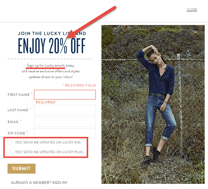
- Include an option for visitors to choose whether they’d like to receive updates or not, like in the following example demonstrated by OptiMonk:

Test Your Images
Images sell. People aren’t there to read stuff, except for product descriptions and, of course, your offer. Accept that some of them won’t read a thing, and that’s fine.
In this case, they need to see your product in the highest possible quality. After all, it’s the closest they’ll get to it before buying. If they can salivate over what they see on your website and picture it in the context of their lives, your conversion chances are sky-high.
Take a look at award nominee and top retailer DollarShaveClub presents displays the products on their website:
It almost looks like they’re on your counter. If you’re looking for a smooth shave, you’re looking at it.
There’s very little copy on the page, because the imagery does the talking.
Don’t Change Your Whole Website. Change What’s Curbing Your Conversions.
There you have it, 5 techniques you can apply to your ecommerce website that could improve it in a matter of days. If you were selling before, notice how your website performs after the changes.
With a little fine-tuning, you’ll close a few gaps, find a few more, and slowly start to get the hang of it. The more you do it, the faster you’ll learn about what visitors want to see in order to say a resounding “yes”.
Digital & Social Articles on Business 2 Community
(79)
Report Post


