By now I’m sure you’ve seen infographics online, but do you know how can you use them effectively in your digital marketing? This article breaks down exactly what they are, why they are a useful tactic to get the word out about your business, how to create them and how to promote them. Keep reading for more details!
What is an Infographic?
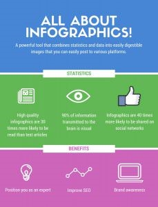
Fission explains it well: “An infographic is a powerful tool that combines statistics and data into beautiful, humorous or easily digestible images that you can easily post to various platforms to ensure the information you want to instill in readers is getting across as intended.”
Why Use Infographics?

It’s no secret that internet users respond well to visuals; this is why infographics are so great to include in your digital marketing strategy. By combining fascinating facts with compelling images, your readers are much more likely to read and share your content. Here are some statistics from Neil Patel and Venngage that back this up:
- High-quality infographics are 30 times more likely to be read than text articles.
- 90% of information transmitted to the brain is visual.
- The brain processes visuals 60,000 times faster than text.
- Infographics can help boost site traffic by as much as 12 percent.
- Articles that include infographics receive as many as 72 percent more views than other articles.
This visual tool makes it easier for your company’s content to stand out amongst the noise and for your readers to digest your message. That’s not all, though; here are a few more reasons infographics are a valuable part of your digital marketing strategy:
- They improve SEO.
- They position you as an expert.
- They increase brand awareness and name recognition.
- They can simplify a complicated topic or make a dry topic more interesting.
How to Create an Infographic for Digital Marketing
Creating an infographic does require a things:
- Accurate research
- Attention to detail
- Big picture thinking
- An understanding of design
- Promotion
Step 1: Come Up with a Topic

As you brainstorm ideas, ask yourself a few questions:
- Who am I trying to reach?
- What do I want to convey?
- Do I have the data available or will I be able to find trustworthy statistics?
Once you have a list of three to five ideas, select the one you think will be most compelling for your target audience.
Step 2: Conduct Research
Infographics are very data-heavy, so plan on conducting research to fill out the content you don’t have on-hand. As you search for relevant facts and figures, make note of the source for two reasons:
- You want to make sure it’s reliable.
- If you use the data they collected, you’ll need to cite it as one of your sources.
As you search for information, look for statistics or information you can break down into charts, graphics and lists; the more details you find, the more flexibility you’ll have as you put your infographic together.
Step 3: Compile Information
This is where your big-picture thinking will be most valuable. Take a look at all the information you’ve gathered and consider how it best fits together. How can you use the details you collected to clearly present information, tell a story, present a problem and make an impact?
I like to start by organizing my facts and figures into the order I plan to use them. Once I have the basic structure of my infographic, I write content to fill out the rest of the details.
For example, if I collect statistics about the best time of day to post on social media platforms, I might lay out the basic structure like this:
Intro
General Social Media Statistics
Breakdown Data by Platform:
Final Call to Action: You’ll want your infographic to have a few different sections, as that will make it easier to break up the design into digestible segments.
Once I have the overview complete, I can fill in the details by:
- Crafting an introduction that grabs readers’ attention, presents the topic and inspires them to read more.
- Writing specific sentences combined with bulleted lists tying the statistics together.
- Creating a call to action that directs them back to my website or one of my social media channels.
Step 4: Proofread
This is an often overlooked but very important step to any content you create for your digital marketing plan! Proofreading is especially important during infographic creation, as it will be much harder to correct mistakes once you design the graphic.
Here are a few helpful proofreading tips:
- Walk away for a while and do something else. After you’ve finished writing, don’t jump straight to proofreading. Your eyes may be tired from staring at the computer screen, and your brain may fill in the blanks of what you meant to write. Get up, walk around, get a glass of water and return with fresh eyes. Putting distance between writing and editing may help you catch more mistakes before you begin the design process.
- Actually read it out loud to yourself. Saying the words out loud can help you notice missing words, spelling errors and a sentence that may need fixing. This simple trick is effective and just takes an extra moment to complete.
- Don’t only rely on spellcheck. For many of us, it is easy to rely on the red or blue underlines that Microsoft Word or Google use to denote a misspelling or a grammatical error. Running spellcheck or right-clicking to fix a problem is not enough, however; you must pay attention to what you have typed. If you rely on just the markings, you may miss that you typed “shoe” instead of “show.” Even though “shoe” doesn’t work in the sentence, because it is spelled correctly it can go unnoticed by spellcheck.
- Google It. Not sure how to spell a word? Google it. Go to www.google.com and type the word into the search engine. When Google gives you the search results, it will also suggest an alternate spelling (e.g., Did you mean: spellcheck?).
- Print out a copy. If the text isn’t too long, print it out and read the hard copy. Sometimes looking at a piece of paper as opposed to the computer screen can bring a typo to your attention. Just remember to be kind to our environment and use scrap or the backside of already used paper, since you’re the only one who will see this copy anyway.
I also recommend asking a friend or colleague to look over your work for you, for a couple reasons:
- Because you wrote it, you know what you were intending to convey. Someone else is more likely to notice missed words or mistaken typos.
- They may have helpful suggestions for making the content stronger. If they have questions about what you wrote, you can go back and revise the content to make it clearer.
Step 5: Design
This is where your understanding of design comes in. Think about the overall look and feel you want your infographic to convey. Simple is best, so pick a few design elements to use throughout the entire graphic:
- A color scheme with 3-5 colors that are complementary to your brand.
- Two or three types of fonts (make sure you use the same font for all the titles, then the same font for the main text).
- Uniform line widths.
Also think about what types of visuals might translate well from your copy. For example, if one of your statistics mentions time, maybe you want to consider a clock. Or if you have a certain number of people, you could use little people icons to visually represent them.
Charts and graphs are always great to include, too! I love this advice from Venngage:
- Binary Question Responses: A question that only has two answer options, like “Yes” and “No,” has binary responses that, when combined, total 100%. For straightforward percentages like this, use pie charts and pictograms.
- Large Samples of Data: For visualizing very large samples of data from across a far-reaching area, use data maps.
- Showing a Trend Over Time: A line graph (or multi-line graph) is one of the most straightforward ways of visualizing trends over time. You could use a line chart or combination chart.
- Rating Scale Question Responses: For questions such as, “Rate our customer service on a scale of 1 to 10,” the average score of the answers can be presented in a pie chart or donut pie chart.
- Open-Ended Question Responses: For questions like “Do you have any suggestions for how we can improve our site?” organize your answers into several categories that can be quantified and calculate the percentages for each answer category. To visualize this, use a bar chart.
- Differences Between Proportions: To display the parts of a whole, use a stacked bar graph.
Make sure you also cite your sources at the very end of your infographic. In addition to letting your readers know where they can get more details, it verifies your information is credible and gives proper credit where it’s due.
Once you’re done with the design, take the time to proofread it again to make sure no little typos snuck in.
How to Promote an Infographic
Congratulations on creating your first infographic! Your job isn’t done yet, though. What’s the point of using these tools as part of your digital marketing strategy if you aren’t going to promote them?
Step 1: Upload Your Infographic
When you upload your infographic to your website, make sure you use the largest version possible. You can scale a large file down, but if someone tries to share it in a bigger size than you uploaded, it will appear pixelated and unprofessional.
I’d recommend writing a quick blog post about your infographic; introduce the topic and share a few key statistics, then post the full infographic below for your website’s visitors to read and share.
Step 2: Create an Embed Code
Good news: You don’t need to be a technical wizard for this! Hubspot created step-by-step instructions for you to follow, including where to put the code in relation to the infographic and what it will look like when someone uses it.
Why is embed code important? This is like a footprint back to your website. Rather than someone just downloading your infographic and uploading it to their website, this code lets them simply link to it on your website while the entire image is displayed on their website. In addition to making it easier for their readers to find their way to your website, this adds yet another link to your site, which is great for your SEO.
Step 3: Share, Share, Share!
You’re ready to share your infographic! As with any content you create for your digital marketing strategy, the more you share the more it will be seen: Share it in your email newsletter and post it on all your social media platforms.
An infographic is also a great piece of content to pitch for editorial media coverage. Brainstorm and research websites you think would be a good fit and contact them, explaining why their readers would be interested in your infographic. You never know who might pick it up!
Digital & Social Articles on Business 2 Community
(52)


