Email doesn’t begin and end with copywriting. Design elements can help persuade customers to click and convert.
Discussions on persuasion in an email message usually begin and end with copywriting. But your email design can also encourage your customers to click and convert.
Think about the last time you tried to talk a friend or family member into doing something. I’ll bet you didn’t just present a written note with reasoned, rational arguments. Did you changed your tone of voice, wait for an opportune moment to state your case, or set the scene some other way?
I’m not saying you must resort to the email equivalent of tears to persuade your subscribers to act. But your email design can amplify your copywriting to encourage conversion.
Why ‘skimmability’ isn’t enough anymore
Both attention spans and email reading screens are shrinking. Now that 60% or more of all email opens happen on a smartphone or tablet, your email messages are more likely to be read on a six-inch mobile screen than a 13- to 16-inch laptop or 22-inch desktop monitor.
With those smaller screens comes less patience to read through the entire email. The latest read-time statistics show the average read time fell four seconds, from 13.4 seconds in 2018 to 9 seconds in 2022.
As an optimist, I would like to believe that this shorter reading time results in part from efficient email design, now that we have evolved to mobile-friendly single-column layouts, larger images and shorter copy blocks. But a thumb swipe is easier than a mouse scroll, so readers can also miss key points that don’t stand out.
This shorter attention span means you have to be even choosier in the images and copy you select to promote a product or tell your story. Your design also has to work even harder to make sure your readers can see your message as you intended, understand what you want them to do and feel compelled to act.
The most common design advice I see is to make emails skimmable. In other words, someone who opens your email (Victory No. 1) can scan it in two to three seconds and grasp what’s important (Victory No. 2). But skimmability doesn’t guarantee action.
That’s the cue for persuasive design. It can highlight key features, move the eye to essential information and make it as easy as possible to click, and keep the reader in the email longer and thus more likely to view all of your offers or other important information.
Overt and covert persuasion in email design
Just as email copywriting can use both overt and covert tactics to persuade customers to act, so can email designers employ both obvious and subtle ways to draw attention to key points in an email message.
Overt persuasive design uses obvious elements like images, animation and layout to call attention to important content like the call to action, price changes, offer copy and the like. It’s centered in the principle of cognitive ease, which is a measure of how easy it is for our brains to absorb information.
Covert persuasive design uses many of the same elements as overt design but as subtle visual cues rather than attention-directing elements. This method of design is more complex and calls on a collection of psychological principles that motivate customers to act.
Overt and covert persuasive design concepts aren’t mutually exclusive. In fact, combining them in a single email can make the message more persuasive. You can reach two kinds of readers — those who are engaged and need just a quick nudge to act and others who need more information and a bigger push.
The examples below include a selection of tactics in persuasive design that call upon cognitive biases to help guide customers.
1. The Principle of Least Effort
This concept asserts that people will naturally choose the path of least resistance, which lets them achieve something they want by exerting the least effort. The move toward streamlining email content for scanning is based on this idea.
Remember first that an email’s job is not to deliver the conversion within the email. It sets the stage and persuades the reader to take the next step, which most often is to click to the website and convert there.
To accomplish that goal, a designer can use visual cues that guide the reader to the content they need and influence them to act.
The design can be wildly obvious, using arrows or other devices to direct attention to the benefit or the CTA. But do your readers need to be hit over the head like that?
An implicit (covert) design cue can be more effective by using positioning and line of sight to direct the reader’s eyes to the objective. Instead of feeling pushed toward a call to action, image or copy block, readers can feel as if they’ve discovered it on their own. That can be more persuasive than the equivalent of an email airhorn.
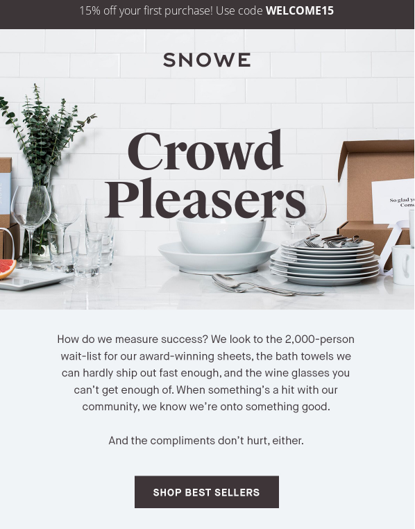
Subject line. The Customer’s Always Right
Sender. Snowe
Why it works. The inverted pyramid design of the introductory copy block draws the eye downward before depositing the reader at the CTA. The extra lines of white space around the last line of copy are like a “mic drop” effect that leads directly to the CTA.
As you can see below, persuasive design doesn’t require an entire template redesign. A simple but tactical reworking of the copy from a standard left- or right-justified block or a centered block of text is all it takes to keep the eye moving down.
2. Persuasion tactics: Anchoring and visual cues
Anchoring is the human tendency to rely heavily on the first piece of information offered (the “anchor”) when making decisions. In other words, first impressions count.
For example, the initial asking price for a retail item sets the value to make the sale price more appealing. This is a classic discounting tactic, but it’s most effective when the design incorporates other persuasive elements to highlight the anchored text like those used in the email below.
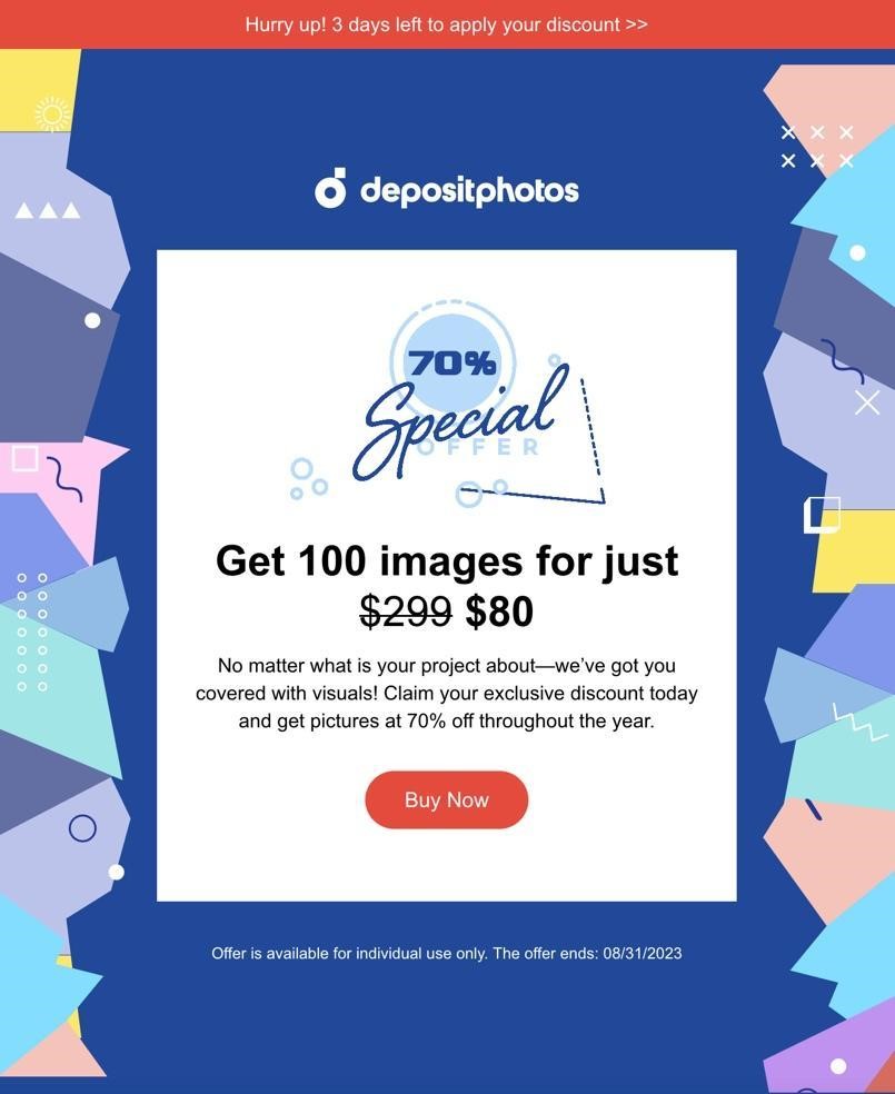
Subject line. Fancy saving $ 219 in a click?
Sender. Depositphotos
Why it works. The anchor text sets the value for the photo collection at $ 299. The layout positions the discounted total of $ 80 immediately next to the strike-out copy. Even the most math-impaired reader can see the discount is sizable. The subject line has already told them how much they’ll save, so they open the email expecting to see a big discount.
The highlighted percentage-off image above the copy reinforces the value expectation, but the email copy conveys the value if the image was blocked.
Other design elements focus attention and prompt customers to act. The pastel color blocks on either side of the white box with the offer copy are stylized human profiles, and they are shown looking at the offer and the CTA button.
Visual cues. As I mentioned above, mixing overt and covert visual cues increases a design’s persuasive potential:
- Overt: The bright red reverse bar across the top of the email and the matching CTA button stand out against the blue background and pastel color blocks surrounding the white box containing the copy block.
- Covert: Those pastel color blocks are stylized human faces, and they’re looking at the copy. One pair of silhouettes lines up with the CTA button.
Although it can be easy to go overboard with visual cues, a combination of compatible cues, such as overt and covert elements, creates a stronger persuasion environment in the email while also not forcing the reader to think too hard to process the message.
Source: Author’s collection
3. Persuasion tactic: Cognitive ease
As I mentioned above, cognitive ease measures how easily our brains can process information associated with a concept or cue. Arrows are familiar directional devices, so we almost instinctively look at whatever the arrow is pointing at. It’s a common visual cue.
We can also use covert cues to help the brain grasp that something is important. Surrounding a copy block with white space takes less processing than positioning a CTA button in one color against a contrasting background color.
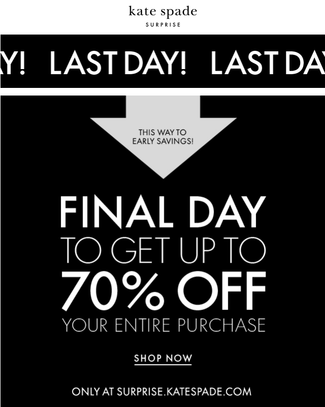
Subject line. Last chance! Take 70% off your purchase
Sender. Kate Spade
Why it works. Oh, is Kate Spade having a big sale? Why, yes! Yes, indeed! The design of this email leaves no doubt that one of the biggest clearance sales of the year is happening.
Kate Spade used variations on this simple black-gray-and-white design for all of the emails in this campaign. This email, sent on the last day of the sale, added yet another visual cue to drive home the urgency of acting — the scrolling reverse bar across the top saying, “LAST DAY! LAST DAY!”
That’s in case the big gray arrow pointing directly to the offer with “This Way to Early Savings” wasn’t attention-getting enough. Too much? For a sale like this, it might be just enough to get super-scrollers to stop and read.
Source: eDataSource
4. Persuasion tactic: Hick’s Law / the Paradox of Choice
Hick’s Law says the more options you give people, the more time they need to decide and the harder that decision becomes. Give people too many choices, and you can bring on “decision paralysis” or “the paradox of choice.”
The evolution from multi-column email design to a single scrollable column helps alternatives stand out more on the screen. But for brands that pack their emails with offers, invitations, bargains, account info and the like, it distracts from the email’s primary goal.
Hick’s Law doesn’t prevent you from giving your customers options. But an email design that helps readers find key information quickly is essential if your emails usually combine multiple CTAs, product promotions, dynamic content modules, account holder information, a loyalty program or other elements.
Testing can help you learn where the number of options tips over from “just the right balance” to “too many.”
Subject line. 100% FREE design sessions: Spots go fast!
Sender. Pottery Barn
Why it works. Pottery Barn packs a lot into their broadcast email promotions. This message alone has eight different content modules not including the admin center in the footer.
But this email design gives each module a distinct appearance, which differentiates it from the modules before or after it and keeps the overall effect from becoming overwhelming.

5. Persuasion tactic: The von Restorff Effect
Also called the isolation effect, the Von Restorff Effect suggests that an item that stands out like a sore thumb is more likely to be remembered. For example, a person examining a shopping list with one item highlighted in green would remember that item better than any of the others.
An obvious but effective way to take advantage of this is to apply the principle to the call-to-action button. If the CTA button tells readers what you want them to do, make the button easy to find and read.
You also could group a collection of products with one in a different color, shape, or size. Or, use a black-and-white image and colorize one part. The difference can be attention-getting enough to stop the scroll.
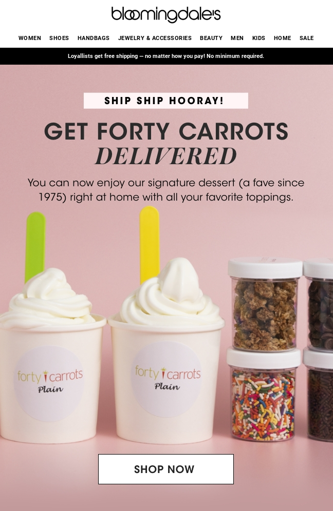
Subject line. Out for delivery: Forty Carrots frozen yogurt
Sender. Bloomingdale’s
Why it works: What caught my eye first on this email was the subject line. “Out for delivery.” Wait, what? I live in a hot climate – why would I order fro-yo to go? Once I opened the email, I caught on. Well played, Bloomie’s.
From a design aspect, the von Restorff effect works best when used in moderation. The novelty can wear off quickly. It works in this email in part because the seemingly ordinary white call to action, bordered by a 1-point black rule, stands out against the colorful background.
I might have tested a CTA button color that contrasted with either of the spoon colors, perhaps, but the white is more attention-getting than it would have been had it been a “ghost button,” white and black on a white background, or the same color as the background.
Source: eDataSource
6. Persuasion tactic: Rule of 3
The Rule of 3 says people remember things when they come in threes. You know, like “Life, liberty, and the pursuit of happiness,” “Lights, camera, action,” or my favorite, “Test, test, test.”
In email design, the Rule of 3 allows your email message to include enough variety to give your customers viable options without overwhelming them with too many choices. (See Hick’s Law/the Paradox of Choice, above.)
Gift guides or similarly themed campaigns are a natural fit for the Rule of 3. You want to give customers multiple options for gifts, but if you throw everything into the email, your customers’ eyes could glaze over before they reach the end. Or your email could end up getting clipped in Gmail.
Sticking to the Rule 3, you could add variety upon variety in groups of three — three categories, plus three products in each category, as in the email below. Or create a hero image with three products, then rotate in different versions of each product. The possibilities are endless, but because you do everything in sets of three, you keep the options to a cognitively manageable number.
Subject line. Mother’s Day Gift Guide by Personality Type
Sender. Sabon
Why it works: Threes are everywhere here. The hero image shows three products. Farther down are three content modules, each with a theme. Two of the three modules features three products each. Including the stand-alone product in Module 2, that’s 10 products total for the guide.
The design leads to a fourth module with a blue background, clearly designating the end of the three main products they’re suggesting for Mother. That module shows eight more products. That’s a total of 18 individual products in one email. In a plain layout, 18 products could induce MEGO (My Eyes Glaze Over). Here, the design packages them so well they can all stand out.

Final thoughts: Test designs first and often
The examples of persuasive design I’ve shared with you here are just a starting point. They can inspire you to start thinking about redesigning your templates to make them more conversion-centered and persuasive.
But before you launch any changes, test prototypes to learn whether your new design helps customers understand and act on your message or just confuses them.
As with any design change, success depends on many things, including the quirks of your own audience. Although I love the pyramid design I showed you in the Snowe email (example No. 1 above), I would test it against a different design to learn whether it could influence my brand’s audience. Some people might be indifferent to it, especially if they read their emails on a large screen that doesn’t force them to scroll up or down to see the whole message.
The same is true for the Kate Spade email in No. 5, the von Restorff effect. Does it drive more email readers to check out the sale?
I hope these examples help you understand why your email design must be more than something pretty or trendy. What parts of your email design are holding your customers back from converting?
The post How persuasive email design can influence the ecommerce customer journey appeared first on MarTech.
(7)
