According to findings by The Relevancy Group, email alone drives the same amount of revenue as social media, website, and display ad combined. This is corroborated by data from the Direct Marketing Association which revealed that marketers can expect an ROI of $ 38 for every $ 1 spent on email marketing. A study from Monetate that analyzed over 500 million shopping experiences also shows that email conversion rate is higher than that of search and social media combined – email converted at an average of 3.19 percent while search and social media converted at an average of 1.95 percent and 0.71 percent respectively.
The internet is much bigger now – it influenced retail sales to the tune of $ 2.2 trillion in 2015 – but all evidence points to the fact that email owns the biggest slice of the internet revenue pie. If you do business online, you can’t go wrong with email.
The million dollar question, however, is how do you achieve regular list growth? By analyzing seven of the most amazing email list growth case studies I’ve come across, I will show you how to achieve explosive list growth:
1. Giveaways Can Grow Your List by Up to 3,418% (or 200,000 Subscribers in 11 Days)
Case Study #1: Josh Earl
One of the fastest ways to achieve explosive email list growth is by running giveaways – the smart way. Anybody can run giveaways, but running them well can put your email list growth on steroids. A great case study to this effect is Josh Earl.
Before his giveaway, Josh had exactly 5,500 email subscribers and 13,400 Twitter followers. After his giveaway, which ran for 11 days, Josh had gotten a whopping 187,991 subscribers.
Running an explosive list-building giveaway only cost Josh $ 267: $ 197 for the plugin that powered his giveaway (KingSumo Giveaways) and $ 70 for the software he offered to people who joined his giveaway.
Josh’s giveaway worked due to the following reasons:
1. He ensured that the giveaway resonated with his audience: Your giveaway will only work if it resonates with your audience and if it is highly desirable to them. Relevancy is absolutely essential because you don’t want just anybody on your list. You want people who want to hear from you and who are interested in your emails.
Josh could have given an iPad for his giveaway, and many people would have joined, but he would have attracted many people who weren’t interested in his core business. He wanted people in his audience so he offered a license for a piece of software his blog talks about.
2. The giveaway harnessed people’s self-interest to make the giveaway go viral: For most giveaways, more entries usually put participants at a disadvantage due to competition. This keeps people from telling others about the giveaway. Josh knew that the success of his giveaway depended on how many people knew about it, so he decided to incentivize people to share his giveaway by giving them more points for sharing. Essentially, the more people shared and invited others to his giveaway, the higher their chances of winning for the individual. This led to a sharing frenzy that resulted in traffic that eventually crashed his server.
3. He actively promoted his giveaway: Josh already had an email list of 5,500 subscribers and a Twitter follower count of 13,400 people but he didn’t stop at this. He further promoted his giveaway by emailing editors of relevant email newsletters to tell them about his giveaway and asked them to mention him in their next issue.
At the end of the giveaway, Josh had collected a total of 364,104 email addresses which he filtered down to 187,991 email addresses. For 11 days of work, this was more than worth it!
2. Use Full Screen Takeovers to Get an Extra 1,200 Subscribers Every Month
One of the most innovative techniques for ensuring an accelerated boost in email list growth is the Full Screen Takeover. If you’re familiar with the SumoMe app, it comes in the form of their “Welcome Mat” feature.
When you employ a Full Screen Takeover on your website, visitors to all pages on your website will first be shown a full page opt-in form that announces your offer and encourages them to sign up. They then have the option to either sign up or close the form to continue reading your blog.
Full Screen Takeovers work really well for one main reason: They put the spotlight on your offer and opt-in form. Generally, people are inundated with opt-in forms on every site they visit – in the sidebar, footer, header, popups, etc – so they’ve been conditioned to ignore these opt-in forms. Often, they close them or continue interacting with your site without noticing the forms. A Full Screen Takeover is different. It is right there in front of them, front and center, and they have no option but to read your message before they can continue reading your site.
Here are two case studies that demonstrate the effectiveness of Full Screen Takeovers for list building:
Case Study #2: Bamidele Onibalusi
Full Screen Takeovers have been reported to be so effective that they convert at around 4 – 8% across websites, making this technique one of the most effective ones for building an email list in recent times. For Bamidele Onibalusi, this has translated to extra 1,200 subscribers monthly since he started employing full screen takeovers.
Here’s a screenshot of a full screen takeover from Bamidele’s site:

According to Bamidele, the simple form shown in the screenshot above is responsible for at least 1,200 subscribers every month.
Case Study #3: Bryan Harris
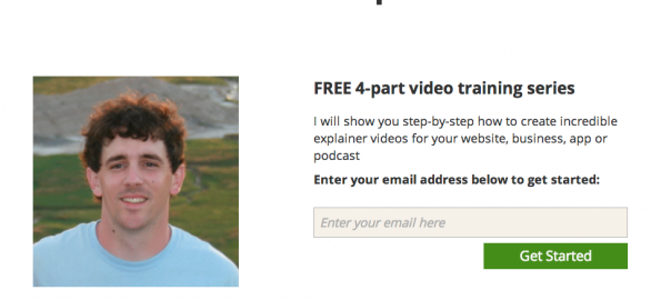
Another testament to the effectiveness of Full Screen Takeovers is Bryan Harris. Below is a screenshot of his Full Screen Takeover:

The simple Full Screen Takeover you are seeing in the above screenshot converts for Bryan at 14.89 percent. That’s a massive conversion rate. A similar form could yield thousands of extra subscribers every month.
Here are some tips to help you get the best from Full Screen Takeovers:
- Offer a compelling incentive: It’s simply not enough to interrupt people’s attention with a Full Screen Takeover and ask them to “Join My Newsletter.” Your offer needs to be compelling enough to make it worth it to have distracted them. In Bamidele’s case, he offered a resource featuring a list of websites that pay writers.
- Use Relevancy to Boost Conversions: If you have a blog that covers a host of topics, you can easily double or triple your conversion rate by offering different incentives depending on the content your Full Screen Takeover is displayed on.
- Use Cookies to Prevent Certain People from Seeing Your Optin Form: Full Screen Takeovers can be very “in your face.” That’s the main reason why they work, but you don’t want to annoy your readers in the process of trying to capture more optins. You can configure your optin form to only be shown to new visitors once in 30 days. By doing this, you can capture more subscribers while maintaining your visitors’ goodwill.
- You can implement a full screen takeover via OptinMonster or Sumome’s “Welcome Mat” feature.
3. Use Header Bars to Gain Thousands of Extra Subscribers Monthly
Take a look at this tiny bar below:
![]()
You’ve probably seen it in the header of one or two websites before, usually with a link to an offer or a sign-up form. It’s called a header bar, and it can massively boost sign-ups to your email list. Below are two case studies of people who have used header bars to great effect:
Case Study #4: Derek Halpern (1,180 subscribers in 30 days from a header bar)
By installing a header bar and offering a compelling incentive, Derek Halpern was able to get 1,180 subscribers from DIYthemes through the header bar in just 30 days. To supercharge the effectiveness of his header bar, Derek Halpern offered an incentive in the form of a 33-page ebook. Based on Derek’s observation, offering an incentive resulted in a 28 percent increase in signups over simply asking people to join his newsletter.
Case Study #5: Shashank Gupta
Shashank Gupta decided to take the header bar to the next level and the result was an instantaneous increase of 134.4 percent in signups. Originally, his header bar was converting at 3.9 percent but a simple tweak raised his conversion rate to 9.14 percent, translating to an extra 3,668 subscribers every month.
What Shashank did differently was that he enabled an “Overlay for Higher Visibility.” This is a feature available through the ManyContacts app. It shows an overlay similar to the one below, drawing significant attention to your header bar. Below is a screenshot of what the overlay looks like:

As you can see from the above screenshot, the overlay features an arrow pointing towards the header bar, thus giving it more prominence and directing the eyes of visitors to it. With 3,668 extra subscribers monthly for Shashank, this is a big win!
Here are some tips for getting the most out of header bars:
- Offer an incentive: Don’t just invite people to sign up to your blog. Offer them something: a free ebook, a resource, a video – anything works.
- Direct them to a landing page: When Derek Halpern tested a form in the bar versus driving people to a landing page through his header bar, he found that people converted more when driven to a landing page. This is understandable since your header bar leaves little space to convince people to part with their precious email address.
- Use overlays to draw more attention to your header bar: As we can see from Shashank’s example above, overlays can do wonders. Naturally, people now tend to ignore header bars due to its widespread adoption. By drawing attention to it with an overlay, though, you will get more people to pay attention, thereby converting more subscribers.
4. Use Content Upgrades to Boost Your List Growth by Up to 785%
Case Study#6: Brian Dean
When Brian Dean had a popular blog post that was resulting in few subscribers, he wondered if there was anything he could do to boost subscriptions from this popular post. There was: Brian decided to offer a checklist that made it easy for people reading his post on to act on his advice. Since the checklist was very relevant to the content people were reading it resulted in a massive increase in subscriptions from that one article. A page converting at 0.54 percent suddenly started converting at 4.82 percent. That’s it. A simple tweak that took at most a few hours of his time resulted in a conversion increase of 785.01 percent.
What Brian Dean did to increase sign-ups was to introduce a content upgrade. A “content upgrade” is extra content that complements existing content on your website, which readers have to either sign up or part with something to get. This simple tweak resulted in a massive increase in email subscriptions for Brian Dean.
How to get the best from content upgrades:
- Make sure your content upgrade is relevant to the content readers just finished reading: This means you might have to create different content upgrades for different types of articles, but it will be a rewarding experience.
- Make your content upgrade short and simple: You don’t need a 250 page ebook as a content upgrade. Instead, offer something that people can make use of instantly: a quick video, a resource, a checklist, a template, or anything of that sort.
5. Get 500 Subscribers from Every Guest Post by Creating Expanded Guest Posts
Expanded guest posts can also be called “content upgrades supercharged.” Basically, this is you making use of content upgrades in your guest posts. If you can deliver really exceptional content, most blogs won’t have a problem allowing you to feature a content upgrade inside your guest post.
Case Study #7: Bryan Harris
A great case study to see the effectiveness of expanded guest posts is Bryan Harris. As Bryan documents in this blog post, he usually gets 500 subscribers or more from every expanded guest post he publishes.
Here are some tips to get the best from your expanded guest post:
- Create anticipation: According to Bryan Harris, what he does to increase results from his expanded guest posts is to build anticipation. Many readers won’t read the whole of your article, but by mentioning in the introduction that you have a bonus for readers at the end of the article, you can get even skimmers and scanners to check out your content upgrade.
- Make your guest post highly valuable: If your guest post isn’t valuable enough, a content upgrade in it will appear like a blatant pitch – most blogs won’t accept it. Even if a blog accepts a poor quality guest post that features a content upgrade, readers won’t respond to it.
- Make it a resource: If your content upgrade is a resource – especially one that readers need to implement the suggestions in your article – more people will respond to it.
Conclusion
The above are five practical tips and seven case studies for explosive list building. Which of the above methods have you gotten results from, and what other methods have worked well for you? Kindly share them in the comments below.
Digital & Social Articles on Business 2 Community(92)
Report Post