In today’s digital economy, having a website for your company is a necessity. But are you using your pages to their full potential? An expertly designed webpage will do more than just wow your users; it will boost your sales. In fact, there are many ways to optimize your website for profitability.
Make Your CTA Easy To Understand
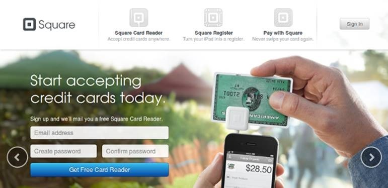
A clear-cut CTA is imperative to conversion rates. If users don’t know what they’re being asked for, they have little chance of giving it to you. What are you offering them in exchange for information? Your CTAs should clearly tell readers what they’ll get for signing up. Then, simply give some instructions on what they need to do to get it. This is called the value proposition.
The best value propositions will address users both in the short- and long-term. Start by figuring out your customer’s dilemma. How does your brand solve it? The CTA should answer this question in a simple, clear way. Furthermore, the CTA placement needs to be optimized for user experience. Don’t interrupt users the moment they land on your page, and don’t use obnoxious CTA buttons that are difficult to close out or navigate. The CTA should come up only after your readers have had a moment to soak up your brand. It should also give them the opportunity to decline if they wish.
Add Video Content
Video content is becoming the go-to trend for making your website a user-friendly experience. Our brains absorb images much faster than text; 60,000 times faster, to be exact. Cater to this short attention span by adding a video to your site. It’s estimated that an information product video on your page leads to 44% more customers diving in and purchasing. Videos are easy to understand and more engaging. So instead of using text-based product descriptions or customer testimonials, why not turn them into a video?
Make Your Site Lightning Fast
The importance of page load speeds cannot be stressed enough. We live in a fast-paced society. People want information, and they want it now. Unfortunately, if your site takes too long to load, users will simply abandon it and move onto to one that appears quickly. In fact, the average consumer will ditch your page if it takes longer than three or four seconds. For every second your page takes to load, you risk losing more and more customers.
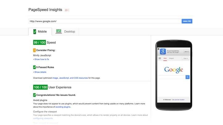
And that’s not just at the initial front page, either. Many shopping carts have been abandoned, sitting full in the virtual aisles of e-commerce sites. If your customers can’t navigate your page quickly, especially when it comes to checkout, they have no problem saying goodbye and buying elsewhere. To make your page load speed lightning fast, you need to improve the scalability of your site. Using a cloud platform will help with this. It maintains fast load speeds even at times when there’s heavy traffic. Lastly, make sure to always check your page speed using Google.
Use Responsive Design To Reach All Devices
In keeping with optimizing page speeds, responsive design is one of the best ways to improve user experience. These pages load fast and scale to fit any type of device automatically. Consumers are researching brands and buying products from their mobile phones and tablets more often these days, so it’s important your site works flawlessly across all devices. Responsive design automatically adapts your page to whichever device is being used to access it. This creates a consistent experience for your visitors and a reliable image for your brand.
What’s more, responsive design helps SEO. In fact, sites that aren’t optimized for mobile get penalized by Google. Responsive design will update your website now and bring it into the future seamlessly.
Make It Easy To Buy
There’s nothing more frustrating than a laggy shopping cart or a CTA that asks for all kinds of information. Make it easy for your customers to buy from you. The goal is to make your site as easy to navigate as possible, while reducing the number of clicks users have to make. This can be done in a multitude of ways:
- Use intuitive menus that are simply and easy to see.
- Keep your website free of clutter and confusing content.
- Make it easy for users to move around with infinite scrolling.
- Make sure important features, like search buttons and shopping carts, are easy to find.
- Make filling out forms easier by reducing the number of fields.
- Use one-step CTAs to make it easy to sign up.
- Use auto fill as much as possible so users don’t have to fill out information every time.
Using tricks like these will greatly reduce the time it takes for users to buy from you and make your website easier to understand at first glance. That’s why we see so many minimalistic websites these days. They convey information quickly, are easier to navigate, and don’t confuse the user with cluttered content.
Brag About Your Happy Customers
Customer reviews are important to other consumers. You can tell a user how astounding your brand is as much as you want, but hearing it from someone else will really drive the point home. High-quality content has been the focus of SEO for some time now, and customer reviews are some of the highest quality you can get. They’re informative and helpful and deliver your brand message without you having to say it personally. Researchers have found that consumers trust advertisements a mere 10% of the time.
On the other hand, when they hear about a brand from a friend, they trust the information 70% of the time. That’s an amazing difference. Leverage this statistic by using customer endorsements to boost your sales. Likewise, consider taking it a step further by publishing customer testimonial videos.
However, keep in mind the placement of these declarations. Site visitors don’t want to be inundated by them the moment they arrive at your page. There are more important concepts you should save for that precious space. Instead, keep customer testimonials and other elements closer to the bottom of the page. This gives readers time to explore your brand before being told how amazing you are.
Clean Up Your Product Pages
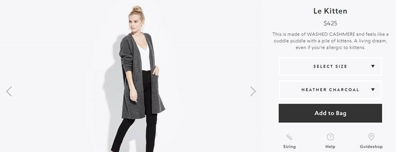
Product pages are the main sell for your goods and services. These are the foundation of your business, so you must have an impeccable product page. Anything less than perfect here will instantly turn consumers off. Make sure your product pages are clean, visually appealing, and informational (yet concise). Your customers want to know exactly what they’re getting.
Use high quality images or videos to show off your products, and don’t forget to include a title, short description, and price. As for the add-to-cart button, make sure it’s easy to find and click. More specifically, it should say “add-to-cart” and not something like “learn more” or “more details.” It seems like a minute difference, but using unclear language on the buy button can make your users wonder how to purchase from you.
Gain Your Customers’ Trust Naturally
Subliminal messaging is a wonderful thing. You can gain your customers’ trust by building the credibility of your brand naturally. Professional social media and white papers are an effective way to show off your industry authority, but you can also do it subconsciously right on your website.
For example, strategically place clips from well-known sources that may have mentioned your brand. Include brand logos of other companies you’ve worked with in the past in places your customers will notice. They may not realize they’re seeing those logos and finding themselves trusting you, but that’s the beauty of design. Instead of outwardly namedropping a few high profile clients, you’re simply displaying their logos, which subconsciously resonates with your customer.
These trends will get your site looking great and make it easier for users to explore your brand. As the web design industry continues to research user behavior, you can expect to see more of the same: concise content, mobile-friendly options, and practical usability.
Hand-picked Related Articles:
- Usability vs. Conversion Optimization
- 25 Amazing Ways to Boost eCommerce Conversion Rates
- Getting E-Commerce Site Structure Right
* Lead image adapted from Gerard Stolk
How To Boost Sales With These 8 Web Development Tricks
The post How To Boost Sales With These 8 Web Development Tricks appeared first on Search Engine People Blog.
(41)

