— April 8, 2019
An online form on your website is useless if no one is filling it out. Whether it’s an order form, an email signup form, a contact form, or a survey, getting people to want to fill out your forms and submit them is essential to learning more about your audience, generating leads, and boosting conversions.
But, filling out an online form takes time, even if it’s only a couple of minutes, so you need to make completing your online forms as easy and enjoyable as possible for users.
So, how do you get your website visitors to fill out your forms? Here’s how to boost your online form conversions.
Create visually appealing forms.
While the form fields are arguably the most important part of your online forms, you can’t forget about design. Creating forms that are visually appealing will make them more enjoyable for the user. After all, would you rather fill out a form that’s unsightly or a form that catches your eye?
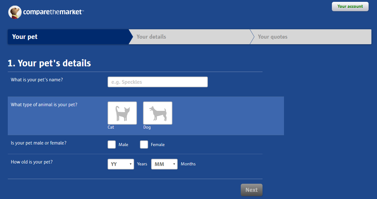
Take a look at this online form from Compare the Market. Instead of a plain, boring form, they have a sleek design that includes color and images.

So, make sure your online forms look great. Consider adding colors, images, a variety of form field types like checkboxes and multiple choice, a progress bar, and so on, to increase form conversions. Remember to make sure the design of your online form is consistent with your brand style.
Keep it on the short side.
Another way to boost your online form conversions is to keep them short and sweet. People don’t have a lot of patience, so if your form is too long, they’ll likely get annoyed and give up on it.
According to Hubspot, the average web form length in 2019 is 5 form fields, which usually result in the highest conversion rates. So, if you can keep your online form length close to this, the more conversions you’ll see. Think about the most vital information you need from your online forms, some of the most important info may include:
- Name
- Phone Number
- Address
- Payment Details
Decide what information you absolutely need and leave out the rest.
Make your forms conversational.
Now, sometimes you need your online forms to be longer than 5 fields, especially if you’re creating a customer feedback survey for instance. So, how do you keep users happy and engaged while filling out longer forms? The answer is to make your forms conversational.
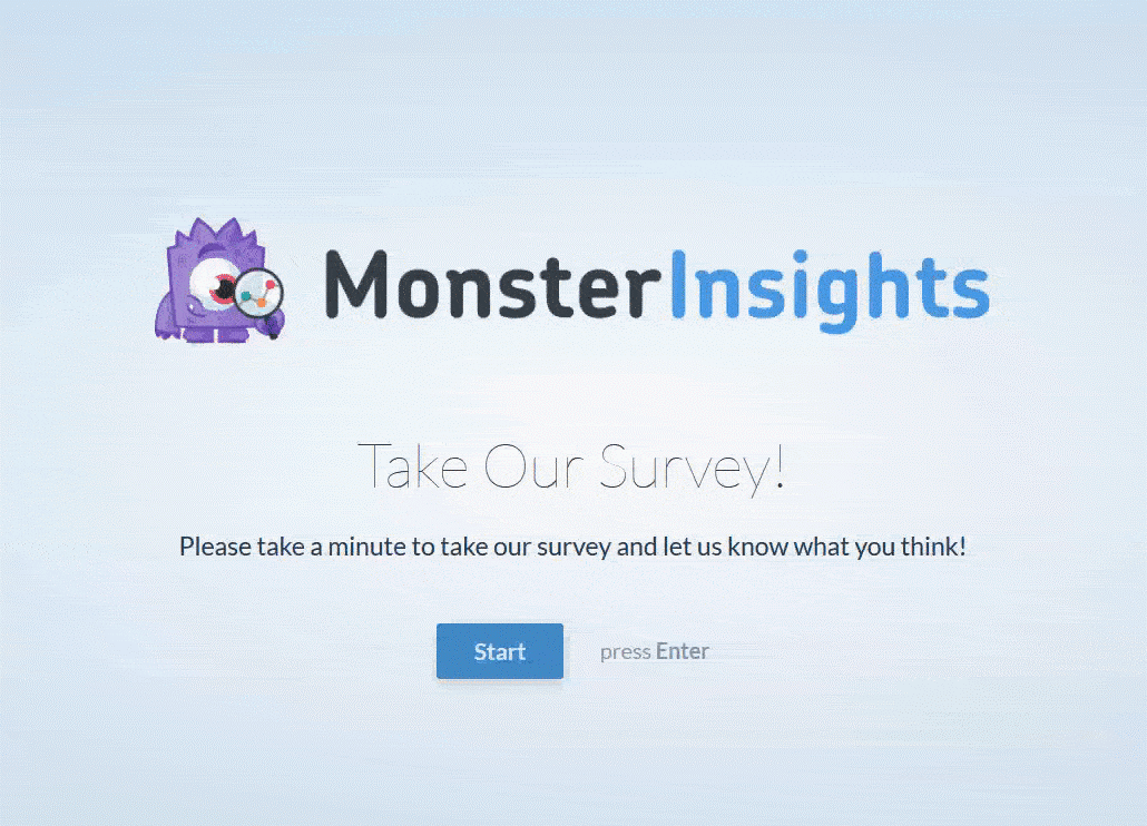
A conversational form is an interactive form layout that’s guaranteed to boost form conversions. Instead of a user seeing a wall of questions all at once, a conversational form will show one question at a time.

Making your forms conversational is an effective way to combat respondent fatigue. Respondent fatigue is a well-known phenomenon that happens when survey participants grow tired of the survey task and therefore the quality of the answers they provide begins to deteriorate. With conversational forms, users won’t become bored by a tedious survey, it will feel more like they’re having a face-to-face conversation.
Get rid of the boring “submit” button.
When designing an online form, most people label the submit button with the word “submit”. Makes sense right? But did you know that your submit button can actually be costing you conversions?
Labeling your submit button as “submit” is not enticing for users and it doesn’t show them the benefits of completing your online form. Instead, try labeling your submit button with one of the following phrases:
- Get The Information
- Download The eBook
- Get My Coupon
- Register For The Online Course
- Show Me My Results
A/B test your forms.
Don’t just create a form, put it on your website, and leave it at that. You may have built a form that you think is perfect, but your users might think otherwise. Which is why you should always A/B test your forms. A/B testing your online forms will help you discover what performs best and what gives you the most conversions.
Something as small as the color of your submit button, the placement of your online form, or the order of the text fields can make a big difference. So, test multiple different forms in order to maximize your conversions and find out exactly what works for your audience.
Over to you.
With these tips for how to boost your online form conversions, your forms will no longer be sitting on your website and collecting dust. Rather, they’ll grab the attention of users and keep it, all the way until they hit that submit button. Plus, now that you’ll be getting more form submissions, don’t forget to track your form submissions to better analyze all that important data.
Digital & Social Articles on Business 2 Community
(59)
Report Post


