— September 6, 2018
In many organizations, user research creates friction. It directly challenges the intuition of others, often at the highest levels. It slows product development. It costs money. It has no clear ROI.
But it’s also essential—89 percent of customers stop doing business with a company after a bad experience. User research delivers the quantitative and qualitative insights to improve those experiences.
The key is to connect user research to an improved user experience and, in turn, an increase in customer retention, leads, or any other metric for which C-suite members are accountable.
You won’t, however, build a culture of user research by touting slide decks of best practices at all-hands meetings or highlighting case studies from other companies.
So what should you do? Here’s how to start from scratch.
Why user research matters
Amazon owes its success, in part, to user research. Its mission—“to be Earth’s most customer-centric company”—depends on understanding and resolving online shoppers’ pain points, whether through web design tweaks or free-and-fast delivery. (Eugene Wei, a former Amazon employee, identified the latter as the company’s invisible asymptote, or key limiter of growth.)
At Samsung, user research led the company to redesign its televisions in 2005, doubling their market share in just two years. (Samsung found that television owners saw their sets as furniture and, therefore, valued sleek design.) Febreze realized that consumers craved a “scent reward” for cleaning—even though its fragrance-free versions successfully removed unwanted odors.
Yet the justification for user research extends beyond anecdotal evidence from industry leaders. A study by the Nielsen Norman Group (NNG) showed that commercial enterprises—as well as non-profits and government agencies—consistently generate a strong ROI from investments in usability.
According to that same NNG research:
- Ecommerce sites can expect to double their sales.
- Lead generation sites can expect to double their conversion rates.
User research is the foundation for those gains.
Which questions user research can—and cannot—answer
When should you conduct user research?
- When you want to assess the intuitiveness and functionality of your design (be it an app or an automobile).
- When you want to fine-tune your design by testing prior decisions.
For web-based products, user research can deliver quantitative measurement of on-site user behavior and qualitative insights from open-ended surveys and user recordings.
For conversion optimization, user research is pivotal. It forms several components of our ResearchXL framework:
- Analyzing web analytics data to understand how users currently move through a site.
- Conducting mouse tracking analysis to understand which components earn the most attention, how far users scroll, and where users click.
- Conducting qualitative surveys to understand why visitors came to a website and whether they achieved their goals, and to ask current customers about their experiences.
- Reviewing real-time user tests to understand users’ thought processes as they try to complete a task on a website.
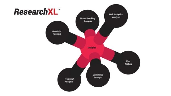
The ResearchXL framework uses quantitative and qualitative user research to inform CRO strategies.
In contrast, user research is not a good idea if:
- You don’t have the budget to do it right. A non-scientific approach that bases product decisions on the opinions of one or two users is useless.
- Your product is not ready. A rush to test a buggy prototype is unlikely to yield useful feedback.
- What you really want is market research. User research focuses on how users behavior while interacting with your product, not whether your product has business potential or with whom it may generate interest.
Making sure that you’re conducting user research for the right reasons can remove one potential roadblock when it comes to winning over skeptical executives.
Why executive buy-in is so hard to get
Expecting executives to lead advocacy of user research is about as likely as designers championing quarterly earnings targets. User research affects earnings, and earnings validate user research, but accountability differs.
So how do you get executives to value user research? It’s not about trying to “change the culture,” according to Krista Godfrey, who led efforts to revamp the user experience at Memorial University Library:
Rather than transforming a culture drastically, it is better to aim for new goals over time that will influence existing culture. As these goals are adopted and achieved, they can influence the broader culture of the organization, effectively transforming the culture.
The limits of persuasion in the C-suite
Nor, even for experts, is cajoling executives into culture change possible: “I’ve been pitching our services for 23 years and I’ve never once successfully convinced an executive of anything,” writes UX and design expert Jared Spool.
Spool continues:
You can find out what your executives are already convinced of. If they are any good at what they do, they likely have something they want to improve. It’s likely to be related to improving revenues, reducing costs, increasing the number of new customers, increasing the sales from existing customers, or increasing shareholder value.
Good UX can help with each of those things.
Once you start talking about what the executives are already convinced of, it becomes easier to get them to make investments. You’re no longer trying to get them to change their focus. You’re playing directly into their main field.
A generic presentation about how Apple or some other company has a great user experience program (or worse, a presentation showing all the bad user experiences in the world), won’t convince anyone of doing anything different.
You’ll need to do something custom. Something specific to their current focus.
These are the steps to build that custom strategy—and to ensure it resonates with the executive team.
5 steps to create a user research culture from the ground up
You could try to effect change independently. But your silo—whether product design or marketing or web development—isn’t the only one that needs or benefits from a user research culture.
Only a company-wide user research culture enables iterative testing throughout the product design process. Otherwise, the impact of user research is limited by the stage at which it occurs. For a SaaS product, it may be impossible (or, at least, prohibitively expensive) to redo the user interface (UI) if user research doesn’t enter the equation until the final stages of development.
Fostering widespread interest in user research begins with the identification of internal allies.
Step 1: Build a team of internal allies.
People inside your company—and outside your department—feel your pain, even if they don’t define that pain as a lack of “user research culture.”
- Marketing staff relies on user persona research to target the right prospects.
- Sales representatives know that a happy customer is a potential referral that can generate a quick and lucrative commission.
- Customer success personnel know that satisfied customers don’t complain about the same issue over and over again.
- The finance team understands that content customers are less likely to churn and destabilize revenue flows.
Change begins by building relationships with other internal advocates. Working with multiple departments quickly shifts the conversation from a design- or UX-centric language to the broader goals of user research—customer satisfaction and brand advocacy.

The vast scope of research that may take place within an organization. (Image source)
Real-world user research teams
Google. When Google embarked on a massive and unprecedented redesign of its core products, designers found that collaboration with engineers forced them to choose a shared vocabulary.
Rather than focusing on specific design elements, they articulated changes in the shared language of user success: “This is going to solve user problems. It’ll take less steps, or people will find that perfect place for a romantic dinner.” (They also validated design choices quantitatively with “voluminous” user testing.)
Yahoo. At Yahoo, they created a centralized UX Research and Accessibility team that included “researchers from existing design research, mobile UX research, ads and data research, [and] accessibility.” (Yahoo enjoyed top-down support for their effort, but the lessons still apply.)
The diversity within the Yahoo team all but guaranteed that user research would counter beliefs of those involved, something Yahoo viewed as positive: “When teams learn information that they were not expecting, they see the value in user research.”
Despite that benefit, the range of professional backgrounds mandated investment in internal team building, too: “Time spent understanding the team and the product is just as valuable as time spent understanding the user, and one needs to spend time doing both to be successful.”
Memorial University. Memorial University Library took a similar approach to their user research, establishing a “permanent” team devoted to usability. The permanent component was a subtle argument for the centrality of user research:
As a permanent group, it highlights both the importance of user feedback and evidence-based decisions within the organization. A standing team devoted to usability testing also implies administrative support for the practice and values the skills the group will develop among its members. As skills grow and spread from this team, usability becomes an organizational value and inherent aspect of the library culture.
A “braided” approach to UX and design
In all cases, the resultant teams adhered to what McKinsey labels a “braided” approach to product development, which weaves design, strategy, and technology efforts—and employees—into a single strand:
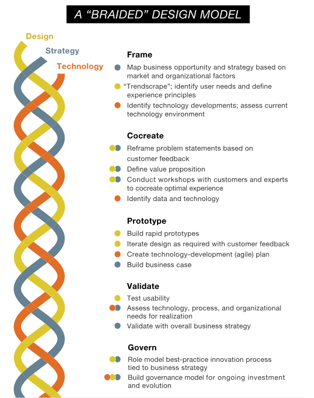
McKinsey’s “braided” design model ensures participation from multiple groups throughout product development. (Image source)
To find allies, ask:
- Which departments indirectly use your product and have connections to people in the user roles you’re targeting?
- Is there a project sponsor who can help sell the value of research and connect you to additional team members?
- Are there employees in other departments whose individual goals align with getting better user feedback?
- Are there departments within the organization (sales, customer service) that can offer connections to customers who want to provide candid feedback?
Once you’ve established an internal team, you can begin to weave together the disparate threads from each member.
Step 2: Create a framework for user research.
If you’re the first internal champion for user research, your team may be starting from scratch. As with any brainstorming session, the initial step is to compile existing data (e.g. buyer personas, user research conducted by various groups) and moderate an open-ended discussion about what user research should look like for your company.
An online space—Slack, Basecamp, Trello, etc.—may support spontaneous contributions or be more sustainable for multi-location organizations.
The goal is to define a set of user research principles to guide your organization. At Yahoo, they identified four principles: timely, believable, actionable, and surprising. (“Believable,” for Yahoo, meant “statistical valid or credible” not “aligned with intuition or experience.”)
Avoid merely listing complaints or perceived missteps. Otherwise, your project may seem like a direct challenge to management.
How much user research is enough?
As you compile existing user research, you may wonder: Do we have enough? All research has a point of diminishing returns, and user research is no different. Quantitative research offers a threshold of statistical significance as a measure of credibility, albeit an imperfect one.
For qualitative surveys, we’ve found that 100–200 respondents is the right range—anything larger typically becomes repetitive (and unnecessarily expensive). For user testing, NNG wryly notes that, “The answer is 5, except when it’s not.” The recommended number of test users varies, in part, on the type of research: card sorting (15), eye tracking (39).
If you have a big budget for user research, NNG argues that the money is better spent on more research methods, not higher user volumes for fewer methods (even if you have millions of users or multiple target audiences).
Once an initial synthesis of user research and a forward-looking framework are in place, you can seek involvement and feedback from the wider company. Your established structure protects the ideas and process from free-wheeling input that can dilute your message.
Step 3: Share user research with your team.
Where do you keep customer journey maps? What about user personas? For most organizations, they’re buried in file folders or isolated within small teams. That reinforces the idea that user research is, for example, “marketing’s job,” rather than a company focus.
There are overt opportunities to share research. MailChimp prominently displays user persona posters at their offices:

MailChimp decorates its walls with user personas to reinforce the centrality of users in product development. (Image source)
There are also other, more interactive ways to engage your organization in user research:
- Invite employees to watch user tests, live or recorded. (Free food or drinks are a simple but effective motivator.) A shared calendar with session times can make it easier for others to participate.
- Regularly send out edited highlights of sessions. Include notes from your internal team that explain how insights are influencing product development.
- Encourage anyone involved in product development to observe in-person user testing sessions. (Yahoo offered an adjacent room with comfy furniture and whiteboards to entice visitors and encourage real-time brainstorming.)
- Host informative lunch-and-learns to present user research best practices and highlight novel findings.
In short, treat your outreach as an internal marketing campaign to build interest in and show the value of user research. (Note: You may want to exclude management if your user research campaign is building toward a presentation to executives.)
Step 4: Prototype a change based on user research.
A prototype validates an improvement in the user experience. While prototyping is far easier in the digital space—a redesigned app UI is cheaper to mock up than a prototype for the phone it operates on—a bare-bones approach can yield a persuasive impact.
Indeed, Mozilla and Disney—two household names—successfully prototyped product updates with paper and cardboard, respectively.
Prototyping a digital product
Mozilla prototyped a redesigned support page on paper. (Yes, paper.) Like many sprawling sites, Mozilla struggled to make it easy for users to drill down into subsections to identify a solution to their problem. The initial interface offered about 30 potential solutions and a search bar:
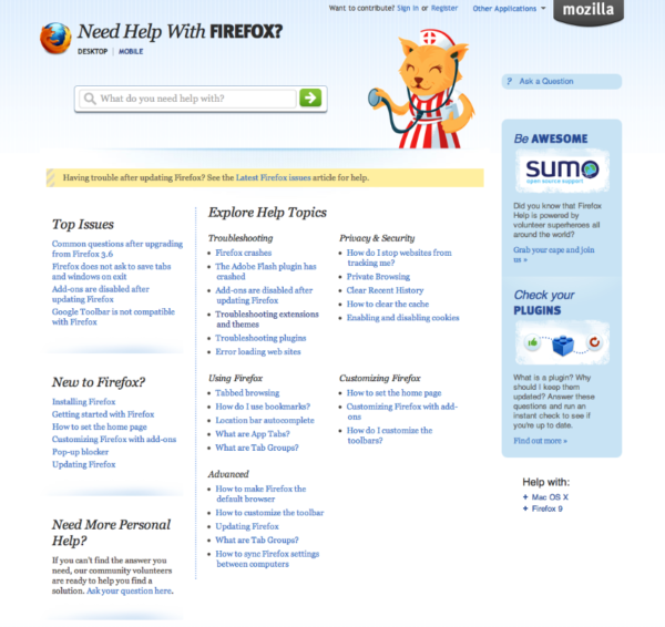
Mozilla plowed through seven prototypes in two weeks by using paper prototypes. (Image source)
Designers used paper prototypes—printed mock-ups of various screens—for user testing, allowing designers to make real-time adjustments based on user feedback. If users struggled to find a section or understand a label on a paper prototype, designers could immediately test alternative versions without time-intensive and costly recoding.
The final product, built through the user-tested prototypes, delivered a simpler interface that vastly increased the chances of the first click being the right one:
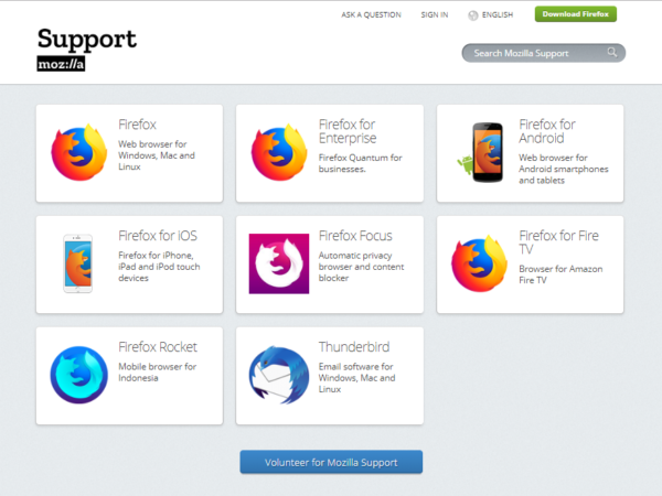
Mozilla’s redesigned support page makes it much more likely that a user’s first click is the correct one.
As research has shown, a correct first click leads to a 70% success rate for a task, while an incorrect first click drops that likelihood to 24%.
Did it work for Firefox? Help questions in its support forum dropped by 70% after the relaunch.
Prototyping a physical product
Disney employees used a prototyped physical environment to pitch the Magicband, a new piece of tech that provided park visitors with a friction-free user experience.
The proposed band allowed visitors to pay for anything, unlock their hotel room, and track their location (so characters could proactively greet a birthday boy or girl, or a hostess could take patrons directly to their tables).

The prototype for Disney’s Magicband featured a demonstration in a cardboard version of the park. (Image source)
The team that developed the concept knew executives would be hesitant—implementation was a “billion-dollar bet” on the technology. They unveiled the prototype in an empty warehouse with cardboard cutouts to represent various park sections and interaction points.
The fake park allowed wristband-fitted executives to walk around and experience its benefits. Showing, rather than explaining, is the gift of a prototype. How else could you describe the sense of freedom from exploring the park with no tickets, credit cards, or reservations to remember?
A prototype is not the final step, however. While it validates UX improvements, only a proof of concept demonstrates feasibility.
Step 5: Build a proof of concept for your prototype.
A great prototype isn’t necessarily a profitable one—it may not address the underlying UX issue or may be implemented incorrectly, two failures that can torpedo anticipated benefits to the user experience and the bottom line. A proof of concept tests the business value of a prototype.
For a media site, a proof of concept could be an A/B test of a redesign for a subset of articles with, say, increased ad clicks defining success. For an app, it could be a beta version of a new feature, with user engagement metrics delivering the proof. (Google is known to leave products in beta for years, in part to gather feedback but also to temper user expectations.)
The goal of a proof of concept is not to validate user research but to show the potential business value of the changes. If the current C-suite focus is reducing churn, roll out changes to a high-churn segment of your user base. If the C-suite focus is growth, make changes that affect key acquisition channels (ad copy, landing page design, etc.).
Ultimately, a proof of concept should provide the final connection between user research, user experience, and business goals.
Keys to building a successful proof of concept:
- Pick an inexpensive project or small market segment to simplify rollout.
- Choose a project that directly supports management’s goals and relies on user research.
- Ensure the improvement is measurable to demonstrate ROI.
Conclusion
“The best thing to do if you want to get people to care about user experience,” UX Designer Paul Boag argued in an interview, “is show that user experience can help them personally.” That means finding common languages to discuss the user experience and common goals to measure improvements.
Did a cluttered design confuse users? Did cleaning it up simplify the checkout process? Are sales up?
Was the value proposition based on features users didn’t care about? Did more empathetic copy increase click-through rates? Are lead numbers higher?
Those sequential questions reveal the thread that runs from conversations in user interviews to those in executive boardrooms. The strength of your user research culture depends on how well you can trace that thread through your company and how many strands it contains.
Business & Finance Articles on Business 2 Community
(79)
Report Post

