You can spend thousands of dollars driving traffic from social media to your website…
…but if the landing page doesn’t convert, you’re wasting your money.
Your landing page is one of the most critical points of your sales funnel. But, ironically, many marketers and business owners act as though their landing page is something to “set and forget.”
Quite the opposite.
Your landing page is where the magic happens. It’s where a new headline can boost your sales by 10%. It’s where a different call-to-action button and color theme results in a 25% increase in revenues.
When viewed strategically, landing page development and maintenance is a potential goldmine.
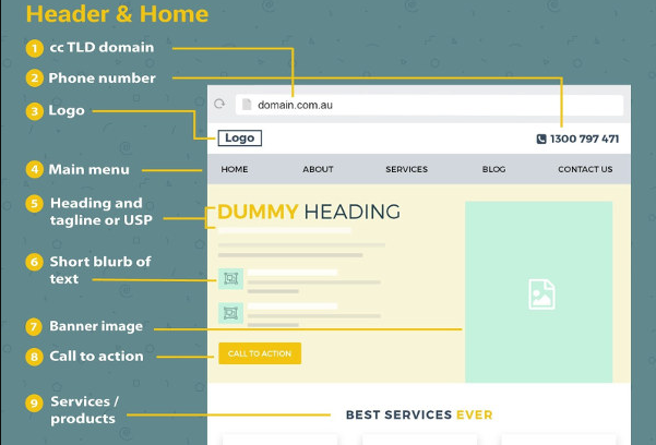
A new infographic (discovered via MarketingProfs) takes a look at 53 “must-have” features of a local business website. While this infographic, on the whole, is packed with valuable information, we want to focus on just the “Header & Home” section, which happens to be an excellent outline for a business website landing page.
If you’re designing a new site (or redesigning an old one), this model is a great one to start with, as it hits all of the key components of a modern landing page.
Creating the Perfect Landing Page
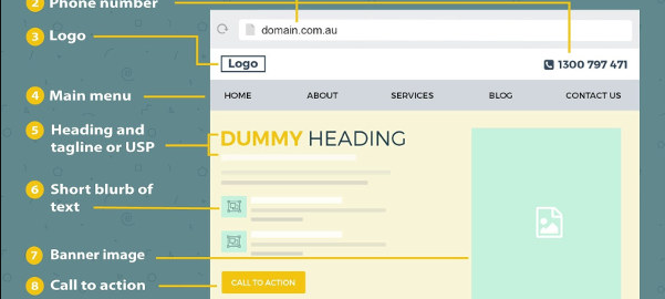
- Phone number: Place your phone number at the top of the document. Also, make sure it’s linked with touch-to-call functionality (especially important for people viewing your site on mobile). This is very easy to do. Simply create a link that points to “tel:5551234567” (replacing the digits with your own phone number).
- Heading and tagline: This is your first major opportunity to grab your audience’s attention. Don’t blow it by writing something generic! Instead, you should use this space to describe the problem you’re solving in as few words as possible – as clearly as possible! Be brief.
- Call to action: Your call-to-action button needs to be “above the fold.” Sprinkle calls-to-action liberally throughout your landing page. Change their appearance, verbiage and positioning, but never let your viewer get too far away from a CTA button.
- Testimonials: “Social proof” can go a long way. In fact, adding testimonials to a website increases conversions by 34%. Your landing page MUST have a section for these.
- Option B: Lastly, give your lead an “option B.” This isn’t something covered directly in the infographic below, but we think it’s immensely important. You don’t want to lose a valid prospect that is not quite ready to buy. So, you have to give these people something they can do on your site. For example, let them chat with a sales person, or give them a free ebook download in exchange for their email. It’s important that these leads have a way to interact with you, and that you have an opportunity to capture their email or phone number.
Check out the full infographic below. Have any questions about what should be on your landing page? Drop us a comment below, and we’ll try to answer your questions!

(122)
Report Post