— May 15, 2019
If you own an ecommerce store, think about your pricing page for a second. Are you confident that it’s optimized to convert people from visitors to paying customers? There’s a lot to consider when designing and creating your pricing page, and it can be tough to gauge what it needs and what it can do without.
Optimizing your pricing page can make all the difference in how your content performs with visitors. If you aren’t taking all the steps necessary to make it appeal to your target audience, answer their questions, and present them with solutions, then you aren’t doing everything you can to make your business grow and succeed organically.
If you’re trying to create a pricing page that brings your brand higher conversions, here’s how to get started.
Offer fewer pricing options
As humans, the more decisions we have to make, the less able we can make them. On average, people have to make around 35,000 decisions a day. When that number can be decreased even by one or a few, it can drastically enhance your chances of making a sale because you’re getting rid of most of the work.
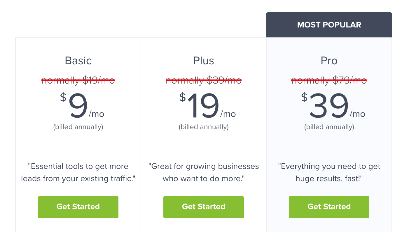
People don’t want several options. Rather, they want two or three that appeal to their needs and simplify their buying decision. That’s why you should limit the number of pricing options available to your audience. It’s wise to add a recommended pricing option that’s in between the others and perceived as not too high but not too low. A study by Survey Gizmo found that highlighted plans perform better with customers than non-highlighted plans.
Create optimized CTAs
Pay special attention to the CTAs on your pricing page. How well do they tell users what to do next? How much do they pop out and catch your audience’s attention? If your CTA doesn’t stand out and plainly tell users what to do, you’ll lose out on potential conversions.
The wording, color scheme, and placement of your calls-to-action have a great impact on how well they perform. For example, something as simple as using the word “Submit” on your CTA button has proven to lower your conversion rate.
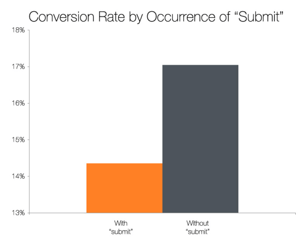
It’s a process of trial-and-error trying to find the perfect strategy for an converting CTA, but A/B testing different components can help you optimize your pricing page for better results.
Show social proof
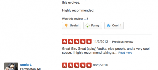
If you’re going to convince your target market that your content, products, and services are worth their hard earned money, you need to boost your credibility. No one is going to buy from a business that doesn’t have any form of social proof, which can be in the form of client testimonials, customer reviews, influencer marketing, word of mouth marketing, and more.
Social proof is really anything that anyone other than the business itself says about its products and services. It’s the easiest, most straightforward way to show visitors on your website that you sell quality products and have a brand that’s worth trusting.
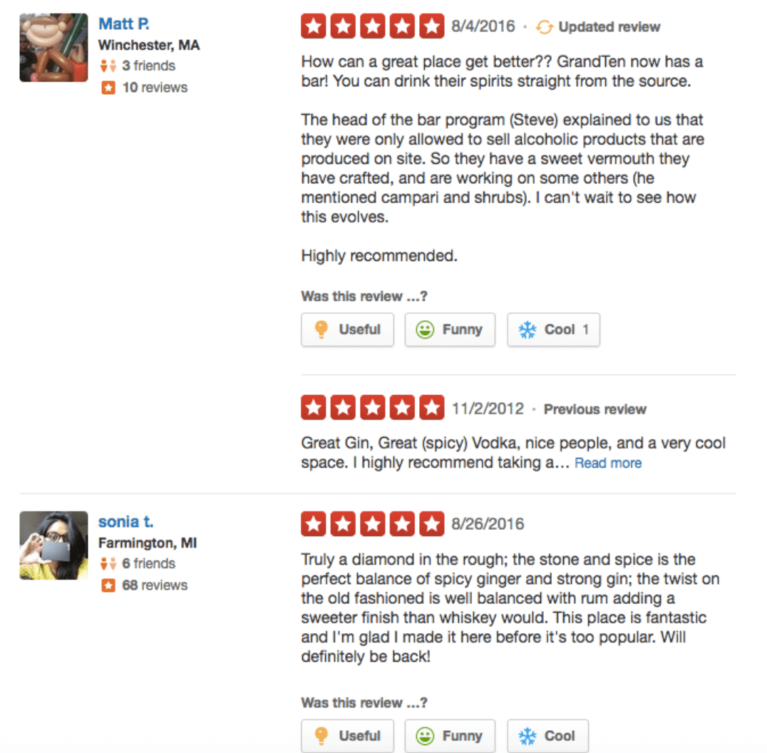
Anytime you scour reviews or ratings to see if a service is worth your time and money, you’re looking at social proof. It’s one of the most widely-used ways to determine whether or not a business is worth investing in and buying from. If you don’t have this on your pricing page, you’re missing out on an opportunity to build your brand’s rapport and show users what your content is all about.
Wrapping up
If you’re looking to improve the conversions on your ecommerce website, it’s important to create a pricing page that matches your goals. It could make or break how well or terribly your website performs and how your products sell, so taking the time to fully optimize it to your audience’s liking is crucial. It’s important to present your visitors with fewer pricing options because people are easily overwhelmed when they have to make too many decision, so simplify the process for them. Review your CTAs to see what changes can be made so you see higher conversions. Finally, showcase social proof to show visitors your brand is worth spending money on. How will you create a high converting pricing page?
Digital & Social Articles on Business 2 Community
(87)
Report Post