The sign of a good marketer is not wasting any digital real estate. From your homepage to your 404 page, every part of your website should be doing something to help engage your customer.
The same rule applies to creating a coming soon landing page. These landing pages can announce new products or a new company—but the challenge is to create a landing page that gets your prospective customer’s attention without overwhelming them. Striking the right balance between revealing information and withholding it can be hard.
In this post, we go over what you need to know to create a coming soon page that helps you convert visitors into future buyers.
What is a coming soon landing page?
A coming soon landing page is a temporary landing page that’s announcing a new product or service. It’s meant to pique interest, but also to get your customer to act on something.
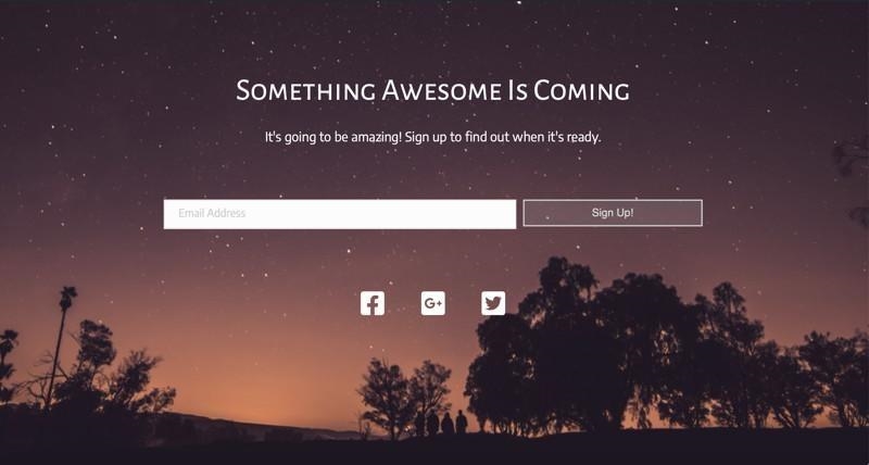
That’s right, it’s not enough if your coming soon landing page just announces your new service. You want it to also get a sign up (or some sort of action) from your customer. This means an email submission. Or downloading an ebook. Or registering for an event.
Why?
Because launching your product or service is a party, and the coming soon page is the party invite.
That means there are also things you’ll want to avoid in your coming soon landing page. Here are two key things to keep in mind:
- Don’t just put up a generic maintenance mode template. Every part of your website should be doing at least two things. By putting up a simple in construction template, you’re telling your customer that you’re in construction but nothing else. Stay away from coming soon landing page templates, and instead focus on making something that matches your brand.
- Don’t over promise or over reveal. Remember, your coming soon landing page is like a movie trailer. You don’t want to give away the whole plot!
Now that we’re clear on what a coming soon landing page and what to avoid, let’s look at what makes a coming soon page a winner.
5 tips for creating a winning coming soon landing page
Here are our five best tips for creating compelling coming soon landing pages that will entice your prospects—and keep them coming back!
1. Be compelling, not overwhelming
With a coming soon landing page, less is more. The first message is: You’ll like this new product because of X. The second message is: To stay in the loop, do Y (as in sign up for our newsletter or product launch).
To do this, focus on your headline and a short descriptor. Both should speak to what you’re offering and how it’s going to help improve your customer’s life.
Let’s look at how TeekTak does this in the example below.
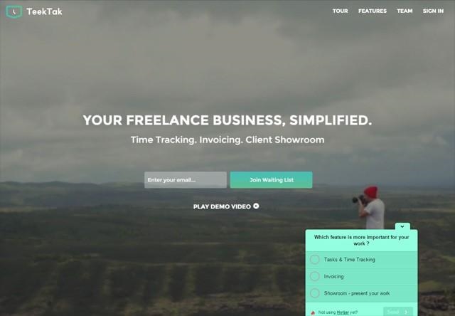
The headline: Your Freelance Business, Simplified. This hits the right emotions. Any freelancer can tell you the hassle of logging hours and using different invoices for each client. And while that emotional resonance is felt right away, TeekTak adds just enough of a descriptor to put real-life examples in our head: Time tracking. Invoicing.
Then, TeekTak has a nice clean place to put your email address, with a clear call to action (“Join Waiting List”).
Plus, customers who want more information can click on the CTA button “Play Demo Video.”
2. Have only one form to fill out
A coming soon landing page is different from a traditional landing page. A traditional landing page can get away with two or three forms to fill out.
But when you’re announcing the arrival of a new site or product, you want your customer’s focus to be laser-tight—because you’re only offering one thing: an email signup.
The more you give a user to register on your coming soon landing page the greater the risk of losing them. There are only so many things for a customer to do on the page. Let’s say you have a coming soon landing page up, plus your site has several other pages (About us, FAQ, Contact Us, etc). Companies have shown that not including those navigational links can increase conversion by 100%.
This is because by cutting distractions the reader is focused solely on the core message of the coming soon page. So there should be social media buttons (more on this below) and there should be one form to fill out.
Pro tip: Set up a splash page that triggers before the user leaves your page. You can set this to go off after a few seconds.
3. Set a countdown
While a coming soon landing page is unique, there’s still the same mechanics of getting someone who lands on your page to convert.
We’ve talked about how the top 25% of landing pages can convert more than 5% of their visitors. So don’t settle for other oft-quoted numbers, like 2% or 3%.
One way to help increase your coming soon pages conversion rate is to set a countdown. You can do this by setting an actual, physically changing countdown clock. Or, if you don’t know the exact date of launch, you can be more general and say “arriving this fall” or “out in time for Christmas.”
The point is the same—a coming soon landing page can look stagnant and forgotten without a countdown. There is no context for the customer to understand how soon is soon.
4. Make it shareable
We like putting sharing social media buttons on coming soon pages for one specific reason.
More than any other landing page, you’re trying to get the word out about your coming soon page.
Your new product or site is likely solving someone’s problem, and so you want to create buzz about your new solution.
Pro tip: Increase the number of social shares your landing page will get across key platforms by creating a giveaway. On this giveaway, customers can enter by sharing your page on Facebook, retweeting it on Twitter, or posting about it on Instagram.
5. Make it mobile
As of this year, over 50% of all web traffic comes from a mobile device. That number may even be higher, depending on your industry.
But whether you’re targeting B2B or B2C customers, you want to think “mobile first” when you’re designing your landing page.
Examples of killer coming soon landing pages
One of the best ways to get ideas for creating your own coming soon landing pages is to check out great examples. Here are four killer landing pages that you can learn from!
1. Arche Travel
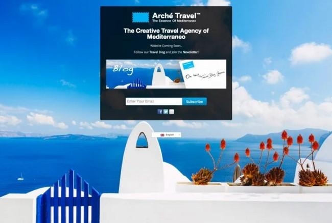
Notice how the eyes go to the Subscribe CTA button in the middle of the screen? It’s great placement, because it keeps the user focused on both the intent (subscribe to our mailing list) and the message (take a vacation). If the CTA button was aligned on the right of the page, it’d take our focus off the ocean landscape. This landing page also has social sharing buttons, which is fantastic.
How to improve this page: Incentives are important ways to convert people on your page. What incentive does the customer get by signing up for this newsletter?
2. LandApart
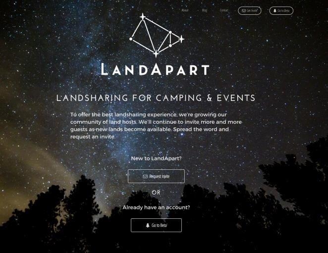
Here’s another striking landing page. Notice how these coming soon landing pages are very visually oriented?
If you’re launching a business or website, you likely don’t have very many images to share. Instead, you can use WordPress templates or plugins to create these very visually-first landing pages where the whole of the landing page is one crisp, clear, thematically relevant image.
One last thing about the image: Look at how the image matches the target audience. This is a site for people who want to camp—and when you get to this landing page, you know you’re in the right spot.
This landing page also touches on something we haven’t talked about yet: exclusivity. This is in a similar vein as setting a countdown. There’s urgency implied with exclusivity. One of the CTA buttons reads “Request invite.”
Now, LandApart may accept everyone who requests an invite, that’s not the issue or the point. The point is it creates urgency for the user, plus it gives more incentive to sign up. People want this, so I’m interested as well.
Notice that this landing page has two CTA buttons.
You can request an invite (to join), or if you’ve already joined, you can proceed to the beta testing site. Think about, psychologically, the effect of this on the user.There are two doors that lead into a VIP lounge, one door leads to the VIP lounge where you want to be, and the other leads to the offices where you sign up for the VIP lounge.
These are mutually beneficial CTA buttons because the “Go to Beta” button serves as an incentive for the “Request an Invite” button.
There technically isn’t a countdown button on this landing page, but a countdown button isn’t needed. The same with social media sharing buttons. This landing page experience won’t be improved by being able to share it on Twitter or Facebook.
How to improve this page: This is a highly-effective coming soon landing page. Well, almost nothing. It wouldn’t hurt to do a split test on the landing page with different colors for the CTA buttons.
3. LAB Petite

We like LAB Petite’s coming soon page for several reasons.
First, look at the copy. “Are you ready for the best modern handmade goods for your little ones? From clothing to toys, we’re going to showcase modern makers from around the world who make great things for kids. Sign up below to be informed when LAB Petite launches.”This copy gets the point across, and it also directs the user to act.
Second, LAB petite uses a countdown clock on their page. We really like the countdown page here because who loves to be reminded how long until they can get what they want? Kids. It makes this site launch sort of an event for the family.
Third, this LAB Petite page has a strong CTA that resonates with its copy.
How to improve this page: We notice LAB Petite is leveraging social media buttons, which is great. But to get a customer to share this on Twitter or Instagram, we think they need to offer an incentive. The incentive could be a coupon or a raffle or a limited offering of a gift with purchases over a certain amount.
4. App Manager 5.0
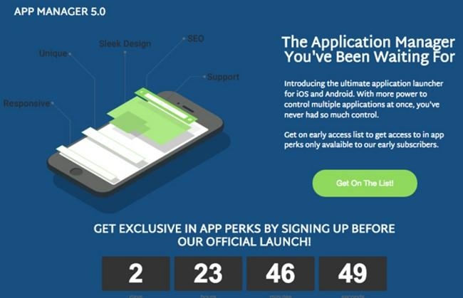
This is a great example of a landing page when you don’t have a stock image that can be used, and you don’t want to just show someone with their phone. App Manager 5.0 created a simple, easy to understand graphic that illustrates the features of their app.
The CTA button is slightly exclusive: “Get on the List!”
The copy offers an incentive: if you get early access, you’ll get perks that are only available for their early subscribers.
How to improve this page: No recommendations here! This page has a great CTA. It has a clear and compelling copy. It offers an incentive and creates urgency with its countdown. A+
What comes after the coming soon landing page?
The coming soon page—in case it wasn’t obvious—is the very beginning of the relationship between you and your customer. You don’t just set up a coming soon page and call it a day. The point Is to attract interest, increase brand awareness, get new email subscribers, and more.
So what comes after the coming soon page? Emails.
Email sequences to follow up on your coming soon landing page
A coming soon page ought to get you some information from your customer. In this day and age, ideally you’ll get an email address. You want an email list of potential customers: 59% of customers said email marketing has motivated them to make a purchase.
Now you can communicate updates to your potential customer—customers who showed an interest. You can create an automated sequence that increases as the date gets closer and closer to the launch date.
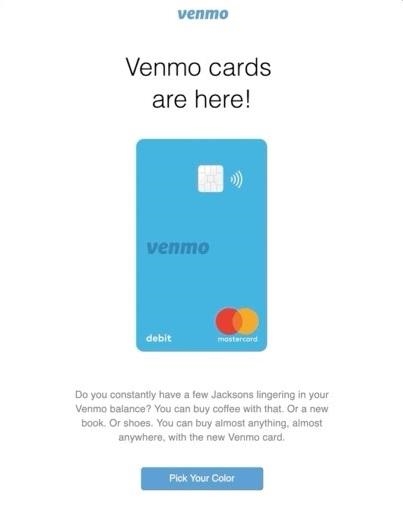
You can share updates on construction (if you’re making a physical product). You can share updates on new features or added accessories.
By leveraging the information you got on the coming soon landing page, you can increase the likelihood of having a successful launch.
Now, create your own killer coming soon landing page!
We hope you enjoyed this guide on creating killer coming soon landing pages. To recap, you want to:
- Be compelling, not overwhelming. Your coming soon page is a short teaser, not a full commercial. Get to the main benefit quickly, but don’t oversell.
- Have only one form to fill out. Streamline the process and ask only for what’s most important—the customer’s email.
- Set a countdown. If you don’t want a physical countdown timer on your page, that’s fine. Just mention in the copy a general idea of when you’re launching.
- Make it shareable. Make sure your landing page is shareable. But, also give your customer an incentive to share it.
- Make it mobile. Make your CTA button big and appealing on mobile.
Digital & Social Articles on Business 2 Community
(92)
Report Post


