— September 6, 2019
Much of the marketing effort involves encouraging prospects to read emails and click-through the CTA. The emphasis on electronic communication is partly because outbound marketing approach like cold calling is getting less effective. However, people are swamped everyday by an onslaught of unsolicited and unwanted emails. As a result, many marketing emails are deleted by the recipient without even being read. What a waste of all the hard work. To avoid this, it becomes imperative to escape the doldrums of drab emails and create professional-looking email templates that would be more persuasive for the reader.
In order to make things easy for you, we shall share some useful tips that would help you create professional email templates.
1. Define your brand through the email
Your subscribers are likely to brush off the emails that do not have any sender details. Therefore, you must include your brand logo and other elements unique to your brand in every email that you send.
Take a look at the email examples by Udemy. They have included their logo at the top left of the email and the links to “My Courses” and “Featured” at the right.

2. Place the calls-to-action at the top of the email
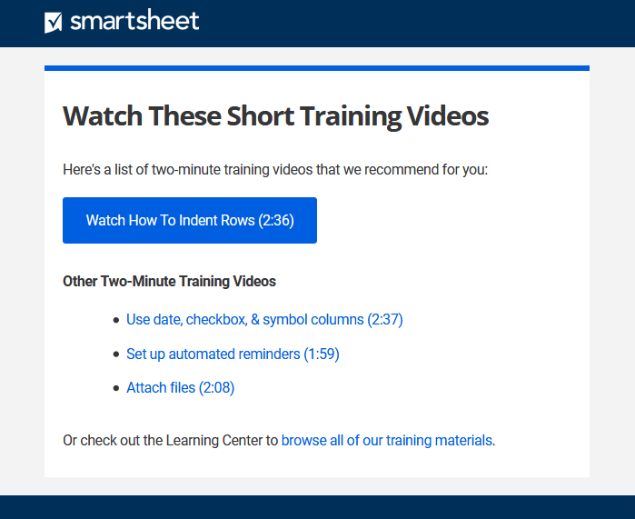
Your subscribers are busy people and to make sure that they take action, you must strategically place your call-to-action in such a way that it draws their attention. It is recommended that you place the call-to-action in the first fold so that it saves the effort to scroll through the email.
Here’s an example by Smartsheet in which they have placed the CTA right at the top to garner maximum attention and get people to watch the video/s.
3. Use web-safe fonts in your emails
Your email fonts should be compatible with the diverse email clients and types of devices. Hence, it is a good idea to use web-safe fonts like Arial, Times New Roman, Verdana, and Georgia as they are supported by most of the operating systems and devices. Web fonts, on the other hand, are supported only by email clients such as Apple Mail, iOS Mail, Google Android, Samsung Mail (Android 8.0), Outlook for Mac and Outlook App. So, the safest bet is to avoid using fancy fonts as far as possible.
4. Arrange the text towards the right of the images
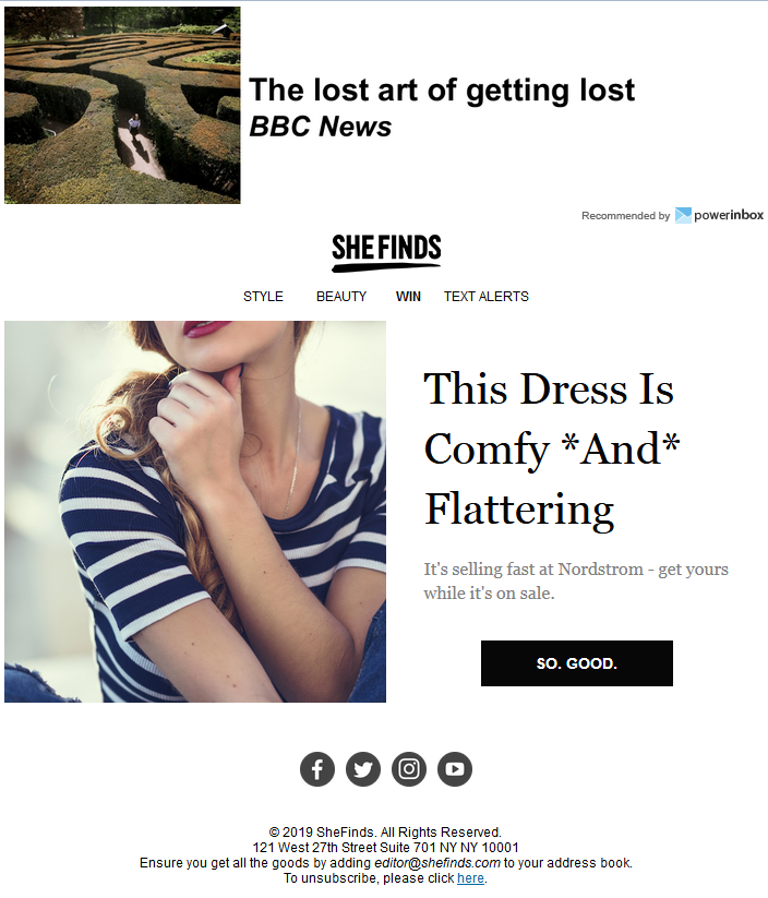
According to researches, your readers are more attracted to pictures rather than text. Considering this fact, you should place the image on the left so that readers see it first. After they have checked the image, they can proceed to read the supporting text.
SHEfinds taps on this psychology pretty well and includes text to the right of the images.
5. Do not add images in the background
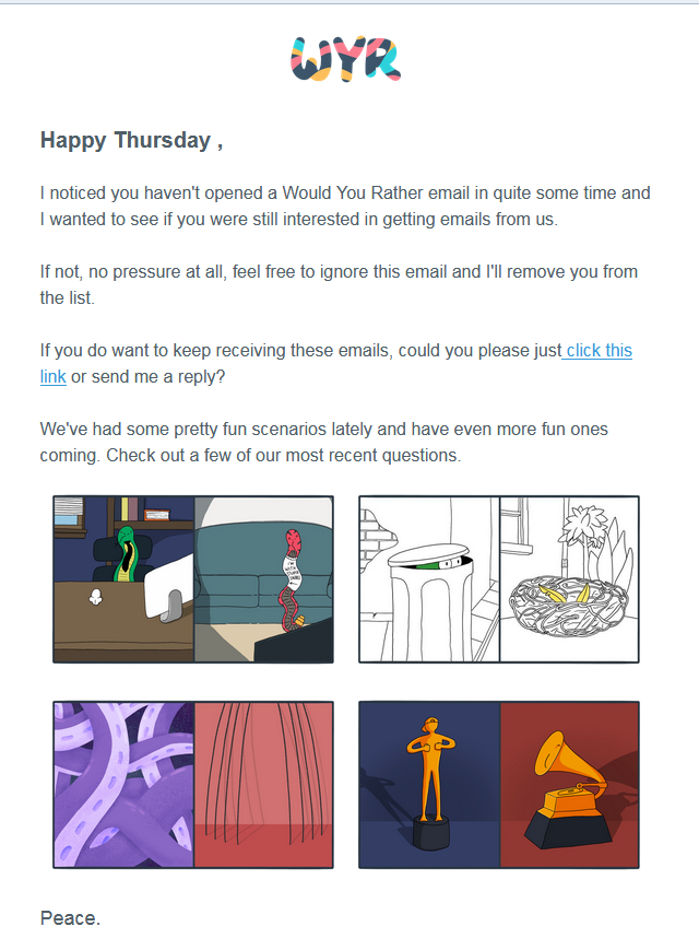
Whenever you are designing a professional email, avoid adding any background images like photos, geometric patterns, or any such visual elements. Try to keep the email simple and sophisticated. Have a plain background devoid of any distractions.
Would You Rather sends a fine reminder email to win back the dormant subscribers in a plain white background which makes the email all the more effective.
6. Always include the “View in Browser” link
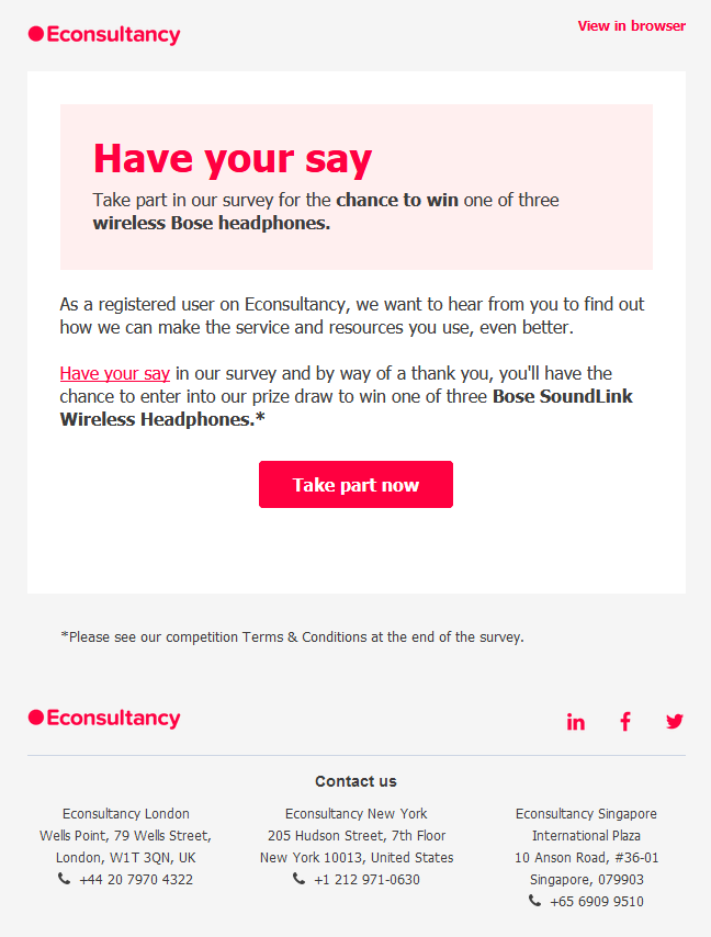
There are a number of instances when the users cannot view the images included in the email. This is because the email clients turn off the images at times. In order to make sure that all your subscribers are able to view the live email along with the visual elements, you should always have the “View in Browser” link in the email.
Econsultancy sends the perfectly designed professional template with a clear “View in Browser” link right at the top.
7. Clearly convey the purpose of the email
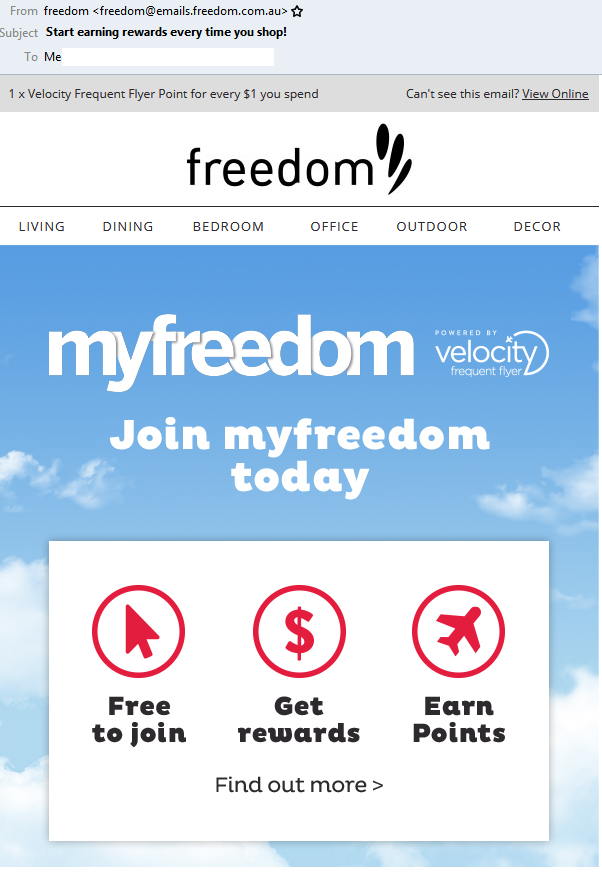
If you want your email to reflect professionalism, you should keep in mind that it should clearly convey the purpose of the email. Whether the objective is to educate the subscriber or generate sales, it should be powerfully communicated to the email recipients.
Freedom sends an email to convince the subscribers to join myfreedom and earn rewards every time they shop. The subject line, preheader text, the email copy as well as CTA – all are completely in sync with the purpose of the email.
8. Design the emails with 3 columns at the most
Keep your email designs uncluttered by limiting the number of columns to maximum of 2 to 3. This will impart a minimalistic look to the email and draw attention to its important parts.
9. Use typography that matches your brand personality and email purpose
Typography can call attention to a particular message in the email and lay emphasis on it. According to your industry and brand personality, you should choose the right typography that best suits you. For instance, Travelocity has incorporated fancy typography to give prominence to the message of “WISE” stays.

10. Always test your emails
Before deploying the emails, you should always test the emails on different devices and email clients so that there are no rendering issues. Other than that, you should check how the email will be perceived by your target audience. “Does it look professional enough to compel the user to take action?” – That’s the question you should ask yourself before hitting the ‘Send’ button.
Bonus Tip
Monitor the metrics of your email campaigns, namely open rate, click-through rate, and bounce rate. Based on this data, you can deduce whether your emails are working or not. If you are not getting results as expected, you should think of refining the copy or design according to the performance report.
Wrapping Up
The key to successful email marketing is creating a well-designed email template that looks professional and brings you the desired results – conversions or signups for the free trials. These tips will definitely help you with the same.
If you still have questions, you can surely get in touch with us and we would love to help you out. You can also share your views in the comments below.
Digital & Social Articles on Business 2 Community
(55)


