How can you develop and maintain a clear, sustainable website labeling system? Columnist Shari Thurow shares her tips and best practices.

One of the key components of a website’s information architecture (IA) is an effective nomenclature or labeling system. According to Wikipedia, a nomenclature is a system of names or terms, or the rules for forming these terms.
In website design and development, there are essentially three different types of labels:
- Document labels
- Content labels
- Navigation labels
All three of these labels are important to both users and technology. A label can communicate to users what content is about. A label can be used to describe a section of a website. And a label can also convey information scent. The scent of information addresses the following questions:
- Where can I go? (clear navigation)
- Where am I now? (orientation)
- Can I tell that I have arrived at my destination? (arrival)
- How can I get to the destination that has my desired content? (route selection)
- Should I click on this link? (content value)
As a search engine optimizer, I know that a website’s labeling system should contain keywords. And as a usability/UX professional, I understand that a website’s labeling system should also use the users’ language. As an information architect, I understand that the labels should support a website’s taxonomy. And, most importantly, as a website visitor, I need to understand the meaning of all labels.
What follows are some general guidelines and best practices for creating and maintaining a clear, sustainable website labeling system.
Document Labels
A webpage is a document. So is a graphic image and a video. A JavaScript file is a document, as is a style sheet. Each document serves a purpose on a website. A document label should communicate what each document is about.
Some document labels include:
- URL
- File name
- Titles
One document labeling system that is important to both users and technology is a website’s URL structure. The abbreviation URL stands for Uniform Resource Locator, and is used to specify addresses on the World Wide Web.
In an ideal situation, a file name within a Web address can provide useful information about the document being viewed, and whether the document is text-based or graphic-based. For example, what do you believe is the content of this URL?
http://www.cancer.gov/images/cdr/live/CDR579033-750.jpg
I believe this is a graphic image on the U.S. National Cancer Institute’s website. The domain, cancer.gov, is the label for the website. The file extension, .jpg, tells me that this Web document might be a graphic image — either a photo or diagram. (The fact that it’s in the images directory confirms this supposition.) As for the content in this diagram? I don’t know what it is. Neither do search engines. Neither do site visitors.
What if the URL structure were changed to the following:
http://www.cancer.gov/images/skin-anatomy-closeup.jpg
This URL has more meaning to both humans and technology. If this image is used on any page of the National Cancer Institute’s website, both technology and users can easily determine: a) what this image is, and b) its context on a webpage.
Unfortunately, some website owners have little control over a site’s URL structure. This labeling system is often left in the hands of a technical team, who might not know or understand users’ language — or the URL structure is software-generated, which often leads to odd labels such as CDR579033.jpg.
Here are some quick URL guidelines that can make your document labels clearer to both users and technology. URLs should:
- Be short but descriptive. URLs should be easy to type and to remember. Or, with mobile, URLs should be easy to text and to remember.
- Contain important, relevant keywords. Keywords aren’t dead. Keywords will be dead when humans stop communicating with and using words. If your webpage’s topic is focused on marketing tips, then use the words marketing and tips in the URL or file name.
- Make sense to human users. Minimize the use of jargon and unfamiliar abbreviations/acronyms in a URL structure. If the number of characters in a URL is an issue, it’s OK to use an abbreviation. Just make sure that you spell out the meaning of the abbreviation in content and the meta-tag description.
- Use few or no “funky” characters. In geek speak, this means to minimize the number of dynamic parameters in the URL. Even though search engines can crawl URLs with &, ?, =, %, + in them, it’s still best to minimize their usage whenever possible.
- Use hyphens, not underscores, as word separators. Search engine optimization (SEO) professionals have known this for years. But just in case you need citations, here is a post from Matt Cutts’ blog (Dashes vs. Underscores) and a YouTube video (Underscores vs. Dashes in URLs).
- Closely match titles. I generally don’t recommend that a URL contain an exact title. Minimizing or removing stop words (and, the, a, an, of, but, nor, for, etc.) from the title can make the URL concise and descriptive.
- Not be keyword stuffed. Keyword repetition is usually unnecessary in a URL.
Document titles are also important for overall online findability. In a text-based document such as a webpage or PDF, the title is critical. Even though Google will sometimes change a page title in search listings, don’t be discouraged. Write unique page titles that accurately describe content.
Please note that the document title and the meta-tag title are not the same item on a webpage. A webpage title is coded like the following:
<title>Page title here</title >
The meta-tag title is coded like the following:
<meta name=”title” content=”Page title here. /”>
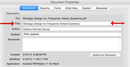
Search engines use the page title, not the meta-tag title, to determine relevancy of webpages. For a PDF, I recommend writing a meta-tag title, as shown in Figure 1 below:

Figure 1: Write unique titles for each PDF and reinforce the document title within the PDF’s content.
As for non-text documents such as videos and graphic images, search engines don’t always use the meta-tag title to determine relevancy. However, I do recommend adding them. I would rather be proactive about implementing consistent labels rather than having to relabel 10,000+ items.
Content Labels
Content labels are very useful because of the support scannability, especially if a webpage’s content requires scrolling. Content labels include:
- Headings (or headlines)
- Subheadings
- Taglines
- Image headings and captions
- Video headings and captions
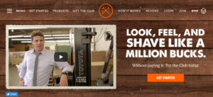
When people view a webpage, they often scan a page’s headline (which should be formatted as an H1 whenever possible) and supporting tagline. Sometimes, a catchy headline might not contain important keywords. One solution is to make sure the following tagline contains those words, as shown in Figure 2 below (from my website):

Figure 2: Both headlines and taglines can be a part of a website’s nomenclature.
Additionally, if a video or graphic image is relevant to page content, I often find that users’ eyes naturally go to this area of a page. I observed this occurrence for many years on printed newspapers as well as online content. In fact, I have a friend whose newspaper job is to write headlines and captions. Headings and captions are important labels for many reasons.
A slideshow is a prime example of an image heading and caption, as shown in this screenshot from a recipe site below:

Figure 3: Slideshow with image, image heading, and caption. Including a relevant link directly to the recipe is a smart decision.
One place I like to do keyword research for image captions and headings is on stock photography websites. People describe photos and diagrams in different ways. These sites can help me understand user mental models and verbiage.
Many site owners and content writers might not realize that they create and maintain content labels on a site. In fact, I highly recommend creating and maintaining a copywriting guide as well as a style guide for all websites.
Navigation Labels
Navigation labels should communicate both content aboutness and information scent. As I wrote at the beginning of the article, information scent should communicate:
- Where can I go? (clear navigation)
- Where am I now? (orientation)
- Can I tell that I have arrived at my destination? (arrival)
- How can I get to the destination that has my desired content? (route selection)
- Should I click on this link? (content value)
Navigation systems and labels should provide “you are here” cues. One way I do this is to eliminate the content to see if the designers/developers have included an “on” or “active” state on navigation elements on multiple levels, as shown in Figure 4 below:

Figure 4: Active navigation in the global and local navigation system on a website.
Figure 4 shows navigation labels from a manufacturing website. Though I am not a person in this site’s target audience, I am reasonably sure that I am viewing the Services section of the site and specifically on a Barrel Tumbling page.
I do not know what barrel tumbling is. However, the target audience does because the website owner used a number of different resources to determine the best navigation and content labels, including but not limited to:
- Client interviews
- Search logs
- Web analytics data
- Keyword research data
- User research and vernacular
- Existing taxonomies
One way I ensure that users understand navigation labels is to conduct a closed card-sort test or a tree test. A closed card-sort test is a validative usability test in which users/searchers are presented with pre-labeled categories and a list of items. Test participants are then asked to place each item underneath one of the categories, the one that they feel is the most appropriate.
Below is a simplified version of a closed card-sort test. Test participants are asked to move items in the far-left column into pre-determined categories.

Figure 5: A closed card-sort test or a tree test can help you determine if your navigation labels communicate clearly to users.
Ultimately, the goal of effective website labels is communication and conversions. An effective labeling system will help your target audience locate and discover desirable content on your website.
Do you have any nomenclature tips you’d add to this list? Please let us know in the comments below.
Some opinions expressed in this article may be those of a guest author and not necessarily Marketing Land. Staff authors are listed here.
(Some images used under license from Shutterstock.com.)
Marketing Land – Internet Marketing News, Strategies & Tips
(229)
Report Post


