Instagram isn’t only popular among sighted users. There are many legally blind people with active Instagram accounts. In fact, according to the Royal National Institute of Blind People, 93% of blind people have some level of partial vision.
When you also include deaf users – images are silent after all – the number of disabled people who may be accessing your Instagram content may be higher than you think.
That’s why the accessibility of your posts is so immensely important – even if the impact on you may be nothing at all.
The following tips and advice can help you to develop processes and plan your visual content so that all of your followers – whatever their situation – can enjoy your Instagram account.
1. Add alt text to ALL images you post
The term “alt text” has connotations of code, particularly meta information such as tags, which is why they’re still commonly confused with alt tags (not the same thing). And because many content creators see code as someone else’s job, alt text is often overlooked during content creation and distribution, particularly in social media.
Alt text is really the name for the HTML attribute that contains the text forming the image description. This allows a browser to display the image description should the image fail to load. Screen readers also use the alt text to read out the image description to blind users.
So, what we’re really talking about is the image description, not the code that contains it.
Instagram has allowed users to write and add their own alt text to their images for a few years now – but not everyone knows how.
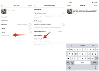
- When creating a new post, go into Advanced Settings where you’ll find the Accessibility features.
- Select “Write alt text” and type in your image description.

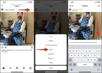
- To add image descriptions to an existing Instagram post, bring up the menu on the post and select Edit.
- On the Edit info screen, select the option to Edit Alt Text, in the bottom right of your image.

“But Instagram automatically makes my images accessible, doesn’t it?”
Yes, and no.
Instagram does auto-generate alt text for images where none exists. However, auto-generated alt text isn’t about saving you time by doing your alt text for you. It’s a safety net for Instagram’s many blind users to retain at least some of the experience when confronted with a feed full of inaccessible images.
And while any alt text is probably better than none, the results aren’t exactly brilliant.
Take this example from Instagram.

Cute photo.
However, for anyone accessing the post on a screen reader, the auto-generated alt-text delivers:
“Photo by Louise Page on April 18, 2021. May be an image of one or more people, people standing, outdoors and the Tower of London.”
Much of the important information and context is lost.
- The two people are actually knitted dolls.
- More importantly, the two dolls are recognisably the Queen and Prince Phillip.
- The building behind them isn’t Tower of London but an entrance to Windsor Castle – which is where Prince Phillip’s funeral was held.
Instagram’s AI missed everything that was important in the photo and got all of the other details wrong – except that the photo was outside, which is hardly the point, I’m sure you’ll agree.
For the record, the alt text on the above image reads, “Screenshot of an Instagram post depicting two knitted dolls of the Queen and Prince Phillip outside Windsor Castle.”
2. Manually write your image descriptions
A great image description isn’t about SEO keywords or basic identifiers (“A man with a dog”). It’s about giving your blind or partially sighted users as close to the same experience as your sighted followers.
Writing great image descriptions can take practice, which is why they should be included as an essential part of the content creation process.
- Avoid non-visual information that a sighted user couldn’t tell from looking at the image. If the image is from a movie, that would be recognisable, but you can’t tell from a product photo whether the item is “great value”.
- Write in complete sentences so that the description is easily understood when read out.
- Be evocative. If the image is intended to create an emotional response in the viewer, the image description should too.
- Try to stay under 125 characters.
- Don’t be spammy by stuffing your alt text full of keywords or self-serving sales copy.
“Focus on the key details. What do you want the screen reader user to understand about your image? How is it relevant to the rest of your content? What information are you trying to convey?”
Alexa Heinrich, social media strategist and digital accessibility advocate
3. Add subtitles or captions to all videos, including Reels
Captions don’t only make your videos more accessible to deaf people, many other followers may be more likely to watch if they don’t need to turn the audio up. According to Biteable, 64% of marketers say their captioned videos perform better.
- When uploading longer videos to IGTV, you can add auto-generated captions by accessing the advanced settings, which are reasonably accurate.
- For shorter IGTV videos, you may prefer to add your own captions for improved accuracy and to control how they appear on the video. This also means your video is accessible if you publish it to other platforms.
- Auto-generated captions aren’t currently available for Reels. You’ll need to manually create your captions and add them to your video as part of the production process.
4. Keep emojis to a minimum
Every emoji also has a descriptive name, which is what a screen reader will read out – and some of them can be quite long, particularly if you use emojis with skin tone variations.
Apologies in advance to anyone accessing this article with a screen reader but here’s an example.
Imagine you want to share your excitement that it’s Friday once more. You might post something like:
TGIF!! 


While this post might be a couple of seconds of fun for your sighted followers, those accessing your post on a screen reader will have a very different experience, as it reads out: “TGIF. Grinning face with big eyes, clinking beer mugs, clinking beer mugs, party popper, man with medium skin tone dancing, hamburger, French fries, oncoming taxi.”
- Use emojis sparingly – and with purpose.
- While emoji skin tones are great for racial inclusivity, as far as accessibility goes, it may be better to avoid them when specifying a skin tone isn’t necessary.
- Leave any emojis to the end of your post so they don’t interrupt or delay the main text for screen reader users.
“It used to be really annoying when people overused emojis. The screen reader would say, ‘Smiley face, smiley face, smiley face,’ over and over. A lot of screen readers have changed this now, so it will say, ‘20 smiley faces’, which isn’t so bad. It’s still better to use emojis at the end of a post.”
Alex Man – Assistive Technology Officer, Royal Blind Society for Children
5. Be careful with your hashtags
Hashtags are essential if you want your content to be easily discovered by the right people. However, they can still cause confusion for blind users with screen readers.
- Always use camel case – signposting the start of each word in the hashtag with a capital letter, as in #SocialMedia – so that screen readers can separate and pronounce the words correctly.
- Dropping hashtags into the main text of a post can save characters and reduce repetition, but the sentence can sound disjointed and confusing on a screen reader. Ideally, leave hashtags to the end of the post.
- While sighted users can easily skip a long list of hashtags, screen reader users aren’t so lucky. And when a post has more hashtags than words, the experience can be frustrating. Only add the two or three most relevant or popular hashtags to each post.
6. Avoid animated gifs
Blinking, flashing or otherwise eye-catching animations and GIF stickers are popular with many Instagram users as they help to attract attention. However, some people are sensitive to such effects, and can even suffer seizures.
As a result, some users may block animated GIFs from playing by default, while blind users may be confused by the experience without a lot of additional information to make sense of the GIF – particularly if the GIF is a meme requiring a lot of additional context.
- Consider whether your post will still make sense and seem complete to anyone unable to see the GIF.
- When creating your own gifs, set them to stop looping after no more than five seconds.
- Test any animations or GIFs for seizure risks with the Photosensitive Epilepsy Analysis Tool (PEAT)
- If you do post a GIF to Instagram, you’ll still need to add alt text as with any other image.
Build accessibility into your content creation processes
Instead of leaving it to whomever publishes the post to come up with an appropriate image description at the last minute, include alt text as one of the agreed copy deliverables.
Similarly, prepare your captions and/or transcript at the same time as the video.
By embedding accessibility into your content creation from the start, there’s less risk of you needing to correct or compromise the content to make it accessible before it can be published.
Digital & Social Articles on Business 2 Community
(64)
Report Post


