— August 1, 2017
This post began life as “Send Better Email.”
Then it started to veer off to: “Send Whatever Email You Like But Make Sure Your Audience Is Already Engaged and You Have a Killer Asset, Topic or Event on Offer.”
Because no matter how sexy or trendy your creative, how strong your CTA, how well a GIF may play, or how many partner logos you flash in your footer, success usually boils down to “What’s in this for me and why should I care?” moments for users.
Right, let’s save that thought for another day.
Back on point, I have more than a billion sends under my email marketing belt, and now work with a team that created the mobile-first email solution trusted by the world’s biggest brands. So, I thought it was time to share engaging advice to help fellow marketers send not just better but killer emails that get noticed.
Delight Your Audience
Enjoying their moment in the marketing sun, emojis are already the lingua franca of text and social.
These those lovable little icons are making a big impact in email and mobile marketing channels like push notifications, where they dramatically increase open rates.
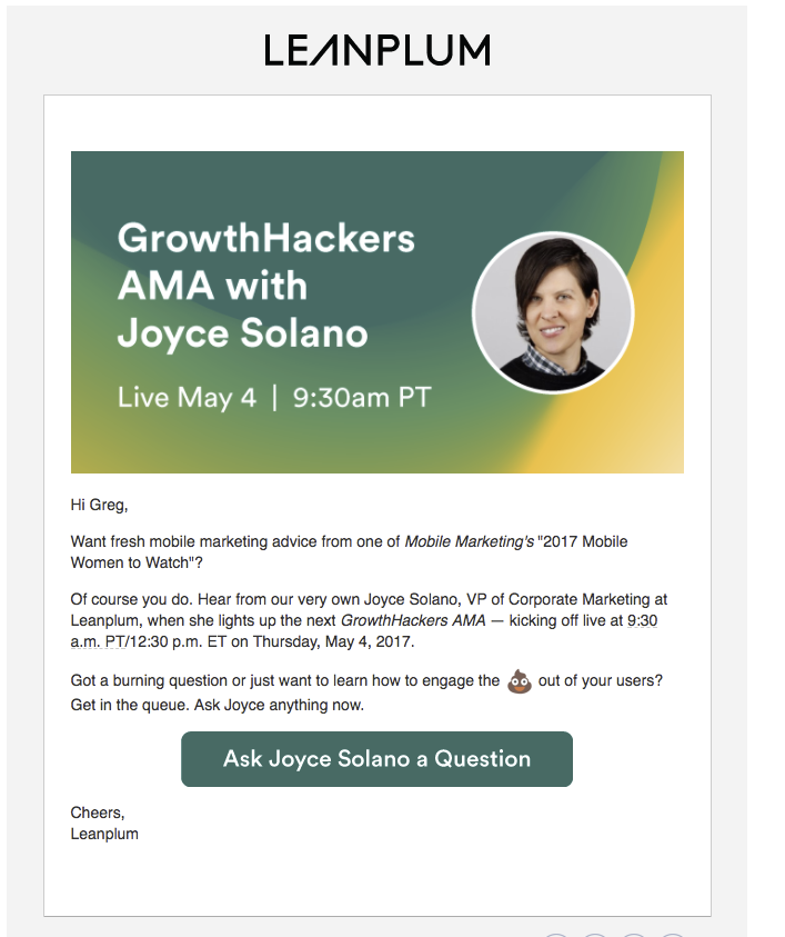
Used judiciously in subject lines or email body copy, we’ve found they can impress the  out of users, as our friend Hankey did in this recent email we deployed.

Think Mobile First
Everything’s gotta be perfect, right? In the past, I’ve spent an inordinate amount of email QA time pruning headlines and body copy to weed out annoying widows, orphans, and bad line breaks.
But when more than half of email is now opened on mobile (Litmus ”State of Email” | March 2017), it’s better to spend your daily life force making sure your content shines on a small screen rather than desktop. Which means shorter copy, fewer paragraphs, simpler graphics — line breaks be damned. You simply you can’t control the experience across every platform or configuration.
Viewed on desktop, the guts of a relatively “short email” are often viewable entirely at a glance in the email pane. Viewed on mobile, the same creative may require a scroll or two to see your CTA button.
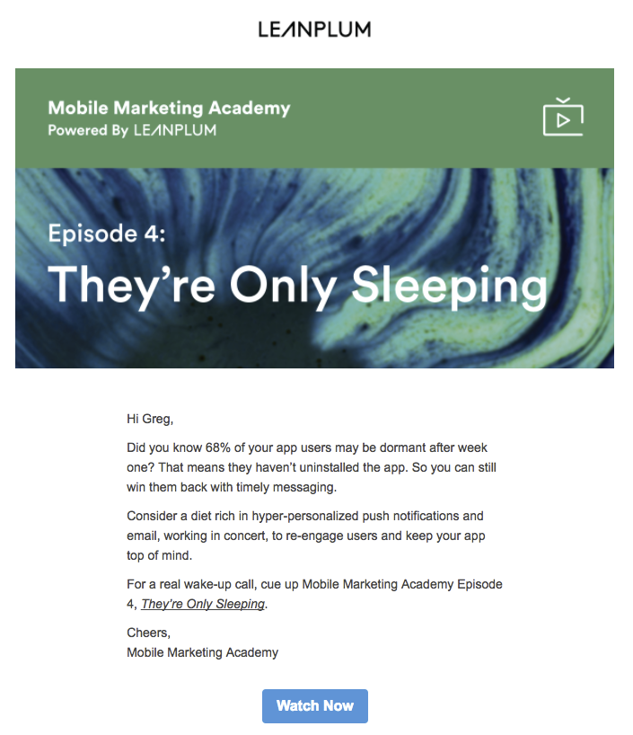
On desktop
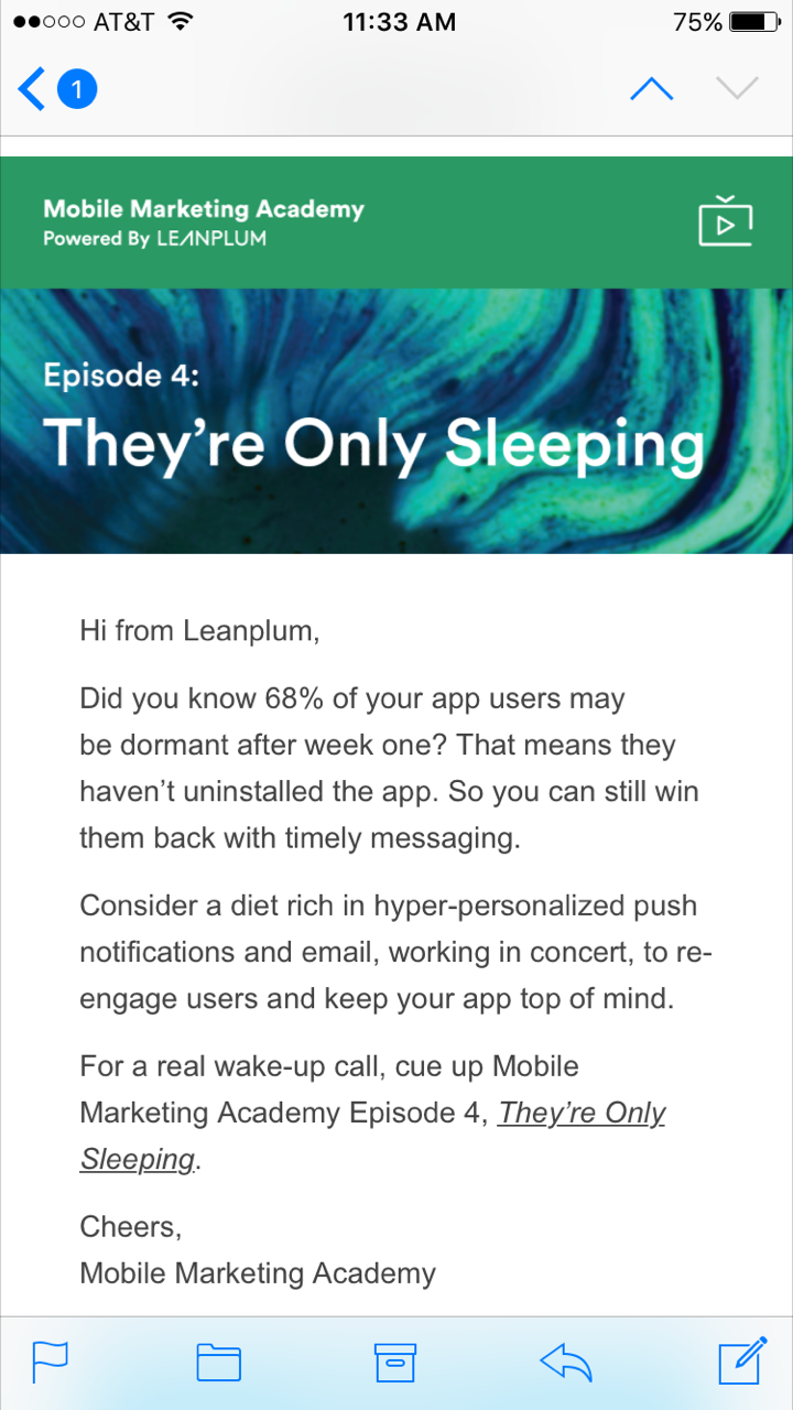
Same message on mobile
If you don’t employ an email testing program like Litmus, get in the habit of sending yourself and colleagues tests on various mobile devices for a mobile reality check.
Push the Right Buttons With Your Subject Line
To me, the subject line is part and parcel of your email.
But one email marketer’s provocative opener is another user’s turn-off. That’s why every campaign I queue up to more than 1,000 recipients gets an A/B/C/D test, usually a mix of approaches, like this from a recent webinar campaign, ranked in order of their success:
- Short and sweet 1: How Pinterest does mobile right
- User name personalized and tokenized: {{lead.First Name:default=Hi}}, pin this Pinterest webinar on your calendar
- Short and sweet 2: Mobile growth secrets from Pinterest
- Just the basics: [Webinar, 7/26] Ideas Worth Pinning: Mobile Growth Strategies From Pinterest
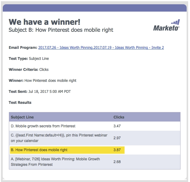
Whatever your winner criteria metric (clicks, opens, click-to-open), my recommendation is to always include a straightforward control subject line, especially for webinars or events. Simply listing the date and title may seem boring AF, especially without a call to action, but many recipients respond to the basics. More often than not, they trump provocative or abstract come-ons (“Don’t be late to the party!”) that may drive more opens but relatively few clicks. No doubt because users don’t make a connection with the promise or boast of the subject line.
Borrow From the Best
Recently, I gave an email presentation to our in-house Sales Development Representative team. To illustrate general best practices, I marked up a promo from Marketo with everything I loved about it.
From subject line to CTA, there was no mistaking what the email and call to action were all about, a textbook case of design and copy in sync with the promise of the subject line.
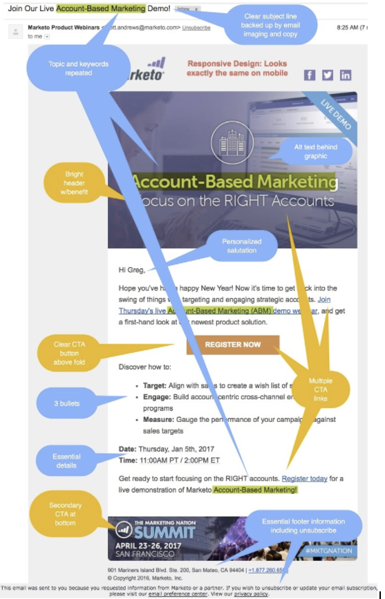
Draw inspiration from campaigns hitting your inbox that made you go “Ah, yes!” then forward to colleagues with a “We should do this!” in your subject line.
Use a Preheader
One of my favorite underutilized techniques to catch scanning eyes perusing the inbox is the email preheader. It’s a snippet of text that comes right after the subject line, a short summary helping amplify it.
Many mobile, desktop, and web clients provide a preheader to “tip you off on what the email contains before you open it,” notes Campaign Monitor. Think of it as a prescreening tool for time-crunched recipients.
I used the preheader in the examples below as combination CTAs + benefits for the subject lines, which were rather long because we were introducing a new series of video lessons.
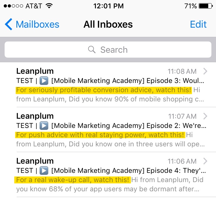
Caution: Leaving the pre-header blank means the first plain text in your email, whether it’s a piece of Alt Text (e.g., “pretty.image.header.jpg”) or generic template copy (“View this email in a browser.”) will take its place, wasting the real estate.
Why You Should Work Email Into Mobile Marketing
As texting and snapchatting rule the modern world more and more, email in general is in danger of becoming passe. But for mobile marketers, it can be an old-school secret weapon to win app users’ hearts and minds.
Why?
Well, traditional web-centric email lacks user intelligence, fails to incorporate mobile app behavior, can’t access real-time location, and doesn’t orchestrate well with other mobile channels. That’s why Leanplum has built email for the mobile era. We help mobile teams overcome common challenges, like siloed data sources and multiple vendors, to understand how email impacts downstream behaviors and conversions.
All this makes good old email the ideal channel to reach and engage app users who opt-out from push notifications, abandon items in their mobile carts, or go dormant.
Ready to hit send?
Digital & Social Articles on Business 2 Community
(123)
Report Post
