Marketers spend billions of dollars and thousands of hours each year developing compelling content, search-optimizing websites and blogs, fine-tuning their ad targeting, and engaging with influencers and prospects on social media.
While these activities serve a number of purposes—establishing thought leadership, expanding brand awareness, improving customer retention—lead generation remains the top goal.
 So once you’ve attracted a prospective customer to your website, you’d really like them to convert into a (potential at least) lead by completing some sort of call to action: downloading a white paper or report, registering for a webinar, subscribing to your newsletter, signing up for a free trial, asking for an online demo, or some other goal.
To maximize the odds that will happen, you need to build the perfect lead generation form.
Well…okay, creating the “perfect” lead gen form may be a tall order. But building a better lead gen form is eminently doable. Where should you start?
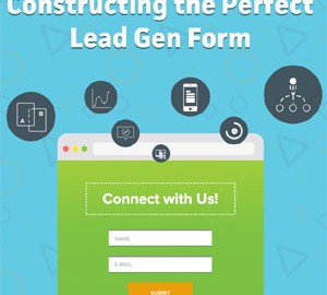
The infographic below, from Formstack, provides several helpful tips and best practices, among them:
- • Keep it short! Ask only for essential, basic information. You can earn the right to ask for more details later in the lead nurturing process.
- • Position forms above the fold, and on the right side of the screen; forms on the right side of the page generate 24% more leads.
- • Use attention-grabbing colors, like blue, green, and orange.
- • Optimize for mobile users: incorporate mobile-friendly features like simple-select buttons and drop-down lists.
- • Test everything! Colors, form length, copy, headlines, and images. Form A/B testing alone can boost conversions by up to 25%.
Check out this infographic for more ideas.

Digital & Social Articles on Business 2 Community
(152)
Report Post