“Get rid of half the words on each page, then get rid of half of what’s left”– Steve Krug.
I’m a huge fan of this quote by Steve Krug because it’s a great lesson in minimalism and staying focused on the user experience. Both, writers and SEOs, get caught up in stuffing as much detail as possible (500-word article mandates, anyone?) into their content without realizing that the customer does not have the time, interest or patience to sit through cascading walls of text.
Today, I want you to internalize this thought: customers and customer experience first. People who have clicked on your ad to reach your landing page are looking for very specific information.
And here’s the harsh, cold truth: if people have trouble finding what they need on your site, they’re going to bounce off the page before you can blink; which translates to a lot of money washed down the drain.
Therefore, if you’re going to pour money, time and effort into designing a PPC campaign, you need to design a landing page that’s going to get you conversions.
And how do you get those conversions? Well. I thought you’d never ask.
Step 1: Allocate Your Resources
I’m serious. Before you get started, get planning. Figure out which teams need to be involved in designing a particular landing page, sit them down in one room and brief them about the purpose of the project or landing page. You’ll save yourself a lot of grief if everyone involved is on the same page right from the beginning.
Step 2: Begin Your First Drafts
Here’s the checklist:
- Wireframes?
Someone’s got to figure out how the content is going to be designed, placed and laid out.
- Content required?
Think about what you want to say and how you’re going to say it. Ideally, your landing page content should have the following areas covered:
- Copy – Keep it crisp and to the point.
- Images¬– High resolution and relevant images. For example, great head-shots of a panel of judges, if you’re running a contest.
- Testimonials – Please keep these real and authentic and make sure they don’t sound like a marketing pitch.
Videos/Product/Service Demos, if possible.
- Lead formwith a clear and precise call to action. CTAs like “Enquire”, “Submit” and “Call Now” just don’t cut it anymore. Base your CTA on the outcome you want from your customers. Remember: long CTAs are acceptable.
- Copy – Keep it crisp and to the point.
- Supporting Ad Banners and Copy
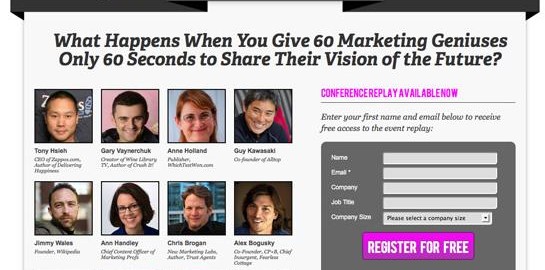
Cool Stuff: What makes a great landing page? Here’s a brilliant example created by Future of Marketing:

Pro-Tip: There’s a good reason why first drafts were never meant to make it out the front door. After you’ve penned everything down, go back and throw away half of it, and then throw away half of the remainder, as Steve Krug said. You’ll be left with the bare essentials and that’s exactly what your landing page needs.
Step 3: Last Minute Checks
Once your design and content have been through the first draft, stop for a moment or walk away for a while. When you come back to the landing page, ask yourself these questions:-
- Are the ads communicating your brand values and/or guidelines?
- Do the ads match the content on the landing page?
- Benefits vs. Features – Instead of highlighting what your service does, tell the customer how your product or service is beneficial for their needs.
- Have you communicated your product/service/campaign USPs?
- Can you offer product demos? If you can, have they been included on the landing page?
If you can’t answer any of these questions with confidence, well, then you know what you have to do. Rinse and repeat until you get it right.
Pro-Tip: Don’t forget about the A/B testing! Walk the extra mile to have to prototypes of your ads and landing pages developed and run A/B tests to gauge their performance. A/B testing generates valuable data and insights that make your campaigns run more efficiently as you move along.
Step 4: Shareability
Add your social sharing buttons to the page to make it easier for people to share your content. Whether your content will be shared is a fleeting decision made at your customer’s end – you want to make it as easy as possible for them to tell people about what you have to offer.
Pro-Tip: Place your social-sharing buttons and CTAs above the fold to ensure higher views and engagement rates.
And there you have it. That’s how you develop great landing pages with content that works.
How have you done it?
(151)
Report Post


