If you feel stuck in a rut with your website design, then it’s time to consider ways to look at it through a different lens. Website design is about more than choosing the right color scheme and font; you also need to create an aesthetic experience that matches your branding.
When visitors come to your website, you need to establish who you are as a brand and what your purpose is. That’s difficult to do if you don’t have a clear vision of what your brand is about.
Where do you start? How do you know where to look for inspiration or how to add those elements to your design? And what elements can you add to enhance your brand and show users its purpose?
If you want to get creative with your website design, here are three tips to get started.
Be Open to Feedback
An important part of ecommerce is the feedback it receives from its customers. If there are gaps in your sales funnel, it’ll hurt your conversions and slow down your growth. Customer feedback gives you valuable insight you can use to improve your current strategy.
Surveys are a great way to find out what your visitors think about your web design. Around 75 percent of users say they’re willing to answer 1 to 5 survey questions, which gives you plenty of room to ask the right questions.
Your survey might include questions like:
- What made you want to stick around?
- What made you want to exit the page?
- Where would you put the navigation menu?
- Which color scheme do you prefer?
It’s okay to ask around for as much feedback as necessary. Ask family and friends what the user experience is like on your website. You can also enlist a professional designer’s help to give you tips and tricks that enhance your site’s look and appeal to your target market.
Experiment with Color
Ecommerce websites see a 35 percent increase in conversion rates with an optimized design, and that includes their color scheme. The colors on your site drastically change its look and feel, which need to match your audience’s taste.
Depending on the colors you choose, you can convey different messages relevant to your audience. Do you want a soft, sultry vibe with pastel tones? Or would you rather keep it simple with beiges and tans?
The possibilities for your site’s color palette are endless. What’s important is that the colors mesh well together and aren’t difficult to look at on a screen. The last thing you want is for users to bounce from your site because they can’t read the text or the colors are obnoxious.
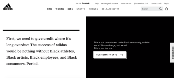
Adidas is widely known for its simple black and white color scheme which is incorporated into its homepage:

If you aren’t sure what colors to choose for your site, don’t be afraid to experiment. You may end up finding you like a color combination you didn’t think you would but actually goes well with your brand image. From there, you can then incorporate those details into your marketing campaigns.
Add Visual Elements
A great way to spice up your design is by adding visual elements. They break the monotony of text and give viewers a break from reading. Studies show that people can recall 65 percent of visual content as long as three days after seeing it, which means it can also make your website more memorable.
Visual elements you can add to your website include:
- Videos
- Images
- Graphics
Your visual components should also align with your branding so it’s easy for visitors old and new to understand your business better. It’s confusing to see different colors, logos, and patterns representing your brand. Make sure your website, email, and social media all follow the same branding guidelines to avoid confusion with potential customers.
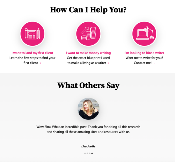
This homepage uses both graphic design and customer images in their design:

Over to You
It may seem daunting to design your website so it speaks to your visitors and encourages them to turn into paying customers. But it doesn’t have to be challenging to create a visually-appealing site you’re proud of.
When you run a business, you need to ensure every element on your site matches your customers’ taste so it speaks to them. That way, you can reach your goals and do so with loyal consumers in tow. How will you get creative with your website’s design?
Digital & Social Articles on Business 2 Community
(33)
Report Post


