— August 24, 2018
With number of emails being sent and received every day reaching a whopping figure of 269 billion, it is imperative for businesses to understand the importance and potential of email marketing. Consequently, this is the reason marketers in the United States alone are predicted to spend a huge 3.07 billion dollars on email marketing in 2019, which was 2.07 billion USD in 2014.
So, you see how marketers across the globe are already leveraging this most preferred marketing channel – from creating awareness to grabbing the attention of the prospects and ultimately converting them into customers, email marketing does it all. In fact, it works a great deal in improving your brand’s recognition too.
This, in turn, helps the customers identify your brand through its features and enhances your chances of attracting them. In fact, an engaged user might even click through your CTA (which you strongly want) and land on your website. And this transition can work wonders for your business if you leverage it the right way. In this context, the first and foremost step is to give your prospects a consistent branding experience everywhere.
Hence, make sure to design your email campaign in a way that it aligns with your website and brand guidelines. It wouldn’t only avoid any confusion among your subscribers but, also help you garner their trust and build confidence as they click through your email campaign to your website. Here’s how you can do it:
Keep a check on the layout
Start with designing the layout of your email templates. Make sure to keep a check on it’s fundamental design to give a consistent feel to the prospect throughout their transition from the email to the website. It doesn’t necessarily mean that your email and website layout need to be the replica of each other. You can alter it a little but, without losing the branding consistency.
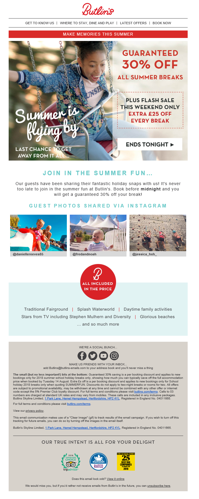
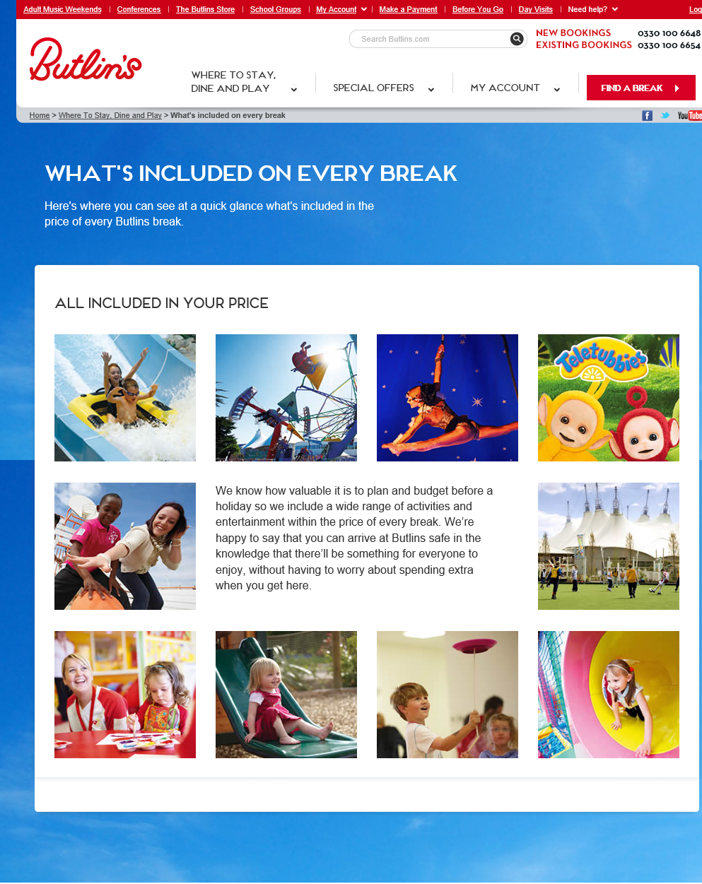
For instance, your website might have a three-column layout. But you can tweak it into a two-column layout in your email. Just make sure the overall feel remains the same. One of the best ways of doing it is by matching the email footer with the website footer. It will not only give a familiar touch to both the channels but, also help the subscriber navigate through your website seamlessly. Take a look how Butlin’s maintains its branding consistency. Here’s their email layout:

And this is how their website layout looks like:

Tips to Align Your Email Marketing with Your Brand Guidelines
1. Include responsive images
Including images in an email serve as a powerful tool in driving subscriber’s engagement. However, every inbox deals with images in a different way. So, there can be situations when your images aren’t displayed properly or don’t load at all. That’s the reason why you need to include responsive images in your email. You can do that by adding alt or HTML tags to your images. In that case, even if the image doesn’t load, the subscriber would get an idea what your image is all about. Also, opt for a browser test of your emails. This will give you a clear insight into how your emails are being displayed across various platforms.
2. Maintain the consistency of design elements
Make sure the design elements present in your email and website are similar and in line with your brand guideline. Remember, when your visuals are consistent on all the channels, it becomes easy for the subscriber to connect with the brand. It saves them from a lot of confusion and misinterpretations. And when everything is so precise and clear, the possibility of their conversion becomes higher. All they need is a smooth experience to convert into a buyer.
3. Make use of similar fonts everywhere
Fonts play a great role in increasing the readability of your email, thereby enhancing the engagement of your email. Therefore, it becomes imperative to choose such a font for your email and website that resembles each other. However, a lot of fonts are not supported on all the platforms. But you can solve this issue by making use of fallback fonts. These are similar looking fonts supported across all the channels. All you need to do is compare the fonts of your email and website and choose a font that is the closest match.
Hope these tips will come handy for giving your subscribers a high-end, consistent branding experience. However, in the quest of aligning your email and brand guidelines, don’t end up goofing up. Make sure your aligning strategy is flawless. If it isn’t so, you might garner a lot of unsubscribes. Hence, to maximize the consistency of your branding experience, here are few mistakes you need to avoid.
Mistakes to Avoid
1. Opting for fonts that are difficult to read
Your subscribers should be able to read the content in your email and website with ease. Also, since people opening emails on smartphones and tablets have doubled up in the past 5 years, it has become imperative to optimize your content for all the devices. And for that, you need to format your fonts on these guidelines.
- Use font size 14 for the body text.
- Don’t use script-like fonts. They are difficult to read.
- Don’t put any text on patterned background.
- Make sure the font color is simple and dark against a light back ground. Lighter font colons can be difficult to visualize while reading.
- The CTAs and buttons should be of brighter and rich color to get easily noticed.
2. Making use of irrelevant images
Remember, relevancy is the key when it comes to email marketing. Same is the case when aligning it with your brand guidelines. Images do grab a subscriber’s attention, but only when they are relevant and strategically placed. So, before incorporating images in your email and website, make sure your majority of subscribers will appreciate and understand it.
3. Doing frequent changes in layouts
If you keep changing the style and layout of your emails, stop doing it right now. These frequent changes are only going to confuse your customers. They won’t recognize your brand and might end up unsubscribing from your list. Hence, no matter how different each of your email campaign is, there are certain features like brand logo, color, contact information etc. that needs to be consistent and recognizable everywhere.
Final thoughts
In a nutshell, to give your subscribers a gratifying experience through your email marketing campaign and avoid any tiff with your boss, aligning it with your brand guideline is the key. Apart from inducing your subscribers with a familiar feel, it will also help them connect with your brand on a personal level. And that’s exactly what you need to nurture leads, drive traffic and encourage conversions. Thus, if you want your brand to become the talk of the town and help you generate revenue, start aligning your email and brand straight away.
Digital & Social Articles on Business 2 Community
(61)
Report Post


