If you’re looking for a tool that can help build long-term customer relationships, there is nothing better than good old email. The opportunity to reach your audience in a place people visit everyday – their inboxes – lets you convert leads into happy customers and maintain engagement.
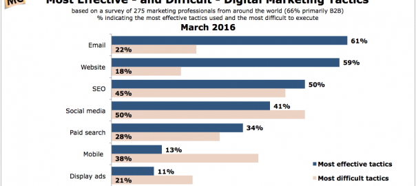
The same is true if you’re a blogger, an event organiser, or you work for a non-profit organisation. Anytime building trust and connecting with users comes first, email marketing is a must-have and forms the backbone of your digital strategy. It is still considered the most effective digital marketing tactic for marketers!
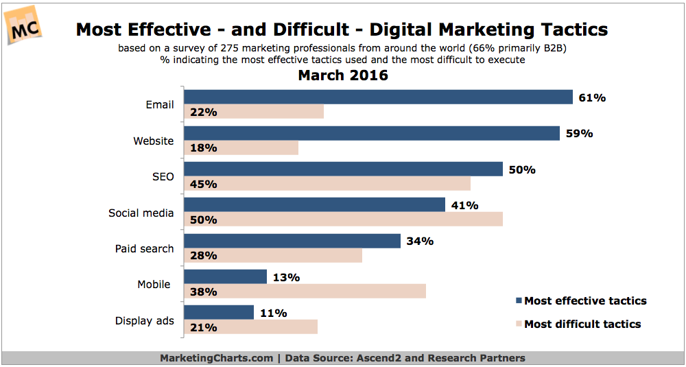
The main reason email is so effective is that it gives people freedom to get what they really signed up for versus random unwanted digital ads or social media posts.
But given the number of commercial emails sent daily, the inbox is a battlefield for your recipients’ attention, and you have to do something to stand out! One way to do so is through visually appealing emails.
Designing Amazing Visually Appealing Emails
As the team at Piktochart always points out: human brains are wired to process visual information 60k times faster than text. While it takes your recipients much more time to go through a plain text email, it takes only a second to process a visual one. This is a huge asset in an overcrowded inbox!
In email marketing, there will always be a debate over whether or not plain text emails are better than HTML emails or the other way around. You should remember that if you’re just sending plaintext, you’re not able to track your email opens, which enables you to track the campaign’s results, and your messages lack visual impact. Email can serve as a medium to introduce and showcase your brand in the best way possible, and compelling visual content is the way to do it.
To make your campaigns stick and resonate with people, make sure to know some email design best practices. Here are few tips I want to share with you so you can delight your recipients with visually stunning emails!

Get inspired by ready-to-use templates
You want to make sure you’ve set up a template that you’re happy with and that’s going to boost your content. Email marketing tools give you a selection of ready-to-use email templates which can save time in the design stage.
You can pick one you like and customise it to your preferences and brand image. Templates consists of different types of content blocks that can be replicated or removed with no problem. Additionally, with responsive FreshMail templates, you don’t need to worry about how your email will display across different devices, and you can provide your customers with a great mobile experience.
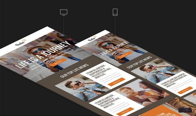
Design a template yourself
If you don’t find anything that really suits your needs, you can always start from scratch and design a template yourself. Templates are made up of blocks in the same way that a wall is made up of bricks. With a drag-and-drop editor in your email system, you don’t need to have any coding skills to design your own project. Simply choose and add blocks to build your template, and customize styles and other elements to suit your preferences.
Think about what you want to accomplish with your template. Consider what kind of and how much information will you be sending out. When you have this in mind, plan a simple and clean template which will present your content in an easily understood way.
Pro tip:
More and more emails are being opened on mobile devices, and the number one rule you should follow is to design for the top 640px of length by three inches of depth.
Half of 640px is 320px, which is a common breakpoint for mobile phones. Tablets require no breakpoints, so your design will act responsively.
Think about your layout
Arrange your template to help your subscribers see the most important things first. Prioritize your content from top to bottom, and always place your key news with a call to action first and above the fold. In email design, this is about 350 pixels high and 650 pixels wide. This area will be visible in most email programs without having to scroll down.
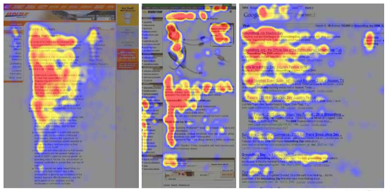
Internet users spend 80% of their time reading above-the-fold content, and Nielsen Norman Group research shows that we follow an “F” pattern when reading internet content, including emails. If your value proposition and CTA is on the top, you can be sure subscribers won’t miss what you have to say.
Other email elements worth placing above the fold include:
- your logo – this will tell your subscriber who the message comes from
- a preview link – a link where a subscriber can preview the message in a browser if the email doesn’t load properly
- compelling graphics – place alt text on every graphic to make sure your message is conveyed just in case the visual elements don’t load in a subscriber’s inbox. Alternative texts can say what is in the message if subscribers don’t see the images.
Make your newsletter template easy on the reader’s eyes. Include lots of white space because it improves the readability of your message and makes content really stand out. This is a golden rule for visual content design which makes graphics appear uncluttered and clean. This and other benefits of using white space are nicely explained in this blog post.
It is also important to balance the amount of text vs. graphics in your email for spam reasons. Many email filters produce a SPAM score based on the ‘graphic to text’ ratio.
Pro tip:
Use message footers to bypass spam filters and successfully land in subscriber inboxes. Balance your image vs. text ratio by placing text-heavy items like your Privacy Policy in your email footer. Anti-spam filters will detect the block of text and will look on it favorably, increasing the reputation of your servers.
Typography – fonts that emails love
A lot of email design is about ensuring that email apps display campaigns properly. When it comes to text, most issues can be fixed by using a safe font, or one that is installed or supported by every device and displayed by every browser in every email service provider. Using a safe font guarantees that your subscribers will see the same text that you designed when you put your newsletter together across multiple devices.
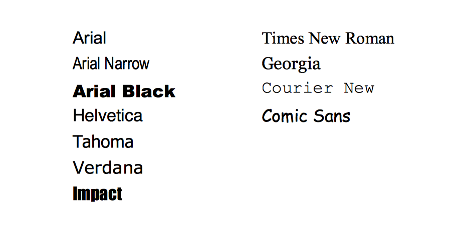
When you want your newsletter to display properly on mobile devices, a good size for section titles is 30px with 22px being an absolute minimum. Text in the body of the message should use at least 14px.
The number one rule when choosing a font is to make your text easy to read. Limit your font choice to 2 or 3 types. A big part of putting together a good design is making sure the overall look is consistent. The FreshMail team wrote an entire blog post on how to choose the right font for your email to match your message style. You can read it here.
Speak with color
The majority of consumers report that color is the most important factor that influences their selection of everyday items. Color plays an important role and can help convey your message.
In your email design, stick with a few colors to make your design look clean. Pick colors that your brand uses on a daily basis or use ones that can help you customize your marketing offer and put readers in the right mood. Let’s say you’re sending a summer newsletter – play with bright colors and introduce a seasonal feeling with sunny yellows or mellow blues associated with the sea.
When deciding on how to pick and match appropriate pairs of colors, follow these rules:
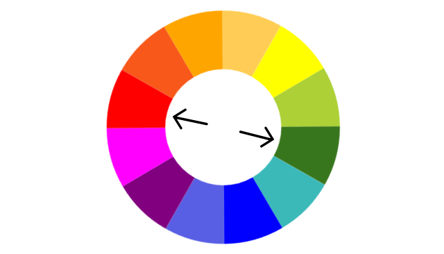
- Complementary colors- This is basic way to pair colors in any design. It’s all about choosing two colors at opposite positions on this wheel.
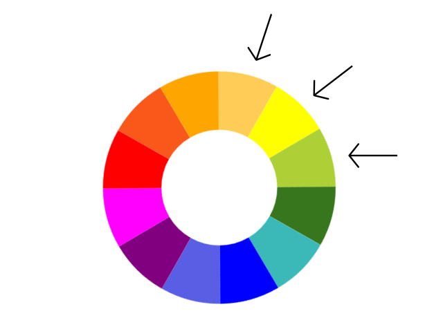
- Analogous colors- Check how close colors are on the color wheel. Colors that are next to each other go well together.
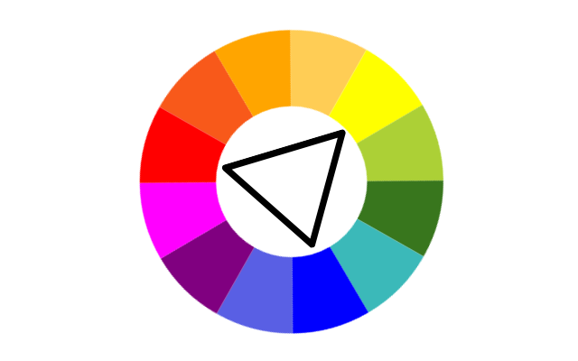
- Triad of colors- Combine three colors, each equidistant from the others.
Don’t send too many messages in one email
Have you ever wondered how many elements an average person can remember at one time? Psychologist Alan Baddeley found that people’s maximum information channel capacity is approximately 2 to 3 bits of information, which corresponds to the ability to distinguish between four and eight alternatives.
Don’t overload your reader with too much information!
Use Alan Baddeley’s insight when putting together your email or newsletter. Your message should contain between 5 and 9 separate pieces. However, if you really need to send more, try to divide your content into categories, where each category consists of no more than 4 items to process.
We follow this practice in our monthly newsletter. The message contains our main news and 3 other headlines to read.
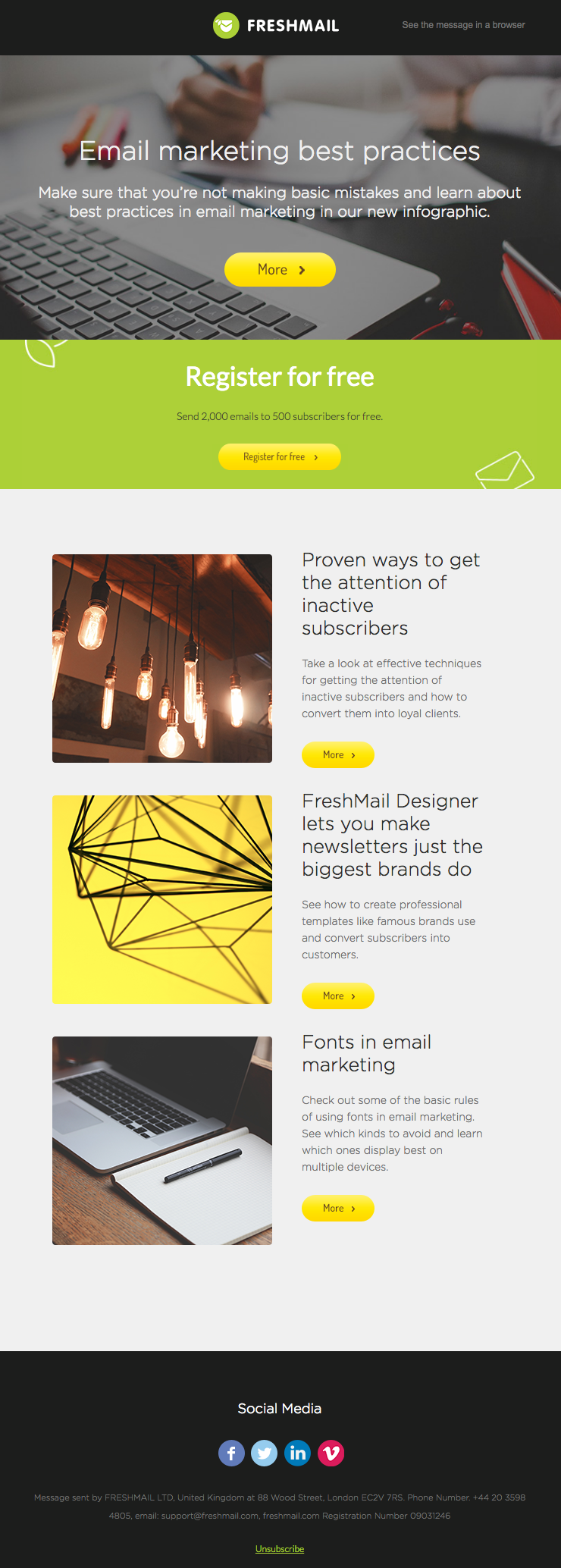
Remember to distinguish your news or categories by clearly defining your sections using dividers or borders and white space. Breaking up your email by subjects with clear subheadings helps your reader scan the message and better understand your content.
Make a statement with compelling visuals
Visual content draws people in, letting subscribers better understand your message. Hubspot conducted a survey and asked more than a thousand professionals whether they preferred HTML-based or text-based emails, and whether they preferred emails that consisted of mostly text or mostly images. Nearly 2/3 opted for HTML and image-based emails.
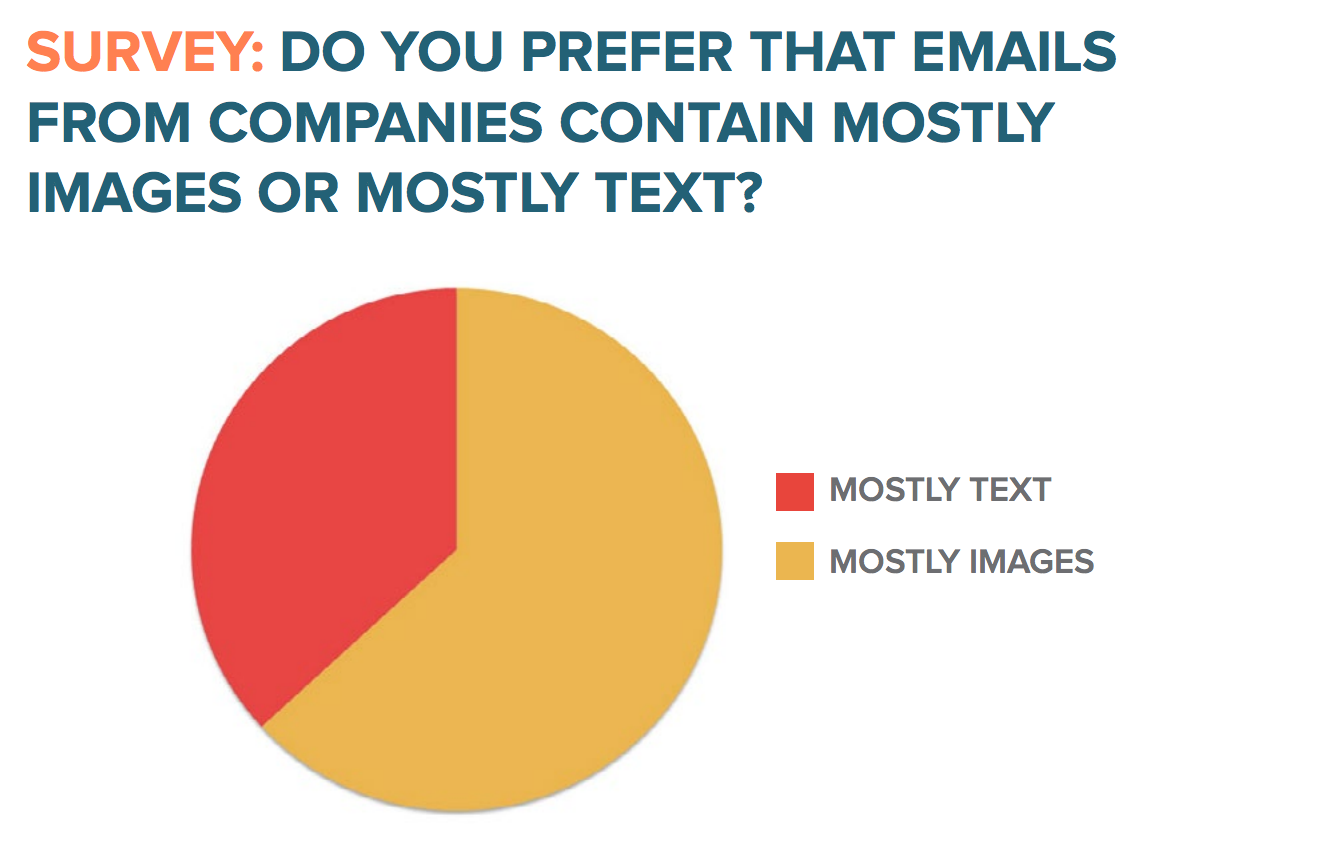
A good picture is worth a thousand words, and visual value is extremely important in any marketing campaign. Most of the time, you don’t need to be a photographer and take the pictures yourself.
Easily purchased online stock photographs and free stock photography resources give endless possibilities for any visuals you might want to include in your newsletter. However, including images in email is challenging. First of all, you have to host them on a web server, then pull them into your email to be downloaded when the message is opened.
When you’re sending graphic emails, remember to:
- Avoid background images layered with text. Many email clients don’t support them.
- Host images on web server
- Save images as .png or other lossless formats
- Limit images in one campaign to 120kb in total
- Locate your graphic content on the left side of the news if you are sending a content marketing newsletter. Pictures will gain more attention because we read from left to right
- Use pictures of the best possible quality and showcase your products using image focus
- Ensure that your email’s images are clickable links since people often click not only CTA buttons but also other places on a graphic
- Use human faces – they attract the eyes of the recipient more than any other objects
Pro Tip:
If you want to focus your subscriber’s attention on what is written on your CTA – use a picture of a person looking at the CTA. It works! Subscribers will follow the gaze to the clickable button.
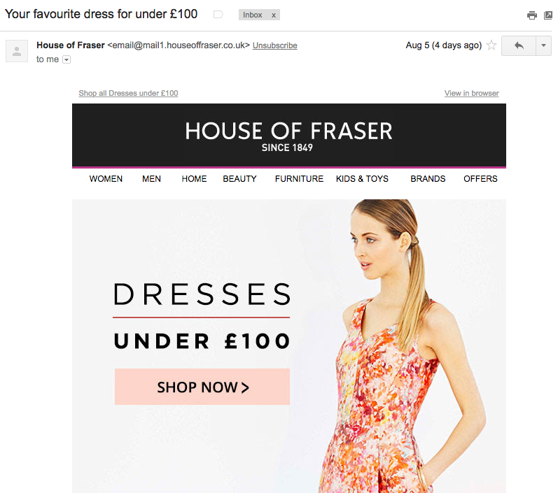
Design an irresistible CTA
The call-to-action is a crucial part of your email campaign since it is a key driver of your campaign goals. The human brain is innately curious about what’s going to happen next, and you can use this curiosity in your call-to-action! People love to discover and explore, so they will also try to find out what will happen after they click a CTA.
To ensure your CTA converts:
- Place your CTA above the fold and make it the first thing your subscribers see after opening the message
- Make it appear clickable. Add a hyperlink with bigger fonts, or make the CTA in a form of a graphic button
- Graphic buttons are the most noticeable and prominent form of CTA
- Use contrasting colors and surround the button with white space to make it pop even more
- Tell your subscribers exactly what you want them to do using actionable language
- Choice overload is extremely easy to invoke. With one CTA, there is still a decision to make: click or don’t click. Keep it simple; often one CTA is enough
- When you have more than one CTA, size your CTAs by importance from the largest to the smallest
- Buttons in your newsletter should be big (at least 44px x 44px) because users need to be able to click on them on smartphones without having to increase the screen size
ReallyGoodEmails cataloged CTA buttons according to used colors and their meaning. You might find this helpful when designing your next campaign.
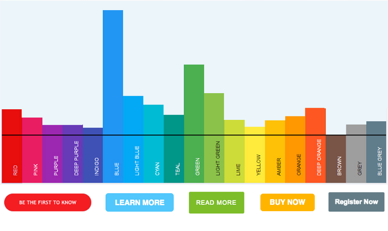
Pro Tip
Repeat your CTA in a postscript to get more clicks. We expect something important in any “PS” so don’t let it go to waste. Your call to action won’t be missed in this part of the message.
I hope these tips will help you convey your message in style. What email design practices do you follow? Feel free to add your ideas in comments below 
One more thing!  We prepared a special offer for Piktochart blog readers. Give FreshMail a try and design beautiful emails with our responsive templates!
Use this link to set up your account. You will be able to use FreshMail for free up to 500 subscribers. If your mailing list is bigger, you can purchase any type of plan with 15% discount!
Good luck with your email campaigns!

(149)
Report Post