— July 4, 2018
Banner ads have been around for a very long time (check out the first one, from 1994). But that doesn’t mean we’ve solved all their problems. Display ads have lower click-through rates than text ads. it can be arduous to create different sizes for different placements; and historically, if you wanted to create something dynamic, you were limited to clunky and non-secure Flash elements.
Public perception hasn’t quite kept up with technology. HTML5 has been a glorious addition to the banner ad game, and strong HTML5 ads have been shown to increase click-through rates substantially when compared to static banner ads—to the tune of 267%, according to one Adform study. Compare an HTML5 ad to a standard static ad, and it’s easy to see why you get that uptick in performance:

They move!
Today, we’re going to give you the lowdown on HTML5 ads. We’ll discuss what they are and how to make them; show you some ways you can shoot to achieve those massive increased click-through rates; and show you examples of some effective HTML5 ads in action.
Let’s get into it!
What Are HTML5 Ads?
HTML5 is the latest iteration of HTML—one of the markup languages browsers use to present content. HTML5 is the first version of HTML that allows developers to write video, audio, and others animations directly into the source code of a page—thus eliminating the need for plugins like Flash.
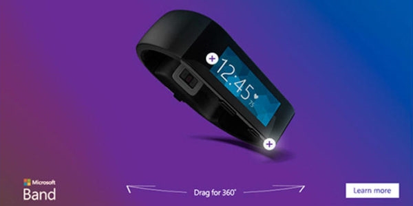
See it in action here.
HTML5 ads are at once more attractive to click on and less intrusive to look at—because they live within the page, they’re more subtle, more elegant, and not quite so interstitial-y.
The big draw, as mentioned above, is that HTML5 ads include thumb-stopping motion elements like videos and gifs. Part of banner ad fatigue comes from an inability to discern the static elements on the page from the static elements in your ad. HTML5 ads demand views and clicks because they stand out from the rest of your on-page content.
Aside from traditional motion elements, HTML5 also supports 3D and interactive (read: the user can play around with it by touching or clicking on it) ad design. They run perfectly within native apps, and can be created to display responsively in all placements, on any device (something Flash ads could not do)—thus eliminating the need to create ads with multiple sets of specs for multiple placements.
How to Make HTML5 Ads
Google announced in 2016 that all Display ads would be served in the HTML5 format, and that Flash ads would be discontinued. This announcement was met with a bit of concern—mostly from campaign managers concerned with their ability to produce code-based ads, quickly and in-house. Flash ads were a security issue, sure; and not all devices could run them; but the alternative seemed like more work, and less output.
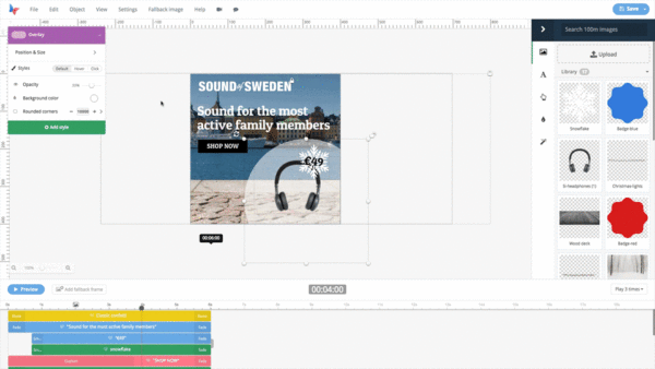
Luckily, you don’t need to be a full stack developer—or even be fluent in HTML5—to create an HTML5 ad. There are dozens of tools—Google Web Designer, Bannersnack, Flexitive, etc.—that allow marketers with limited knowledge of web-based code to create dazzling and click-worthy HTML5 ads.
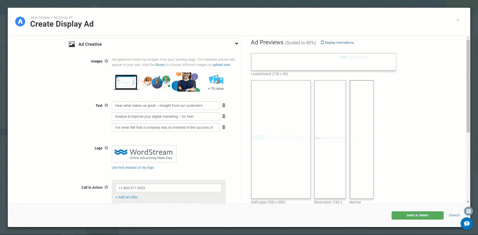
Some of these special products allow you to skip the creation process nearly altogether. Merely enter your website or product page’s URL and some relevant ad copy. Advisor harvests the best images from your site or web page for ad creative; harvests your logo and company colors; then automatically generates HTML5 ads in the seven most common display ad sizes.
There are several options at your disposal when if you want to pump out in in-house HTML5 banner on the fly. If you’re still considering creating one from scratch, check out this great workshop from DoubleClick. You’ll need to have a strong facility with HTML5; you should also know that your ad will need to be SSL compliant.
HTML5 Ad Examples
It’s quite possible you’re still on the fence about creating HTML5 ads. Perhaps you need to see them in action to believe in their efficacy. We have you covered. To pique your inspiration, we’re going to show you three ways you can create HTML5 ads that give you a chance at drastically increasing click-through rates. We’ll show an example for each, and discuss why each ad is effective in utilizing the ascribed tactic.
Let’s look at some ads.
1. Make it expansive, not intrusive
One of the best parts about using code to write an ad is that you can essentially make it as expansive as you want. An HTML5 ad is like a webpage within a webpage; accordingly, you can customize it so users have immersive brand experiences without ever leaving the page on which they see your ad. Take this ad for Major League Soccer by Undertone:

This ad speaks to the “flashy but not intrusive” modus operandi I discussed earlier. The bright and dynamic create, when you first open the page, is transparent—this ad looks like a part of the page viewing experience; not something “extra” that’s impeding the user from accessing his or her content. And, if the opening creating is intrusive, it’s gone in a flash—the ad changes size and retreats to the corner of the page, where it’s hardly bothersome, but definitely still present.
From there, if the user’s intrigue is piqued, she runs her cursor or finger over the minified ad creative and clicks/presses. Doing so opens an expansive chamber of highlights which allows the user to either revel in a Michael Bradley give-and-go, flip through to the next highlight, or click “View Schedule” to see when the next game near them is taking place. If you’re a small business, you can think of this like a lead for one of your brick-and-mortars.
Expansive, but not intrusive is possible; and if you accomplish it, you won’t have to accost users for clicks—they’ll click through on their own volition.
2. Put your products in motion
Flashing imagery is great; but if you can animate your products without using video, you’ll have a streamlined ad that doesn’t sacrifice performance for slick aesthetic. Take this ad from Jeep:
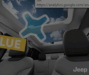
In quick succession, Jeep uses HTML5 run through three panels advertising one product feature—with selective copy for each panel—before the product itself virtually drives onto the page. When you run your cursor over the last still shot, the “Renegade Details” call-to-action, which brings users to a Jeep landing page, is the final part of the ad that moves—an animation which basically tells the users how to interact with the ad without being overly pushy about it.
The notable thing here, though, is the way Jeep puts its product in motion. Much like an interactive web page that reveals information as you scroll, the animation is accomplished without video, so there’s no need to embed any cumbersome files to achieve the desired effect. And, unlike a traditional gif, the ad plays through once and is done (we made it into a gif, so you won’t see that action here)—so, if the user doesn’t click on the first try, your ad will not continue to invade his eye space with its flashiness.
Leveraging this kind of animation is a great way to show your products performing in their natural habitats while maintaining fully optimized and succinct ads.
3. Gamify your promotion
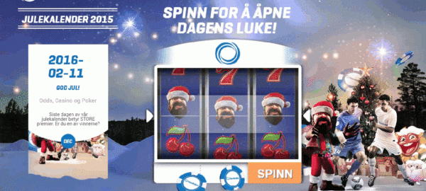
Excuse us for the language flip flop here, but this HTML5 ad Revenue Engineers created for online gaming company NordicBet was too good not to include:
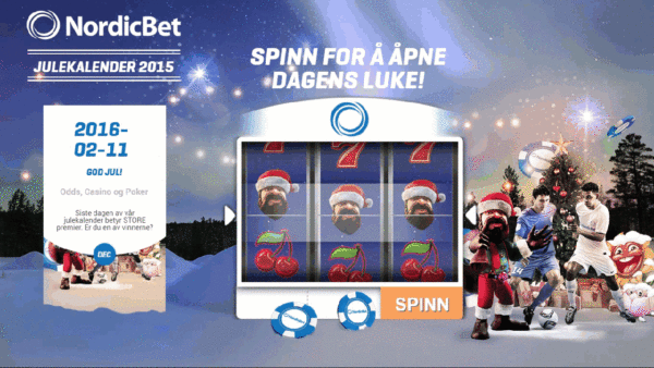
What better brand to gamify an ad than an online gaming brand? You’ll see gamified ads in a number of formats—completing a crossword puzzle, making an animated basket, shooting an animated target—but the result is always the same: the user is enticed to click through to a landing page by playing the game. How can you resist playing a little impromptu roulette?
This ad is particularly effective because it doesn’t directly send users to a landing page after they spin the roulette wheel. Rather, it displays the “prize”—a link to a registration form—in a widget on the left with the call-to-action, “Receive Your Gift.” From there, users are led to a registration page complete with a form field in which they fill in their information. This is another form of permission marketing that falls in line with the non-intrusive examples we’ve already discussed.
Gamifying your ads with HTML5 is a great way to entice clicks; and this ad shows that you don’t need to be intrusive or spammy to do so.
Making the Most of Your HTML5 Ads
Feel a knowledge gap between your understanding of HTML5 ads and the level of creative design achieved in the examples we discussed? Don’t sweat it! HTML5 ads are now easier to create than ever; and accessing one of above-mentioned tools will put you on the fast track to HTML5 ad success.
Digital & Social Articles on Business 2 Community
(96)
Report Post