— May 15, 2018
Do you know what’s most important when it comes to marketing? LISTENING.
Might sound bizarre, I know, but tell me honestly, what kind of people do you like? Those who sing their own praise or those who do speak, but only after listening to what you have got to say? The second kind, right?
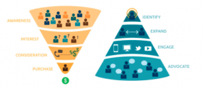
The same thing works in email marketing as well. Email is one of the most personal ways of reaching out to your target audience. And don’t we all like to receive emails that are tailor-made to fit in our specific needs? The more you understand your subscriber’s situation, you will be in a better position to send them the right suggestions and convince them to become your customers. This is the basis of inbound marketing.
However, not long from now, it was outbound marketing that had all the powers. Outbound marketing is about sending across your marketing message to maximum number of people through channels like direct mail, cold calling, TV and Radio commercials, print advertisements, etc. No wonder it is referred to as interruptive marketing!
On the flip side, inbound marketing is about attracting prospects through relevant content, incentives and great user experience, which nudges them to connect with you and eventually convert. Content marketing, SEO, email and social media marketing are some of the ways that take your marketing inbound.
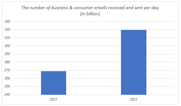
Source: Radicati Group
Taking an inbound approach for your email marketing strategy is now quintessential, and I’m not alone; 68% of inbound organizations believe their marketing strategy is effective. More so, we have our own numbers to prove that.
Here’s a case study of one of our clients who approached EmailMonks to help him build a conversion-friendly email template that will help his business generate better results on their clicks, views, buys, and ROI. We responded to our client’s challenges, understood his target audience and created an email template using inbound tactics that help nurture & convert customers.
CASE STUDY – HOW ROI CAN BE INCREASED MANIFOLDS WITH INBOUND EMAIL MARKETING
The Challenge
Here’s the template the client had been sending to promote a particular product:

They have used a video link on the product in focus and there is also text describing the product. The play link takes the subscriber to a landing page on which the product description can be viewed in the form of a video. Announcement of the clearance sale is placed below the fold.
Major Flaw – The campaign is text heavy; the images do help to an extent but do not reduce the burden on the text to convey the message. When there is too much text in an email, subscribers tend to skim through it and in the process, the possibility of missing out on an important message or offer is high. Such an email is also less engaging.
The client was not very happy with the ROI this template was fetching. So, they asked Monks to create a new design for the same template.
Our Inbound Solution
EmailMonks created a new version of the template harnessing the basic principle of inbound – providing information that the subscriber would want to know (nurturing the lead), in a more engaging, clean format.
Here’s a look at the template designed using inbound principles.
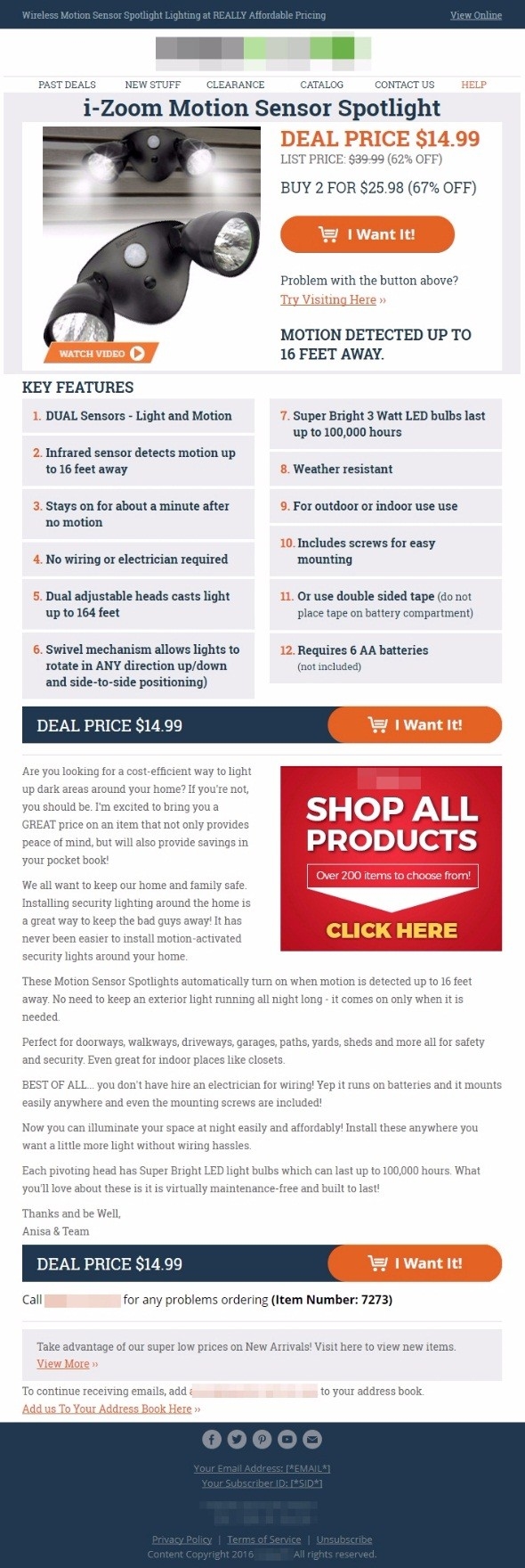
The emphasis in this responsive template with a view online link is more on making the information in the email easily accessible and conveying the motto behind the email in the first fold. This way, the subscriber gets to know what the email is about, in the initial section itself. The subscriber can clearly see the product information, image (without the play symbol on it), a link to view the video below the image, price of the product, and a prominent CTA to avail the offer.
In the subsequent section, the subscriber gets to learn about the detailed features of the product, where again there is a CTA to help them take an action.
A well sorted write -up regarding the product follows. (this content is hardly noticeable in the earlier design which has a huge wall of content.)
The Results
Unsure about how well this new template would perform, the client conducted A/B Testing. Both the emails were sent to 123,000 subscribers, and the responses over 3 days were recorded. Here are the results:
Click-through Rate
Original template: 497
Inbound Template: 602
Order placement
Original template: 54
Inbound Template: 105
Conversion Rate
Original template: 10.87%
New Template: 17.44%
Great! We now know that inbound works for email marketing. So, let’s jump to the best practices.
Best Practices of Inbound Email Marketing
- Aim for a Responsive Design
You have no control over the device on which your subscriber will view your email. Moreover, there are statistics to prove that 54% emails are now opened on mobile devices.
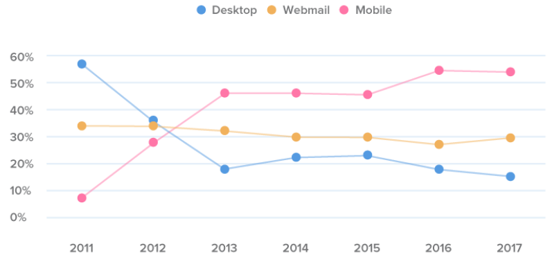
Thus, you need to ensure that your email is responsive and is seen just the way it should be in every device as well as email client so that the user experience is nothing but the best.
- Never forget the ‘View Online’ link
Most email clients, by default, keep images blocked and the subscriber will not see the beautiful images in your email you want them to see. And if it’s your image on which you have announced an offer, your campaign may go down the drain with most subscribers missing out on viewing it. Providing relevant alt text is something that will help to convey the message but another better way is to provide a view online link from where the subscriber can see all the images and your email as you had sent it. Good customer experience means good business!
However, you can check the email metrics and then phase out the “View Online” link if it seems unnecessary.
- Use high resolution images but don’t forget the text:image ratio
Plain text emails have their own advantages but imagine receiving one from your favorite brand or e-commerce website telling you about their bestselling products and there are no images of the products displayed!
Images play a vital role in helping a subscriber make a decision. However, a good text:image ratio also matters so that your emails get delivered without getting caught in the spam trap.

Like stated earlier, providing alt text is a must along with a view online link. Moreover, keep the important portions of the message in the form of text and not over an image because your aim is to provide a good user experience.
- Make use of a Prominent Menu
Making it easy for your subscribers to find what they are looking for is important if you want them to have a good impression of you. A well-thought and well-designed menu should work in this regard. What is your email about or what are the categories you want your subscribers to check out should inspire you to zero down on the sections in your top menu.
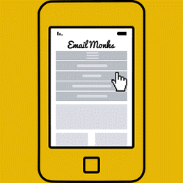
Using a Hamburger or dropdown menu for the mobile version of your design is a great way to save email space.
- Place the CTA correctly and make it bright and noticeable
Making every step in the buying process easy for your subscriber is significant, and making the CTA prominent is the first step towards doing this. If you have succeeded in arousing the interest of a subscriber through your email copy, they are bound to take the next step and that is through the CTA. So, highlighting it with colors that are contrasting to the background and placing the CTA above the fold is favourable not only for the subscriber but the email marketer as well.
- Write an informative yet crisp copy that helps subscriber make a decision
A warm and friendly tone in your emails is essential as you are corresponding with a person at the other end. Moreover, never lose focus from the motto of your email. Provide all the information your subscriber will want to read about the product you are promoting, but also make sure it is not a huge wall of content. Crisp, to-the-point content works well in emails.
And before you say you are done with writing your email copy, ask yourself these few questions just to be sure you’ve done a good job.
- Is your copy an extension of your subject line and headline?
- Is the content easy to understand as well as catchy?
- You can fulfil every promise you have made in the email, right?
- Is the email copy concise and to-the-point?
- Is the content relevant to the subscriber?
- Link to social pages to expand visibility
Inbound is about reaching out to people who are interested in your products/ services on whichever platform they are comfortable connecting with you. So, make sure you have links to your social pages in your email. Someone who may not be interested in emails from you, would probably not at all mind connecting with you on Facebook or Instagram; don’t miss out on the opportunity.
Wrap-up
Aligning the content of your email with your customer’s online behavior- their search history, purchase history, cart abandonment history, etc. helps you attract inbound traffic. And then it’s just a matter of time until you convert, close, and eventually, delight the leads you generate. So, when are you going inbound?
Digital & Social Articles on Business 2 Community
(88)
Report Post