“People ignore design that ignores people.” At least, that’s according to best-selling author, designer, and illustrator Frank Chimero.
But imagine, for a second, that you didn’t know the source of that quote. You could easily think that it belongs on a student’s bedroom wall rather than in the workplace.
However, when it comes to the world of UX design and eCommerce, that quote couldn’t be more important.

Source: Career Foundry
In the first year of profit on Amazon, Jeff Bezos spent a hundred times more on UX design than advertising. Whilst the world’s largest eCommerce company only represents a modest portion of the industry’s $ 9 trillion pie, if you want a slice of your own, it’s worth taking a note from Bezos’ book.
What is user experience or UX design?
Believe it or not, pretty much everyone is already an expert on the subject.
Anyone who has ever found a website easy and intuitive to use will know what good UX design looks like. Anyone who has ever cried with frustration trying to find the checkout is unfortunately an expert on bad UX design.
Good UX design should simplify the way people interact with the technology around them.
With that being said, it can be surprising how many people still believe UX design simply involves making websites look pretty. It’s true that 38% of online shoppers will leave a website if they find the design ugly. But the job extends far beyond that.
UX design crafts the user’s experience from end-to-end. From the second a customer enters an eCommerce website, they’re in the UX designer’s hands. Whether they then feel comfortable enough to provide their credit card information is also up to the designer.
Good UX design should be the cornerstone of your growth and customer retention plan.
Research shows that every dollar invested in UX brings 100 dollars in return. That fact alone goes some way to explain Bezos’ incredible success.
Whilst it’s true that we can’t all become the next Jeff Bezos, here are 3 top tips you can use now to boost your own eCommerce business apps through UX design.
Source: Super Office
Tip 1: Identify the problem
Of all the key performance indicators that you’ll come across, this is the one you should pay the most attention to: your abandonment rates.
The second a visitor comes to your website, your UX design will begin converting them into a paying customer. Interruptions to that process are the leading causes of abandonment—that moment when they simply walk away.
The higher the rate, the more people are dropping out of your carefully designed customer journey.
You should shoot for an abandonment rate of around 68%. If your figures exceed that metric, now’s the time to start asking questions.
For some quick answers, you could go through the process of buying something on your website. Pay close attention to the website’s design as you do. Is it as easy or as smooth as you’d like it to be?
As you do, ask yourself whether there are any moments where you feel annoyance or irritation. It’s those negative feelings that will drive your prospects away. If you can recognize the source of those emotions, bingo! You’ve found your problem.
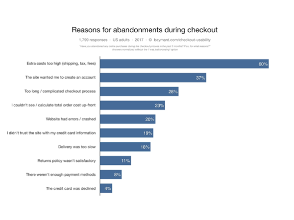
If you’re still having problems, then the next best place to check is the graph below. Use it as a checklist and cross off as many as you can. What’s left at the end?
Source: Design Wizard
There will inevitably be some remaining issues that you can’t resolve as easily. Driving down shipping and logistical costs are what made Amazon the trillion-dollar enterprise it is today. But they’re also high barriers to entry that many smaller competitors can’t beat.
Some problems, however, will have easier alternatives. If account creation is a key cause for your abandonment rates, consider ways of streamlining the process with various business tools.
Are some details required by the form really needed or can you remove them? Can visitors use details from a relevant social network to auto-fill key information? Or can you use contact center specialists to provide ad-hoc customer support for queries and questions if the form proves trickier than most?
Even with those solutions implemented, it might just be that the customer doesn’t trust your website with their personal details. In this case, you should take the time to assure them that you’re using the top CASB vendors to keep their information safe and secure.
The important thing is to keep an open mind and to examine every solution to each problem.
You may quickly find a lot of problems to manage. Don’t worry. That’s a good thing. Better to discover them now than to ignore them and keep your abandonment rates higher than they should be.
But that piece of advice doesn’t stop these problems from feeling overwhelming at times.
The trick here is to break each problem down into easy, digestible steps. Some firms rely on project management systems to keep track. What matters is that you commit to paper what the problems and solutions are and the key criteria you and your team will use to define success.
With the road ahead mapped out, it’s a lot easier to get from point A to point B.
Tip 2: Don’t just stop at design
You might find that after solving the major reasons for your abandonment rates, your eCommerce website is still falling short of the ideal 2.63% conversion rate.
You wouldn’t be alone. It’s a fairly common problem. Sure, you might have given prospects no reason to click away. But have you given them a reason to buy?
ECommerce copywriting furnishes your customers with those reasons.
Your copy may currently aim to convey the qualities of each product in a calm, practical, and clear way. It may even try to avoid all the overwhelming positivity that companies fill every marketing message with.
But there’s a reason marketer’s everywhere do that. Positive copy sells. Negativity doesn’t.

Source: Big Commerce
You might view your copywriting as a craft. And it is. But unless you’re the second coming of David Ogilvy himself, now’s not the time to break the cardinal rule of copywriting. Avoid negativity at all costs.
If you find that it’s just the natural way you write, there are a couple of ways to get around that problem. You could either study copywriting for years until you master the craft. Or you could get yourself into a happy mood.
Listen to music. Go for a run. Whatever you do, get your pulse racing. When it’s finally up, sit down, and start to write. Your happiness will translate onto the page.
Once you’re injecting positivity into every line of copy, it’s time to mention every deal, discount, and coupon your website offers. Mention them ten times over.
If you’re trying to market your new book titled Call Center Management: Strategies and Best Practices of Successful Call Centers, add a discount to it. Add two. One for first-time buyers and one for readers looking to give a great gift. Whatever works. Just make sure you’ve presented all of the benefits that are available to customers in your discount strategy.
Some of the time you don’t even need to include a discount. You could try including a countdown timer until the next major promotion like Black Friday. If a customer is about to leave the website, it’s small details like these that might have them coming back later.
Tip 3: Get customer feedback
If you’re still at a loss for how to improve your eCommerce website through UX design, there is one final option: listening to your customers. Of course, this sounds obvious. But you can take this as your latest suggestion to check back in with your customer feedback strategy.
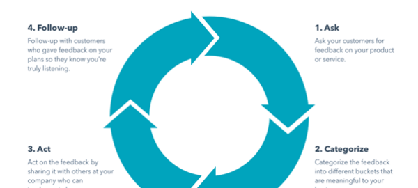
If you check and you’re not happy with what you see, change things up. One strategy, according to HubSpot, could be employing the ACAF Customer Feedback Loop. The graph below sums the concept up quite nicely.
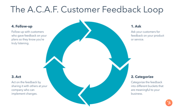
Companies across the globe use variations of this strategy. But the principle remains the same: your customers tell you what the problem is and when you fix it, you tell them.
72% of customers will share a positive experience with 6 or more people. That fact alone should spur you on to develop one variety or another of feedback form for your website.
The best thing about it is that you don’t need an entire call center to conduct customer research. You don’t have to put your customers through endless questions as they get more and more annoyed.
A simple email with a feedback form after an order has been placed is more than enough for most businesses to gather useful feedback.
Just be careful that after whatever amendments you make that you take the time to perform the final step in the ACAF Customer Feedback Loop.
You should consistently inform your customers about what you’ve done to improve. This way, you can tell them about it, and they feel part of the process and heard.
So there you have it: three top tips you can use now to foster a create the kind of eCommerce website you want through UX design. They’re easy. They’re simple. But above all, you can implement them now.
Good luck.
Digital & Social Articles on Business 2 Community
(99)
Report Post