With so much content out there on how to increase your landing page conversion rates, it’s easy to get carried away and think that with every new element you add you’ll see a surge of new conversions.
But that’s not always the case.
The last thing you want is to have your landing page looking like a garage sale from the 1980’s. While there might be some interesting trinkets here and there, it’s probably not the best experience for your users.
In this article, I’ll show you how to eliminate distractions and focus your landing page on it’s primary goal: conversion.
Eliminating Distractions
It’s natural to want to convey a ton of information to your users as soon as they arrive on your landing page.
The problem is, if you hit your users with too much content, they’ll get overwhelmed, won’t be focusing on your offer, and will probably end up leaving your page.
That’s what we call information overwhelm, and it can cripple your conversion rates if not dealt with effectively.
Below are two case studies of companies who squared off with the problem of information overload by deleting entire sections of content in order to eliminate distractions.
The result?
Let’s just say “mo content, mo problems”.
Eliminating Distractions Case Study 1:
The SEO service company TheHOTH tested two variations of their homepage which had been converting at around 1% using a signup form.
They knew a couple factors going into the test:
People converting were mainly coming from direct search, referrals, and word of mouth
These people were already familiar with their brand
Explaining what their business was about might be redundant to these users
Here’s what their original homepage looked like:

As you can see this page is content rich, and follows best practices in the sense that the form is above the fold, includes testimonials, and has a clear value proposition with clear headlines and descriptions.
Despite all these facts, the page was still converting at around 1%. They decided to strip away all content that wasn’t pushing visitors towards their conversion goal.
Here’s what their variation looked like:

As you can see the variation was a very simplistic form which got right to the heart of what the page was designed to do: sign up people who were already familiar with their business.
The result?
A conversion rate increase of 13.3% for the variation! Not a bad boost if you ask me.
Eliminating Distractions Case Study 2:
AssesmentDay, a company that specializes in delivering aptitude tests to job seekers, wanted to increase their conversion rates for a landing page located inside of a Wiki Jobs page.
Rather than adding additional content to persuade their users to convert, they decided to test eliminating entire sections of content.
They tested two versions, one with no FAQ section, and one with no screenshots section:

What did they find?
By removing one content section (FAQ’s and screenshots) from each variation, the landing page performed 50- 60% better than the original. What’s interesting however, is that when both sections were removed in tandem, conversion rates actually dropped around 3%.
So what does this tell us?
There was too much content on the page. That was proven. But the page still needed enough content to persuade a user to spend $ 19.99 on an online test.
When designing a page for conversion, always consider the length of your page in relation to the magnitude of the product or service being offered.
For smaller offers, smaller pages can suffice. For larger offers, longer pages are often needed.
In this case, the best route was testing the removal of entire sections to see what extra pieces of information were positively affecting conversions, and which could be removed.
For more information on optmizing the legnth and content of your landing page, see my colleague James’s article “7 Landing Page Mistakes that are Costing You Conversions.”
Focusing for Conversion
Once you’ve cleaned up your landing page by removing unnecessary sections and only providing the information your users NEED to know in order to convert, it’s time to start thinking about how you can focus your page for conversion.
There are a number of different techniques which can be used to focus a page. For the sake of brevity though, I’ll outline the 3 main strategies which I believe will have the greatest impact on your page’s overall focus.
While you don’t need to implement every one of these, using them in combination will help to create a hyper-focused landing page.
1. Directional Cues
Directional cues are one of the most powerful and subtle ways to direct a user’s attention towards your call to action. There are two main types of directional cues: eye direction cues, and arrow and linear cues.
Eye direction cues work by having a person look in the direction of your focal point. As humans, we’re instinctively curious about what other people are looking at. Once we identify a person on the page, our eyes will naturally be drawn to where their eyes are looking.
Take a look at an example of an eye direction cue used by KISSmetrics:

Notice how after seeing the man on the right, your eyes automatically go to the form? While it might appear on the surface that the attention is on the model, the direction that his eyes dictates the focus of the page and in turn focuses the attention on the form.
Another example of a directional cue is a arrow, or linear cue. These types of cues can be very subtle, as in this example of an indented arrow on a salesforce form:

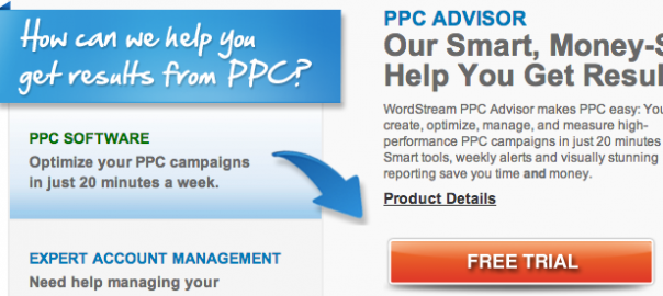
Or they can be very blatant as in this example of a arrow pointing towards a CTA:

Either way, all three versions of these directional cues serve to draw a user’s attention to either the form or CTA, making them a great tool in influencing the way your landing page visitors interact with the page.
2.Color Contrast
When elements of a page are too similar in color, it becomes difficult to differentiate between different sections and naturally guide your user where you want them to focus their attention.
That’s why utilizing color contrast is so important on any landing page focused on conversion.
Take a look at these two landing page variations:


Which one do you think converts better?
Unless you really like blue, most people would rightly say the variation with the orange CTA would convert better.
And they’d be right.
That’s because the call to action pops off the page by using the design principle of color contrasting.
Using heatmaps on both landing pages, we can see the click data that led to difference in conversion rates.
On the all blue variation, we see how dispersed the clicks were throughout the page:

Since there was no contrasting CTA, people were much more likely to click on various elements on the page (most of which were not interactive).
Now take a look at the click data from the second landing page:

As you can see the majority of clicks (75%) are concentrated on the main CTA buttons.
3. Blank Space
The last of element we’ll be looking at in order to focus your landing page on conversion is blank space.
Remember when I said you didn’t want your landing page looking like a garage sale?
If you have a ton of content on your landing page, one way to declutter and increase the level of focus is to add white space around your different elements. This could include headlines, forms, buttons, important images, and text.
By white space I don’t literally mean space that is white (although you could choose the color white). What I mean is blank space in a contrasting color to help emphasize that content area.
Here’s an example of a page that uses the idea of white space well:

You could also try literally adding white space around certain key elements such as your CTA on pages where there’s a lot of stuff going on.

This is one way of really making your CTA button pop out amongst a sea of other content.
Putting it all together
Hopefully understanding and applying these core design principles will help you achieve your landing page conversion goals.
One of the problems we see time and time again is landing pages that are too cluttered, lack clarity, and don’t provide the necessary information that will encourage people to convert.
If you want to focus your landing page on conversion but don’t know where to get started, I’ll leave you with three questions to ask yourself to get going. If your landing page is in alignment with all three of these questions, then you’re off to a good start.
- Who is viewing my page and what do they NEED to know?
- What is my core conversion goal?
- In 5 seconds or less, can a user determine what’s important on this page? (Think directional cues, color contrast, and blank space).
(58)
Report Post


