— August 24, 2017
When it comes to increasing engagement on a website, you’ve probably heard of the usual suspects:
- Create website content that stands out
- Include relevant visuals that complement the content
- Respond to all comments
Are those important?
You bet.
Do they work?
Definitely.
But here’s the issue:
As important as those are, there’s one thing that always gets overlooked. And even though it’s usually behind the scenes, it still plays an important role in keeping your readers glued to your content.
What is it?
Formatting.
In today’s post, I’m going to show you exactly how you can use it to give your content a competitive edge.
Why does formatting matter?
It’s tough keeping readers engaged.
In fact, due to various factors, the human attention span has been decreasing since the year 2000.
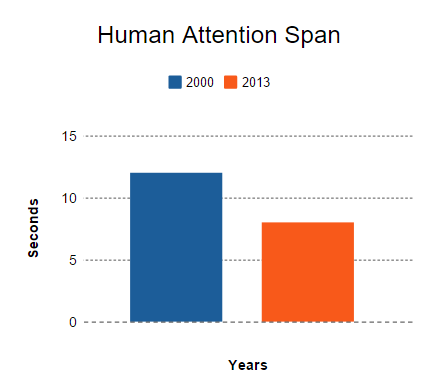
Meaning if your content doesn’t look appealing from the very beginning, chances are your audience won’t read it.
That’s where formatting comes in.
With the right formatting, you can change your content from this:

Into something more readable:
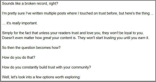
See the difference a little formatting makes?
Because when you format your content like the second example, it makes it appealing to the readers — AND the scanners too.
That being said, here’s a few formatting steps to consider every time you create a new blog post or webpage.
Step 1: Emphasize what you want your readers to feel
In your normal day to day life, how do you communicate with people?
Do you have actual conversations with them? Do you talk in a monotone? Or is there inflection in your voice?
Yes. Maybe. And yes.
There’s a saying in content marketing that you need to write like you talk. But that alone isn’t good enough.
You want to make sure your words are felt wholeheartedly. You want t make sure that what you say is appreciated. More importantly, you want to make sure that what you say actually gets your message across.
Let’s do a quick exercise.
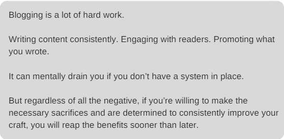
Can you tell the difference between these two passages?
Passage 1:
Passage 2:
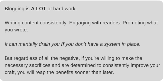
Similar enough, right? The words are all the same.
But look again. Notice the bolded words in the second example?
Could you feel a stronger tone in that passage?
I wanted certain words in that passage to stand out because not only would I talk that way if we were face-to-face having a conversation, but I wanted the message to be understood.
And the message is that blogging is a lot of hard work.
How does adding emphasis increase engagement?
When you emphasize certain words by bolding them, capitalizing them, or italicizing them, you alert the reader that they should pay special attention to a certain point.
Not only that, but remember what I said about having a conversation?
You want to make your words jump off the page and mirror a natural face-to-face interaction.
NOTE: Use bolding, italics, and capitalization in moderation. You don’t want to do it all the time or it will lose its effectiveness. But when used occasionally, it really sticks out in the mind of the readers.
Step 2: Write in smaller, easy-to-digest chunks
Remember High School?
There was always that one class that provided that HUGE textbook that you had to read, wasn’t there?
And not only read it, the teacher would give homework assignments, usually chapter work, for you to hand in the next day, didn’t they?
“Read chapters so-and-so and answer only the odd-numbered questions at the end of the chapter.”
That’s what one of my teachers always said.
What’s the problem?
Each chapter was usually 30 something pages.
Yikes!
And to make matters worse, it usually contained huge chunks of text that resembled one coma-inducing paragraph.
You don’t want that for your blog.
In fact, when I wrote my post about having a credible website, I knew it was going to be a lengthy post. So, I made sure to go above and beyond and provide a TON of space within my content.
I made the reader’s experience more enjoyable by not being too busy or overbearing.
Think about it:
If you come across content that is easier to read and consume, wouldn’t that make you want to stick around longer? Not only that, but wouldn’t you be more interested in the content in general?
How do shorter paragraphs increase engagement?
When you write in a way that’s easier to understand, the flow of your content starts to become seamless.
Avoid huge chunks of text and incorporate more white space. Not only does more white space declutter a page and give it more room to breathe, but Smashing Magazine referenced a 2004 study that found that a good use of white space increases comprehension by almost 20 percent.
Step 3: Capture the attention of scanners with subheadings and bullet points
Raise your hand if you’ve ever scanned over a post instead of actually read it.
Come one. Don’t be shy.
*raises hand*
I’d be surprised if you didn’t raise your hand.
Because in this fast-paced, technology driven age we live in, we’re always busy. We’re always in a rush. We always want things done as quickly as possible.
And if you’re like that, the chances are pretty high that your readers are like that as well.
And as a marketer, that’s something you don’t want.
You don’t want your readers rushing, even scanning, your post to get it over with. But because the blogosphere is so darn competitive, everyone is lobbying for each reader’s attention and eyes on their content.
Sure you can lure them in with your eyebrow raising, “irresistible” headline but after they read the opening paragraph, then what?
I’ll tell you what.
They start scanning.
And if you don’t have subheadings that grip their attention enough to actually double back and read the post, then they’ll quickly leave your site.
You don’t want that, do you?
That’s where subheadings come into play.
Great subheads can truly make the difference in readers taking interest in what you have to say and actually reading it (staying on your site longer) or just scanning and quickly leaving.
But as important as subheadings are for proper formatting, the same goes for bullet points. If you want readers to read more of your content, using bullet points can certainly help.
Here are some of the main benefits:
- They allow you to say a lot in very few words
- They organize information into digestible chunks
- They allow serial scanners to quickly find the most meaningful information
- It’s a nice contrast from the rest of the content … making it pop
How do subheadings and bullet points increase engagement?
The bullet points break up sentences, while subheadings increase the readability of your posts and stop scanners dead in their tracks.
Ready to try these formatting tips on your site?
Let’s be real here…not only are readers impatient; they have choices.
That’s why they scan and make snap decisions about whether your content is worth reading.
But if you have that lethal combination of a captivating headline, quality copy, eye-catching images, and proper formatting, you’ll keep your readers’ attention right through to the end.
Digital & Social Articles on Business 2 Community
(91)
Report Post


