— May 1, 2019
UX, which stands for user experience, is the overall experience a person has when using a website. Of course as a business, you want the people that visit your website to have an enjoyable time. Because if your website is enjoyable and easy to use, people will be more likely to buy from you. In fact, 79% of people who don’t like what they find on one site will leave and search for another site.
But good UX design is not created equal. A B2C company such as an eCommerce website will have a completely different UX design than a B2B company. But a lot of B2B companies forget that. B2B websites shouldn’t be copying the UX design of an eCommerce website, they should be creating a good user experience for their target audience — businesses.
So, how do you create a website that is enjoyable for B2B buyers and increases conversions? Here’s how to improve the UX of your B2B website.
Design with your buyer persona in mind.
B2C companies typically spend a lot of time creating customer personas in order to effectively convert their website visitors. But, many B2B companies forget that they have to create buyer personas as well and design their sites with that persona in mind.
For instance, a B2C company might create a customer persona of a busy mom on-the-go who values convenience and affordability. But B2B companies need to think about buyer personas a bit differently. B2B buyer personas should include the following:
- Company/Industry
- Work Responsibilities and Activities
- Job Role and Experience – How long have they been in their career? Do they have buying power?
- Business Goals and Objectives
- Challenges and Pain Points – What challenges do they face when trying to meet their business goals?
- Brands – What brands are they already using in their business?
- Objections – What frustrations do they have with your brand or similar brands that prevents them from buying?
Your website design and copy needs to address these aspects of the buyer persona in order to improve the UX of your B2B site and increase conversions.
Make site navigation a breeze.
In order to improve the UX of your B2B website, you need to make site navigation a breeze. Site navigation is especially important for B2B websites since these businesses will need to go into detail about product features, specs, compatibility, and more. In addition, a B2B buyer typically already knows what they want, so you need to make it super easy for them to find it.
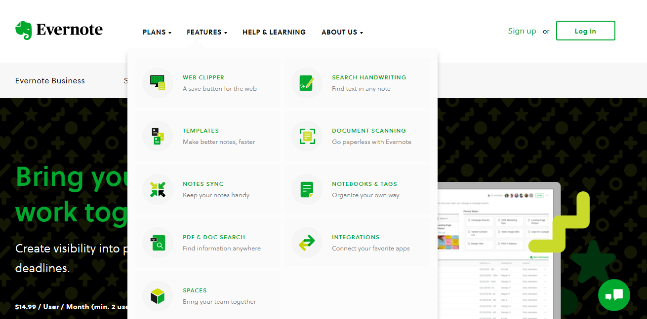
Take a look at this example from Evernote Business. Their website makes it easy for their visitors to discover all of the features their product offers. Users can see all of the standout features at once and click on the one that interests them the most to learn more.

So, make sure your website visitors can find everything they need in your website’s navigation menu including product features, pricing, a way to contact you, and so on. Improving site navigation will allow users to easily learn more about your product and it’ll result in them staying on your website longer.
Create helpful content.
Content is still king, especially for B2B. In fact, according to Content Science, 82% of consumers research products prior to going in the store and for B2B buying decisions, that number jumped to 94%. So, to improve the UX of your B2B website, you need to allow your audience to research your product or service thoroughly in order to get them to purchase — and you can do that by creating content.
Start creating valuable, educational, and helpful content for your website. This can include detailed product descriptions, informative blog posts, product demonstration videos, infographics, and more. The more helpful content you have on your website, the longer users will stay on your site and the more likely they’ll be to buy.
Showcase brand credibility.
More time and thought goes into making B2B decisions because it typically involves several decision makers considering the long-term investment. But one way you can help B2B companies make those decisions easier is by building trust. It’s not enough for you to say your product is good — of course, you think it’s awesome, you made it. You also need to prove that other people think it’s great too. To build trust, showcase brand credibility prominently on your website in the form of customer testimonials, case studies, reviews, etc.
Here’s another example from Evernote Business, since they do such a great job at putting their audience first. On their website they showcase numerous customer success stories.

When a company can look at your website and see all the great things you’re doing with similar companies, making the decision to buy is that much easier.
Over to you.
Improving the UX of your website isn’t just about making it enjoyable to use. It’s also about making sure your website is built for conversions. With these tips for improving the UX of your B2B website, B2B buyers will land on your website and happily stay on it until they buy.
Digital & Social Articles on Business 2 Community
(56)
Report Post


