Have you ever wondered why some Google+ posts attract hundreds, if not thousands, of shares and +1 while some simply drown in a sea of noise almost immediately after being published?
What is the difference between a popular Google+ post and the average ones? What is it that makes a reader want to share your Google+ post or even take the time to read it in the first place?
In this post, I am going to share my recent experience and give you a hint or two about things I learned. You can easily repeat these tricks for your own Google+ posts.
Here goes my story.
Case study: How I got 100s reshares and +1s in one day
Not too long ago, I published a roundup of 70+ web generators over on WHSR. In the article, I covered list of web generators for savvy web developers and bloggers.
I was pretty sure that the topic, a roundup plus web generators, was a surefire topic that would be popular on social media. The last time I published a similar post titled “30 Must See Web Generators for Lazy Web Masters,” it hit a homerun on both Stumble Upon and Reddit. The sudden traffic spike was so drastic that it crashed my web host.
On Google+, I promoted the article twice.
First, I let my private circle know about the post and shared the link.
I then came back and did a second round of promotions. During the second round, I shared the post publicly with a custom-made image.
The results
The two different posts received very different results.
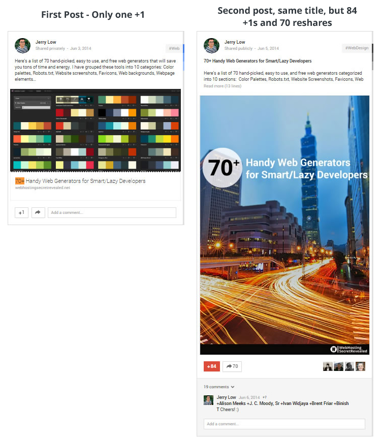
The first post received very little attention. It only received one +1 and that’s all about it.
For the second post, I used the same title but something obviously worked better in this post. It received 84 +1s, 70 reshares, and a handful of new followers over night.
In other words, the engagement rate for the second post is more than 8,400% better than the first one.
What makes the second post 8,400 percent more popular?
While studying the reasons why my second post received a huge response on the same article when the first post did not, I came to several conclusions.
Is the second post really 8,400 percent better than the first post? HELL NO.
But why?
Quite simply, Post #2 is getting better reception in the Google+ sphere because it’s using the right post format. Knowing what draws people’s eyeballs on Google+ is the key to the success of the second post versus the first.
The differences between post #1 and #2
| Details | Post #1 (unpopular) | Post #2 | Comment/Remark |
|---|---|---|---|
| Title | 70+ Handy Web Generators for Smart/Lazy Developers | 70+ Handy Web Generators for Smart/Lazy Developers | Note that both titles are exactly the same. |
| Sharing | Privately | Publicly | Apparently, sharing publicly allows more viewers to look at your post. |
| Image | Small image, Undescriptive | Big image, Descriptive | Big images eat up larger space on others’ Google+ feed wall. Furthermore, a descriptive image attracts more people who are interested in the topic. |
| Headline | Normal text | Bold | The bolded title works as a hook and gives the viewers of post #2 a focal point to start reading. |
| Branding | Nil | WHSR logo added at image | Not sure if the professional look affects anything. |
| Post content | Short excerpt, 4 lines | Lengthy, 15 lines | Still studying how this works. In some cases lengthy post = less engagement; but in this example, it’s apparently the opposite. |
| Tags | 3 auto generated tags – Web, Website, and WebDesign | 3 custom made tags – WebDesign, Webtools, and WebGeneators |
The perfect combination: Tall, descriptive image + Meaty content
If you spend some time over on Google+ looking at the profiles of others who are influencers with a large number of followers or high number of shares, you’ll notice a trend.
The majority of their posts follow this format: Tall descriptive image + meaty comment.
Let’s look at some examples and I think you’ll see what I mean.
TwelveSkip
Pauline Cabrera (TwelveSkip) is an Internet friend of mine. She’s freaking awesome in graphic designs and social media marketing. The majority of her posts on Google+ are accompanied by tall images and titles with large fonts.
I spent some time looking through Cabrera’s Google+ postings and I noticed (screens copied in August) that the posts with tall images are getting at least two times +1 shares than those with smaller images or no image.
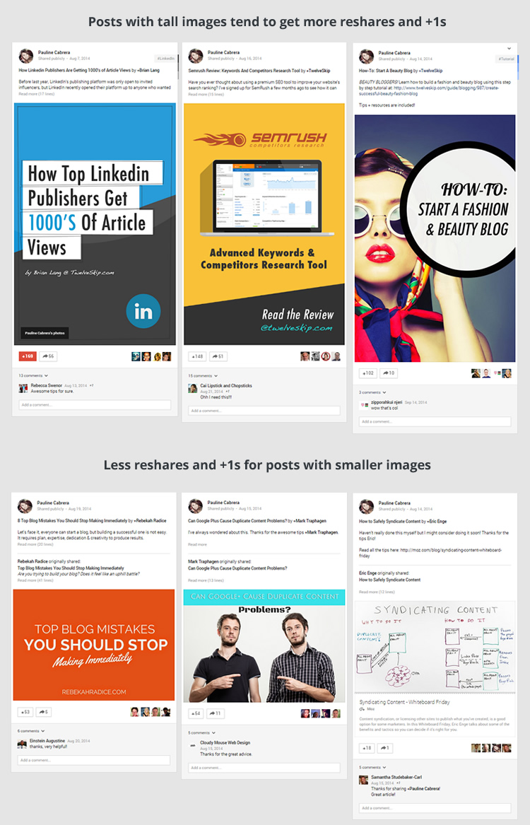
Samples of Pauline’s Google+ posts.
John Paul Aguiar and Adam Connell
There is a similar trend with John Paul Aguiar and Adam Connell Google+ profiles.
Generally speaking, the posts on their profiles that have tall images most often equal more reshares.
The recommended post format on Google+
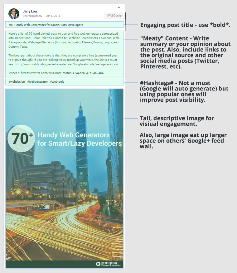
After looking through the posts and studying the trends, I’ve come up with the “perfect” format for posting on Google+.
But wait, this is no magic pill
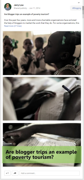
Tall images + descriptive headlines + meaty content FTW? Well not at all – if you are sharing to the wrong crowd, this will not work.
Although the format can make a difference in getting attention, it is not a magic remedy that will make just anything popular on Google+.
If you write a lousy post and share it on Google+ using my perfect format, it will not work. If you share content outside your audience’s interest area or something that they can’t relate to, it will not work. If you have insufficient active followers, it will not work.
Visitors might be fooled into clicking on your link, but they aren’t going to give you +1 if they don’t like what they find when they get to your blog. And, you have to reach your readers in your niche area and on their level of interest.
I decided to test this to prove my theory that while the perfect formula will help you promote a well-written, on-target article, it will not help if it is outside your readers’ interests.
I promoted another article using the same format and it received nothing from the floor.
No matter what tips or formulas you use, it still boils down to the basics.
The quality of your content and basic marketing rules still matter – A LOT.
The topic selection matters a lot, too. Just like Pinterest and Twitter, some topics get more interaction on Google+. Each social media platform reaches a particular demographic and Google+ is no exception.
Find out what’s already getting the best interaction on Google+ and work on content that matches those topics. A quick way to do so is using Buzzsumo to see what is getting the most shares and then build out your editorial calendar using those topics.
If you could walk away with only one thing from this post…
Your Google+ post format and style matter.
Use a bolded line for the title and the subtitle. Use hashtags. Create a descriptive and tall image for your post that takes up space. Write something useful in the post instead of only a one-line statement.
If you do these things, your posts will have a better chance of being +1’d and shared.
(255)
Report Post
