Stop reporting absolute numbers and put your data into context with ratios to engage your stakeholders with the smaller, but important, data points.
It is amazing; the horrible job many digital marketers do when reporting their work to clients. This includes both internal and external clients. Just think about how many marketing presentations and reports you’ve seen that simply contain screenshots from Google Analytics, Adobe Analytics, Adwords, Google Console, or reports from a backend ecommerce system. This isn’t the way to influence people with your data.
The biggest issue is that most marketers are not analytics people. Many marketers do not know how to collect all of the necessary data or how to leverage that data, and to a lesser degree, know how to present it in a meaningful way. Typically, this is the job of a data analyst. The same way purchasing a pound of nails, a hammer and a saw doesn’t make you a carpenter, gaining access to your analytics reporting tool does not make you a data analyst. This is why many reports contain those convoluted screenshots, and present data out of context, contributing little to no meaning.
Data out of context
Many reports merely report the facts (the data) with a number and no context. Data out of context is just data. For example, simply making a statement that Adwords generated 5,000 sessions to a website last month is meaningless without context. The number 5000 is neither a good nor a bad data point without a reference point or a cost factor. It’s not until you add in other factors (open the box) that you can demonstrate whether or not your efforts were a success. If the previous month’s Adwords campaign only drove in 1,000 sessions, then yes without other data, 5000 sessions looks good. But what if the cost to drive those additional 4,000 sessions was 10 fold the previous month’s spend? What if the previous month, Adwords drove 5,000 sessions but at double the spend?
It is only by adding in the additional information in a meaningful way that marketers can turn their reporting from a subjective presentation into an objective presentation. In order to do this, stop reporting absolute numbers and put your data into context with ratios. For example, when assessing Cost per Session, toss in a 3rd factor (goal conversion, revenue, etc.) and create something similar to “Cost per Session : Revenue”. This will put the data into context. For example, if every session generated costs $1 : $100 (Cost per session : revenue) vs. $2.25 : $100 (Cost per session : revenue) the effectiveness of a marketing spend becomes self-evident. In this example, it is clear the first result is superior to the second. By normalizing the denominator (creating the same denominator) the success or failure of an effort is easily demonstrated.
Data is boring
Yes, presenting data is boring. Simply looking at a mega table of a collection of data will cause many to lose interest and tune out any message you might be trying to present. The best way to avoid this is to make your data sing!
Make your data sing
Just like in the marketing world, the easiest way to grab someone’s attention and make your message sing is with imagery. Take all that great data in your mega table, and turn it into an easy to understand graph, or when necessary, simplified data tables. Even better, (if you can) turn it into interactive graphs. During your presentation, don’t be afraid to interact with your data. With some guidance, your audience can dive into the data they are most interested in.
Learn to use data visualization tools like Data Studio, Tableau, DOMO, Power BI and others. Leveraging these tools allows you to take boring data and not only give it meaning but to make the data sing, which will turn you into a data hero.
Interacting with your data
Back at the end of July 2019, my firm acquired an electric vehicle. We wanted to know if the expense was worth it. Did the cost savings of using electricity over gasoline justify the difference in the ownership cost of the vehicle (lease payments +/- insurance cost and maintenance costs).
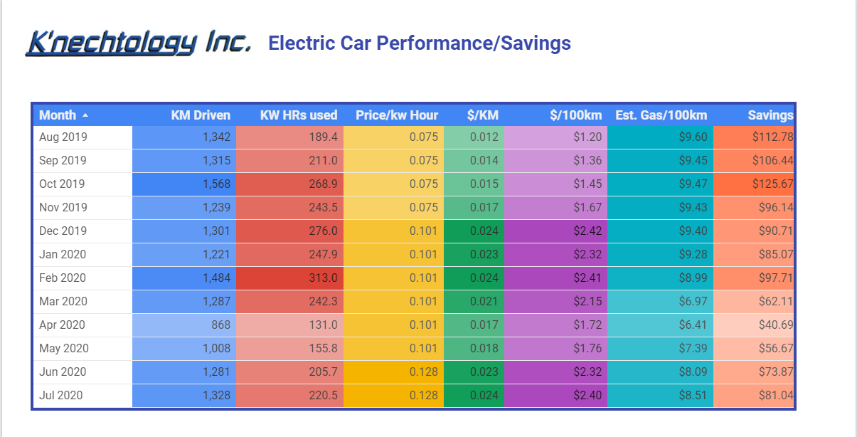
Below is a typical data type report with all the boring detailed data. This is a mega table of data and only those truly interested in the details will find it interesting. If presented with this table most would likely only look at the right-hand column to see the total monthly savings. If presented with just this data, many will get bored, and will look up and start counting the holes in the ceiling tiles instead of paying attention.

The following graphs demonstrate many of the ways to make this data sing, by putting all of the data into context through interactive graphics.

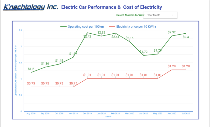
The above graph (page 1 of the report) details the cost of operating the electric vehicle. The first question we were always curious about was how much it was costing us to operate per 100 km. By collecting data on how much electricity was used to charge the car, how many kilometers we drove in a given month and the cost for that electricity, we are able to calculate the operating cost. In the graph you can easily see the fluctuation in operating costs, with costs going up in winter months (cost of operating the heater in the car) and again in June & July (cost of running the AC). You can also see the impact of increases in electricity prices.

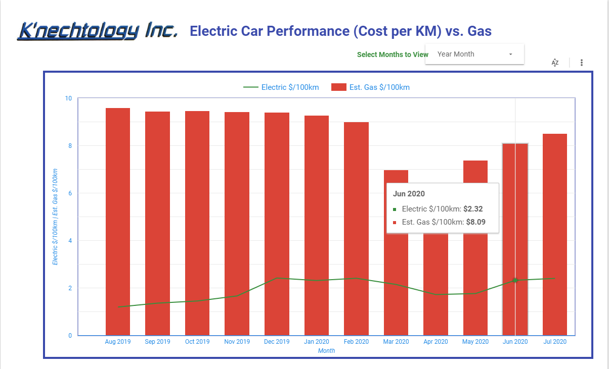
To truly evaluate the big question “Was acquiring an electric vehicle worth it?” we’d need to estimate how much gasoline would have been consumed by driving the same distance against the average cost for gas during the same months. On page 2 of the report the data is now starting to sing as the difference in the savings of electrical over gas becomes clear. The chart becomes interactive and allows the user to hover over any column to reveal the data details.
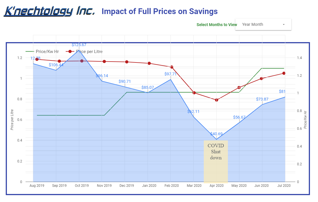
To make the data truly sing, we’d need to not just compare the operating costs, but the costs of ownership. Do the savings in the operating costs justify the price difference between the vehicles? We know that the difference in lease costs, insurance and annual maintenance is in the range of $85-$90/month

The above graph (page 3 of the report) demonstrates, the impact of plummeting gas prices and the reduced driving done during April 2020 due to the COVID-19 shutdown. In April 2020 a mere monthly savings of approximately $41 dollars was achieved. Therefore, there were no savings in owning a more expensive electric vehicle over an equivalent gas-powered vehicle (the difference in lease costs and insurance, etc. is in the range of $85-90/month). While it might not be sing, it definitely was screaming out when we saw it.
Check out the entire report for yourself. It is accessible here so you can view all the pages/charts. The report is interactive allowing you to hover given months to see data details or even change the reporting date range.
By embracing not only data visualization but the visualization of meaningful data, we as marketers can raise the bar and increase engagement with our audience. Think of the four pages of this report, which page talks most to you? Which way of presenting the data makes it sing for you? Odds are it was not the first table with all the detailed data.
Opinions expressed in this article are those of the guest author and not necessarily Marketing Land. Staff authors are listed here.
Marketing Land – Internet Marketing News, Strategies & Tips
(35)
Report Post


