![]() by Pooja Lohana October 29th, 2014
by Pooja Lohana October 29th, 2014
You’ve seen it with your own eyes.
Social is going Visual Social and it’s about time you started creating and sharing some cool visuals for your brand or clients.
It’s natural for humans to immediately pay attention to visuals. When blogging first became popular, people posted longish posts of about 1000 words. Then Twitter revolutionized content sharing and we saw 140-characters long posts doing the rounds of the Net.
A few years ago, infographics made their first popular appearance. Smart marketers watched the trends and were the first to jump ship.
With the rise of Pinterest and Instagram, visuals are not going anywhere anytime soon. Long blog posts still have their place, but combined with rich images, they work like a charm because visuals instantly capture your readers’ attention and your high-value post holds it.
But as you’d imagine, most other bloggers already know this and combine visual strategies with their content marketing.
So it’s obvious in order to stand out, you must do something different. But don’t fret – you don’t have to be super-creative with great design chops to publish visually-appealing content.
The easiest of the steps is actually creating your content. There are many free tools that don’t require you to have Photoshop-like skills.
Online tool Visme, dubbed as the Swiss knife of visual content, lets you create everything from cool infographics, presentations to CTA banners all for free. Just choose from their many templates and create new visuals in minutes.
Instagram has 150 million active users and is obviously one of the top social media websites today.
But if you thought Instagram can only be used to put up crisp, filtered images of your Sunday picnic, think again.
Successful brands are already using Instagram in creative ways. Generic Electric for example has 166,318 followers the last time I checked.
If a company that has hardly any “creative” component and can be interpreted as “boring” can boast of thousands of engaged followers, surely your brand can find some good use for Instagram?
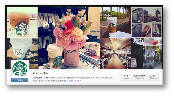
Another great example is Starbucks. They have got a massive following of more than 2,300,000 followers!
These companies understand the golden rule of social media: People love connecting with people. They’re using Instagram to humanize their own brands.
So it’s a great idea to share photos of your staff, make use of captions and reply to photo comments using tags (@username) of the people who leave comments.
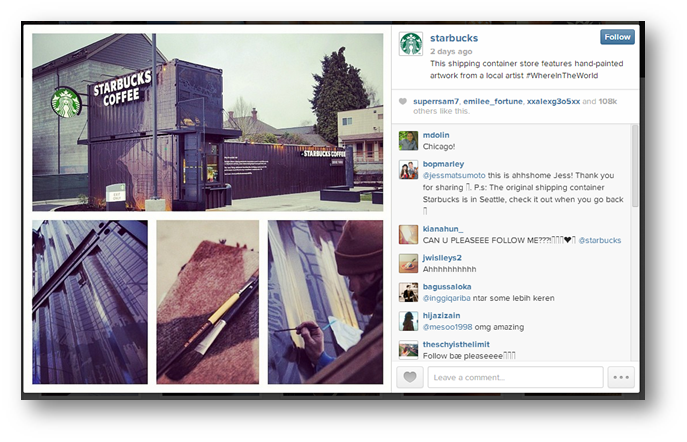
Also make sure you use the hashtag (#) just like Starbucks does in their post above (#WhereInTheWorld) to be found when people are searching for relevant topics. You can also come up with your own signature hashtag to engage people in conversations about your brand.
Pinterest is a huge virtual pinboard where your images become pins and people can like or share them via the “Pin it” button.
Although 80% of Pinterest audience is female, it also drives more referral traffic to websites than Twitter, Reddit, LinkedIn and Google+ combined.
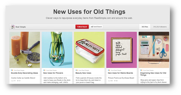
Real Simple, a NY-based magazine that gives creative, practical and inspiring tips to make life easier, is one of the most-followed pinners on Pinterest.
With over 130 boards, their content is organized and users can pick topics that interest them to follow. They’ve got boards from easy hairstyles, weeknight meals to decorating ideas.
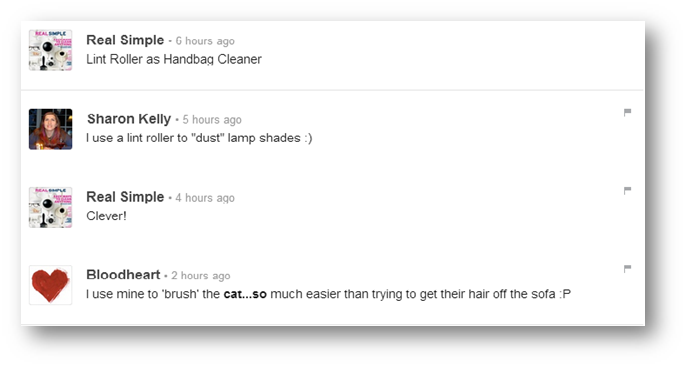
The best part? They make sure they’re engaged with their followers via comments.
Needless to say, on Pinterest, use only high-quality photos. A good size to start with 736 x 1128 pixels because it’s long enough not to be missed by users and stands out nicely. It also works nicely on smartphones.
This board shows you how different sizes come out when published.
Another neat tip is to add a “Pin It” button to your images if you want them to be shared on Pinterest. However, try posting them once to see if they are near-perfect size and don’t get lost in the sea of pins.
Vine
Vine is relatively new on the block. It lets you create 6-second videos to put your message across. It was released in January 2013 and has bagged 13 million users already making it the most downloaded iOS app in June last year.
The beauty of this video-sharing app is that it leverages the low-attention span online. Videos are capped at 6 seconds but you don’t have to shoot the whole thing in one go. You can create a montage and a series of non-consecutive pieces together.
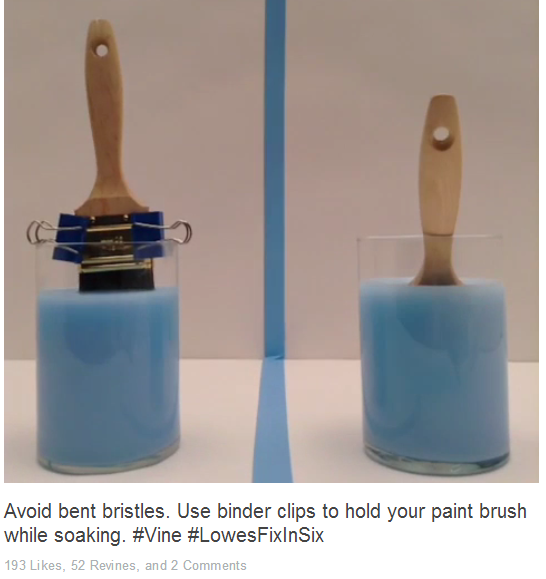
Home improvement brand Lowes understands this pretty well. Their Vine page uses a hashtag #LowesFixInSix where they teach 6-second home improvement tips using fun, short videos.
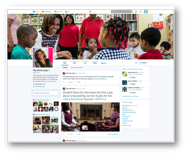
Surprised to see Twitter in this list? Well, Twitter is always making new tweaks to their design and the latest one looks eerily like Facebook.
Nevertheless, this means they are jumping the visual bandwagon with a larger profile photo.
The new features, along with larger “best tweets”, pinnable tweets and an ability to choose which type of tweets you’d like to see are coming.
Jamie Riddell, creator of BirdSong, thinks that “visually, this latest update is a firm move away from 140 characters to a more engaging ‘multimedia’ experience that encourages the user to dwell longer on Twitter.”
And we totally agree with Jamie. The micro-blog is listening to their audience and very well know images are the most engaging factor on Facebook itself.
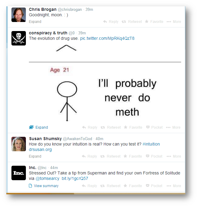
So what does this mean for you? Well you could already make your tweets stand out like this:
For the above effect, you have to use a third-party application such as Twitrpix.
Using Twitrpix is super-simple with these 3 steps:
1. Go to the Twitrpix website and click the “Sign in with Twitter” button.
2. Click “Upload/Webcam” icon.
3. Upload an image from your computer, add a caption and tags.
Voila! Your Twitter pic is ready. Adding a picture preview is powerful because your tweets immediately stand out from the rest in your followers’ stream.
There are many more ways to capture attention using visuals, but I’ll stop at these and pass over the megaphone to you. What other creative ways have you used to make your content stand out on visual social media?
Post from: Search Engine People SEO Blog
How to Make Your Visual Content Stand Out On Social Media
—
Written by Pooja Lohana, Damn Fine Writing
The post How to Make Your Visual Content Stand Out On Social Media appeared first on Search Engine People Blog.
(701)
Report Post

