A Rejoiner study found that over 50% of the cart abandonment emails they send are opened on a device that is different than the one the customer originally abandoned on.
A typical situation is a person browsing your site on mobile, perhaps adding items to their cart as a “wishlist”, then never completing their purchase.
Wouldn’t it be great if you could email them with the exact items they’d left in their cart, and restore their cart with those items, no matter what device they use when they click through your email reminder?
That’s the beauty of cart regeneration, a feature that online retailers often overlook in their cart abandonment email strategy.
Why Your Customers Are Leaving Without Purchasing
There’s so much information online about abandoned carts, from what they are to best practices for preventing them.
The reason there’s so much information about abandoned carts is because more than two-thirds of people who add something to a cart abandon it.
So, here are three popular reasons so many of your customers are abandoning their carts without making a purchase.
1. They’re shocked by your shipping costs.
According to Business Insider, the number one reason that consumers abandon their carts is because they are unprepared for the shipping costs associated with their purchase.
How to Battle This
Determine if your business model can support offering free shipping. If so, make sure your messaging is clear and visible during every step of the checkout process.
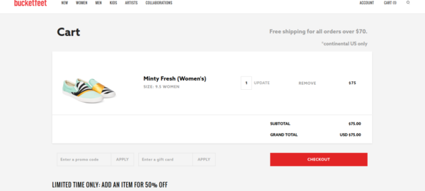
Consumers are less likely to abandon if they can visually see that “free” offer. If you can’t offer free shipping, think about building a free shipping threshold, instead. For example, “All orders over $ 50 qualify for FREE shipping!”
Check out how eCommerce shoe company, Bucketfeet, displays their shipping threshold messaging at the top-right corner of their cart…

2. The checkout process is way too complicated.
People are impatient. Don’t expect them to push through a checkout full of barriers without exiting out of pure frustration.
How to Battle This
Consider reducing the amount of steps in your checkout. Think of ways you can minimize and condense multiple steps into one, especially if you have more than three steps or an account creation process.
Pro Tip: Look into your mobile checkout analytics. Perhaps you have a high abandonment rate because your checkout isn’t optimized for mobile use.
Here’s a good example, the 3-step mobile checkout process from Bonobos…

3. Your customers are “wishlisting”.
It’s very common for customers to add items they’re interested in to their cart just to see what the total adds up to. They really don’t intend to buy, they’re just creating a “wishlist” of products they’d like to buy, just “kicking the tires”.
How to Battle This
Deploy visual incentives and trust elements throughout each step of your customer’s buying journey.
Even if they are just “wishlisting”, if they see a “free shipping / free returns” offer or a “100% customer satisfaction” guarantee or social proof elements (e.g. customer photos of your products in use), they could be pushed through to actually completing their purchase.

If They Leave, Win Them Back with Email
After you’ve implemented the best preventative measures for cart abandonment, now it’s time to dial in your cart abandonment email strategy.
Sending a strategic email after your customer leaves your site without purchasing the items in their cart is crucial to winning back consumers who are “wishlisting” or browsing from mobile.
As of Q4 2015, 37% of all eCommerce transactions involved multiple devices and mobile commerce now represents 35% of total eCommerce transactions globally.
That means your abandoned cart emails need to cater to shoppers who may complete a single transaction with multiple devices.
For example, your customer is browsing your eCommerce website from their mobile phone. They add items to their cart and do not complete their purchase. Later that evening, they get an email from you and open it on their desktop.
There’s a button to “return to their cart”. They click it, and all the items they’d previously added on mobile are magically restored to their cart… on their desktop.
So, it’s great to send a “reminder” email to your customer after they’ve left items without purchasing, but it’s a completely new email strategy if you can actually regenerate the cart they left behind.
Making it easy for your customer to buy those items can and will incentivize conversion.
Cart Abandonment Email Designs (with Cart Regeneration)
When designing a cart abandonment email with cart regeneration, you should keep these three elements in mind:
- A sense of urgency.
- A trust-building element.
- A discount (when appropriate).
Here are some of my favorite examples of cart regeneration emails done right.
1. Huckberry
Check out how Huckberry designed their cart abandonment email…

Is there urgency? Yes.
Check out the last line of copy in the top paragraph. It urges the user to “hurry” because these items “won’t last long”.
Are there trust-building elements? Yes.
The free shipping and returns offer below the CTA allows the customer to have more confidence in their purchase. Additionally, they’ve done a thorough job of providing support information, showing the customer that if they do place an order, they can trust they will be supported.
Is there a discount? No.
At this stage, Huckberry isn’t offering a discount to their customers. And, frankly, a discount may not even be a part of their strategy.
Most brands that offer discounts wait until no action has been taken for quite some time. Think 5 days to 2 weeks later. (The Honest company sends their first discount 2 weeks post-abandonment.)
Why? Because there’s always a chance the shopper is “just thinking about it” or even waiting for you to send a discount.
2. Chubbies
Here’s how Chubbies takes on cart abandonment…

Is there urgency? Yes.
Check out the copy just below the giant button. Chubbies is known for their cheeky copywriting, so this sense of urgency they’ve added follows suit.
It does inspire action after reading. If the time to dominate is now, they better buy those shorts now.
Are there trust-building elements? Well, this could be improved a bit.
Below the imagery of the men in Chubbies shorts, they do provide their contact and support information. However, in comparison to Huckberry’s email, Chubbies falls short in that they don’t include their “free returns / free shipping” offer… at least not in this email example.
Is there a discount? No.
Again, this may not be the correct stage for Chubbies to offer a discount or perhaps it’s not part of their strategy at all.
3. The Honest Company
Both of the examples above don’t include a discount in their emails. The Honest Company does, though…
1 Day Post-Abandonment

2 Weeks Post-Abandonment (Discount)

3 Weeks Post-Abandonment (Better Discount)

All of these emails exhibit all three elements to consider when designing a cart abandonment email with cart regeneration: urgency, trust, and discounts. Though the images are cropped, they do link to their service and support for strong trust-building.
How You Can Get Started with Cart Regeneration
Alright, now you know how some of the fastest-growing eCommerce brands are designing their cart abandonment emails and putting cart regeneration to good use. Now here’s how you can get started.
Find an Email Marketing Solution with Cart Regeneration
Obviously, you need to make sure your email solution can integrate with your eCommerce website and provide this level of marketing sophistication.
Here are some of the top solutions that eCommerce sites use for cart regeneration:
If you’re already using one of these solutions, ask your client manager or dedicated rep about adding cart regeneration to your service.
Design Around the 3 Elements
Next, comes design. As discussed above, you’ll want to keep these three elements in mind while designing:
- Urgency
- Trust
- Incentive
Here’s a simple, yet effective design from Bonobos…

Avoid Discounting Too Soon
Developing a solid cart abandonment email strategy often comes with discount temptation. Though it’s true that offering a discount incentive can boost conversions, it’s best to launch your campaign with the goal of being customer-centric and gaining qualitative insight first.
Offering discounts too soon can not only be a poor strategy in terms of maintaining good margins, but it can also cause your customers to become accustomed to discounts or change the value perception they once had.
(Author’s Note: Be aware of the fact that a discount might not make sense for your site at all, regardless of how much time has passed. Run the numbers beforehand and carefully consider your margins.)
Monitor Conversions and Optimize with Segmentation
Once you’ve gained that qualitative insight, it’s time to analyze!
In a recent article from Klaviyo, they outline some different ways to make decisions based off of the data you acquire:
For instance, if you know that students ages 18-22 respond less favorably to abandoned cart emails (one study found that 54% of students find abandoned cart emails “annoying”), you can use that information to influence your flow cadence and messaging.
Similarly, if you know that men respond in an overwhelmingly positive way to discounts, you can use that data to create custom email flows.
So, if you do want to offer a discount, use your customer behavior to inform that decision so you can avoid some of the costly pitfalls of discounting before you’re ready.
Conclusion
If you learn nothing else from this article, let it be this: cart regeneration is one of the easiest ways for you to generate revenue from abandoned carts, especially in this new multi-device world.
And, chances are, you’re already using a service that offers cart regeneration as a feature. So, remember…
Stop cart abandonment before it happens by: being upfront about shipping costs and reducing them if possible, simplifying steps and removing friction throughout the checkout process, and promoting guarantees and social proof for wishlisters.
Email is a good way to reengage wishlisters and mobile browsers when they’re more likely to complete their purchase.
When designing a cart regeneration email, consider: urgency, trust, and incentives.
Focus on gaining qualitative insights before offering a discount. How do consumers respond to your cart regeneration emails?
Through segmentation and analysis, decide on messaging, cadence and discount timing.
If you have any questions about integrating cart regeneration with your eCommerce platform, leave a comment below and I’ll be happy to give you some feedback.
Business & Finance Articles on Business 2 Community(54)
Report Post


