How to Nail the Art of Visual Email Marketing
Interesting subject line 
Engaging and relevant copy 
Actionable CTA 
All these make up a high-converting email. But there’s one more thing that helps in getting maximum ROI from your emails. That’s attractive visuals. Vennage has revealed that 49% of marketers rate visual marketing as “very important” for their marketing strategy. Three days later, people will probably remember only 10% of the information they hear but 65% of the information if it is presented with a suitable image.
So, if you want your emails to make a difference and prompt the subscribers to take action, using visuals is a must.
That said, let’s take a look at all the different types of visuals and rich media you can use to enhance the email’s aesthetic appeal.
1. Images
Static images come first, as they are a basic yet compelling part of visual email marketing. Whether you want to display your product with a pretty picture or break down the content with vectors, images come in handy. If you want to pull the plug on lengthy text, use relevant images along with a crisp copy.
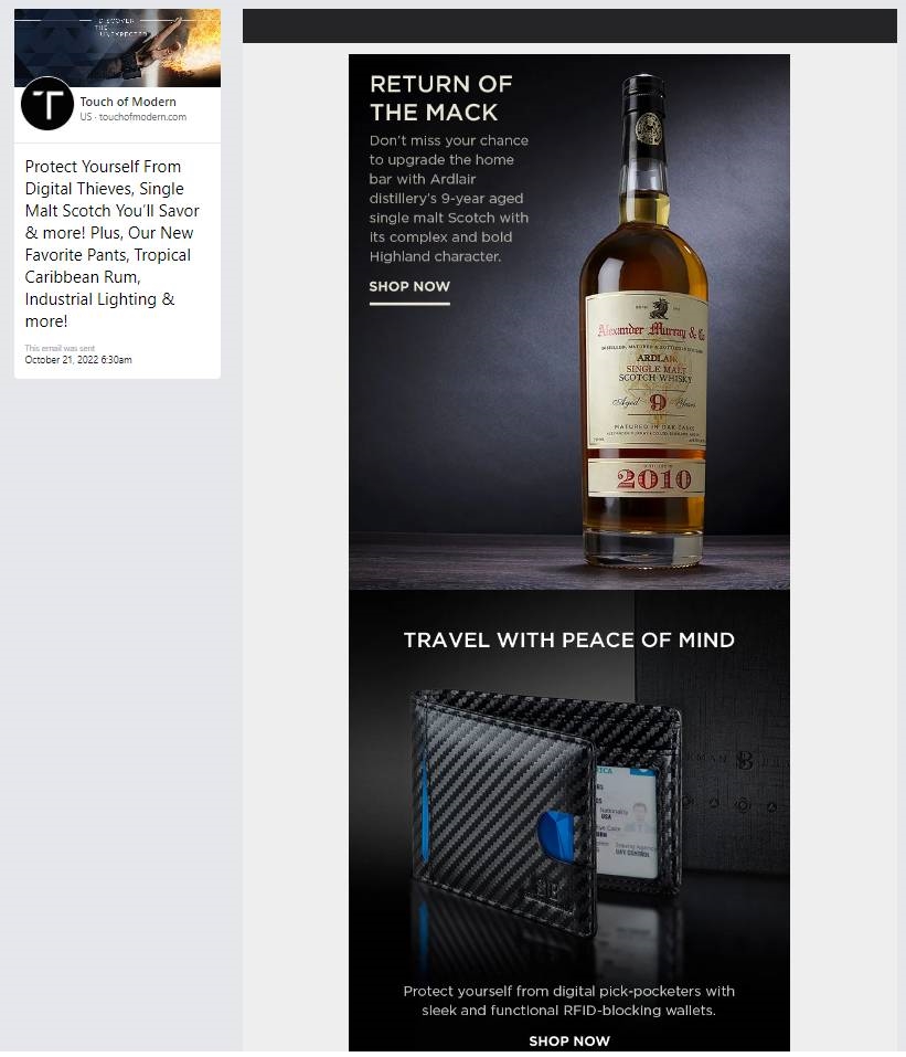
Take a look at this email by Touch of Modern. They have nailed the art of product photography and included the perfect image that would attract shoppers.
2. Illustrations
Illustrations can be used as a powerful storytelling tool in emails. According to a survey, illustrations and infographics are performing better than many other visual elements when it comes to yielding engagement. Rather than using stock images, you can use meaningful illustrations that add more value to the emails.
Here’s an email by Harry’s that uses an illustration to depict the awesomeness of their face wash packs.

3. 3D Images
3D images originated in the 1970s. They established their identity in web designing and gradually made their way to emails. These images add depth to the flat email design and bring freshness to the subscriber’s inbox.
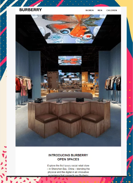
Burberry has incorporated a nice 3D image to promote their open spaces in the email.
4. GIFs
Let me take you back to the earliest usage of GIFs in emails.
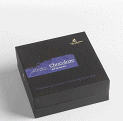
In the year 2007, Lake Champlain Chocolates incorporated GIFs in their emails, and to their sheer surprise, it brought 49% higher conversions.

Then, in 2014, Dell drove 109% revenue (marketingsherpa) with the help of an animated laptop image in email.
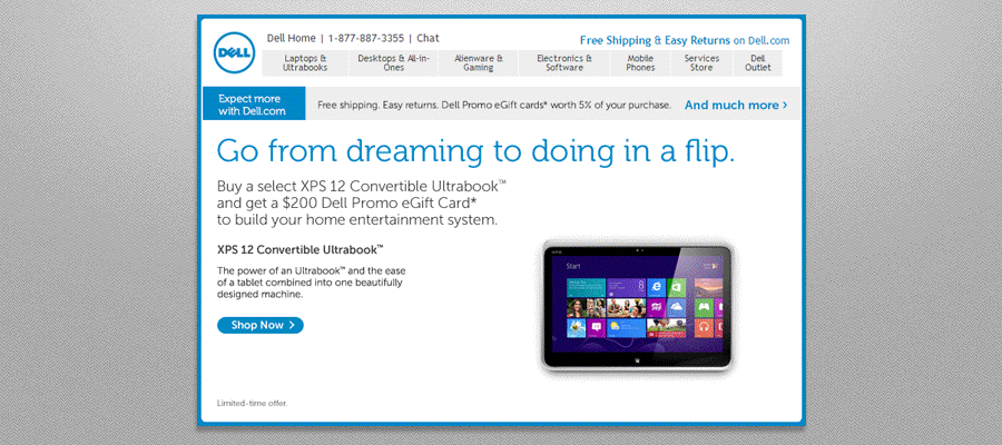
Animated GIFs prove to be extremely beneficial in various use cases, as discussed below:
- Displaying the huge range of products available in your eCommerce store
- Inspiring wanderlust in the readers with enticing images of the destinations
- Demonstrating the usage of your products
- Promoting a new show released on your OTT platform
- Executing occasion-based email marketing
- Animating the typography to draw attention to an important message
Anthropologie has used action-packed animation to show its products. It portrays comfort and aesthetics and lures the readers to buy.

5. 3D Animations
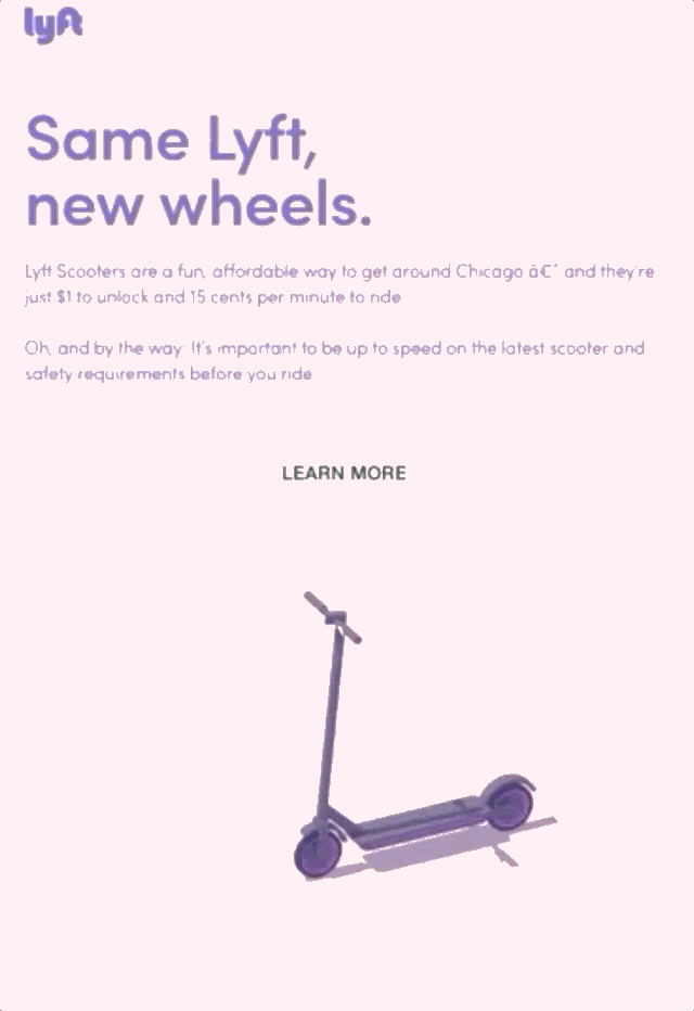
3D animations are a step above GIFs. If you want to further enhance the user experience, use 3D GIFs as Lyft has done.
6. Animated Illustrations
Illustrations with animations are a visual treat. They help in telling a story to the subscribers. If you go by the “Show, don’t tell” adage, try using animated illustrations in your emails.
Grammarly sets the perfect example of using animated illustrations in their email promoting the midnight sale. The animated owl and clock form a great combination to convey the message.

7. Cinemagraphs
GIFs are snippets taken from a video or an animation played on a loop. On the other hand, cinemagraphs are sophisticated animations with a seamlessly endless loop that take the subscriber back to a past moment.
Here’s an email example by Detour Coffee Roasters showing the use of cinematography in their welcome email.

Like GIFs, you can use cinemagraphs in the telecommunications industry and add visual oomph to your emails. It will pique the subscriber’s curiosity and make them buy an OTT subscription to watch the show.
8. Videos
You can add videos in emails in two ways.
- Place a video thumbnail with the play button and take the reader to the landing page.
- Embed the video in the email itself and let it play therein.
The first option is pretty straightforward in that you just have to embed a static image in the email that emulates a video thumbnail.
Here’s an example.
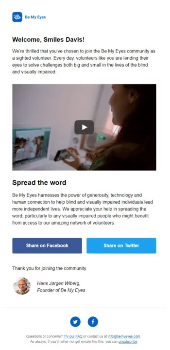
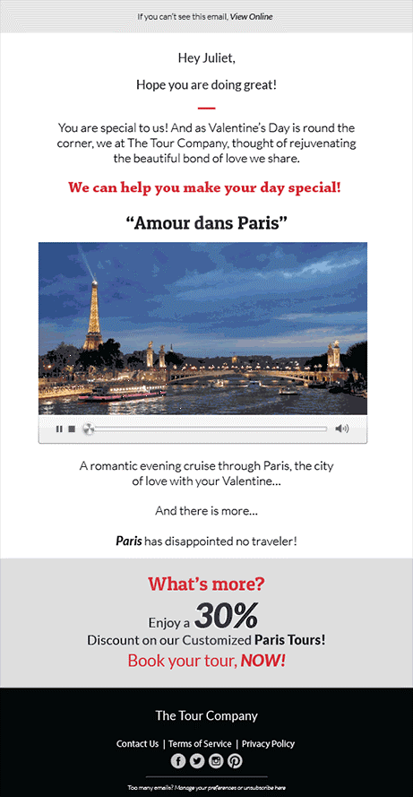
The second option requires some coding expertise. You have to consider email client support too, if you want to use embedded videos in email.
Take a look at this email template to experience an embedded video in it.
Some Additional Ideas to Make Emails Stand Out
- You can use a monochrome design layout with a single color in the emails.
- Add gradients to reinforce visual hierarchy and get the emails read till the end. You can even experiment with innovative CTA buttons with gradients.
- The key to using visuals effectively is to follow the principles of visual hierarchy. Arrange the email components in a Z or F-shaped pattern to guide the readers. Also, adhere to the accessibility best practices.
Pro-tips for Adding Visuals in Emails
- The text-to-image ratio should be maintained at 80:20.
- As email clients block images by default, add a suitable alt-text with every image. This will also be useful if the subscriber views the email with images turned off. It is an important accessibility best practice and aids the screen readers in conveying the message to subscribers with visual impairment.
- Don’t add important information and CTA in the images.
- An all-image email will trigger spam filters and hamper your email deliverability rate.
- Avoid stock photos at all costs. Real photographs work better if you want to leave a lasting impact on the subscriber’s mind.
- Animations should not flash between 2 to 55 Hz; otherwise, it will aggravate the condition of photosensitive epilepsy.
- Keep close tabs on the email file size to ensure fast loading. It will prevent cutting into the user’s Internet bandwidth.
- While adding GIFs and embedded videos, include a suitable fallback to curb rendering issues.
- Use images judiciously without getting over the board.
- Test the emails so that they render well across all the major email clients and devices.
Wrapping Up
Remember those times when it seemed impossible to format emails with anything more than an image? And now, we have so many different options to explore and make our emails more fun and entertaining. Besides visuals, you can even use interactivity to add to the visual appeal. Test and see what works best for you.
Put your creative hats on to create email designs that resonate with your email subscribers. It will, in turn, bring you unmatched results in terms of open rate, click-through rate, conversion rate, and ROI.
Featured Image Credit: Provided by the Author; Thank you!
The post How to Nail the Art of Visual Email Marketing appeared first on ReadWrite.
(16)
Report Post

