Isn’t it crazy how the smallest things can have such large impact on your business? In this particular case those small things we’re going to discuss are your calls-to-action (CTAs) that you use in and around your site to generate leads online.
CTAs come in different shapes, sizes, colors, fonts, gradients, shadows, graphics, and infinite other options. But this article will focus on 3 key ideas that you must pay attention to in order to optimize your calls-to-action for higher conversion. Let’s dive in.
Content vs. Design
The words that you put on your CTA are equally as important as the shape, color, and size of the final design. With that said, take a look at the examples below to see just how effective content and design can be.

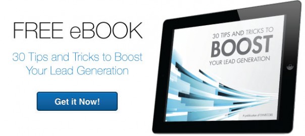
This A/B test group is for a downloadable content piece, which in this case is an ebook all about responsive web design. The design is clean and simple. It showcases an image of the cover of the ebook, some copy that encapsulates what it’s about, and a bright blue CTA that stands out from the white background.
You’ll notice that each version has slightly different copy on the actual CTA. Version A states for the user to “Get it Now!,” while Version B is a little bit more personalized, informing the user to “Grab Yours Today.” Notice the difference in the clicks-to-submissions? The personalized copy of Version B worked better in this situation and, in the end, it ended up with a slightly higher conversion rate than Version A.
Shape, color, and size are integral aspects of CTA development. But when a prospect or visitor has to make a decision whether or not to “click through” your CTA, the copy itself is what will drive that user to take action. Not to mention, that “click” sound on your CTA potentially means money in the bank for your business.
Keep It Simple
People do all sorts of crazy things to their websites to grab visitor attention—images, arrows, GIFs, scrolling text, and crazy CSS effects to name a few. But when it comes to CTAs, the best-performing ones have a simplistic statement and very little flair.

You can see that Version A, with its dark background and heavier wording, did not perform as well as Version B, which is clean, simple, and has elements that really stand out on the white background of the page. If you think you’ve added too much to your CTA, you probably have and should dial it back. Oh, and did I mention…simplicity leads to higher conversion rates. It’s that simple.
Don’t Make Them Think
You’ll get caught with your pants down if you assume too much about the people visiting your website. So don’t make those users think! Tell them exactly what actions you want them to take. Don’t let them deviate from your intended path, and make sure that path is one of least resistance.
What does this mean? It means your CTAs should be the one-and-only option for them to take when nearing that “click.” Direct them to the CTA, tell them exactly what they’re going to get when taking action, and deliver on those expectations. The image below shows some viable options that you should and should not use when developing your own optimized CTAs.

As you can see, the examples in the “Do This” column are exciting, actionable, and have a personal touch when read by the user. Put yourself in your prospect’s shoes. What sounds better to you, “Download” or “Download My Ebook”? Stock action words like submit, register, and download can exponentially lower your conversion rate. Instead, try using short, self-referencing verb phrases that suggest action and momentum.
I’ve written this article in the hope that it will help jump-start your journey to optimizing your calls-to-action for higher conversion. These 3 ideas are only the tip of the iceberg when it comes to online lead generation and optimizing your digital efforts for higher conversion rates. So share this blog and help jump-start my journey to writing more content about CTAs and other inbound marketing musings.
Oh, and comment below to let me know how your CTAs are working out!
(159)
Report Post