Last year’s U.S. holiday ecommerce sales reached a total of $ 100 billion, and some studies are already expecting U.S. customers to up their spending this year by more than 500%, totaling $ 616.5 billion over the course of the winter holidays. That’s a lot of potential uplift for your business — and it’s never too early to start planning and optimizing for the rush of holiday traffic. After all, 26% of shoppers purchase before Halloween.
Many of these early shoppers are browsers turned purchasers. In other words, a holiday reference or promotion will bring the gifting season to mind. The potential customer will then begin browsing to see what is available this season — and if they like what they see, they’ll likely convert.
Most shoppers begin this journey on marketplaces, where 64% of online customers start their browsing activities. For these people, shopping is a curation game. Start big on a marketplace like Amazon, eBay or Jet.com, and then narrow your options down. For online SMBs, you want to be part of that narrowing down process. Beyond having your products available on marketplaces, you’ll also want to pull potential customers to your site with marketplace and social media ads.
Once they are on your site though, you’ll need to provide a quality site-search experience. Remember, these shoppers are in the curation step of their buying journey. Allow them to narrow down seamlessly and you could win the sale.
Below, we’ve gathered six ways to optimize your site search and navigation for the holidays, in order to increase conversions, average order value and time on site.
1. Make Your Search Box Prominent
The first step to optimizing site-search for the holiday season is ensuring the search bar on your site is prominent. Holiday shoppers are often crunched for time, so efficiency is key. If they can’t find the search box on your site easily, they might just leave. Want proof? According to the Online Marketing Institute, 85% of customers abandon a site due to poor design, and 83% leave because it take too many clicks to get to what they want. Don’t give customers a reason to buy from your competitors.
Check out how online store Englin’s Fine Footwear places the search box in the top right corner, where online shoppers expect to see it, using their brand’s color palette to make sure the search bar stands out.

2. Offer Autocomplete Functionality
An enhanced autocomplete function will present shoppers with phrase and product matches as they type. Product matches in an autocomplete drop-down list allow shoppers to see visual representations of the product and lead them directly to a product page — skipping the extra step of viewing search results.
Consider how online music supply retailer Chuck Levin’s includes both popular search phrases and product matches with thumbnail pictures in its drop down search.

3. Offer a Mobile Search Solution
More than ever, consumers are shopping on the go. In fact, mobile sales now make up 30% of U.S. ecommerce sales. Offering a second-screen search and navigation experience that is as user friendly as your traditional desktop model is paramount to capitalizing on the holiday rush.
Help consumers find what they are looking for by improving the search functionality on your mobile site. Research indicates that if a consumer cannot find what they are looking for within eight seconds of landing on a site — they will leave. Optimize a mobile shopper’s experience with responsive design and filtered suggestions.
4. Ensure Your Site Is Optimized with Quality Search Results
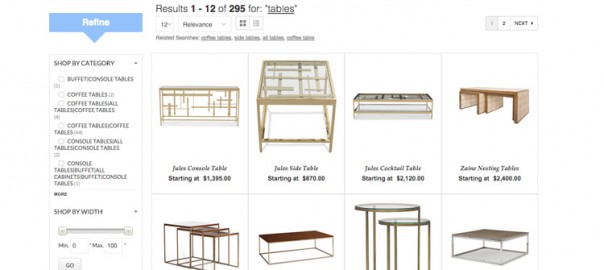
When a shopper does choose to view a search results page, it’s equally important that the results are fully optimized in order to create a seamless user experience. To do so, search results should be displayed in order of relevancy to the search term entered. They should be presented in a grid format and should contain high resolution images along with a brief product description. Product details, such as price and rating, and the presence of a “buy now” button are also helpful to increase your site’s conversion rate.

5. Create Customized Category Pages for the Holiday Season
To optimize the user experience during the holiday season, create category pages catered to your shoppers. For example, highlight the deals on your website by creating a clearance or holiday sale page. This will gather lower cost items on one page and help your customers access these products more effectively.
In addition, creating these types of category pages increases your SEO. When similar products are pulled together onto one landing page, and that landing page is optimized for the keyword common to all those products, you’ll get a boost by Google in search rankings for relevancy. All in all, you can’t go wrong with category pages. Just be sure to deprecate them as they become irrelevant or update them to keep them evergreen.
6. Create Filters and Refinements
Allowing shoppers to narrow a search by price, color or brand through a filtered search feature will enhance the user experience and help them to quickly focus their search.
Search results pages can additionally be enhanced by using banners, product spotlight badges and product recommendations. All of these add-ons will work together to make your online store more visually appealing and easier to use.
 For both the merchant and the consumer, the holidays are a stressful time in the retail world. Nurture your customers through the season by making your gift ideas easy to find and pairing product offerings with useful information. Remember, preparation is key — and with optimized search functionality, you can ensure the browsing experience on your site rivals that of the bigger box brands.
(145)
Report Post


