— July 22, 2017
Social media – it’s not just a B2C marketer thing. It should come as no surprise that 83 percent of B2B marketers today use social media content. Marketers say they see more exposure, increased website traffic, and more loyal fan bases thanks to social media.
Another fact – 74 percent of marketers are using visuals as part of their social media marketing efforts. It’s not surprising – most people claim to be visual learners after all, so a well-placed cat meme seems to go a long way.
But feeding the never-ending demand for content can appear impossible for resource-strapped teams. Dedicating precious design resources to a what can feel like less significant piece of content than say, your pillar white paper or guide for a quarter, can seem silly.
That’s why it can be easy for an overwhelmed marketer to throw their hands up and claim a post to be good enough without an image.
It’s a huge missed opportunity and can actually be addressed without a ton of heavy lifting.
A proliferation of design-it-yourself tools for content marketers makes the process easier and simpler than you might have imagined to create simple, engaging, on-brand visuals to support each and every social media media post you publish, without having any graphic design chops.
It’s as simple as three steps:
- Find the right image.
- Craft action-oriented language for CTAs.
- Build your image in a DIY tool.
Find the Right Image
Finding imagery or stock photos that align with your social media posts doesn’t necessitate thousands of dollars in credits to purchase stock images. There’s been an explosion in recent years of sites offering free-to-use photos (like Pexels or Unsplash). You simply enter a search term and then find the image that makes the most sense for the post you’re creating.
Best practices include picking images that:
- Are not a direct contrast to your brand personality or aesthetic
- Are thematically linked to your social media post
- Have negative space if you plan on adding text
Let’s walk through an example. I want to create a Twitter post to help promote one of our recent blog posts, 101 Ridiculously Effective Ways to Use Interactive Content in Your Marketing Today. On the Pexels site, I search for “ideas” and come up with a bunch of good, relevant photo options.
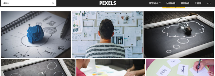
I opt for this one, as it’s in line with many of the images we use as part of the SnapApp brand and it speaks directly to the theme of idea generation. I also know I’ll want to add text to it for the CTA, so I think the space on the left side of the image gives me some room for that.

Craft Action-oriented Language for CTAs
While finding the right image is a good start, if you want to drive your followers to engage with your content, creating action-oriented, interesting CTAs as part of you images can drive up click throughs. After all, it means your followers know exactly what to expect when they click, so they will be more encouraged to engage.
Tell users what they get.
Clearly indicate what the value is for your followers in clicking through – why should they bother clicking? What’s the point? Is it some unique insight? A prize? Valuable content? Something else? Be clear in your CTAs and always answer the question, “What’s in it for me?”

The “get” for those who click here is very clear: $ 100.
Think action when crafting CTAs.
Are you more likely to “read more” or “take a quiz”? Action-oriented verbs tend to drive more clicks, particularly on social.
Beyond just the language, it’s also important to think carefully the type of content you are pushing through your social media channels – is it all static white papers you want people to download? Are you using assets that are truly engaging?
More and more companies are seeing success on social media using engaging, interactive content on social media – think quick polls, quizzes, surveys – vs. traditional, long-form content. The short-form, highly engaging nature of social media lends itself well to these types of content, and provide an easy entry point into more in-depth pieces (like a three question quiz as a precursor to a longer PDF guide).
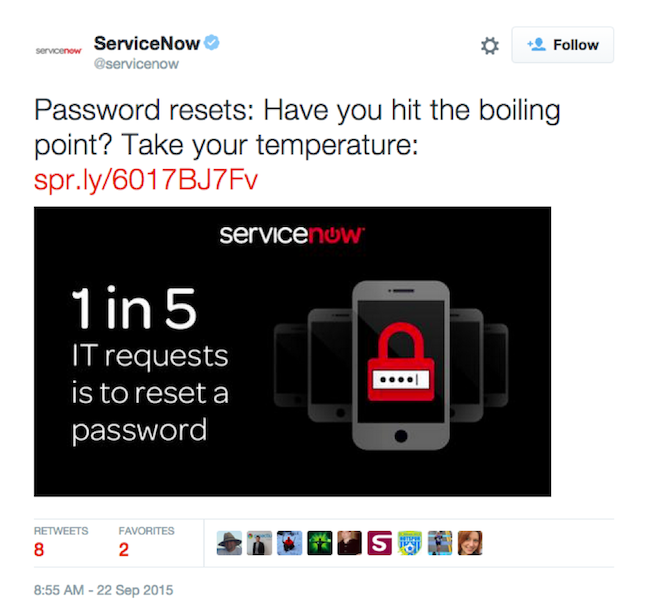
ServiceNow uses a short assessment to engage followers on Twitter.
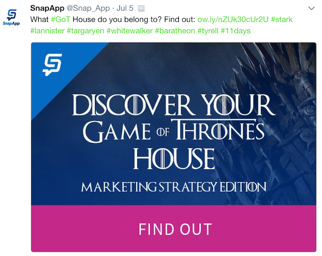
We give our followers the chance to find out what GoT house they belong to with our short quiz.
Create a sense of urgency.
No one wants to be left out of a great opportunity. Take advantage of people’s sense of FOMO by using time-oriented language like “Don’t miss out!” or “Only two days left!” Limited time frames can be very effective in driving interest.

Noting a timeline can encourage followers to click through.
For my example post, I’ve come up with this language: 101 Interactive Ideas to Fuel Your Content Calendar: Generate Ideas Now!. I’ve picked this because:
- It’s action-oriented (generate an idea)
- The “get” is very clear (your next idea)
- There’s a timeliness to it (do it now)
Build Your Image in a DIY Tool
Now that you have your image picked out and your copy drafted, it’s time to put it together. There are a few great DIY tools out there, but one that the SnapApp content team tends to go back to time and time again is Canva.
With an easy to use interface, even the most hopeless non-designers can put together something simple and effective in very little time.
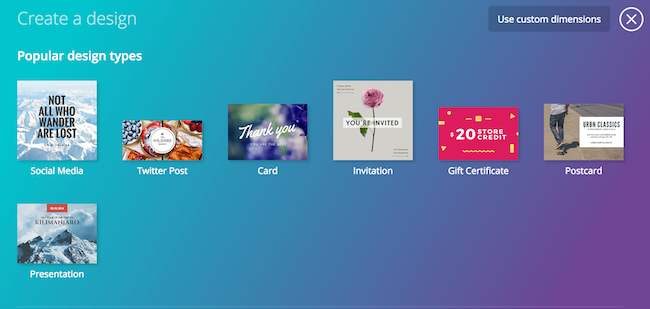
To get started with Canva, you simply choose the dimensions you’d like for your design based on output type, or you can input custom dimensions. For my example, I’ve chosen Twitter Post, which Canva makes even easier by having a template that follows Twitter best practices.
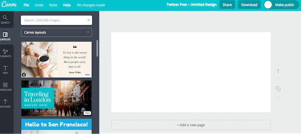
From here, Canva is pretty easy to navigate. It comes with a variety of pre-created templates for layout, images, icons, and more. While it can be tempting to use some of these, we recommend sticking with your brand colors, images, and fonts where possible, to keep things consistent.
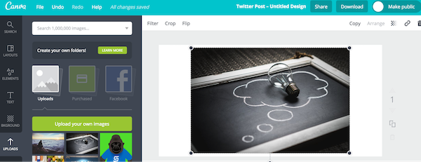
I’ve uploaded my stock photo to the platform. With just a bit of pulling on the boundary anchors, I easily resize the image to fit the template, being careful to preserve that open space on the left I want for the CTA text.

I can pop in a shape to hold my text, to make it really pop against the background.
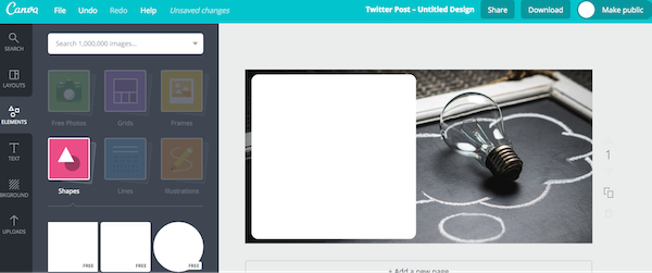
Canva also makes it simple to stick to your brand guidelines. Here I’m testing one of the pinks in SnapApp’s color palette, simply plugging in the hex code from our style guide.
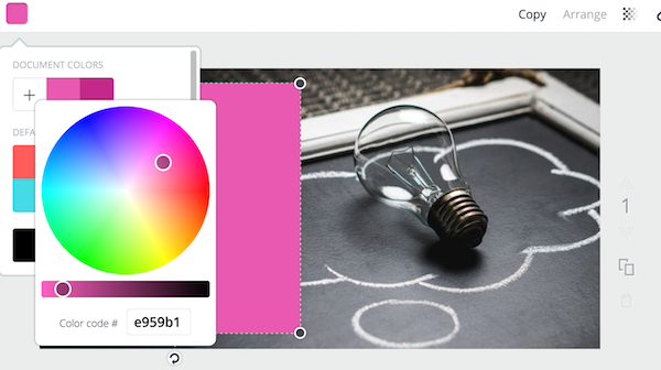
Now I can dd in a text box and play with fonts, sizes, and colors.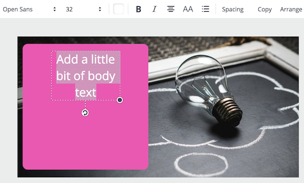
I end up here. I’ve decided to incorporate some of our blue, and use the pink as part of a pseudo “button” for followers to click. I also made the background image a bit more transparent, so the text and colors pop even more.

The final touch? Adding the SnapApp logo to the corner. Always be consistent!

And voila – an image ready for Twitter, all in less than 10 minutes.
When using Canva or other tools for DIY images, keep in mind the following best practices:
- Use the right size images for the platform.
- Take advantage of negative space for text.
- Use your brand style guidelines – fonts, colors, etc.
- Don’t rely on pre made templates, make them your own.
- Be consistent and keep you images recognizable as your brand’s across platforms.
Creating images to support your social media marketing efforts doesn’t have to be terribly time consuming, but is extremely important. Explore some of the great DIY tools out there to make your work easier.
Digital & Social Articles on Business 2 Community
(48)
Report Post

