A look at the importance of good website structure for eCommerce websites and 4 key areas you must get right, including website hierarchy, URL structure, web code structure and navigation.
Website structure organises your pages and content into a system that’s both logical and navigable for search engines and users. Poor website architecture makes it difficult for search engines to crawl and index your pages while users will struggle to access the information they need and complete meaningful actions on your website.
For eCommerce brands, creating the right website structure is particularly difficult, given the volume of products and pages to manage. In this article, we show you how to create the right structure for higher search rankings and happier customers.
Why is website structure important?
Structure is important for any website but eCommerce sites tend to be larger and more complex. You’ve got a whole catalogue of products to arrange, many of which need grouping into product categories and organising into a logical system. As a result, getting the structure right for an eCommerce website is more challenging and work intensive, which also creates a lot of room for technical issues and mistakes.
The good news is, the same structural rules apply to eCommerce websites as a much smaller site – they’re just more difficult to implement.
Website structure is important for two key reasons:
- Search engines can crawl and index your website and pages more easily with the right website structure in place.
- Users benefit from a logical structure that makes your website easier to navigate and use.
In many respects, website structure is the fundamental core of search engine optimisation because a poor structure makes it difficult for search engines to crawl and index your pages for the most relevant searches.
It’s also the basis of a positive user experience that helps users find what they’re looking for and take action on your website. This is especially important for an eCommerce website because the average user is likely to navigate product categories, several product pages and interact with on-page elements before taking action.
Imagine a customer who walks into a high street clothing store, walks around several departments, flicks through a bunch of items in each section and, possibly, tries a couple of things on.
This is the customer experience an eCommerce website is trying to replicate with product categories and product pages.
The benefits of getting website structure right
Getting the structure of an eCommerce website right takes some work and plenty of planning but the benefits are more than worth it. By following the steps in this article, you’ll give your website the best chance of maximising its potential in search and delivering an experience that encourages visitors to buy.
Here are the key benefits of a well-structured eCommerce website:
- Search engines crawl and index your pages correctly.
- Page authority: Your most important pages get more link equity and page authority.
- Sitelinks: Google automatically shows sitelinks and sitelink search boxes for websites with complex (but correctly optimised) structures.
- Navigation: Your website is easier to navigate and use.
- Engagement: A positive UX increases engagement (page visits, time on page, etc.), which is an important signal for SEO.
- Browsability: A logical structure helps users browse different products, compare options and edge closer to the purchase.
- Higher conversion rates, thanks to easy navigation and a compelling shopping experience.
- Repeat buyers: A positive experience encourages shoppers to come back for more.
The third benefit in the list above refers to sitelinks showing in your search results and this is what they look like for eBay:
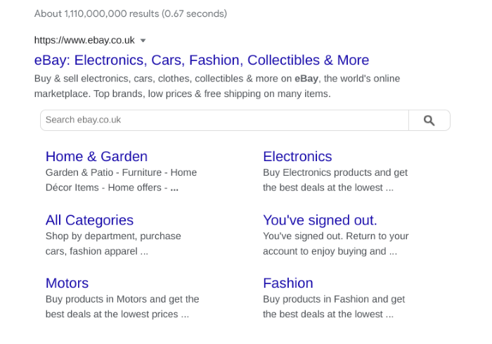
Underneath the main blue link, you can see six sitelinks showing some of the most important product categories on the website. This helps users jump straight to key parts of your website without going through the homepage by clicking on the standard link.
Google automatically generates sitelinks for websites that need them so this isn’t something you can switch on or off. However, you need to make sure your website is structured properly if you want Google to see that your website should be showing sitelinks when it ranks in organic search.
You’ll also see a Sitelink search box in the image above. Again, Google automatically determines whether results should include a search box and you’ll need to have a search function properly set up on your site for the search giant to detect and access.
Now that we’ve explained the importance of good website structure, let’s run through the steps you need to follow to set up your own website properly.
#1: Create your website hierarchy
The first step to structuring any website is creating the page hierarchy and this starts with grouping all of your products into relevant categories and sub-categories. For SEO purposes, a website structure should be no more than three layers deep (excluding the homepage) because link equity and page authority diminish at every level.
Where possible, stick to a page hierarchy of 2-3 layers to ensure your product pages are receiving enough credit.
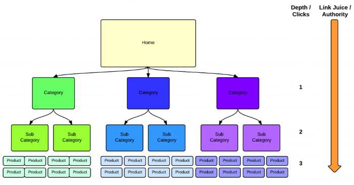
Your home page should link to a top-level layer of category pages – the broadest differentiation between different product types. These top-level category pages can then link to an optional layer of sub-category pages, which help filter product types further if you’ve got an extensive range of stock.
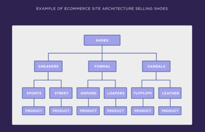
Your product pages make up the final layer and this structure finds the ideal balance between helping users navigate your site without creating an overly complex structure and diluting the link equity and authority of your product pages.
One possible exception to the 2-3 layer rule is clothing retailers that may want to separate products by gender. In this case, you can either use the top-level categories to split products by gender or you’ll have to genderise individual product categories where relevant (eg: men’s shoes, women’s shoes, etc.).
#2: Create a URL structure
With your website hierarchy sorted, you need to create a URL structure that matches the navigational structure of your website. Your URLs should be descriptive, including your primary keywords for each page, which should also be included in the title for each page.
For example, when a user clicks through to a top-level category page and, then, navigates to a sub-category and product page, the URL should look something like this:
https://yourwebsite.com/category/subcategory/product-page
So, if you’re selling sportswear, this might translate to:
https://yourwebsite.com/running-shoes/nike-running/nike-air-zoom-pegasus
This URL format communicates the structure of your website to search engines and users while including all of your target keywords. You can drop the top-level category from your URLs if they don’t add any value but make sure your URL structure is consistent across your site.
What you don’t want to end up with is URLs filled with numbers or codes that mean nothing.

Here are some key guidelines to follow with URL structure:
- Keep URLs as short as you possibly can
- Make them descriptive
- Include your primary keywords
- Use “-” dashes in place for spaces, not “_” underscores.
- Avoid using meaningless numbers
- Include important numbers in product URLs (eg: iphone12/64gb)
- Avoid using any extra characters that have no contextual meaning
Finally, make sure you’re using secure encryption (HTTPS) on all of your URLs. This is a ranking factor, provides an important layer of security and most users expect this from any company they’re going to do business with – especially when you expect them to make payments on your website.
#3: Structure your web code
Messy code is one of the most common issues with eCommerce websites and it can cause all kinds of problems for users and SEOs. The first thing you’ll run into is slow loading times and this is bad news for your search rankings and conversion rates. Page speed is a ranking factor and people don’t take too kindly to slow loading times, either.
Unfortunately, eCommerce pages tend to have a lot of resources (especially images) that put a strain on browsers, servers and internet connections. So you can’t afford to have messy code slowing things down even further.
Use clean HTML and CSS for as much of your website as you can and keep the JavaScript to a healthy minimum. Poorly-written JavaScript is the fastest way to kill loading times and even clean JS can cause problems if you force the browser to deal with too much of it.
If using WordPress, be aware that the CMS isn’t particularly code efficient. Themes and plugins add yet more code into the equation, written by several different teams. Choose your themes carefully, keep plugins to a minimum and stick to reputable eCommerce plugins, such as WooCommerce.
If you’re outsourcing the development work, make sure you get developers who take page speed seriously.
You’ll also want to use structured data markup on your product pages for Google to provide product information in rich search results.

This can include details like product ratings and price ranges to make your results stand out in the SERPs and increase click-through rates. You can find Google’s documentation on structured data for product pages here.
#4: Build your navigation system
Navigation allows users to move between pages on your website and there are several components you can use to create an intuitive navigation system:
- Main navigation menu
- Search
- Filters
- Breadcrumbs
- Footer navigation
- Internal links
Your main navigation menu should include all of your top-level pages as visible, clickable links with keywords as anchor text. Drop-down menus can help desktop users skip to deeper layers of your navigation but they can be problematic on mobile devices so make sure you optimise them for touch and smaller displays if you use them.

Alternatively, you can simply link to your top-level category pages and use a secondary side menu and on-page internal links to guide users the rest of the way.
You should also implement search functionality on your website for users who know what they’re looking for or simply don’t want to browse.

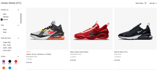
Once users land on a product category page or a results page, you can use filters to help them refine the results. If you’ve only got a small range of stock, you may not need to use filters but these are essential if you’ve got a lot of product variations, such as colour, size, model, etc.
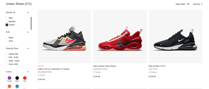
One of the hardest jobs you’ll have with building your navigation system is optimising it for mobile. The more products, categories and filters you have, the more touch elements you have to fit into a UI that’s intuitive on smaller screens.
Nested menus are fine to use but the more layers you include, the more difficult it becomes for users to move between them – eg: jump straight to a new product category.
There are no perfect answers to mobile navigation and you have to find the right compromise between coverage and usability.
Digital & Social Articles on Business 2 Community
(64)
Report Post