Sometimes, it can be tricky to determine which mobile configuration a site is using. Thankfully, columnist Bryson Meunier shares several methods for discerning responsive and adaptive sites.

As most SEOs are aware by now, there are three main techniques for serving mobile website content: responsive design, adaptive design (also called dynamic serving), and separate mobile URLs.
While it’s easy to identify separate mobile URLs just by looking at your browser’s address bar, telling responsive and adaptive sites apart can take a little more digging around.
In my mobile workshops with Shari Thurow at SMX West and SMX Advanced earlier this year, many of the participants were confused as to how to tell responsive and adaptive mobile configurations apart. So, I went through the exercise that I’m going to describe today. Hopefully, it will help some of you make the distinction.
If you’re not sure if the site you’re looking at is responsive or adaptive, ask yourself these questions:
Does it change shape when you resize your browser from a desktop computer?
Responsive sites are meant to change layout based on browser window size (regardless of device), while adaptive sites detect when you are on a mobile device and present different HTML accordingly. Thus, if you know that a site doesn’t use separate URLs for their mobile configuration, you can often tell responsive and adaptive apart by visiting the site on desktop and seeing what happens when you resize your browser window.
Want to test this out? Take the following steps:
- Open WebMD.com or m-w.com in the browser of your choice (the videos below use Chrome). Ensure that your browser window is not full screen — in other words, you should be able to see the desktop behind it.
- Position your cursor along the right edge of the browser window, and resize the window down to the size of a mobile phone display.
- As you can see, the layout changes based on your browser window size, even on a desktop. That means these sites are responsive.
- For contrast, if you do the same thing with Amazon.com on a desktop, which is adaptive, the content on the right side of the screen is simply hidden rather than resized or moved elsewhere.
Can you find the word “responsive” or “@media” in the home page source code?
Responsive sites have specific elements within their HTML source code that adaptive sites do not. To check for these elements, take the following steps:
- Open WebMD.com in Chrome, on mobile or desktop.
- If on a desktop, you can press CTRL+U (Windows) or Option+?+U (Mac) to view the page’s source code. For mobile users, you can go to the address bar and add view-source: before the root domain (e.g., view-source:www.webmd.com) and hit enter to open source code.
- Search the page for the word “responsive,” which exists on the page to call out responsive templates and stylesheets. Click on the responsive stylesheet, which should be a clickable link.
![]()
- On the CSS page, search for “@media” — the presence of these indicates that are CSS Media Queries, which power responsive sites.
Does the site display different content or a different layout on a mobile device (or when you use a mobile user-agent like Googlebot smartphone)?
Adaptive sites generate different HTML for a page based on the user’s device, regardless of screen size. That means that if you are looking at an adaptive site on a mobile device — even one with a large screen — you’ll still be served specific mobile content.
We can check for adaptive mobile pages via desktop browser. This is achieved by using a browser extension that allows you to view a site as though you are using a mobile device.
Here’s how to test an adaptive page with a user-agent switcher extension on Chrome:
- Open Chrome on desktop, then download and install a user-agent switcher extension. I recommend User-Agent Switcher for Google Chrome.
- Once the extension has been installed, navigate to www.amazon.com.
- Click the icon for the extension in the upper right-hand corner, then use the drop-down menu to change the user-agent to a popular mobile user-agent, such as Chrome on Android Mobile.
- Notice the navigation has changed once you switched the user-agent, and the header image decreased in size. When you resize the browser window — even when you make it very large — it doesn’t change in a fluid way but creates more white space around the same image. This is an adaptive site that changes its layout based on user-agent.
- Keep in mind that many sites store cookies to remember your device type, so it is a best practice when using user agents to clear your browser history after switching user agents.
Additional questions
Here are a few related questions I’ve gotten on the subject that may also be of interest:
Can you use Chrome Developer Tools to tell adaptive from responsive sites?
Yes, but be sure to clear your browsing history before toggling device type from Desktop to Mobile and vice-versa. Then, follow this procedure:
- Open amazon.com in Chrome on a desktop.
- Open Chrome Developer Tools by clicking on the three vertical dots in the upper top right corner of the browser, then scrolling down to More Tools > Developer Tools.
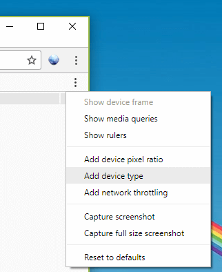
- Once in Developer Tools, click on the three vertical dots just below the ones you clicked in Step 2, and select Add device type.

- Set the Device to “Responsive” and the Device Type to “Desktop.” This allows you to resize the browser within by pulling the slider to the right, mimicking exercise one above. You can also change the device type from desktop to mobile, which allows you to mimic exercise three above without installing a separate user-agent switcher. As above, if the layout looks different on desktop and mobile user agents, it’s adaptive, and if the site resizes to fit the screen when you pull the corner of the window, it’s also responsive.
Can a site be adaptive and responsive at the same time?
Yes. Sometimes this is called RESS or REsponsive with Server Side Elements. In these cases, the layout is fluid, but server side elements may be used to serve smart banners for app downloads or change the text on the page.
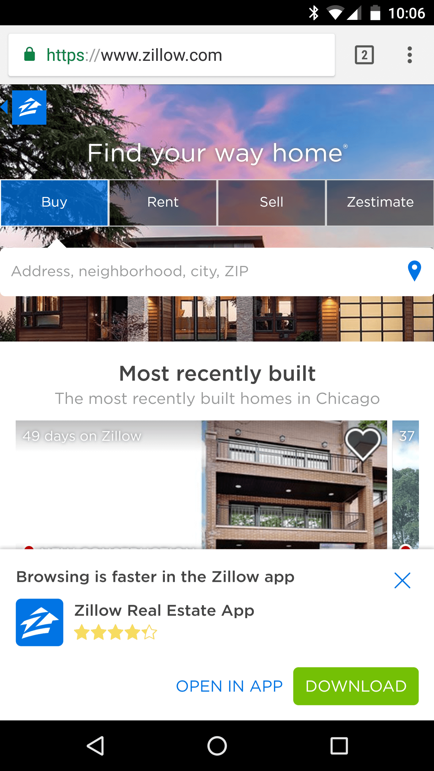
Zillow.com is currently like this. If you use a desktop agent to access the site you can resize the browser and the site is responsive, just like merriam-webster.com. But if you access the site from a smartphone user agent detection is used to provide additional device-specific elements like smart banners to encourage app downloads.

Access Zillow.com from a smartphone or with a mobile user agent and you’ll see a smart banner that doesn’t exist on desktop. This site is responsive with adaptive elements.
Likewise, at Vivid Seats our desktop site doesn’t resize, but if you access the adaptive site from a mobile user agent it does. So, our adaptive site is also responsive.
You can also have adaptive and responsive pages on the same site. At Vivid Seats, we use responsive pages for event pages, as search behavior doesn’t vary much across devices, but adaptive for certain category pages where we noticed a difference in search behavior that we want to address on the page.
[Article on Search Engine Land.]
Some opinions expressed in this article may be those of a guest author and not necessarily Marketing Land. Staff authors are listed here.
Marketing Land – Internet Marketing News, Strategies & Tips
(58)
Report Post


