We’ve all seen those profiles with the clever, branded and visually impressive images at the top, and I am often asked what should go in there, how to do it and more, so here’s a blog to explain the thinking and process.
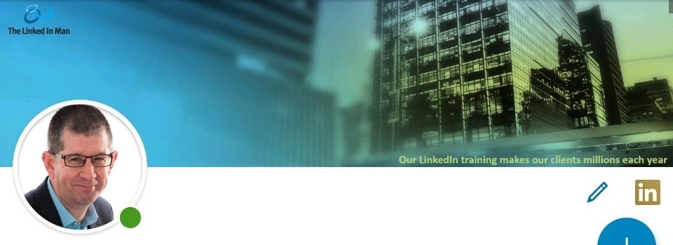
On the desktop client you can see it across the tops of a profile like mine (see below):

On the mobile it looks a little different. In portrait it looks like this:

And in landscape mode it looks a little different again:
The process of making it work within LinkedIn is the easy ‘bit’ so let’s start there.
1) Look at your profile by clicking the small picture of me on the top right on the desktop or laptop view and then click the small pencil symbol highlighted beside more:
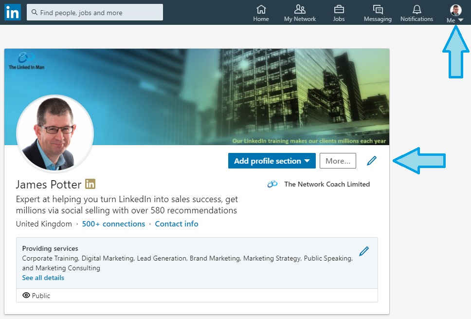
2) You will then be presented with the screen below and left click the small pencil symbol highlighted on the top right.

3) It will then pop up the dialogue box so that you click the ‘change photo’ button and then upload your new preferred image (size is 1584 by 396 pixels). In my experience I have found .png format marginally more reliable to work with than .jpg
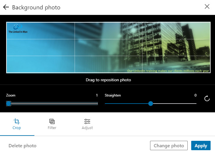
You can then choose to either crop or zoom the image if there is one part you want to highlight, and/or drag the frame around to position it correctly. You can even straighten the image if it is partially rotated or needs to be.
4) Then if you hit ‘Apply” bottom right you are done.
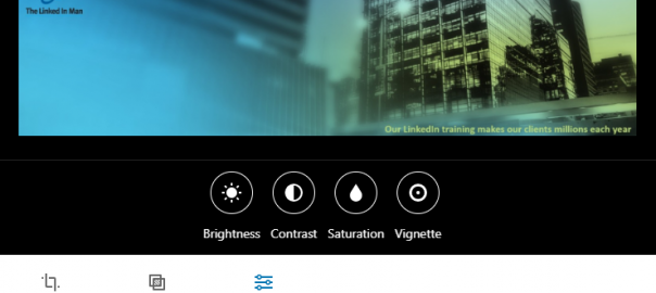
5) If you want to manipulate the image a little with filters you can select that option. You can preview the effect of each before hitting ‘Apply’.
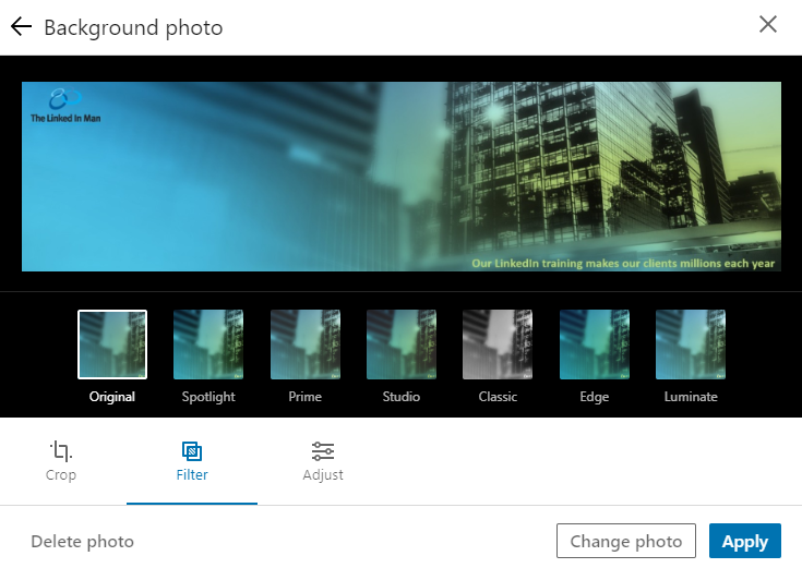
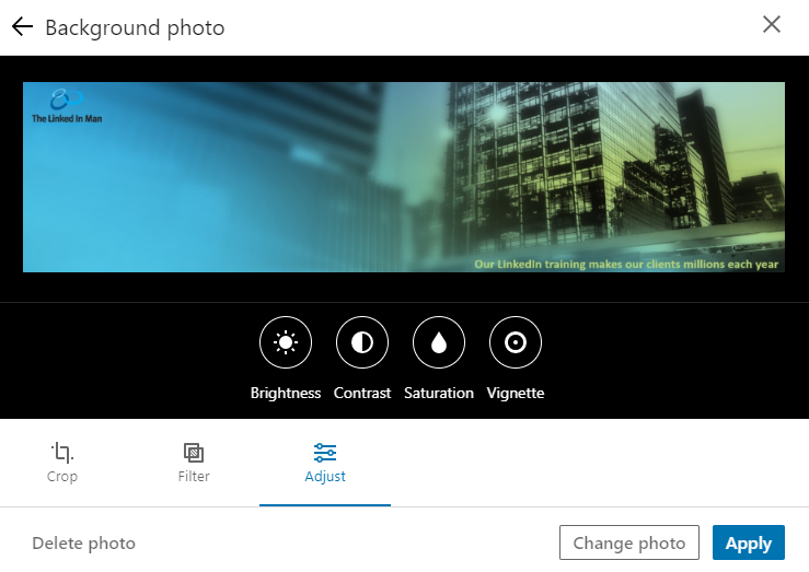
6) If you want to adjust the image you can select the Adjust option and then use the controls to change brightness, contract, saturation or vignette to your preferred settings where it highlights the end result in the image and you can save this by hitting ‘Apply’.
Ok so now you know the process let’s deal with the hard bit, what sort of image, what device and what size.
You must consider mobile when thinking of your header image as you saw at the top of this blog post that the image presents a little differently on each device, so check your design on a mobile in portrait, landscape and on PC / Mac as well to ensure your message travels well across all formats – 58% of LinkedIn use is on a mobile.
I’m a huge fan of ensuring that it is not just a good visual image that ideally reflects your business branding, colours and identity, but also includes some indication of what you do, its impact and value to a viewer. Not everyone is analytical, some are visual, and a picture speaks 1000 words as they say.
But if it is too busy it can make it too tricky for a quick viewer to see your value if you hide it amongst a raft of images or small text that a viewer may not understand or identify the key message in amongst the noise.
For example, if you’ve written a dozen books and your image is a bookshelf proudly showing the spines of the books the viewer may not take time to realise you wrote them all whilst a simple message on the image would explain it.
The imagery is not fixed, you can update, change and improve them as time goes on, your focus evolves, or your brand reconfigures and (just like your LinkedIn profile) the header image will change too.
Digital & Social Articles on Business 2 Community
(121)
Report Post