— November 19, 2017
Are you the proud owner of an ecommerce store?
If so, I have some good news… and some bad news, too.
Let’s start with the bad news first: you’re leaving a lot of money on the table.
The good news? It’s a problem that’s easily solved.
In this article, we’re going to take a closer look at one of the most powerful, underappreciated and underutilized tools of digital marketing: pop-ups. Though they’re great for a variety of businesses, they’re particularly awesome when it comes to ecommerce.
They’re the one thing I believe every online store should have. They help you generate leads, segment your customers, and – most importantly – drive more sales.
How?
Why Popups?
Most people groan when they hear the word “popup”, and reasonably so. They can be annoying if they’re overly obtrusive or make it difficult for your visitors to get where they’re trying to go.
But if they’re used intelligently, to make the most of the traffic your ecommerce store receives, they can be complete game-changers that help you turn your website visitors into sales.
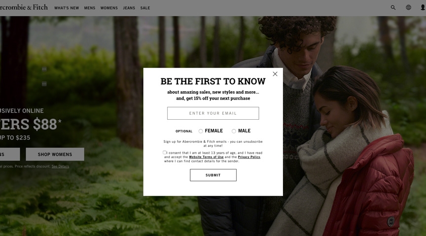
Popups help your store generate email subscribers by offering a specific discount or coupon to people who fill out a form. Check out this simple popup on Abercrombie & Fitch’s website:
Let me put it into perspective: as an e-commerce store, the only thing that’s more important than a subscriber is a sale.
Why?
If sales are the equivalent of people walking out of your store, bag in hand, then subscribers are the visitors exploring your store and browsing through your product selection. These are people you’re able to market to directly – and more than that, you know they’re already interested in what you’re offering.
Turning visitors into leads and subscribers means you’re able to send them promotions, offers, and announcements about new products to turn them into customers. They’re all interested and engaged potential customers.
Now that that’s out of the way, let’s look at how you can add popups to your own ecommerce store.
Creating an Offer for Your Popup
Before you start building your popup, you’ll want to come up with some sort of offer – an incentive for people to convert on your form and subscribe to your email list. It’s often the most important factor in determining whether or not a visitor converts on your popup.
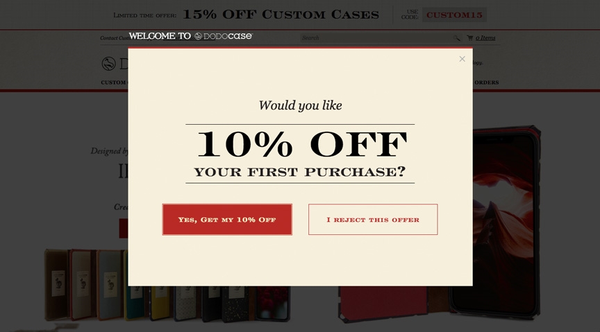
Generally, I’ve found “first-time” discounts of 10-15% are the most popular popup offers. A direct discount conveys value right away, and prepares people to take on a buyer’s mindset, increasing the chance that they’ll buy sooner rather than later (or worse yet, never).
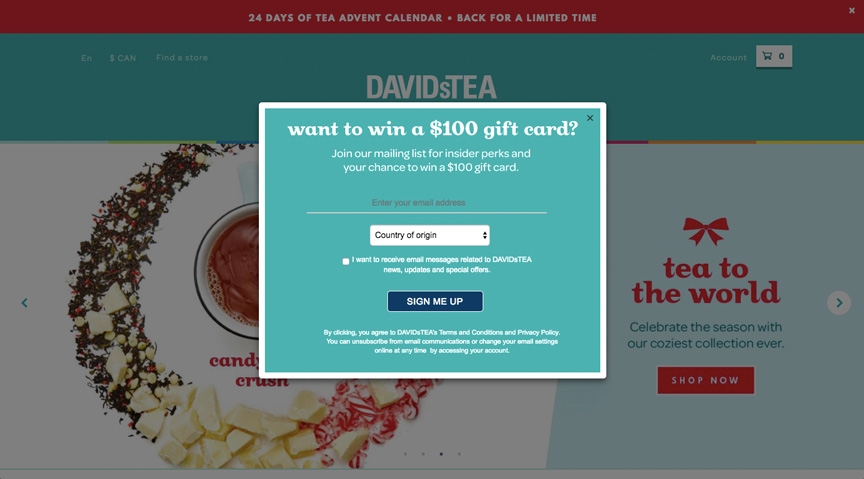
Another great offer or incentive for your popup is a contest entry. Check out this example from DAVIDsTEA – people who sign up for their mailing list are automatically entered to win a $ 100 gift card.
Oftentimes, your newsletter alone won’t be enough to convince people to sign up. Though content is great, it’s best to sweeten the deal with an offer that has actual monetary value. Remember, most of the people visiting your store just need a reason to buy – and often, a discount or promotion can be that reason.
Other popup offers I’ve seen include:
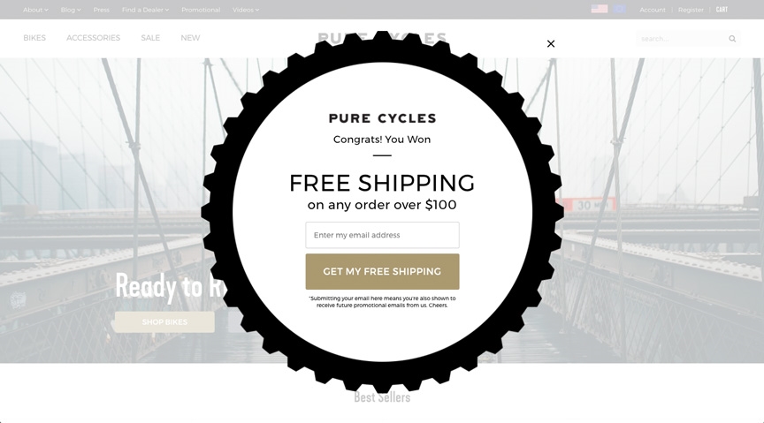
- Free shipping
- A free gift with any purchase
- Content (newsletter, style guides, how-tos, etc.)
- Sale items (link people to a page listing your sale or clearance items)
Of course, the success of each of these offers will vary greatly depending on your product and target market. Different incentives will work better in specific markets, and there’s no right answer – so don’t be afraid to play around with different offers to see which works best for your business.
Choosing a Popup Type
Once you’ve decided what your offer will look like, it’s time to choose a popup type. For the record, we’ll be building everything in this article using Wishpond, but all of the takeaways will apply to your favorite popup tool of choice.
Though normal popups are the status quo, there’s actually a few different types that are worth exploring.
We’ll start, however, with the common popup. It’s a box (or circle, or whatever) that comes up on a visitor’s screen, dimming the material behind it to focus their attention on the offer at hand.
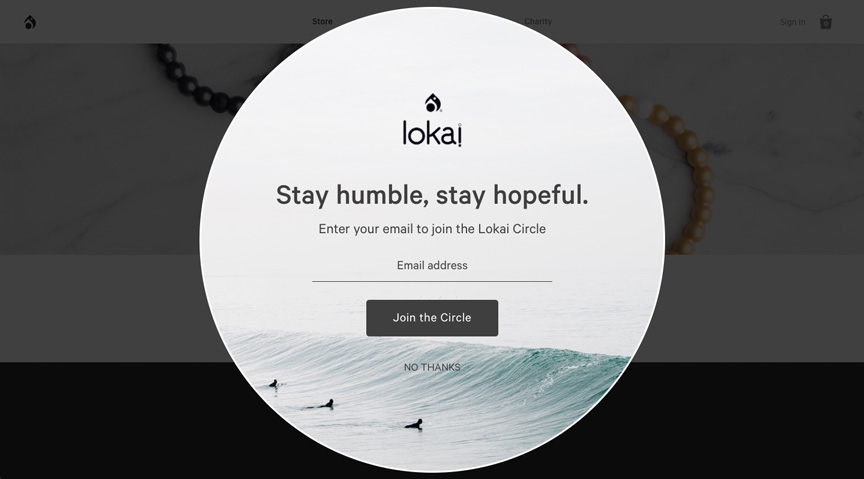
For all the negative attention popups get for being obtrusive, they’re actually not that bad. Having a semi-transparent overlay means visitors can still see the content behind, easing their experience and preventing them from feeling like they’ve ended up someplace they didn’t mean to be.
Slide-In Popup
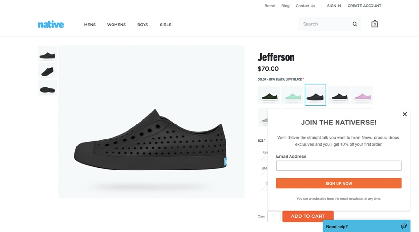
Next, a slide-in popup. Slide-in popups are slightly less intrusive than normal popups; they appear to the side of your store, covering a minimal amount (if any) of content. They’re great when it comes to user experience, but I do find they’re less effective in getting people to convert immediately, since they can be ignored. Because they don’t need to be closed for visitors to browse your site, slide-in popups can sometimes go unread or unnoticed.
Welcome Mat
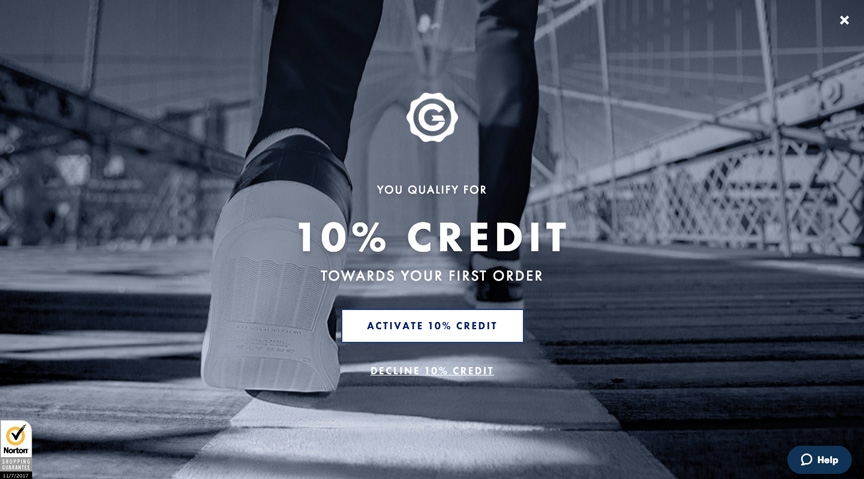
Next up – welcome mats. Welcome mats are definitely the most attention-grabbing of all popup types because they cover a visitor’s entire browser window. These work amazingly for entry overlays (hence “welcome”).
Welcome mats announce their importance and command visitor attention by nature of their size – they’re literally impossible to miss. If you really want people to pay attention your offer, a making your ecommerce popup a welcome mat definitely helps.
On the other hand, they’re not particularly friendly from a user experience standpoint as they cover all of the content beneath them. A simple workaround is to add a bit of transparency to your overlay, allowing people to see that they’re still where they want to be and can close the welcome mat at any time to go there.
Opt-In Bar
Finally, we have opt-in bars. Though they’re not technically popups, I’m including them here because they serve much the same purpose. Opt-in bars, though less visually striking than any of the aforementioned popup types (put it simple, they’re small), they’re great at highlighting specific offers or promotions that you’re running. Autumn sale? 20% off all Christmas products? Add an opt-in bar with a countdown timer to push people to buy.
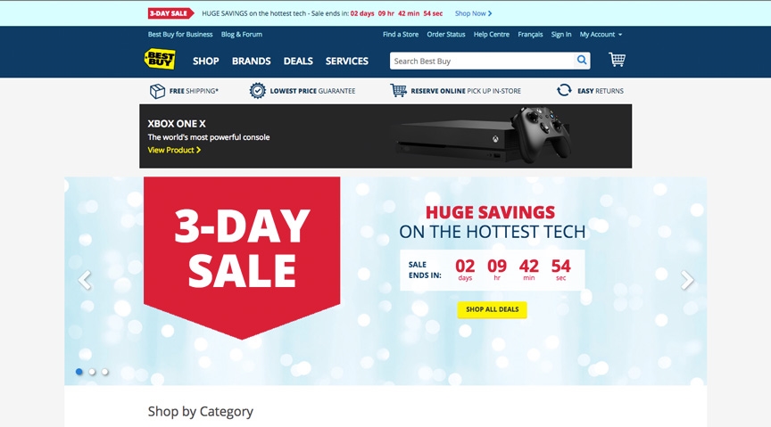
Opt-in bars are great because they look a little more native, almost as if they’re part of your site’s navigation. This makes them a little more subtle in their “salesiness”, which can sometimes be a good thing.
Remember you can always test different types of popups, so don’t be afraid to try them all – you’ll find based on the offer that you might have better or worse results with each of them.
Popup Triggers
Once you’ve chosen your popup type, you’ll need to choose when you want your popup to trigger. Common triggers include:
- On page entry (the popup shows as soon as the page loads)
- On exit intent (the popup shows when the visitor’s mouse leaves the browser window)
- On scroll (the popup shows once the visitor has scrolled down a certain portion of the page)
- On click (the popup shows when the viewer clicks a specific link)
- On a timed delay (the popup shows after a preset amount of time)
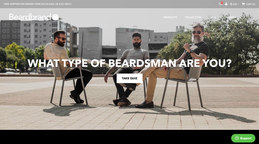
Check out the clever click popup example above from BeardBrand, who puts a notification badge on a message icon on the top right of the page. Clicking this icon opens a click popup for a newsletter subscrption.
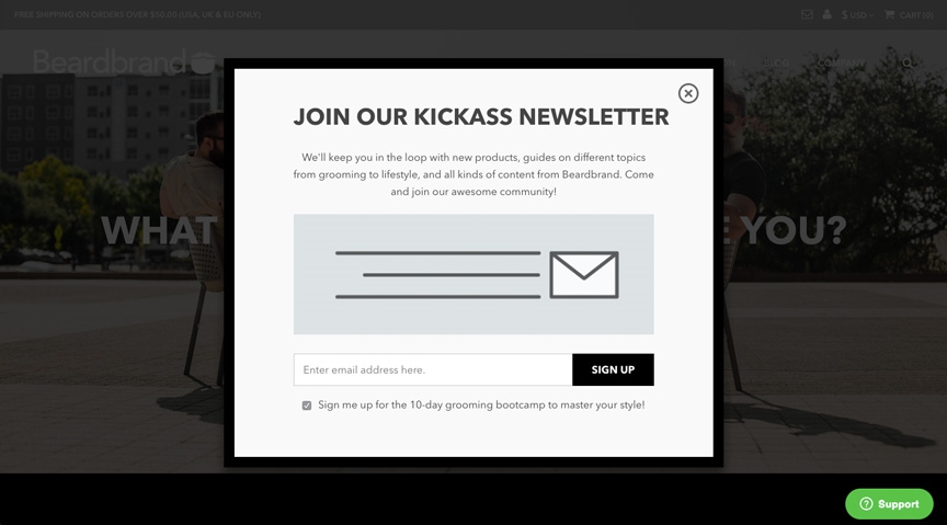
For ecommerce stores, I generally recommend the first two (entry and exit). Entry popups are great for highlighting offers, discounts, and sales – they put your visitor in a “buy now” mindset and help focus their browsing.
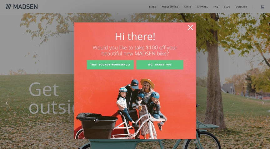
Exit popups are awesome for people who are leaving your store – what better way to pull them back in than with a discount or special, limited-time offer?
While you may not actually need to choose your popup trigger until later on in the process, it’s good to start thinking about it before you build your popup, as it might inform some of the design or copy choices you make along the way.
Designing Your Popup
Now for the fun part! Putting together your popup can be incredibly easy, especially if the popup builder you’re using has a bunch of templates on hand that you can easily change to fit your business and offer.
I’ll look at popup design in general, and then we can go into specific tips for different popup types. We’re aiming for good-looking popups that convert well.
Popup design best practices
Bold, benefit-oriented headline
Remember when I said your offer is the biggest deciding factor when it comes to conversion? That importance should be reflected in your popup’s design, too. Put your offer front-and-center, using headline typography that’s bright, bold and easy to read. Make sure that anybody who sees your popup can understand your offer right off the bat by keeping your headline copy simple too.
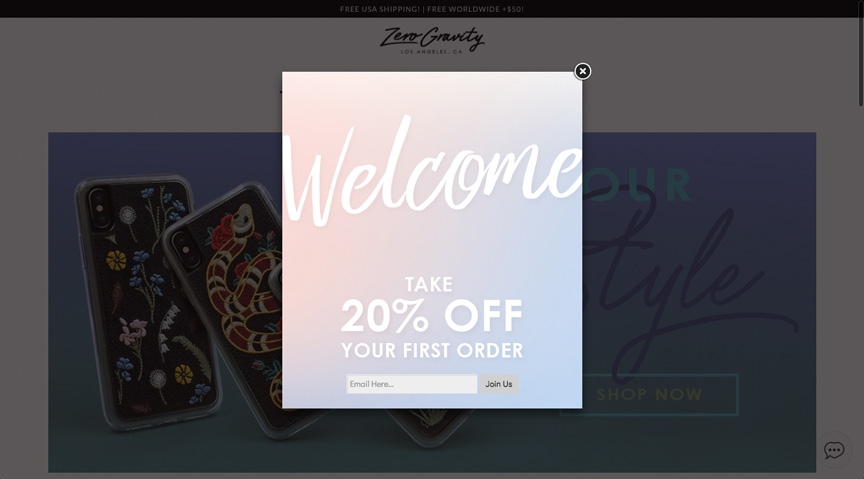
Minimize form fields
The shape your lead or subscriber-generating efforts take should match the size of the ask. Popups are less weighty when it comes to user experience – they’re not landing pages, so the number of form fields you’ll want to have on a popup should be less in comparison.
Keep the number of form fields to a minimum. For your ecommerce store, I’d recommend only asking for your visitors’ email addresses, and maybe a single piece of self-segmenting information (e.g. “I’m shopping for men” or “I’m shopping for women” for apparel companies).
Beautiful, relevant imagery
Moving towards making your popups, well, pop, let’s consider images for your popup. Depending on the type of popup you’re using, you’ll want to use varying types of imagery. In general, I’d recommend using a professional product shot that alerts people to the value of the offer. If your watch shop’s offer is a 15% coupon, displaying a picture of your flagship offering says “Hey! Get 15% off this beautiful watch!”. A good image ideally links your offer and product in an implied value statement.
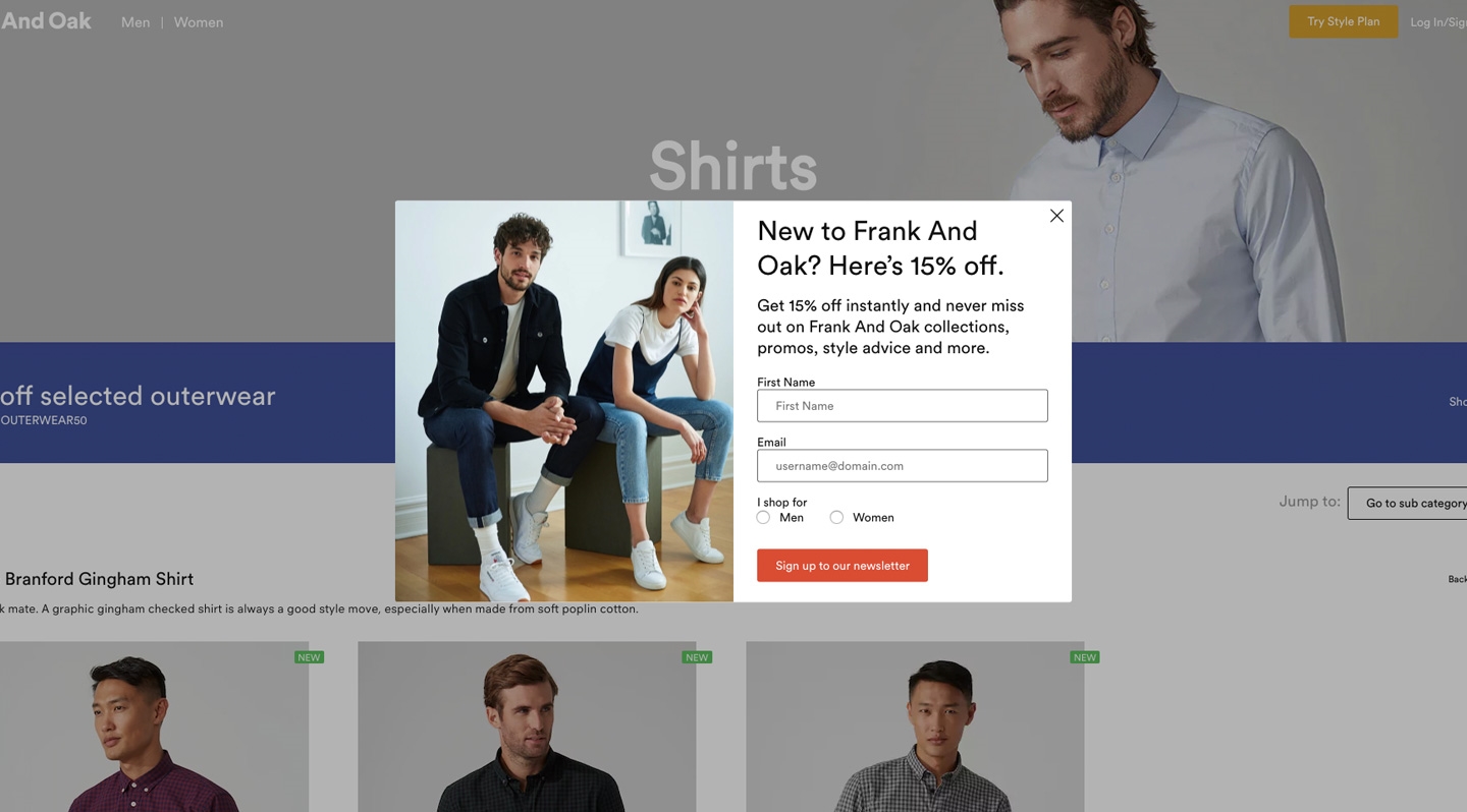
Branded theme
One mistake I’ve seen some ecommerce shops make time and time again is creating marketing collateral that isn’t branded at all. It’s understandable, as many of these businesses simply take popup templates and change the copy. But I’d recommend going the extra step.

All of your marketing materials – online and offline – should carry the theme of your business. Use your business’ brand colors (and imagery where necessary) when building your popup, and it will feel like a more cohesive, concrete part of your online store experience.
Let’s get into some type-specific tips.
Welcome mat tips and tricks:
- Change the transparency of your overlay so your visitors don’t feel like they’ve ended up on a different webpage altogether.
- Utilize all the space – make your headlines and images bigger and bolder to make the most of the additional real estate a welcome mat offers.
Slide-in popup tips and tricks:
- Play around with different trigger types for your slide-in popup. Because they’re less obtrusive, it might be a good idea to get them to trigger after a timed delay or on scroll to let the viewer take in the other information on your page first.
- Even if you’re not looking to generate subscribers, a slide-in popup is great to inform visitors about sales or promotions that are going on without impeding their user experience.
Opt-in bar tips and tricks:
- Because your opt-in bar feels like a part of your website, it can be tough to convince people to click or convert on it. Try adding a small (but bright) countdown timer to pull more visitor attention and create some much-needed urgency.
- Opt-in bars don’t often have enough space to convey all of the value of your offer. Feel free to use them as an intermediary step that links to a click popup with more information.
Adding Your Popup to your Website
Once you’ve designed and built your popup, it’s time to add it to your website. This might vary depending on the popup service you use, but it should be a pretty similar experience regardless.
To do it, simply publish your popup (making sure to choose how you want it to be triggered) and copy the code that’s given to you onto the pages you want your popup to appear on. On this dialog, you’ll also have the ability to choose how often you want your popup to appear.
Turning Popup Leads into Sales
Frankly, this is a discussion that warrants its own article, but I’ll touch on this quickly so you have an idea of where to start.
Ideally, your online marketing platform has a marketing automation or email marketing feature of some sort. This is incredibly important – email subscribers mean nothing if you’re not marketing to them.
The way I see it, there’s two ways to approach email marketing to popup leads for your ecommerce store.
The first is by simply adding them to your email newsletter, sending them the same promotional offers you send to all of your subscribers. These offers could include occasional discounts, information on sales, and announcements about new products. This strategy is great as it doesn’t require any additional effort on your part – however, it’s not as targeted as it could be.
The second is to segment subscribers based on their specific activities. One of the most powerful uses of marketing automation is to identify visitors’ interests based on pageview.
For example, if they converted on my 15% discount popup and then visited a specific product page for a women’s workout top, I’d make sure to add them to a segment that receives only emails promoting women’s products. This increases the relevance of each email, increasing the chance that they’ll click through and purchase something.
For example, I converted on a popup on RYU’s site a couple months ago – they know based on my activity and past purchases that I’m interested in male products, so that’s what they send me.
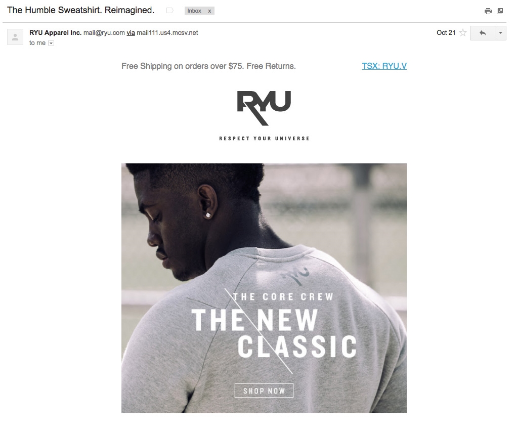
Best of all? It’s one and done – once you’ve set up your automation to segment popup conversions automatically, you never need to do it again (unless you’re looking to add another segment).
I could go on and on about email marketing for ecommerce, but I’ll save that for another, more in-depth article.
Conclusion
There you have it – a complete guide to designing, building and publishing popups on your ecommerce store. I said it before and I’ll say it again: popups are the secret to picking up the money you leave on the table.
Digital & Social Articles on Business 2 Community
(47)
Report Post