Are you losing customers because of something as simple as the colour of a button on your website, or the positioning of your text?
Although you may not realise it, every decision that you make online is probably influenced to some degree by simple, ingrained, psychological factors that you’re not even aware of.
As the online marketplace continues to grow and develop at a rapid rate it’s important for small businesses to make their online presence as strong as possible to help them to stand out from the crowd.
Countless experiments have been performed by businesses all over the world to see whether small tweaks to web design have much of a psychological impact on customer browsing, and often the results are surprising. Many of the experiments have shown that the smallest changes in wording, positioning, or colour can have a significant impact on how successful a website is.
A thoughtfully designed website will evoke emotions, thoughts and feelings within a customer and effectively guide them towards the buying decision that the business owner wants them to make.
It’s not just about making sales though, a website designed with customer psychology in mind can massively improve visitor experience, thus improving your business’ reputation and increasing the chance of customers returning.
Failing to take note of even the most basic of psychological principles of web design could be holding your business back online and resulting in many lost opportunities. Let’s take a look at a few of the simplest ways you can use psychology to your advantage when designing your website.
Incorporate Prominent Trust Indicators
Customers won’t buy from you if they don’t trust your website.
Many people are still nervous about giving out their card details over the internet, so it’s important that your website looks polished and professional to put visitors at ease. If your website doesn’t look the part it can leave your business looking like a bunch of cowboys and put customers off buying from you.
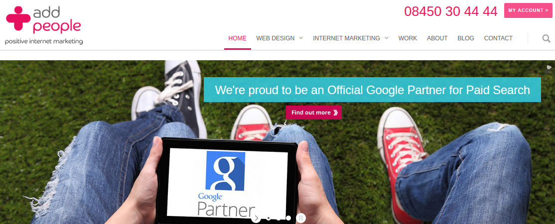
Make sure that your website doesn’t only look professional, but also clearly displays trust indicators. These could include professionally branded logos, awards, certifications, customer reviews and testimonials. For example, here at Add People we’re a trusted Google Partner agency, so we have incorporated this into our page’s design, prominently and above the fold as well as in the footer.
It may be tempting to try to build your own website on the cheap but it could just end up setting your business back in the long-run or damaging your business’ reputation. There are plenty of affordable and professional website services available out there including our Affordable Websites product.
Use Color and Space Wisely
To some extent your company logo and branding will decide your website’s color scheme, but you should still think carefully about how these colors are used.
Use this basic color emotion guide from thelogocompany.net for a quick run-down on which emotions are associated with which colors.
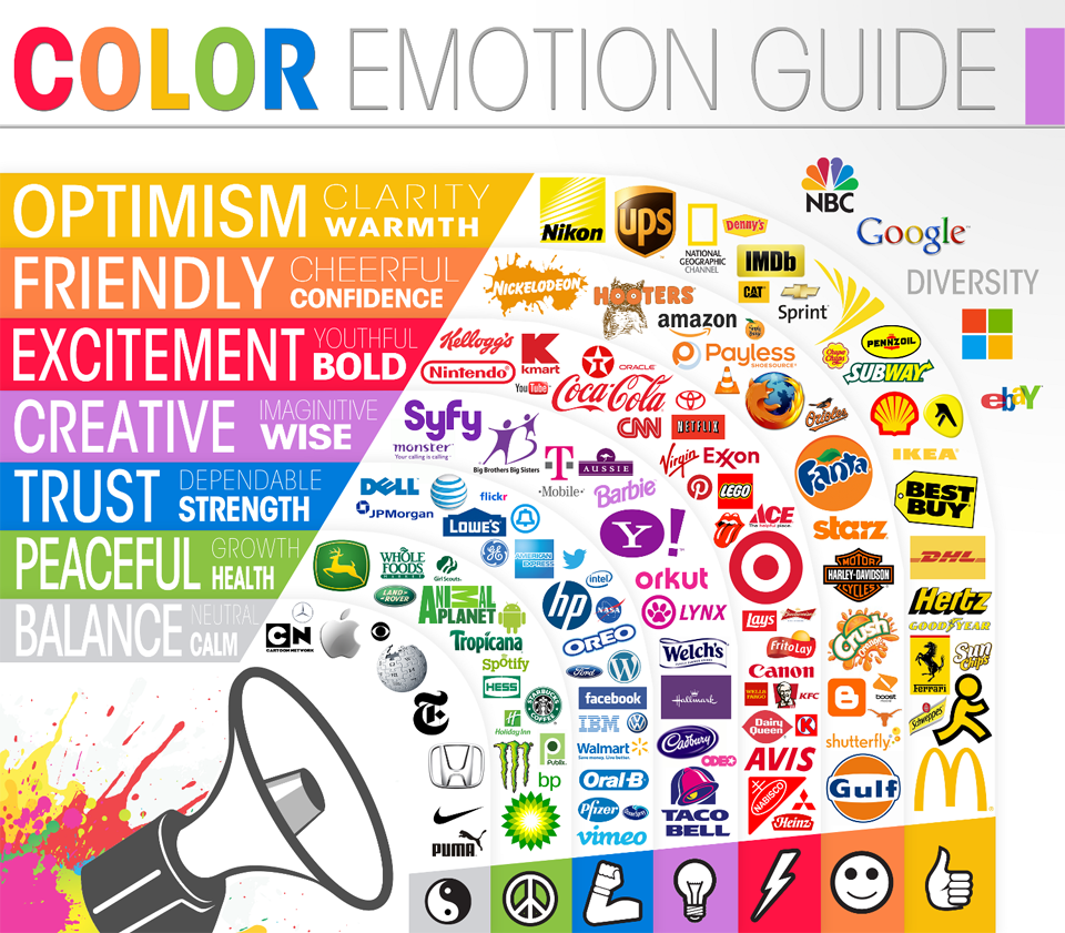
Consider the psychology of different colors and how they will make users feel. It’s no coincidence that the top 3 social media platforms and the majority of UK banks all have blue logos and branding. The color blue is perceived as being calm, relaxing, dependable and trustworthy, all the qualities you’d expect from your bank!
Red is generally seen as an urgent, fiery and sometimes angry color. Yellow is often associated with happy and warm emotions. Green is associated with nature and growth; whilst purple is seen as a fun and creative color.
Whichever color scheme you decide to go with, don’t neglect the power of ‘white space’! Websites that are too colorful, busy or cluttered can appear stressful, disorganized and confusing for visitors. Cluttered pages will only detract attention away from the action that you want customers to take, so be sure to leave enough white space on your page to create clear focal points.
Find out more about the psychology of color in this comprehensive infographic ‘The Psychology of Colour: How It Affects the Way We Buy’ from Hubspot.
Think Carefully About Positioning
A study performed by Nielson Norman Group found that when viewing content online people tend to read in an ‘F’ shaped pattern.The images below are the heatmaps from Nielson’s eyetracking studies. The most viewed areas are in red whilst the least viewed are in blue.
![]()
Keep this pattern in mind when designing your page’s layout to ensure that the most important information is displayed prominently.
It’s also important to make sure that the most important information on your website is kept above the fold (at the top of the page so that there is no need to scroll down to see it). If it’s difficult for visitors to find the information that they need then they’re likely to get bored and bounce off your website and onto a competitors’ instead.
Guide Customers’ Decisions
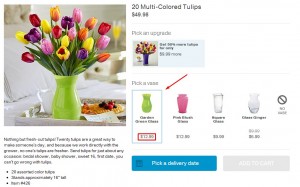
Make the action you want your website visitors to take stand out. Sometimes a little subtle emphasis on one option over another can make all the difference. Give your customers cues as to which products or services they should choose by making these the focal point on the page, you’ll be surprised at how much of a difference a small tweak like this can make.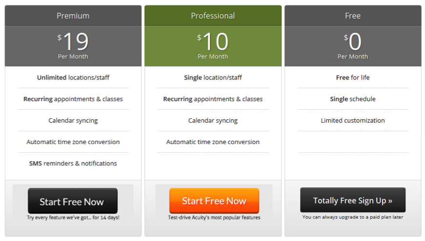 (Image source: Copyblogger.com)
Use the Right Words
Many small businesses make the mistake of overlooking the importance of their website copy.
The content on your website offers you the opportunity to really sell your products or service to visitors. It should evoke emotions, get your audience excited about what you’re offering, and clearly and concisely explain the features and benefits.
Here are a few of our top tips for using psychology to create compelling website copy that will convert visitors into sales.
Write with your target market in mind
You will struggle to write effective, tailored content if you don’t know your audience. Take the time to do your market research thoroughly and paint a picture of who your target market are and what they may be thinking and feeling when they look for your products or services.
Play on emotions
Website content is one of the most power psychological tools that you have available to you as a website owner. Choose your words carefully to evoke emotions in your visitors’ minds and create more powerful and effective website copy. Evoke fear or doubt in the reader’s mind to make them feel like they need your product or will be missing out without it. Empathize with your target market and the problems they may be facing that have caused them to look for products or services like yours; or create a sense of camaraderie and belonging around your brand.
Make your offer enticing
Make sure your business clearly stands out from your competitors by displaying your unique selling proposition (USP) prominently and expressing it clearly.
If you have any enticing discounts or offers running make sure these are highlighted, a great offer could mean the difference between a customer choosing you or your competitor.
Create strong and attractive calls-to-action
Guide your customers to take the action you want them to using powerful calls-to-action. Try replacing second person phrases like ‘get your free report’ with first person phrases like ‘get my free report’. Studies have shown that tiny tweaks like this can often be surprisingly effective.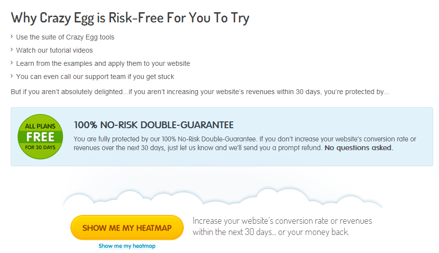
Find out more about creating killer call-to-actions over on this blog from WordStream.
Make it easy
Don’t make reading the content on your website a chore. Explain your product and its benefits clearly and concisely without using jargon.
Make it easy to read and scan over your content by breaking it down into manageable chunks and bullet points where appropriate.
Use stats
Use a few impressive stats as proof of the effectiveness of or demand for your product or service. People love quick and easy stats that help them to quickly get an idea of the kind of results to expect.
How many of the points in this blog have you got covered?
With an online presence now essential for small businesses there’s a lot of competition out there. It’s now more important than ever to design your website intelligently with psychological factors in mind in order to stay comeptitive and convert more of your traffic into sales.
(195)
Report Post
