— October 15, 2018
The checkout page is one of the most important pages on any retailer’s eCommerce site. It’s the final hoop visitors have to go through in order to make a purchase. You can make this an easy or difficult process depending on your user experience. For instance, if your checkout process is time-consuming because your forms are too long, this can create enough friction that can push visitors away.
On the other hand, if your checkout process is seamless and fast, this can increase the chances of closing the sale and at the same time motivate the customer to come back for a repeated purchase. Think about Amazon’s checkout process. It’s so fast that it encourages consumers to keep coming back to the platform to order more products. If their user experience was not up to par, they would get less repeat orders, even while offering better prices than other websites. Remember that time is money, so anything that you can do to speed up your checkout process will be greatly appreciated by your customers.
Speed is not the only component that defines a good user experience. Ease of use and accessibility across different devices are also key factors. For example, if your checkout process is seemingly fast but the pages are not mobile-optimized, it will be tough for users to complete their purchase. Keep on reading to find out how to solve these issues and many others to provide a better checkout user experience (UX)and maximize conversions.
Form Optimization
One of the biggest issues hurting UX on checkout pages is poor form optimization. See examples of issues below:
- Too many form fields making the forms too long
- Form errors that arise from entries that are not accepted. For instance, entering a password without a character when it requires one.
- Not enough options (examples: payment forms or shipping options)
- Too many options
- Forms that are not mobile-responsive–they may look too small on mobile devices or get cut off
In this section, we’ll go over tips to optimize forms.
Use Autofill Whenever Possible to Save Time for the User
The key to solving most of these issues is to leverage autofill functionalities that can help users automatically fill out the form based on specific information.
Address fields are one of the easiest fields to set for autofill. For example, instead of providing five different fields for address, city, zip code, state, and country, you can use Google’s geolocation API to autofill information based on an address. Users can save time by not adding fields that can be easily autofilled by entering an address. You can always offer the option to edit the address once it’s autofilled.
Another field that can benefit from this functionality is the email field. Offer autofill suggestions with the most popular email domain options such as Gmail, Hotmail, etc. to save time for the user. These two optimizations will be especially beneficial on mobile devices where forms are harder to fill out to due to the lack of space.
Organize Your Forms Properly for Better Visualization
Your form fields need to be aligned in a way that will make your entire form easily scannable. Opt for using vertical alignment whenever possible to organize fields and multiple options selections. For instance, instead of having the name next to the email address field, you would organize them one on top of the other.
The same concept applies when offering multiple selection options. For example, align your shipping options vertically to allow for easier selection on both mobile and desktop. Note that a horizontal organization (where fields are right next to each other) would be increasingly difficult to fill out on mobile since there is less space horizontally.
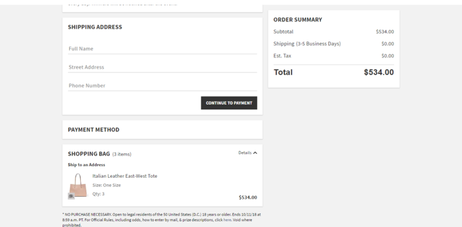
Also, consider grouping related fields together. For example, let’s say you have the following fields: one group related to creating an account (name, email, address) and the other related to shipping (free shipping, overnight shipping, etc.). You would group the account-related fields together and leave spacing before the next group of fields related to shipping. See how Banana Republic groups related fields below:

Offer Multiple Payment Options
It’s a simple tip, but a very useful one. Offering multiple payment methods will ensure all your visitors will have a way to make a purchase. Besides accepting all the major credit cards such as Visa, Mastercard and Amex, offer the option to pay with PayPal.
Some people feel more protected using this payment method and it also helps to speed up the process. For instance, I love to use PayPal to check out because it doesn’t require any effort. I don’t have to find my wallet or take out my credit card. All I need to do is remember my login to check out. I have actually abandoned carts before because I did not have my wallet handy and the website did not accept PayPal payments.
Instill Trust with Trust Seals and Testimonials
Adding products to the cart is easy. Making the jump from just adding to making a purchase takes more commitment. It is in that moment when doubts arise. Am I spending too much money? Am I going to get my packages on time for this special date? And most importantly, can I trust this company with my money? The latter question is the toughest one to overcome.
If one of your visitors truly wants to purchase one of your products, he or she will convince himself that it is the right decision to make. However, there is little someone can do to convince himself that the company is trustworthy without some type of outside validation. This is when trust seals and testimonials come in handy to instill enough trust, enabling users to shop with confidence. See some of the most popular trust seals or trust badges below:

In addition to these badges, add testimonials or reviews with star ratings. Stars can easily provide visitors an idea of the experience without actually reading the testimonial.
How to Monitor and Optimize Efforts
As with any other effort online, you have to test everything to discover the solution that is right for your specific business. Shoppers demand different user experiences depending on the product being sold, pricing and perceived quality. For instance, an eCommerce website selling fine jewelry may require more trust badges to verify the products are real than another website selling affordable fashion jewelry.
One of the best ways to find the right solution is by recording all user behavior. Using a tool like Inspectlet or Hotjar, you can record sessions to find out where people are clicking and hovering. Those platforms also offer heatmaps that can provide a snapshot of where people are concentrating their actions (scrolling and clicking). Then, according to the data collected, you can create experiments using Google Optimize where you A/B test different solutions to find the right one to use. Finally, you should always use Google Analytics to find out where people are exiting in comparison to the amount of pageviews recorded.
Digital & Social Articles on Business 2 Community
(61)
Report Post


