As far as technology has come, email marketing is still the most effective way to stay in touch with your target consumers. It allows you to stay at the forefront of their minds so that they can take action on whatever you’re offering when the time is right. Just as a successful email marketing strategy has many different components, writing a solid promotional email has many moving parts. In this guide, we’ll cover everything you need to know to craft promotional emails that drive results. We’ll go over:
- What promotion emails are and when to use them.
- Considerations to make before writing your promotion email.
- Tips and best practices for crafting your email.
- Promotional email examples you can use as inspiration for your own.
What are promotion emails?
Promotion emails are exactly as they sound: a marketing email written to your audience—whether they’re customers, leads, or subscribers—with information about a promotion you are running. You can create promotion emails for just about any offer you are running:
- Limited-time offers.
- Subscriber- or customer-exclusive deals.
- Seasonal or holiday promotions.
- Product launches.
- New arrivals.
- New subscriber/customer welcome offers.
- Contests and giveaways.
- Free content like eBooks, white papers, guides, infographics, and more.
- Any other special deals, like buy-one-get-one, refer a friend, coupons, and promotional codes.
I’ll be providing examples of the many types of promotional emails throughout this guide and at the end.
Promotion emails are effective because, first of all, email marketing is highly effective:
- 91% of consumers open their email on a daily basis.
- 58% of consumers check their email before doing anything else.
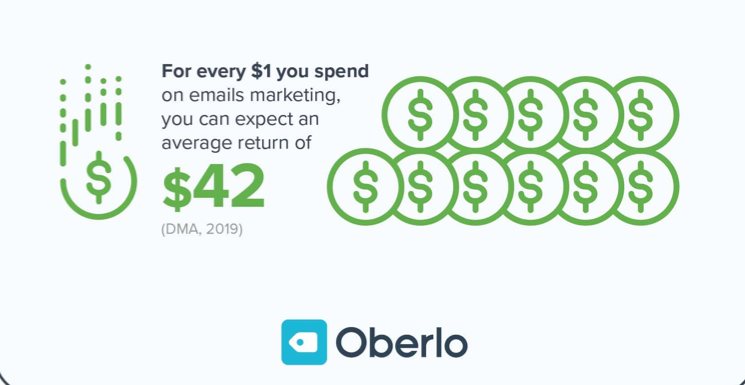
- Brands get a return on investment 42 times the amount they invest in email marketing.
Second, everyone loves a promotion. So when you put the two together, you see that promotional emails are a successful marketing strategy:
- 68% of millennials say promotional emails have influenced their purchase decisions.
- 76% of email subscribers have made purchases from an email marketing message.
Before you start writing your promotion emails
As effective as email promotions are, you can’t just throw one together and expect to get results. There are general email marketing best practices that you’ll want to follow, as well as some guidelines specific to promotional emails that are important to consider. Let’s start with some basic initial steps to take before you even start writing your email.
Decide what you’re promoting
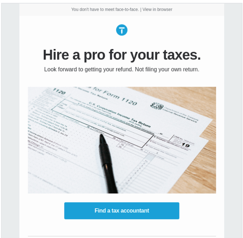
Before you even start the outline of your email (which you should do every time), you have to decide what the subject is. What are you offering to the reader? Whether it’s a limited time discount, webinar, free eBook, or a rewards program, whatever you’re promoting is going to determine how you craft the entire email.
Identify why you’re promoting It
Now that you know what you’re promoting, it’s time to ask yourself why. For instance, you might be offering some free content to move leads further down your sales/marketing funnel, or you might be hosting a webinar to launch your new product and generate some sales. Identifying your objective will help determine your email wording, position, and audience.
Examples of objectives include:
- Bring back dormant customers.
- Increase sales for a specific product or service.
- Improve audience engagement.
- Generate more traffic to your website.
- Increase brand awareness in a particular vertical or niche within your audience.
- Decrease customer churn.
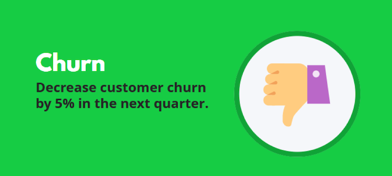
Courtesy of our marketing objectives blog post.
Target your audience
Once you figure out what you’re promoting and why, it’s time to determine your audience. Sending the same promotional email out to your entire audience is not recommended, because your messaging will get diluted as you try to appeal to all readers.
Instead, send it to a select few, or segment out your list so you can deliver targeted messaging for each segment. The way you describe the offer to new customers that you’re trying to move through your sales funnel will be different from the way you describe it to existing customers you’re trying to get repeat business from. Knowing your audience beforehand will allow you to write a more effective email.
Tips for writing your promotional email
Once you have the framework set up for your promotional email, you can start to craft your copy and set up your send. The tips below will help you to maximize your open rate and engagement rate.
Focus on the benefit/value
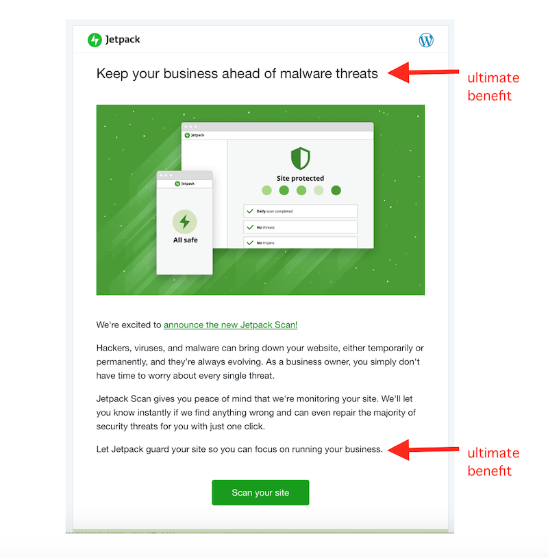
Be careful not to focus too much on the promotion and its features at the expense of its benefits. Ideally, the link for your offer will take readers to a landing page describing the promotion’s features and terms in more detail. The body of the promotional email itself should clearly identify why this promotion is of value to the reader and make clear the ultimate benefits.
Send from a person
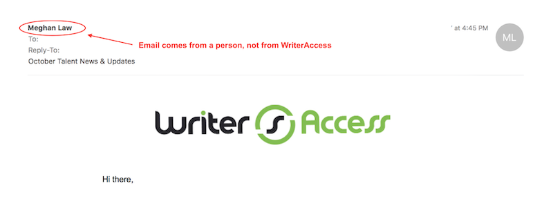
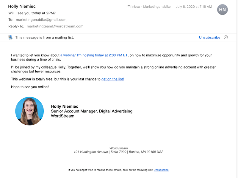
In addition to the subject line, the “from” field can have a significant impact on whether your promotional emails get opened, disregarded, or sent to the trash bin. Instead of using your company name, use your (or a teammate’s) name to add a more personal touch. People like to read emails from other humans, but sure to test this out as preferences vary from audience to audience.
If you do send the promotional email from a person, be sure to include an attractive and professional email signature. This should include the name and role in the company, and if applicable, company contact information, social media handles, and a photo. This adds a nice personal touch to your promotional emails and helps your readers to feel more connected to your brand.
Introduce your promotion in the subject line
Did you know that 47% of emails are opened solely based on the subject line? That said, when including your promotion in the subject line, strive to be catchy, conversational, and compelling Just be aware that some words and phrases can trigger spam detectors and send your email to your readers’ spam folder (for example, using “free,” “FREE,” or “100% free”). Here’s an example of a compelling promotional email subject line from Shutterfly:

Use preheader text
Email users see three layers of information before opening an email: sender name, subject line, and preheader text. Though just a few words (anywhere from 40-130 characters), preheader text can be the final influence over whether a reader opens your email. Use this limited space to provide an essential detail about the promotion that will clarify the email’s purpose and attract readers. Preheader text appears in different forms depending on which email client and device you’re using. Sometimes it appears below the subject line, and other times right after it, such as with the Shutterfly example we just used:

In some cases, preheader text may also appear in the promotional email itself, as with the example below, but not always.
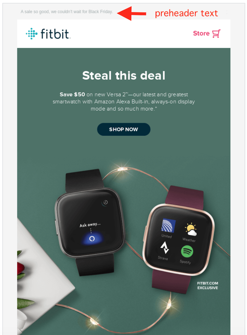
If you don’t have the ability to fill in the preheader text field, your email client will typically pull in the first 40-50 characters of the email, so make sure the first characters of your email are engaging and give the reader a reason to continue investing their time.
Brand your header
The header is the first thing a consumer sees upon opening your promotional email, so make sure it’s clean, professional, and appealing. You could use a standard simple header with your logo, company name, and brand colors; or leave space for text so you can include the name of the promotion.
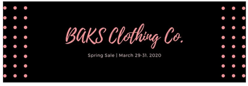
You may even wish to include the CTA right in the header of the email, as we sometimes do:

Break up the body of the email
Depending on the offer of your promotional email, the body is going to vary in length. Regardless, a wall of text is a surefire way to get the reader to click the “X” and trash the email. Keep the body of your promotional email concise and break up lengthier blocks of text with images, links, or bullet points so it’s easier for your readers to digest.
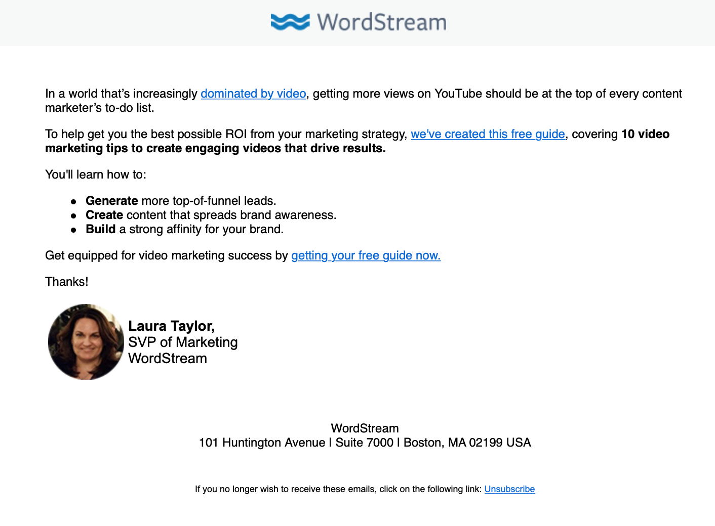
Include a call to action
Above all else, you must include a loud (but not obnoxious) and clear call to action in your promotional email. Most effective promotional emails have a nice flow that leads your readers to the desired action.
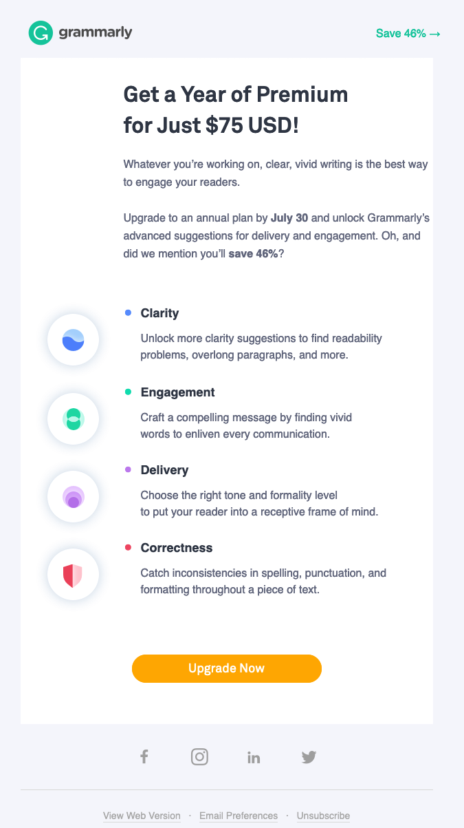
Having the CTA at the end of your promotional email isn’t necessary, as long as it’s clear and easy to spot:
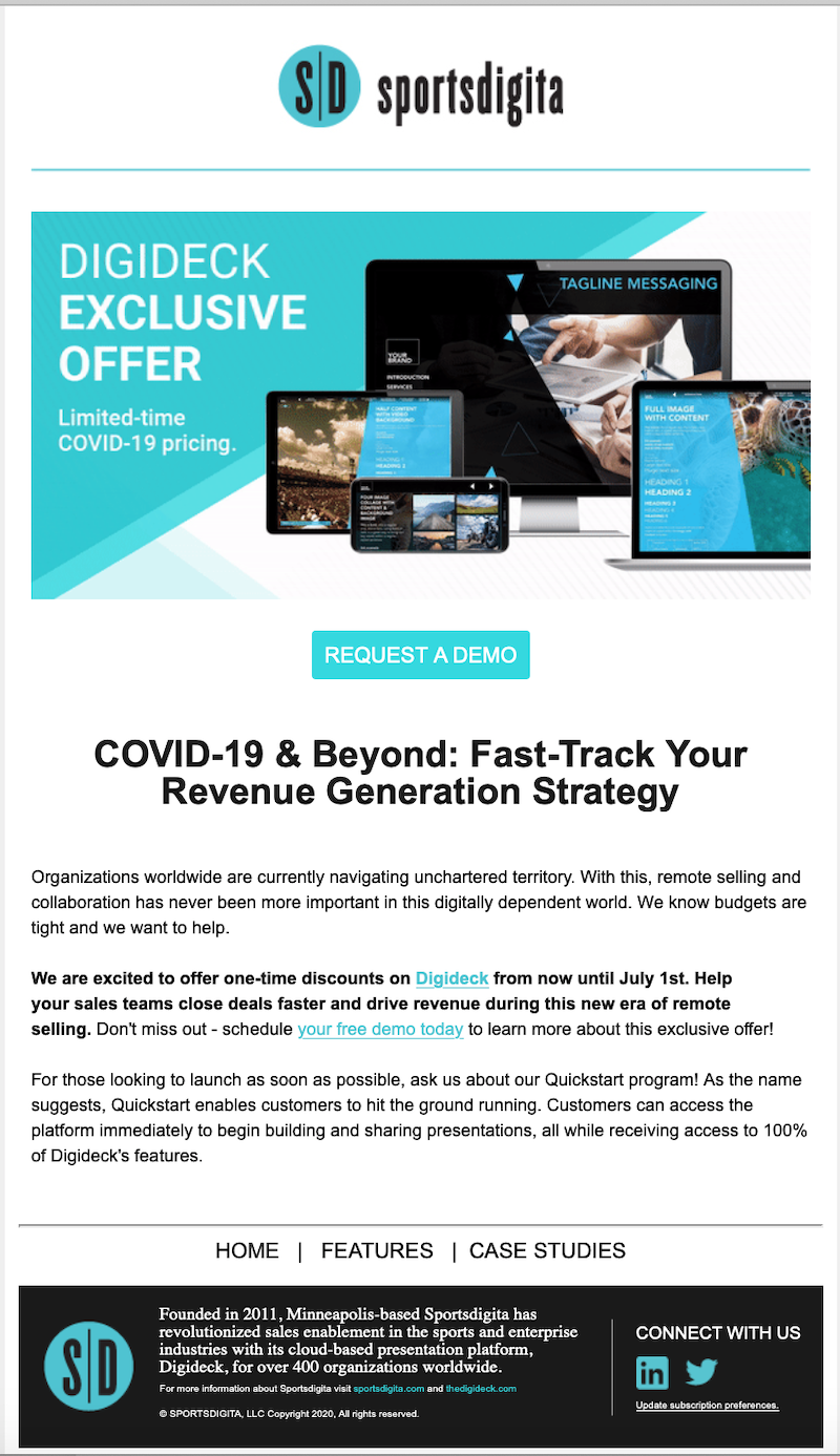
You may also wish to include the CTA twice if the email is long enough. That way the option is always in view even if the reader has scrolled.
Add visuals
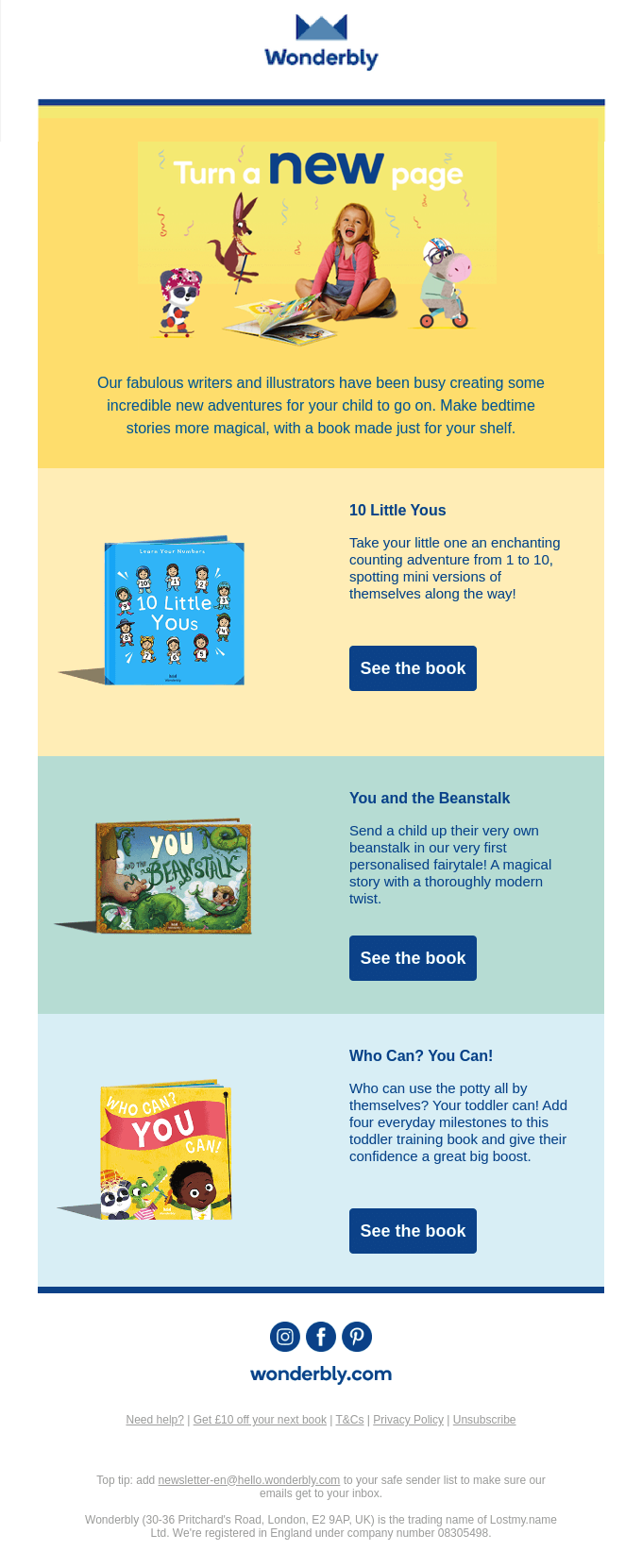
No email is complete without captivating and appealing imagery. Rather than using the same stock photos that every company in your industry uses, try using your own photos. Or create graphics with free and easy-to-use platforms like Canva. It doesn’t take much time, it’s an easy way to authenticate your brand, and also helps to break up the text.
Just don’t go too overboard with them. Your promotional email should be exciting but not overwhelming, and the images should complement, rather than distract away from, the CTA.
More promotional email examples
We’ve included plenty of promotional email examples above with our tips and best practices, but it can never hurt to see more examples. Here are a few more that you can use as inspiration or adapt for your own business promotions.
New offer promotional email
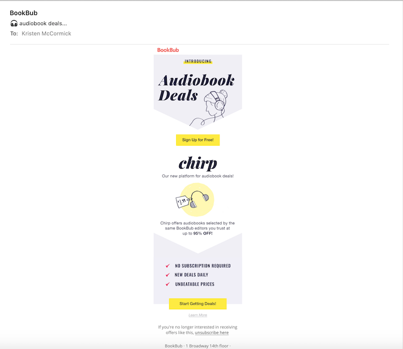
This great promotional email example by BookBub has a branded header with attractive imagery, and the value of the promotion (rather than the promotion itself) is prioritized—meaning they provide the name of the platform they are promoting (“chirp”) but not before first highlighting the ultimate benefit (“audiobook deals”).
The copy is also clear and concise. In under 50 words, the email answers all of its readers questions:
Why should I read this email? To get audiobook deals.
What are you asking me to do? Sign up, for free.
What is it? A new platform called chirp.
Why will I like it? No subscription required, new deals daily, and unbeatable prices.
And then they have a second CTA that reinforces the ultimate benefit (“Start Getting Deals!”).
Flash sale promotional email
I’m actually going to start off with an example of a promotional email that does not follow the best practices covered in this post. First of all, there is no attractive imagery. Even the logo in the branded header is small. Second, the features, rather than the benefits, are highlighted. Third, while promotion is clear (20% off all plans)—the call to action is not. Yes, you are clearly asked to claim your discount, but for what? Only with a closer do you find that it’s to “upgrade today.”
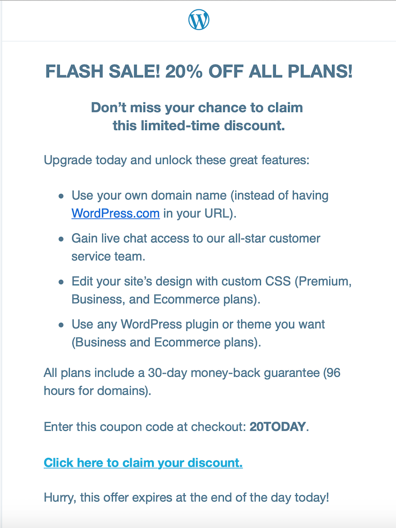
On the flip side, WordPress could be targeting this email for WordPress power users or engineers who already know the benefits of the platform and are more inclined to look for specific features. In this case, providing feature details without any distractions or unnecessary elements makes sense, which brings us back to the third tip in this post: target your audience. Also, two best practices are followed: the bolded blue text makes the call to action easy to spot among the gray text, and the bullets break up the text for an easier read.
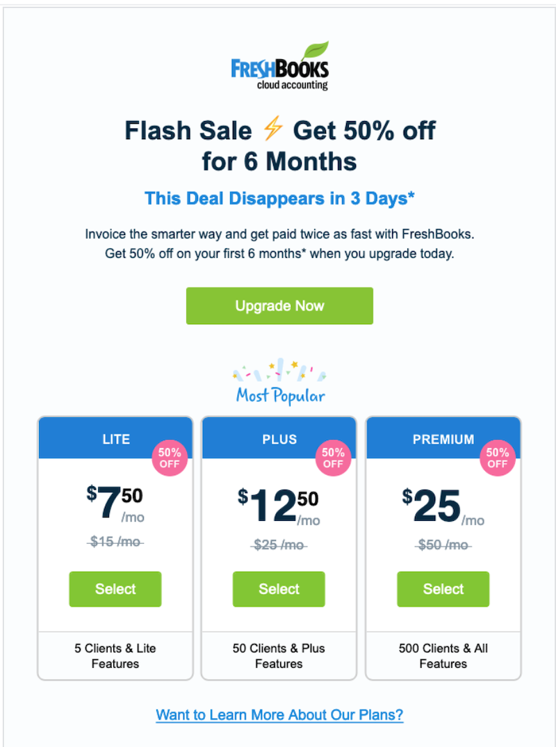
In general, however, effective flash sale promotional emails can be limited in text. After all, you’re urging recipients to stop reading and start shopping, and the discount itself automatically implies the benefit of saving money. Here’s an example of a flash sale promotional email that better follows the best practices in this post. It uses simple design elements, including a legibly-sized logo, an emoji, and branded charts; the benefit is prominent (“get paid twice as fast”), and the CTA button both stands out and clarifies the offer.
Free resource promotional email
This email example from Zoom doesn’t offer a discount or sale, but rather a variety of free resources. Promotional offers like this keep customers engaged with your brand as well as your products, which helps to foster customer loyalty.
As far as the best practices it demonstrates, we see a branded header and a benefit statement (host meetings like a pro) right off the bat. There’s also concise copy about each resource and a large orange CTA that makes clear the next step to take.

Time-limited promotional email
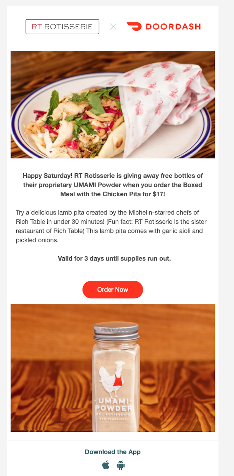
The example below from Doordash may be text-heavy, but because it adheres to best practices, it is an effective promotional email for a time-limited offer. You’ve got your attractive imagery and prominent CTA button. You can also see the use of bold versus regular font to help break up the text.
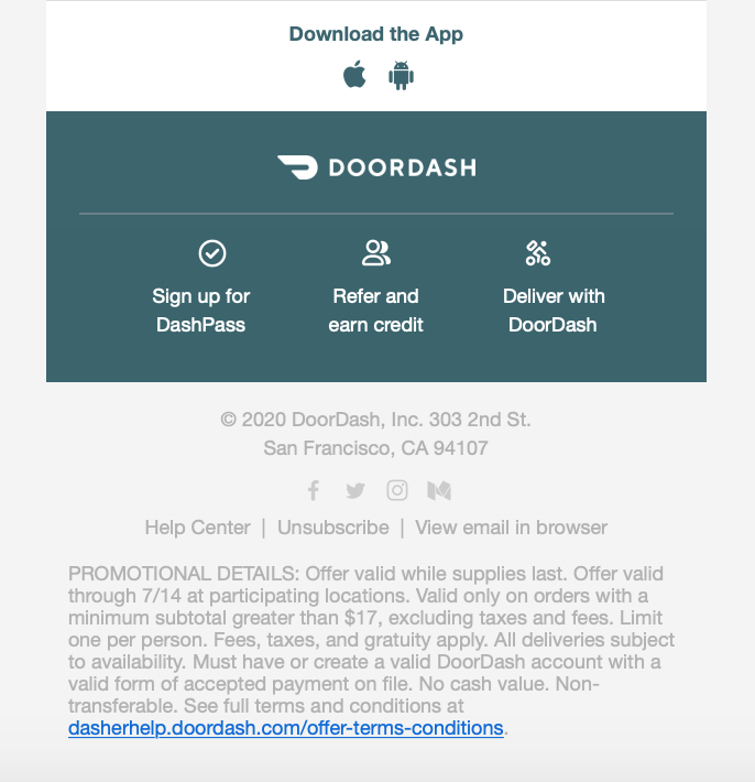
Another thing to note is that the footer of this email contains details about the promotion. This is a good way to include terms and conditions without cluttering up the body of the email.
New offering announcement email
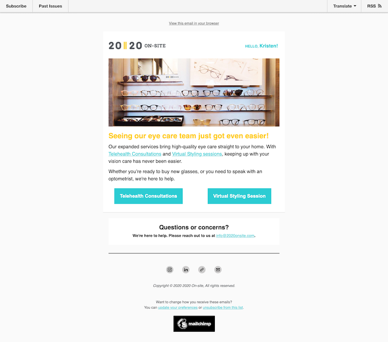
New products and expanded offerings make for great promotional emails. In the way of imagery, benefit focus, brevity, and CTA best practices, this example email covers it all. The image complements the colored text, the ultimate benefit is highlighted in large font at the top, the messaging is quick and to the point, and the two options are crystal clear.
Content promotion email
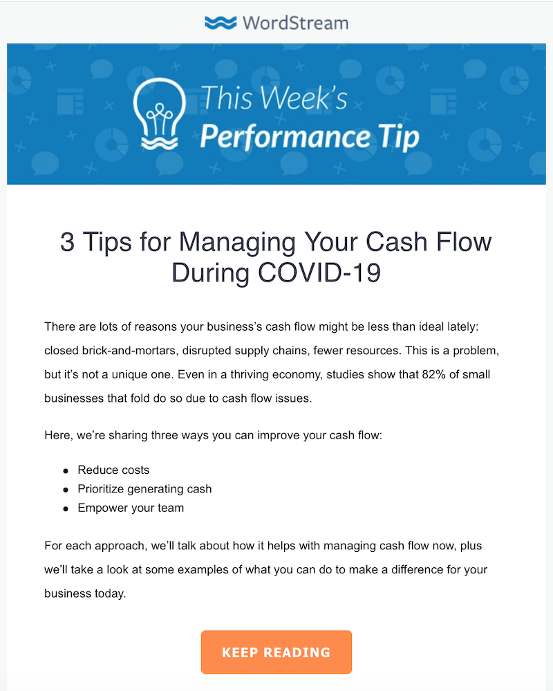
You don’t need to have fancy promo codes or create unique landing pages for every promotional email you send. Our weekly Performance Tip email is a good example of a simple content promotion.
We may be tooting our own horn here, but then again, you’d better hope we’re following best practices if we’re writing about them. We use a branded header with appealing imagery that orients the reader to what type of email this is. The title of the content is in large font at the top so that readers can know right away what they are investing their time in. There is a lot of text, but it is broken up by bullet points to make it easily skimmable. Finally, there is a clear CTA at the end to send readers to the full post.
Ensure success with your business’s promotion emails
Using email to communicate your special offers, deals, and promotions is definitely worth your while. Just be sure to follow the tips and guidance above so that you maximize your results. Here’s a recap of what we covered:
- Determine your promotion, identify your objective, and target your audience.
- Focus on the ultimate benefit to the reader
- Send from a person (if applicable) and use an attractive signature
- Introduce the promotion in the subject line
- Use a branded header
- Break up the body of the email
- Include visuals
- Be concise
Digital & Social Articles on Business 2 Community
(265)
Report Post


