— August 14, 2018
I had the good fortune to participate in a closed-door meeting on the future of government websites. Nothing secret, of course, but very useful. Here are some valuable lessons from that meeting.
As with all such gatherings, be they government or industry, there is a buzzword. And the buzzword at this event was “optimization”.
Forget everything you’ve ever heard about optimization. This has nothing to do with the search engines. Well…almost nothing. I’ll get to that later. This is about “user experience” optimization, or UX for short.
What is UX? It is helping your website visitors do what they want to do. Yes, it’s about service. It is described by another buzzword in the air at that meeting: “user-centric.” You achieve UX when users:
- find what they came for
- understand what they read
- do this quickly and without frustration
It’s what every business or organization should be doing when they interact with customers, online or offline.
As Shannon Thompson points out, UX takes good website design and even better web development. Actually, she goes further than that, pointing to the sweet spot where design, development, and performance are in balance. Kumbaya!
I have distilled UX to six points, applying what I heard at the closed-door meeting to small business. The one aspect each point has in common is service to your customer.
Speed
Have you noticed how impatient people are these days? A few seconds delay will push some visitors to abandon your website or your shopping cart. Test everything, then optimize for speed. Use this tool to check page load time. I like how it shows exactly what files slow down a page. When I began revamping my websites, those insights made it easy to optimize for speed.

Security
The government is big on privacy, so I was not surprised to hear about protecting visitors’ privacy at the meeting.
Search engines and browsers have begun displaying each website’s security status. So it pays to switch to https. Government websites are all switching over. Do you need that government-level security? If 10% of potential customers avoid your website because Google or Firefox label it “unsecure,” you need https. I don’t process transactions on my websites. But I switched them all to https a few months ago. That way, my users can feel safe filling in my query form.
Many web hosts are heading in the direction of offering free https, so check with yours.

Devices
More people now surf the Web on mobile than on desktop. If you have not already made your website fully responsive, do so now! A fully-responsive site changes the location and size of elements (such as images) based on screen size. If you are on the phone, you don’t want to have to scroll sideways. You don’t want images wider than the screen. You don’t want the entire screen taken up with navigation.
With Google’s mobile-first algorithm, it’s not just that you’ll lose frustrated visitors. Your website will also start performing worse in Google’s desktop results.
Navigation
You have a navigation bar. That means people can find what they want, right? Wrong. People don’t necessarily go to the navigation bar. To optimize for your visitors, you need to analyze each page’s search data to understand the user’s intent. Then tweak the content to make it easy for them to take their next step.
The government is big and does lots of user testing. You can’t. But you can access analytics and other available data. Lead users where they want to go.
Understanding
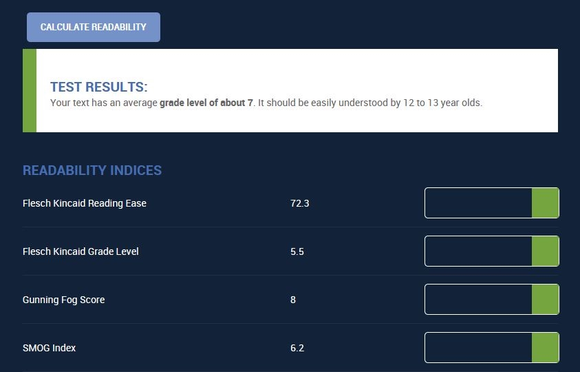
Your customers are not stupid, but we all tend to read at a grade eight level or lower. Plus, people scan more than read on the Web. If it takes work to read something, you’ve already lost customers. Here are a few quick tips to follow:
- Use simpler words.
- Break up long sentences.
- Make lists look like lists (like this one).
- Use the active voice (subject-verb-object).
Then measure readability to see how you’re doing.

Easy action
Some visitors are just doing research. Their visit is informational. Others are on a mission. They want to do something:
- subscribe
- get a call-back
- ask a question
- make a purchase
Whatever it is, make it easy for them. If it takes work to find the “buy” button, you’ll lose some of them. Especially on tiny mobile screens, searching for a small button on a page is a big pain.
This might sound elementary, but so many websites still frustrate. Figure out what transaction a user might want on a given page. If your website template doesn’t accommodate that action, add something into the page content itself.
On my website, a red button linked to my query form follows users down the page. No need to search. No need to scroll.
Search engines
Now we come back to what I said earlier about this having something to do with search engines. Gone are the days when they ranked pages based only on content and links. They now focus just as much on UX.
They look for mobile-friendly websites.
They look for https security validation.
They watch user behaviors, such as bounce-backs to their search results.
As Lee Fuller explains, SEO and UX are converging. If even the government realizes that it has to optimize its websites with user-centric design and plain language, it’s about time you do, too.
Henry Ford once said, “A business absolutely devoted to service will have only one worry about profits. They will be embarrassingly large.” If you can optimize your site for service to the customer, you’ll have the competitive edge you need.
Digital & Social Articles on Business 2 Community
(56)
Report Post


