— October 5, 2018

The argument over whether or not to gate content is a hotly debated issue in the world of demand generation. Gating your content refers to the practice of requiring visitors to provide you with personal information before they can access your content. While gated content can help generate leads for your sales team, there are also plenty of drawbacks. We recently decided to ungate the majority of our content. Read Why We Ungated Our Content & Results We’ve Seen So Far for more information about that process.
Even though we decided to remove most of our lead forms, we still wanted to bring in as many quality leads as we could. That put a lot of pressure on the few lead forms we had remaining on the site, such as our “request a demo” form. As one of our most valuable sources of new business, we wanted this form, in particular, to be as effective as possible to ensure an optimal conversion rate.
In this blog post, I’ll describe how we implemented a progressive profiling approach to optimize the effectiveness of our demo request lead form.
Initial Analysis Showed High Abandonment Rates
We began with an analysis of the pages that contain our lead forms. We knew we wanted to optimize the demo request page but wanted to see how it actually compared to others. Sure enough, we noticed a relatively high abandonment rate on our demo page. Visitors would land on this page, presumably because they wanted a demo of our product, but they were leaving that page at a rate of around 80%. That suggested to us that something about the experience on the page itself was turning off visitors.
A previous assumption we had about this high abandonment rate was that people were looking for a video demo of the solution and not necessarily ready to sign up to schedule a live demo or to speak with a salesperson. For this reason, we implemented an “internal retargeting” campaign, which you can read about here. But we believed that still couldn’t account for all the abandons and that the existing, conventional form-focused experience was not ideal.
When re-examining the form on the demo page, what stood out the most to us was that there were a lot of fields we were asking visitors to fill out! We asked for seven different pieces of information (first and last name, email, email, phone, website, company and industry) all at once. We hypothesized that visitors felt this was too much information to provide and was a potential barrier to form completion.
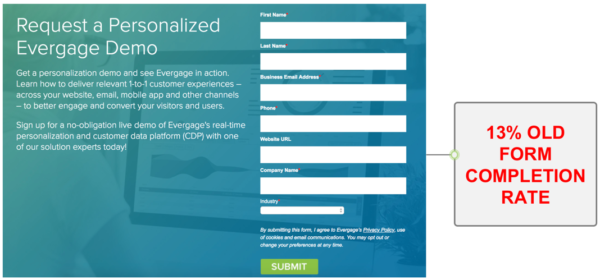
Our old form with seven fields had an underwhelming 13% conversion rate. We theorized that the long form was a factor in its performance.
Providing a Better Experience by Breaking Up Forms
After brainstorming different options and drawing on our experiences visiting other websites, especially consumer-oriented ones, we thought we should try redesigning the flow. We also had experience with progressive profiling which we thought would work well in this case too. To improve the visitor experience and our conversion results, we decided to eliminate most of the copy on the page and break up the form fields into different steps, starting with the most important field, email address. We wanted to ensure that any prospect who was considering requesting a demo at least provided his email address. That way, even if we didn’t know anything else about him, we could still contact him. We decided this is all we would ask for in Step 1 and that it would be mandatory.
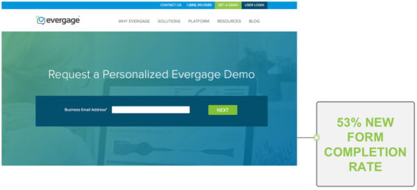
When we redesigned the page and asked solely for email address, we saw a 53% completion rate!
Then we set up Step 2 to ask for first name, last name and company, but this step was optional to complete. This would allow us to include the prospect’s name in future communications, and allow our sales and business development teams to research the prospect’s company.
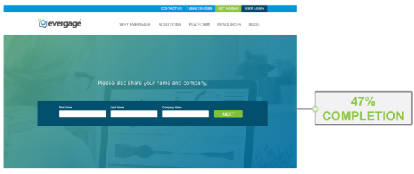
The next optional step of the form asked for first name, last name and company name. Nearly all of the visitors that completed the first step also completed the second step.
Finally, in Step 3, we decided we’d ask for phone number, website and industry — also optional. At this point, we would have sufficient information to follow up effectively and personalize the initial demo conversation.
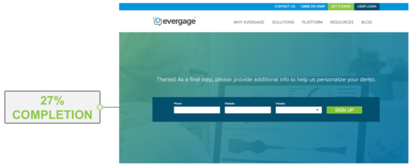
The final optional step of the form asked for phone number, company website and industry. More than half of those who completed step 2 completed step 3.
Upon completing the final step, visitors would be redirected to a thank you page, where we let them know we will be reaching out shortly to set up a time for the demo. We also decided to present some machine learning-driven content recommendations on the bottom half of the page to drive further engagement and education.
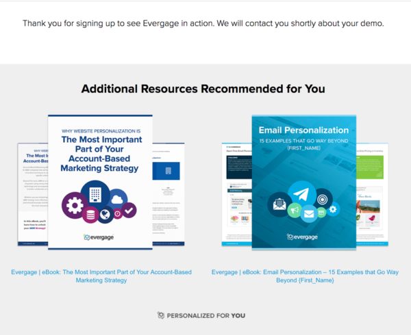
A machine-learning algorithm drives the content recommendations on our demo request thank you page — displaying the most relevant eBooks to each individual.
Results
After redesigning the demo sign-up experience, we did an A/B test and made it available to about 50% of demo page visitors. The other half received the old demo page experience. We let it run for several weeks, and the results were remarkable.
We found that 53% of visitors to the “request a demo” page completed the first step of the new progressive form — vs. only 13% on the original form. Of course, we didn’t have as much data on each person as with the original form, but we had an email address, the most important piece. This was, in essence, a 4x increase in leads generated. And the drop-off between Steps 1 and 2 was significantly less than we anticipated, with a 47% completion rate.
Step 3, however, did show a steep decline, with about a 27% completion rate. Still, this was 2x the number of leads with complete information (all seven fields completed) as compared to the original form!
We were initially concerned that lead quality might decrease when we lowered the barrier to sign up, but to our surprise, it remained consistent with our old form. For the test sample set, the conversion rate from demo lead captured to actual appointment set stayed constant at about 50%, hence we nearly doubled our number of appointments!
Digital & Social Articles on Business 2 Community
(83)
Report Post
