It’s no surprise to anyone at this point that we are living in the age of social media. Your mom, your coworkers, and even your grandma are on social media at this point. Even your dog, if you’re into that.
With so many posts, tweets, snapchats, and messages being sent each day, how can you be sure your message, in business and personal, is getting across? Images. Photos. gifs. videos. Anything that isn’t text.
Marketing to Short Attention Spans
Squirrel! If you’ve seen the movie Up, you know what this means. If not…
According to a study by Microsoft, the average attention span of humans is shorter than that of a goldfish (8 seconds for humans, 9 seconds for goldfish). This means that if your text is too long and with no visual appeal to your audience, chances are the message is skipped over and lost.
Sure, there are the few crazy people that read every single post they come across but they are definitely in the minority of social media users. Additionally, users that feel the text is too long will not take the time to read it.
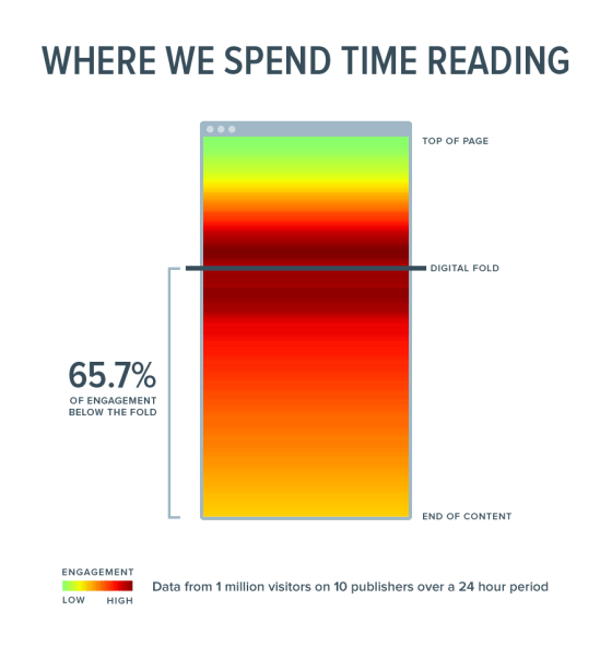
This heatmap image below from Digital Uncovered shows where readers spend the most time, which decreases after the digital fold. The digital fold, or the “meat” of the content, is where your message lies. If your content is not grabbing the attention of your audience at the top of the page, they will not continue reading to the digital fold and therefore, will miss the message.
Yes, the text in your posts is important too. Bullet points, subheadings, and highlighting keywords are all ways to attract the eye of the reader. However, if you really want to catch the eye of someone quickly scrolling through their feed, images are the best option.
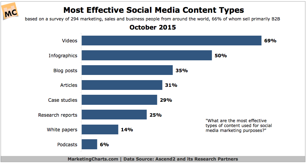
Whether it is a photo, a graphic image, chart, video, gif, or screenshot of something important on your website, your audience will be more captivated and willing to hear (or read) what you have to say.
Some ideas to switch up your content can be, but are not limited to:
- Photos
- Videos
- Gifs
- Slides from a slideshow
- Logos
- Charts or graphs
Instagram and Snapchat
Foodies, Fitspo, and Faces, Oh My!
Two of the most popular social media platforms are Snapchat and Instagram, both of which use images to communicate.
If you are on Instagram, you know that people LOVE to share selfies (Faces), food pics (Foodies), and fitness inspiration (Fitspo) with hopes of going viral. Or with the goal of becoming an influencer, which is a whole different ballgame.
Sharing images with similar concepts can show that your brand is aware of trends and can create personal connections with your followers.
More and more businesses are joining Snapchat as a way to connect with a younger target market. Snapchat is a great for…
- Behind-the-scenes looks at your business
- Exclusive content and offers
- Photos and videos of products
- Encouraging customers to share photos and videos with you
However, don’t limit yourself. Photos can be shared across all social media platforms and cross-posting, or sharing the same image across all of your platforms, will continue to encourage your brand’s visual identity.
Why Should You Care About Images?
Social media posts with images get shared more often than posts without. This means, the more visually appealing your posts are, the more engagement you’ll get and therefore more opportunities for leads.
Using relevant images consistently can create a visual identity for your brand. While this doesn’t mean you should repost the same photos or logos over and over again, it does mean that adding different visuals into your posts will prevent the content from feeling stale.
Where to Start with Images
If you haven’t posted many images on your social media platforms, start with a vision board to find out what will work best for your business. It does not have to be concrete, as your ideas and inspiration may change often.
Use colors or patterns that are relevant for your business to help develop a brand identity. By having and following a brand identity, consumers will be able to recognize your brand quicker and respond to your content.
For example, the Walmart logo uses blue and yellow. So, in all of their advertisements and social media posts, they use images that include blue and yellow. The Walmart logo is instantly recognizable and by using the same or similar visuals in social media, their content will be recognizable as well.
Most readers will scan content instead of thoroughly reading it. If your content and images are direct, to the point, and interesting, your audience will be more interested.
Don’t forget about your why; you wouldn’t post random text, so don’t post random images. Make sure each image you share on social media has a purpose, even if the purpose is to catch the reader’s eye.
Digital & Social Articles on Business 2 Community
(61)
Report Post
