Like many of you, we read a lot of email at Yozio. And, like many of you, we read many emails on our phones. In fact, phones became the default tool for reading email, overtaking desktops a couple years ago. Now, it’s estimated that 65% of emails are opened on mobile devices first. Email is over 40 years old, and not going anywhere. It has proven over the decades to be an effective tool for marketers and it is one of the first channels you should look at when you are trying to grow your mobile app.
Unfortunately, there are more examples of poorly executed emails than good ones. Too few emails create a seamless download and onboarding experience for users of mobile apps. I’ll cover one particularly bad email at the end of the post. You’ll be surprised who the company is that sent it. But first, to highlight the best practices of growing app users through email, I’ve analyzed some of the best emails I’ve received that encourage app installs and user engagement.
Increase App Installs with Email Best Practices
First and foremost, to effectively use email to acquire new app users and re-engage existing users, your emails should be mobile optimized. Litmus, a company that provides a QA and testing platform for email marketers has a great blog post on the anatomy of a perfect mobile email and we suggest you check out that blog post to understand how to make your email readable for mobile devices. All of the examples below had mobile optimized emails, which were accessed and read on the native mail application on iOS.
Foursquare
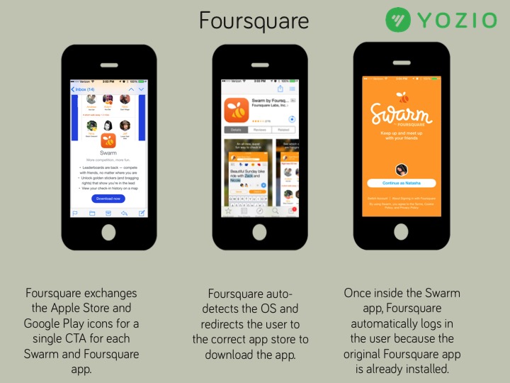
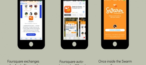
Earlier this year, Foursquare split its wildly popular check-in app into Foursquare and Swarm. This is an email Foursquare sent to powerusers encouraging them to download the latest versions of their Swarm and Foursquare apps. Foursquare’s email is great because they don’t introduce friction for the user with separate Google Play and App Store logos frequently used in emails and on the web. Having these two CTAs for each app would have confused some users and decreased conversion rate.
Sidecar
Sidecar is a mobile app that allows users who are going in the same direction or to the same destination, to pick up passengers. They’ve run some fun and innovative marketing campaigns including their latest — #cheaperthan. Sidecar is a Yozio customer and used Yozio’s Superlinks to create this personalized onboarding experience.
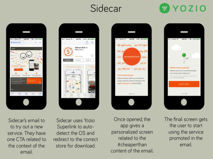
This email from Sidecar is promoting their rideshare efforts via their #cheaperthan campaign. Clicking on the email gave me a prompt to download their app. And even better, they personalized the onboarding experience based on the CTA in the email. Personalization reminds the user why they clicked and installed the app. It creates a frictionless user experience for mobile users and drives high activation.
Netflix
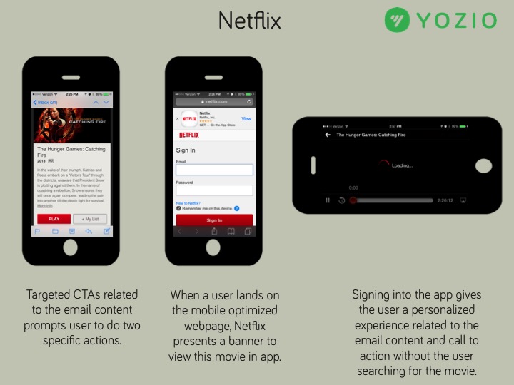
This email from Netflix is promoting the highly anticipated Hunger Games movie. Netflix has two compelling CTAs related to the content of the email instead of generic app store links. When you click on the “play” CTA while on a mobile device, you are brought to a mobile web page that allows you to sign in to Netflix. The page includes a simple banner to view in the app. After being brought to the app store to download the app and sign in, Hunger Games starts streaming immediately, without having to search for the title and tap play. While this might seem like a small detail, connecting the intent of the email with the CTA with the first screen the user sees upon app launch helps activate the user and showcase the functionality of the app.
Sosh
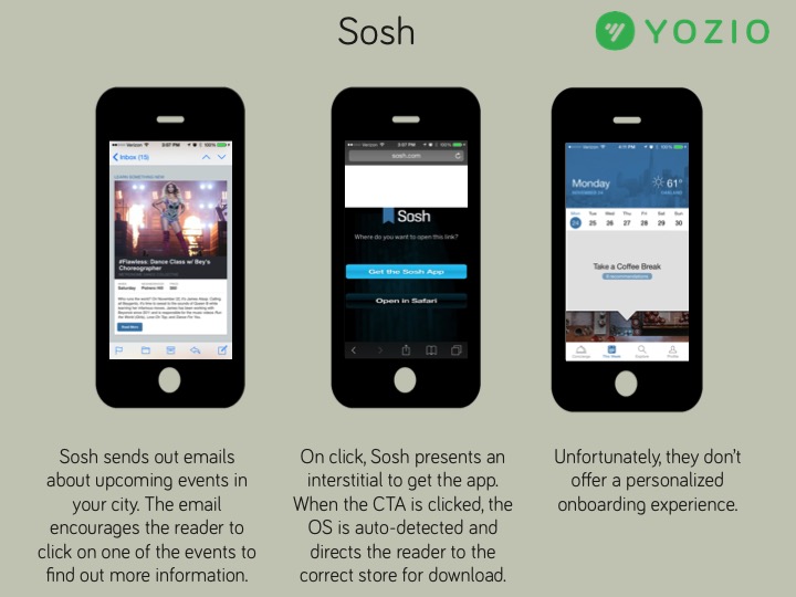
Sōsh is a social mobile app that enables members to discover local activities, events and places. Sosh does something great when you click on a featured event in the email — they present the email reader with an interstitial to view the content in Safari or to get the app. This is a really great way to encourage the people who are already opening, reading and clicking on your emails to download and install your app. Unfortunately, Sosh adds unneeded friction to the user experience because once the app is opened, the reader must scroll through the events or search for the intended event in the app.
And the email that is bad? It’s from..
Google Inbox
Google could learn a thing or two about using email to encourage app installs from the previous examples. Here are the things that we identified for Google to improve their Inbox email.
- Multiple call-to-actions (one for iOS and another for Android) provide a disjointed user experience. Google could create one download CTA in the email to encourage users to take action and download Google Inbox.
- Google could utilize auto-detection in their CTAs to route users to the appropriate app store instead of squeezing three CTAs on one small screen
- Google could customize the call-to-actions to match the email’s purpose, which is a special invitation to download and use this new and exciting app.
- And because Google’s Inbox required an invite from another person, Google could have personalized the onboarding experience with information about the referrer when the user first opened the app to drive activation.
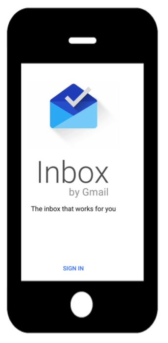
The onboarding experience from Google Inbox is not personalized with a welcome message from the person who invited me to use the app.
To recap, here is a checklist for building a mobile email campaign. Following these steps will make your emails valuable to your readers, and encourage your subscribers to download your app and shop via your app.
- Make your emails mobile optimized.
- Write your emails with purpose and craft compelling call-to-actions that relate to the purpose and content of the emails. This means removing the App Store and Google Play store icons that are so common and replacing them with a call-to-action like “Download” or “View in App” that automatically detects the OS and routes users accordingly. The screen for mobile phones is small and removing extraneous CTAs gives your users space to select the CTA.
- If you are promoting content or products in your emails, detect if users have your app installed, and if so, use deeplinks to direct them to relevant content within your app. This reduces the number of steps to get to the content. If users don’t have your app installed, direct them to the content or product immediately after they open the app.
- Personalize your first time user experience to drive activation. You are likely segmenting your users and sending emails with messaging and content with a purpose (see number 2). Connect the user with the intended content. Just like Netflix sent an email about watching The Hunger Games movie, the first screen upon opening the app and logging in was the movie. This is a great example of personalization which quickly shows the user the content which prompted the click within the email.
- Finally, crafting great emails that convert your subscribers into app users requires properly attributing the impressions, clicks and installs. You need accurate click-to-install attribution based on the content, campaign and channel for two reasons. The first is so you can experiment and optimize. We can’t identify if Netflix, Sosh and Foursquare are accurately attributing their installs from email campaigns, but as a Yozio customer, Sidecar can track the source of their installs and use the data to grow by optimizing email messaging, images and targeting. The second reason is so you can pass the campaign information into the app so you can personalize the onboarding experience.
You can download these examples and a checklist of best practices for gaining more app installs from email.
(344)
Report Post